| Active TopicsSearchRegisterLogin |
| WIP (Work In Progress) | |
| |
  |
| Author | Message |
|
kyro
Seaman 
Joined: 25 June 2013 Online Status: Offline Posts: 13 |
  Topic: Breathing animation [Need Help] =) Topic: Breathing animation [Need Help] =)Posted: 20 July 2013 at 7:15pm |

so i'm pretty noob when it comes to animation lol.. Need some advice. my sprite needs a lot of cleaning up i realize, but at the moment i want to try to get this breathing animation down.Any help would be super appreciated! thanku also something that is kind of freaky for me to tackle is animating the scarf to make it look like it's moving in the wind a bit. How would i go about this? Edited by kyro - 20 July 2013 at 8:22pm |
|
 IP Logged IP Logged |
|
|
Resistor
Seaman
Joined: 10 July 2013 Online Status: Offline Posts: 13 |
Posted: 20 July 2013 at 11:59pm |
|
The overall motion is good but he's more "bobbing" than "breathing." Breathing is the expansion of the diaphragm which is located just underneath the lungs. Most of the movement is in the chest and shoulders. I think you've captured the subtlety of the movement, it's just not quite the correct movement.
Here's the daunting news. If you're out to get this done right you're going to have to invest some time in actually animating it. By that I mean going frame by frame and manipulating the volume of the chest and the position of the shoulders and not just moving chunks of the body around. Have a slight bob is fine, just remember that breathing starts with the diaphragm and then resonates to the rest of the body. Great post tho and keep us updated. |
|
|
IP Logged |
|
|
kyro
Seaman
Joined: 25 June 2013 Online Status: Offline Posts: 13 |
Posted: 21 July 2013 at 5:00pm |
|
Thanks for the advice Resistor! I tried to make more changes based on what you said
the chest is still weird to me.. I didn't redraw it, but just enlarged it a bit. I think it may be noticeable still.. But idk let me know what you think. Hoping to get to the clean up phase soon Edited by kyro - 21 July 2013 at 5:05pm |
|
|
IP Logged |
|
|
Resistor
Seaman
Joined: 10 July 2013 Online Status: Offline Posts: 13 |
Posted: 21 July 2013 at 10:49pm |
|
You didn't change a whole lot but it already looks way more natural. Great work! I dig the colors, too!
|
|
|
IP Logged |
|
|
Resistor
Seaman
Joined: 10 July 2013 Online Status: Offline Posts: 13 |
Posted: 22 July 2013 at 12:14am |
|
As far as a flag goes there are lots of resources for that. Just google it. Make his hair move too. That would really add to the ambiance of it all.
|
|
|
IP Logged |
|
|
Hapiel
Rear Admiral 
Joined: 30 June 2023 Online Status: Offline Posts: 3266 |
Posted: 22 July 2013 at 4:50am |
|
If you stand straight and breathe, do you bounce trough your knees too?
|
|
|
IP Logged |
|
|
kyro
Seaman
Joined: 25 June 2013 Online Status: Offline Posts: 13 |
Posted: 22 July 2013 at 6:15am |
|
Originally posted by Resistor
You didn't change a whole lot but it already looks way more natural. Great work! I dig the colors, too! Originally posted by Resistor
As far as a flag goes there are lots of resources for that. Just google it. Make his hair move too. That would really add to the ambiance of it all. thanks! yeah i'll try that Originally posted by Hapiel
If you stand straight and breathe, do you bounce trough your knees too? can't tell if sarcasm  haha i wouldn't think normally you would. When i was animating, that part of the body seemed too stiff to me. The whole breathing motion may be a bit exaggerated, but that's ok, right? it's a cartoon haha i wouldn't think normally you would. When i was animating, that part of the body seemed too stiff to me. The whole breathing motion may be a bit exaggerated, but that's ok, right? it's a cartoon
|
|
|
IP Logged |
|
|
Hapiel
Rear Admiral
Joined: 30 June 2023 Online Status: Offline Posts: 3266 |
Posted: 22 July 2013 at 7:46am |
|
It was a serious question. You can exaggerate motion, but inventing it is a whole other thing. So exaggerate the chest up and down, perhaps to the point where his head goes up and down too, but leave the knees at rest ;)
|
|
|
IP Logged |
|
|
kyro
Seaman
Joined: 25 June 2013 Online Status: Offline Posts: 13 |
Posted: 24 July 2013 at 10:39pm |

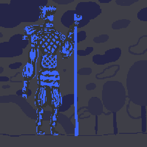
ok, here's the current edit based on what you guys said. liking it sooo much more right now. Thanks a bunch for the help again. So I'm sure there's still things i need to fix. Looking at it some things still seem off, but what do you guys think/suggest? |
|
|
IP Logged |
|
|
kyro
Seaman
Joined: 25 June 2013 Online Status: Offline Posts: 13 |
Posted: 25 July 2013 at 12:24am |
|
wow so i have a really awesome friend who's super great at animating and he did this little rough to help me figure out how i could fix this thing. His animation is really great in it's own way even though it's a bit more extreme than i wanted it to be. Posting it up just so you guys can see

not sure if i can compete with this, but i sure will try Edited by kyro - 25 July 2013 at 3:57am |
|
|
IP Logged |
|
|
porchpuppy
Seaman
Joined: 05 June 2013 Online Status: Offline Posts: 18 |
Posted: 25 July 2013 at 4:57pm |
|
Here are some redlines to fix his anatomy. His arms are too long and his legs are too short, so it makes him seem inhuman (in addition to the super dramatic breathing animation by your friend, it reminds me of some kind of haunted armor flying together to combine. XD)
Just make the breathing very subtle. You don't want it to look like it's bouncing. I'm not even sure if you can really see the breathing of a person in armor, because it doesn't move like skin does and is heavy. EDIT: The size of the trees makes it seem like a giant, probably need another tree that is closer to the viewer and bigger than him in height to show scale. Put the grass "horizon" lineart somewhere higher on his body up his legs, so he's not directly on it like a table edge. 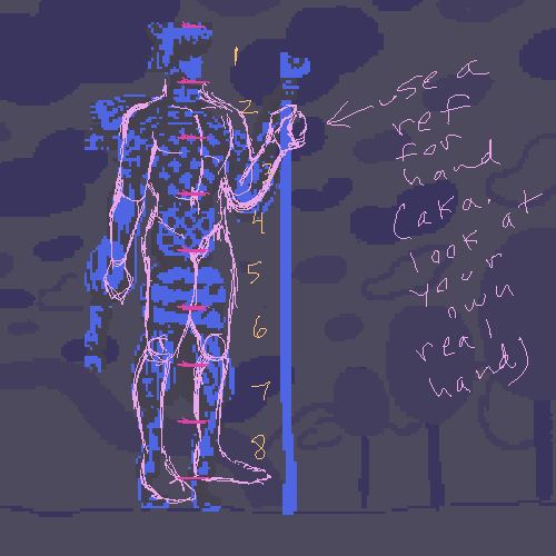 Edited by porchpuppy - 25 July 2013 at 4:59pm |
|
|
IP Logged |
|
|
kyro
Seaman
Joined: 25 June 2013 Online Status: Offline Posts: 13 |
Posted: 25 July 2013 at 5:47pm |
|
thanks for the advice. Actually i know the anatomy is off. totally intended! It's part of his design.
Right now the background is just a place holder for another comp i'm gonna put together. I agree with you though that there is too much bouncing in my friend's version and i would like it to be much more subtle. |
|
|
IP Logged |
|
|
Oriena
Midshipman 
Joined: 30 June 2013 Online Status: Offline Posts: 79 |
Posted: 25 July 2013 at 8:59pm |
|
I think the anatomy is fine. Unnatural, but I enjoy the cartoony/exaggerated look. I think the latest one you made it great, though. And I also think your version is a bit better than your friend's, but that's just my opinion.
|
|
|
IP Logged |
|
|
kyro
Seaman
Joined: 25 June 2013 Online Status: Offline Posts: 13 |
Posted: 25 July 2013 at 10:37pm |
|
Originally posted by Oriena
I think the anatomy is fine. Unnatural, but I enjoy the cartoony/exaggerated look. I think the latest one you made it great, though. And I also think your version is a bit better than your friend's, but that's just my opinion. seeing as how i really love my friend's version that means a lot. thank you Edited by kyro - 25 July 2013 at 11:22pm |
|
|
IP Logged |
|
| |
||
Forum Jump |
You cannot post new topics in this forum You cannot reply to topics in this forum You cannot delete your posts in this forum You cannot edit your posts in this forum You cannot create polls in this forum You cannot vote in polls in this forum |
|
