| Active TopicsSearchRegisterLogin |
| WIP (Work In Progress) | |
| |
  |
| Page of 3 Next >> |
| Author | Message |
|
Lakelezz
Commander 
Joined: 28 January 2023 Online Status: Offline Posts: 172 |
  Topic: Practicing outline-style Topic: Practicing outline-stylePosted: 31 January 2015 at 9:22am |
|
Dear PixelJoint-Community!
Currently I am practicing an outline-style and would appreciate your feedback. I started to work on two pieces: The first one is "Mei Misaki" from the manga/anime "Another".  What I do not like / struggle with: - The hair I wanted to add a highlight but I struggle with combining the dark colours with some new light one and keeping everything consistent. Reference for the hair:  I know that my shape is not quite accurate to the original, however I will fix that later on. - Concept & Anatomy The left hand is seems not to fit but I do not know what to do with it. Maybe I should rework the whole gesture? If there is anything wrong with the anatomy (which probably is), I would be happy to hear about it. The second image is Faris Nyannyan from the manga/anime "Steins;Gate".  What I want to fix/improve: - The hair The colours occur to be washed out. The bright pink has a really soft transition, letting the darker pink be useless/unrecognizable and confronting to hard with the red. - The ribbons I could not manage to make them better. Any ideas to make them less giant with this style? - Anatomy, Outline & AA banding The arms and legs. Specially the arms though. The hands are still pretty much work in progress but the arms volume feel wrong. I am not quite sure how to tackle or fix this. Additionally I think there is some AA banding. Would you agree? Is there a possibility to fix that? Specially long lines, keeping a consistent direction are my problem... Here is a reference for her: 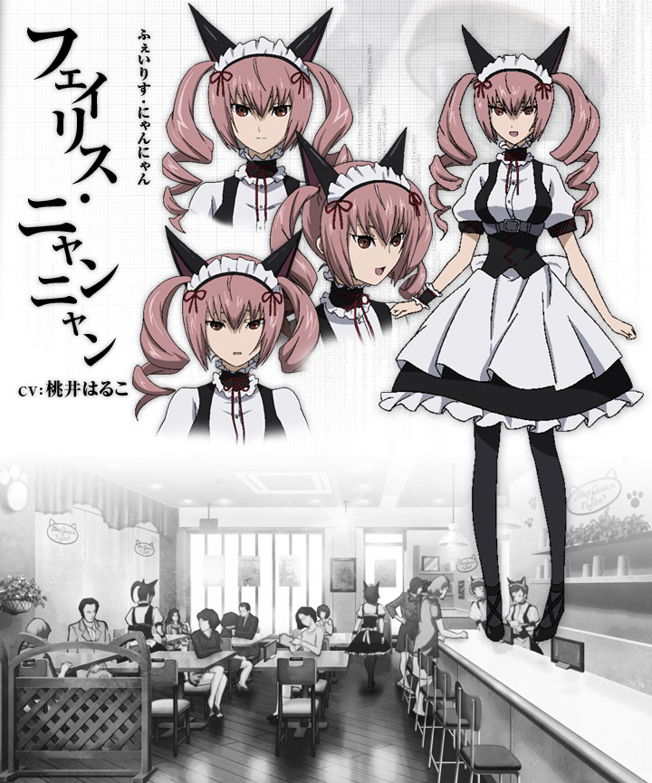 Please keep in mind: These are still work in progress :) Thanks for taking your time to read and I am looking forward for your ideas, suggestions, edits and help in general. Edited by Lakelezz - 31 January 2015 at 9:24am |
|
 IP Logged IP Logged |
|
|
RebeaLeion
Commander
Joined: 04 October 2017 Online Status: Offline Posts: 321 |
Posted: 31 January 2015 at 12:58pm |
|
For ribbons on her head maybe try to do some little thinning(?) that way you could separate bow-knots a little.
Edited by RebeaLeion - 31 January 2015 at 1:32pm |
|
|
IP Logged |
|
|
Lakelezz
Commander
Joined: 28 January 2023 Online Status: Offline Posts: 172 |
Posted: 31 January 2015 at 7:09pm |
|
I guess you are right, RebeaLeion! However how to manage that with an outline around all the objects? On this way there will be always a thickness of 3 pixels (1 red of the ribbon - 2 for the dark red outline on each side).
However I tried a little edit + skipping the red outline whenever I felt it would improve readability. Though this is still kinda against the style.. I guess.  Edited by Lakelezz - 31 January 2015 at 7:10pm |
|
|
IP Logged |
|
|
RebeaLeion
Commander
Joined: 04 October 2017 Online Status: Offline Posts: 321 |
Posted: 31 January 2015 at 11:13pm |
|
i cant help with this, let us someone more experienced tell us that. I started skipping outline on my trees too. So I am curious bout this as well.
But since it's inside a sprite I think it's ok. Or you know what you could try ? try to add outline not the same exact red dark but one which is more similiar to hair value. :) Edited by RebeaLeion - 31 January 2015 at 11:19pm |
|
|
IP Logged |
|
|
Lakelezz
Commander
Joined: 28 January 2023 Online Status: Offline Posts: 172 |
Posted: 01 February 2015 at 2:01pm |
|
Oh, you at least tried giving me ideas :)
I came up with this:  In this attempt I tried simply AAing the ribbons. Kinda works but still.. hmmm.. I appreciate any kind of help - must not be about the ribbon. There is a list of struggles in the first post :) Edited by Lakelezz - 01 February 2015 at 2:04pm |
|
|
IP Logged |
|
|
Lakelezz
Commander
Joined: 28 January 2023 Online Status: Offline Posts: 172 |
Posted: 03 February 2015 at 7:20am |
|
I made some edits.
 -Some experimental extreme highlight on the hair. -Lower hair part got shaped. -Minor fixes  -Hair colours tuned - still not sure if this tone fits to the original. -Some hair transitions have been improved. -Ribbon tweaked. |
|
|
IP Logged |
|
|
dpixel
Commander
Joined: 03 February 2015 Online Status: Offline Posts: 564 |
Posted: 03 February 2015 at 7:14pm |
|
Here's an edit. Mainly a color/face edit. I found the face a bit creepy. Is it supposed to be? Maybe it can give you some ideas. Also, you had a lot of colors so close to each other, it was very hard to tell them apart. The dress and legs looks great (nice pixel clusters). The arms could use some reshaping...smaller wrists? larger hands?
|
|
|
|
|
|
IP Logged |
|
|
Lakelezz
Commander
Joined: 28 January 2023 Online Status: Offline Posts: 172 |
Posted: 04 February 2015 at 1:42pm |
|
Thank you, dpixel! I really like your edit and appreciate your commitment!
In my opinion your edits made her look more like the original, which is quite a good guideline for me. Since I drifted off from what she actually looks like. Though you opened my eyes now, haha. All those similar colours were me practicing to blend over between the colours to provide a fluid transition. I made an edit, used nearly the same colour values as you. As far as I could see they are pretty close to the reference and they indeed work for the purpose of pixeling her.  I kept the old mouth. Your's might be more like the reference but I simply prefer the old one. Additionally the bangs has been emphasized with the red and darker pink. This might change in the next updates. Another point would be the eyes: I went for something close to your edit but changed that and added the white leather skin. As well as the face proportions were changed: Positioned eyes higher to a proper distance to the mouth and nose.Moreover the neck has been extended. Lastly I added some bright spots on the string on the right arm and her stomach - this might be removed as well. I am simply lacking time to make more edits today. The hand for example is cut off - I tried on improving anatomy but it is not that easy for me and also the ribbons are still a thing to be tackled. The could work like in your edit but they would miss the outline. I am not sure if I actually need them to stick to this outline-based-style, though. Edited by Lakelezz - 04 February 2015 at 1:51pm |
|
|
IP Logged |
|
|
Lakelezz
Commander
Joined: 28 January 2023 Online Status: Offline Posts: 172 |
Posted: 05 February 2015 at 1:29pm |
|
I have done some updates. Though my time was limited again.
 First of all I tried myself on adding the hands. Also the hair has been tweaked around and the darkish border of the pony got removed with something much more fitting. Additionally I added some small shadows on the right bright side of the dress. Lastly there have been some pixels moved from one place to another or added - just some little stuff. What I just realized is the missing shading of frilly stuff. However I might gonna completely rework them in order to get closer to the original. While that do not mind them for now, haha. Edited by Lakelezz - 05 February 2015 at 1:32pm |
|
|
IP Logged |
|
|
Lakelezz
Commander
Joined: 28 January 2023 Online Status: Offline Posts: 172 |
Posted: 06 February 2015 at 1:20pm |
|
Some more changes:
 -Pony is now longer and fits much more to the original. -Hair shading changed. -Legs shapes got synchronized. -A new outline around the white cloth on the skirt has been added. -The cloth's throwing shadows onto the skirt adjusted. -White ruffles has been completed in terms of shading. Edited by Lakelezz - 06 February 2015 at 1:23pm |
|
|
IP Logged |
|
|
dpixel
Commander
Joined: 03 February 2015 Online Status: Offline Posts: 564 |
Posted: 06 February 2015 at 4:19pm |
|
The white pixels around the eyes just doesn't look right. I see it in the reference, but at this size it just looks confusing and hard to read.
|
|
|
|
|
|
IP Logged |
|
|
Lakelezz
Commander
Joined: 28 January 2023 Online Status: Offline Posts: 172 |
Posted: 07 February 2015 at 6:28am |
|
I agree! As a result I removed the white.
 |
|
|
IP Logged |
|
|
Lakelezz
Commander
Joined: 28 January 2023 Online Status: Offline Posts: 172 |
Posted: 07 February 2015 at 5:39pm |
|
Starting off with this update: I felt like her legs were too thick and clunky.
I prefer this change by far - though I might do some more changes on the right leg's shadow.  The colours were lowered from 24 to 15. Edited by Lakelezz - 07 February 2015 at 5:41pm |
|
|
IP Logged |
|
|
Lakelezz
Commander
Joined: 28 January 2023 Online Status: Offline Posts: 172 |
Posted: 08 February 2015 at 2:24pm |
|
Another small change on the shoes.
 Does somebody think there has to be something fixed or changed in general on this piece? |
|
|
IP Logged |
|
|
Lakelezz
Commander
Joined: 28 January 2023 Online Status: Offline Posts: 172 |
Posted: 09 February 2015 at 9:17am |
|
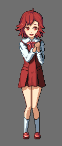
Old:
New:  Changes:
Whenever you have an idea, suggestion, or an conceptual edit feel free to share this with me :) Edited by Lakelezz - 09 February 2015 at 9:17am |
|
|
IP Logged |
|
|
rhlstudios
Commander
Joined: 17 September 2018 Online Status: Offline Posts: 106 |
Posted: 09 February 2015 at 2:32pm |
|
I love watching your WIPs, you work so hard to make your pieces the best they can be and it's fantastic to see :D
If you want to reduce your color count more, I notice that the colors used on her hair highlight are unique to the highlight. You can incorporate colors already used, this is just a rough example but you can play around with your existing colors  |
|
|
IP Logged |
|
|
Lakelezz
Commander
Joined: 28 January 2023 Online Status: Offline Posts: 172 |
Posted: 09 February 2015 at 3:31pm |
|
Oh, I am glad you like watching my WIPs :) Did not really think that they are that great but rather slow and tenacious.
Yes, I added those colours and told myself: It okay.. I probably need them... Bad excuse, haha. So I started to work on the following edit thanks to you.  Down from 30 to 24 colours! Though I use the pure black on the inner. I might go up to 25 or something to replace the pure black. |
|
|
IP Logged |
|
|
Lakelezz
Commander
Joined: 28 January 2023 Online Status: Offline Posts: 172 |
Posted: 09 February 2015 at 5:28pm |
|
Here comes another additional attempt on Nyannyan:
 I remember having problems with adding the leather skin to the iris - this might work a little bit better than before. Though I am not sure. Any ideas? |
|
|
IP Logged |
|
|
Lakelezz
Commander
Joined: 28 January 2023 Online Status: Offline Posts: 172 |
Posted: 10 February 2015 at 1:20pm |
|
Ok, a last tweak on Faris. I will publish her now. If something pops up into my mind I can still apply little edits anyway.
 I used some darker skin tones to emphasize on the leather skin of the eye. Added some more texture on the right curly hair. Some minor changes here and there. |
|
|
IP Logged |
|
|
RebeaLeion
Commander
Joined: 04 October 2017 Online Status: Offline Posts: 321 |
Posted: 11 February 2015 at 7:19am |
|
the final looks superior to your first sketch/attempt. :)
|
|
|
IP Logged |
|
|
Lakelezz
Commander
Joined: 28 January 2023 Online Status: Offline Posts: 172 |
Posted: 13 February 2015 at 1:22pm |
|
Thank you, RebeaLeion! There will be many more to come. Right now I am figuring out which character try myself on next, haha.
While I am thinking, I am applying some new changes to Mei Misaki. |
|
|
IP Logged |
|
|
Lakelezz
Commander
Joined: 28 January 2023 Online Status: Offline Posts: 172 |
Posted: 13 February 2015 at 3:21pm |
|
Some changes on Mei Misaki:

|
|
|
IP Logged |
|
|
Lakelezz
Commander
Joined: 28 January 2023 Online Status: Offline Posts: 172 |
Posted: 14 February 2015 at 8:58am |
|
New changes! I might publish her soon, too.
 So I did some changes in her face. Specially to emphasize on the shadows and use my variety on tones much more. The area around her neck got changed a bit to stress out the neck and the surroundings. Her legs had a small shadow tweak as well! Both knee had like 1 or 2 pixels changed and the right leg's shadow got removed because it would make no sense at that position. Additionally the skirt cast shadow got brightened to provide a less strong transition. Lastly the line between both legs got softened up. Her mouth (which became a smile in the last update), got changed by some pixels. Things to think about: Moving her knees down. They might be too high. Skin colours. Even though I like it right now, there might be something better. Edited by Lakelezz - 14 February 2015 at 8:59am |
|
|
IP Logged |
|
|
Lakelezz
Commander
Joined: 28 January 2023 Online Status: Offline Posts: 172 |
Posted: 14 February 2015 at 4:09pm |
|
More changes!
 Lowered the colour amount from 23 to 20. The hair got changed a bit but I am still not happy with the hair. It should be different I guess. Additionally there were some small changes (neck area and so on..). |
|
|
IP Logged |
|
|
Lakelezz
Commander
Joined: 28 January 2023 Online Status: Offline Posts: 172 |
Posted: 18 February 2015 at 8:53am |
|
I published Mei Misaki!
http://www.pixeljoint.com/pixelart/92726.htm Additionally I tried to improve Faris Nyannyan.  The head has been lowered in order to fix anatomy. Additionally her jaw has been softened because her chin being too sharp. If you have any feedback, feel free to share it with me! My next step will be about creating an animation with this style. Therefore I will create a base which should be customizable by me. Edited by Lakelezz - 18 February 2015 at 8:53am |
|
|
IP Logged |
|
|
Lakelezz
Commander
Joined: 28 January 2023 Online Status: Offline Posts: 172 |
Posted: 20 February 2015 at 5:13am |
|
I did some more changes on Faris Nyannyan:
 - Head got changed: - Head is now shorter. - Facial expression has been edited according to the new head size. - A shiny effect was added onto the eyes. - Cheeks are more lovely now (soft blushes). - Legs are now shorter. - Hair got adjusted: - Reflection on the hair got almost totally changed. - Another AA gradient was applied. - Colour palette got tweaked. - Canvas got adjusted according to her new height. |
|
|
IP Logged |
|
|
rhlstudios
Commander
Joined: 17 September 2018 Online Status: Offline Posts: 106 |
Posted: 20 February 2015 at 7:10am |
|
WOW!! Wow wow, her hair and face look amazing, like night and day! Very nice work, I found her face looked a little menacing before but now it looks so adorable and sweet! her hair reflection looks so much better too, as does her hair. Just wow, I've said it before and I'll say it again, I absolutely love watching your WIPS :3
|
|
|
IP Logged |
|
|
Lakelezz
Commander
Joined: 28 January 2023 Online Status: Offline Posts: 172 |
Posted: 21 February 2015 at 4:55pm |
|
Rhlstudios, thank you a lot! Always appreciate your feedback!
Additionally I am glad that you enjoy my WIPs : ) Before I start with animating this style I felt like practicing some more. Specially focusing on AAing. This time it is Aoba Tsugumi from the manga and anime "Kannagi". Oh, do not mind those depth on the clothes too much - I am switching the clothes around so often right now... I will fix them when everything is in the right place, haha.  I started to work on this today and used 15 colours. However the anatomy let me struggle so much and I am pretty sure her arms not correct. Anybody who could give me some rough edit to show me how it should be? Her hand gesture is also not that good I guess. Next is the head - which might be too big? However looking at the following references makes me wonder again. One more aspect is the detail in the dress. I am not talking about the depth in general but those purple lines leading up to her chest. Originally those are a feature of her dress which you can see on the second reference but I simply can not implement them... Any ideas? 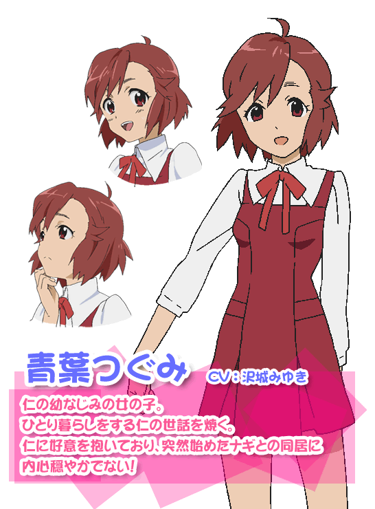   Thanks for reading and of course I appreciate any kind of constructive feedback : ) Edited by Lakelezz - 22 February 2015 at 1:20pm |
|
|
IP Logged |
|
|
Lakelezz
Commander
Joined: 28 January 2023 Online Status: Offline Posts: 172 |
Posted: 22 February 2015 at 8:56am |
|
Another edit, changed multiple minor things.
 I tried to stress out the lines on her dress. However I am still not happy with this. Any suggestions about those lines? Edited by Lakelezz - 22 February 2015 at 8:57am |
|
|
IP Logged |
|
|
Lakelezz
Commander
Joined: 28 January 2023 Online Status: Offline Posts: 172 |
Posted: 22 February 2015 at 1:19pm |
|
Just gave it another try:
 I made her dress brighter in order to let the by lines back folded areas look deeper. As a result there is no need for those extreme deep purples anymore. This is based on the reference where the back folded area has the same shade as on the dress. |
|
|
IP Logged |
|
|
Limes
Commander
Joined: 15 September 2021 Online Status: Offline Posts: 683 |
Posted: 22 February 2015 at 8:17pm |
|
Her skirt is kinda flat. The shading doesn't really fit her form.
|
|
|
|
|
|
IP Logged |
|
|
Iscalio
Commander
Joined: 29 March 2023 Online Status: Offline Posts: 225 |
Posted: 23 February 2015 at 6:34am |
|
cute
|
|
|
IP Logged |
|
|
Lakelezz
Commander
Joined: 28 January 2023 Online Status: Offline Posts: 172 |
Posted: 27 February 2015 at 5:18pm |
|
Thanks for your feedback, Limes. Also thanks for your one word impression, Iscalio.
However I made some huge updates - including a total makeover of her size and everything. 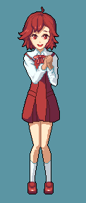 Nonetheless her skirt is still pretty flat but I am not sure too add a good depth. I tried different things but they all do not work out. Any suggestions, ideas, edits? Edited by Lakelezz - 28 February 2015 at 5:25am |
|
|
IP Logged |
|
|
Limes
Commander
Joined: 15 September 2021 Online Status: Offline Posts: 683 |
Posted: 27 February 2015 at 5:34pm |
|
The outlined indent adjacent to the light source. Maybe just colour it in darker. It looks much less flat anyhow.
|
|
|
|
|
|
IP Logged |
|
|
Boder
Commander
Joined: 07 February 2015 Online Status: Offline Posts: 112 |
Posted: 27 February 2015 at 5:37pm |
|
I like that Aoba much, much better.
I'm glad you were able to fix up the proportions without any input. Good eye! |
|
|
No sig kinda guy :'(
|
|
|
IP Logged |
|
|
dyluck
Commander
Joined: 24 July 2015 Online Status: Offline Posts: 231 |
Posted: 28 February 2015 at 5:24am |
|
I think the outline should not be everywhere in the same color, there's places when the outline should me much clearer.
Please, could some PJ member more experienced confirm this? Edited by dyluck - 28 February 2015 at 5:24am |
|
|
IP Logged |
|
|
Lakelezz
Commander
Joined: 28 January 2023 Online Status: Offline Posts: 172 |
Posted: 28 February 2015 at 6:25pm |
|
Just a small update on the shoes and the right sleeve:
 Nonetheless I am not sure whether I let the right sleeve stay blank or let it as it is right now. Limes, thanks for your input but for now the outline will be independent from the light source. Boder, I am glad you like it : ) Dyluck, as I mentioned in Limes' reply, for now the outline wont be affected by the light. However I am still stuck on adding depth onto the dress. Any suggestions without changing the outline's colour? Edited by Lakelezz - 28 February 2015 at 6:26pm |
|
|
IP Logged |
|
|
Lakelezz
Commander
Joined: 28 January 2023 Online Status: Offline Posts: 172 |
Posted: 04 March 2015 at 4:34pm |
|
In order to add more depth to the skirt I tried multiple things.
However I am not happy with what I have got now nor do I feel like this is the best way. Basically there is the first version: 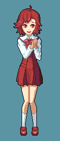 Then I decided to change the blue tone to give it a better synergy with the white tones. I also reworked the shading and used some lines to return to the style. 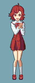 However I was not satisfied with the lines so I removed them: 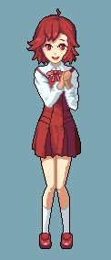 Nonetheless nothing of this really feeling goot enough. Though changing the skirt's shape on the left might have helped into the right direction, haha. |
|
|
IP Logged |
|
|
Lakelezz
Commander
Joined: 28 January 2023 Online Status: Offline Posts: 172 |
Posted: 05 March 2015 at 2:43pm |
|
New update!
I decided to go with selective outlining to improve the depth a bit more. Though I tried to reuse the colours of her which ended up in only a small difference compared to the black outline. 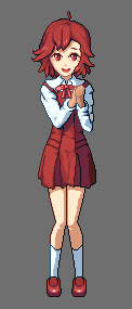 As a result using new colours for the outlines could be a better idea to go with. Additionally making the blue darker ended up in a rather too strong contrast on the right sleeve. That would underline the need of using different and more outstanding colours. Still struggling with the depth of the skirt - this is really tough thing to get done well for me. Edited by Lakelezz - 05 March 2015 at 2:45pm |
|
|
IP Logged |
|
|
Friend
Commander
Joined: 01 April 2015 Online Status: Offline Posts: 710 |
Posted: 05 March 2015 at 3:58pm |
|
you could get a little more depth with a single click of that good old trusty bucket xD though youd have to shade everything else similarly to maintain a uniform style...
 I do not think the sel out is working at all in the hands. The hands look like they do not belong with the rest of the pic because everything else has a well defined outline. Ironically, the hands are an area that need outlines the most, since they are overlapping the torso Edited by Friend - 05 March 2015 at 6:28pm |
|
|
IP Logged |
|
|
Lakelezz
Commander
Joined: 28 January 2023 Online Status: Offline Posts: 172 |
Posted: 06 March 2015 at 1:49pm |
|
Haha, the good old trusty bucket :D
Thanks for your idea, Friend! It actually added depth but as you said: I would have to change the whole piece in terms of shading :/ However I came up with this, after the artist dpixer giving me an edit.  I really think the skirt looks better now. Lowering the usage of all the colours before just was not fitting to the references. Haha, actually I could fix the little hair strand, too! I am still thinking about the shoes... They need probably more changes. -------- Edit: I went for a perspective fix for the shoes. 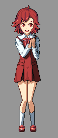 Additionally the colour amount has been removed from 24 to 17 (without the background grey). Edited by Lakelezz - 06 March 2015 at 5:40pm |
|
|
IP Logged |
|
|
Lakelezz
Commander
Joined: 28 January 2023 Online Status: Offline Posts: 172 |
Posted: 07 March 2015 at 4:28am |
|
I went down to 15 colours (without the background again) and changed the shoes.
 |
|
|
IP Logged |
|
|
jalonso
Admiral 
Joined: 29 November 2022 Online Status: Offline Posts: 13537 |
Posted: 07 March 2015 at 4:45am |
|
I know its not noticeable at 1X but the single pixel line at the bottom of the elbow is considered a bad habit in pixelart. You hardly ever want to see that even in small sprites.
Edited by jalonso - 07 March 2015 at 4:45am |
|
|
|
|
|
IP Logged |
|
|
Lakelezz
Commander
Joined: 28 January 2023 Online Status: Offline Posts: 172 |
Posted: 07 March 2015 at 5:21am |
|
Thanks for pointing out! Is it fixed now or did I misunderstand you?
 Edited by Lakelezz - 07 March 2015 at 6:08am |
|
|
IP Logged |
|
|
Iscalio
Commander
Joined: 29 March 2023 Online Status: Offline Posts: 225 |
Posted: 07 March 2015 at 10:28am |
|
I'm not sure I understand either. There are single pixel thickness lines of a single color all over the model. What's going on at the elbow that's different? 0_o
um if you wanted suggestions...I guess the hand feel quite unfinished atm, maybe you were still getting around to that? on a related note her left lower arm (right side of image) feels bent and feels like it has as much or more thickness at the wrist than higher up the arm. Edited by Iscalio - 07 March 2015 at 10:31am |
|
|
IP Logged |
|
|
jalonso
Admiral
Joined: 29 November 2022 Online Status: Offline Posts: 13537 |
Posted: 07 March 2015 at 11:40am |
|
Yes. That's what I meant. That single pixel jump is bad form.
Similarly on the right shoulder that's colored in the lighter grey right at the bend where the dress strap is you jump from a single pixel to a long line...same thing. Clean up after yourself ;) |
|
|
|
|
|
IP Logged |
|
|
Lakelezz
Commander
Joined: 28 January 2023 Online Status: Offline Posts: 172 |
Posted: 07 March 2015 at 1:16pm |
|
Thanks for your feedback, Iscalio! I appreciate it!
Therefore I did an update on the hands :) Jalonso, thanks you a lot for pointing out my mistakes! As a result I tried to remove all those single pixels! Last but not least: The eyes got nearly completely updated! Edit: I changed the hand's shading according to the rest.  Edited by Lakelezz - 07 March 2015 at 2:28pm |
|
|
IP Logged |
|
|
jalonso
Admiral
Joined: 29 November 2022 Online Status: Offline Posts: 13537 |
Posted: 07 March 2015 at 5:33pm |
|
Because you call this thread 'practicing outline style' I pointed that out. I see a lot of 'poor' lines still here and many singles that jump a little bit.
Its not always possible to be 100% clean but lines that 'jump' in any way generally look odd even to those that are not aware of it. 'Stepping' your lines whenever possible is the best thing to do and when it does not work then AA or coloring the outline can help. For example a line that is 3-4-3-5-5-9 will jump more than a 3-3-5-7-9 line. |
|
|
|
|
|
IP Logged |
|
|
Lakelezz
Commander
Joined: 28 January 2023 Online Status: Offline Posts: 172 |
Posted: 08 March 2015 at 5:03am |
|
Thanks for the input! I checked all the lines whether they can be improved or not.
Nonetheless I decided to increase the saturation. Here is a comparison via animated GIF: 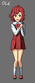 Last but not least - the update without animation: 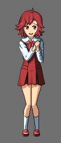 Edited by Lakelezz - 08 March 2015 at 6:24am |
|
|
IP Logged |
|
|
jalonso
Admiral
Joined: 29 November 2022 Online Status: Offline Posts: 13537 |
Posted: 08 March 2015 at 8:33am |
|
For your consideration :)
 |
|
|
|
|
|
IP Logged |
|
| Page of 3 Next >> |
| |
||
Forum Jump |
You cannot post new topics in this forum You cannot reply to topics in this forum You cannot delete your posts in this forum You cannot edit your posts in this forum You cannot create polls in this forum You cannot vote in polls in this forum |
|

