| Active TopicsSearchRegisterLogin |
| WIP (Work In Progress) | |
 Topic: Study of ilumination in metals (4 colors) Topic: Study of ilumination in metals (4 colors) |
  |
| Author | Message |
|
frikicat
Seaman 
Joined: 27 February 2024 Online Status: Offline Posts: 6 |
  Topic: Study of ilumination in metals (4 colors) Topic: Study of ilumination in metals (4 colors)Posted: 19 February 2018 at 2:51am |
|
Hi, i?m a complete newby in pixel art, i read many toturials and now i start drawing, i?m try to start with a simple 4 color palette (GameBoy), but traying to practice with illumination start to confuse me, i think is for a too limitate palette, i cant reflect as i want...
These are my works for now:   Can you tell me what is the best form to represent the metal with these palette? thanks you so much friends  Edit: :( it?s a gif but i thinks there are some strange in the background? how do you load the images? |
|
 IP Logged IP Logged |
|
|
eishiya
Commander 
Joined: 04 August 2022 Online Status: Offline Posts: 1109 |
Posted: 19 February 2018 at 4:59am |
|
Metal is usually smooth, which means you should avoid dithering, since dithering creates a textured look.
With metal, it's usually much more complicated than just "lighting" and "shading", because what gives metal its distinct look is its reflectiveness. The reflections on curved metal will tend to be distorted, squished in the direction of the curve, appearing like bands of reflected colour running along the form of it. Reference image. Brushed metal (as opposed to polished) metal has a slightly rougher texture and is less obviously reflective. It reflects shapes in vague clouds rather than in clear bands. Either way, for low-res pixel art, this tends to mean metal has a tendency to have dark and light areas in multiple bands. So, you can achieve a metallic look just by adding some bands of colour here and there. Before you add those bands though, you should make sure your shadows make sense. Once the lights and shadows convey the form you're looking for, it's pretty easy to add a bit of shine. From the outline of the helmet, it looks like you're going for a half-pill kind of shape, like this. Since the helmet doesn't have a major curve at the bottom, there should be no shading that suggests the helmet curving under itself. Since the top is curved, the highlights and shadows should also curve towards the top. These are the two most important things to keep in mind when doing lighting: 1. Shadows are the absence of light. Pick a light source in 3D space, and imagine the light-rays that come out of it. Where do they hit? Where are they blocked? Where they're blocked, that's shadow. 2. (Specular) highlights are reflections, they are places where the light is directly reflected by the object into the eye/camera. Where should the light from your light source bounce off the object straight into the camera? Put your highlights there. Shiny metal complicates this by reflecting objects around the metal object, potentially breaking up the shadows with reflections of lighter objects, and breaking up some of the fainter, less direct highlights with reflections of darker objects (the brightest highlights are not broken up, because what's being reflected there is the light source). In art, it's common to emphasise the shadows and highlights more than the reflections, because it creates a clearer read. Here's an edit I did of your helmet, with two different light sources, in the hope that it'll demonstrate what I wrote above. I went with a dark base colour, but you can apply the same ideas to a light-coloured helmet.  I deliberately chose a different light direction from any of your versions, so that you could try making your own version with your desired lighting without copying mine. |
|
|
IP Logged |
|
|
administrative
Midshipman 
Joined: 27 August 2015 Online Status: Offline Posts: 45 |
Posted: 19 February 2018 at 5:46am |
|
I like the gameboy style colour pallette; I think adding a bit of bright lines will give more of a metal appearance.
|
|
|
IP Logged |
|
|
frikicat
Seaman
Joined: 27 February 2024 Online Status: Offline Posts: 6 |
Posted: 19 February 2018 at 9:15am |
|
Thanks for your advices!
I try to use my new knowledges to make an armor: But the results dont convence me 100% so i take this image from google: 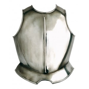 and make this beauty: Is it ok now for your expert eyes?  Thanks you so much lovely folks! |
|
|
IP Logged |
|
| |
||
Forum Jump |
You cannot post new topics in this forum You cannot reply to topics in this forum You cannot delete your posts in this forum You cannot edit your posts in this forum You cannot create polls in this forum You cannot vote in polls in this forum |
|
