| Active TopicsSearchRegisterLogin |
| WIP (Work In Progress) | |
| |
  |
| Author | Message |
|
spartan_117
Commander 
Joined: 14 June 2007 Online Status: Offline Posts: 478 |
  Topic: the secret garden(reef) Topic: the secret garden(reef)Posted: 27 November 2007 at 8:26am |
 hi guys. this is my challenge entry for this week. just for ur info: This piece has a story. Its about new beginnings. The reef as shown is still new, with very few species, but as it grows it will become a whole new world. It was meant for dogmeat for his new development. It was also meant for trying out a new style. my problem is this. Since we are using a palette that is not quite harmonic with itself, i am finding difficulty with blending the colors with only slight dithering. can u guys help, ill give u a cookie ( unlike A.B in the chatterbox) |
|
 IP Logged IP Logged |
|
|
Platnium
Commander
Joined: 27 June 2007 Online Status: Offline Posts: 319 |
Posted: 27 November 2007 at 8:32am |
|
Awesome, looks exactly like clown fish as well:

|
|

|
|
|
IP Logged |
|
|
spartan_117
Commander
Joined: 14 June 2007 Online Status: Offline Posts: 478 |
Posted: 27 November 2007 at 8:33am |
|
thats my reference. first page on google when searching clown fish.
|
|
|
IP Logged |
|
|
jalonso
Admiral 
Joined: 29 November 2022 Online Status: Offline Posts: 13537 |
Posted: 27 November 2007 at 8:51am |
|
A most classic of tricks: use greys to blend very difficult color to color transitions.
|
|
|
|
|
|
IP Logged |
|
|
spartan_117
Commander
Joined: 14 June 2007 Online Status: Offline Posts: 478 |
Posted: 27 November 2007 at 8:55am |
|
ill give it a try.
until my next update then. |
|
|
IP Logged |
|
|
GeorgiePie
Midshipman 
Joined: 07 November 2007 Location: United States Online Status: Offline Posts: 89 |
Posted: 27 November 2007 at 10:55am |
|
I find that the fishes mouth/nose area is too pointy, maybe try and round it out a bit. Also, I find that the back fins aren't like the ref, doesn't fan out the same way, it looks like yours isn't getting bigger then smaller again.
|
|
|
|
|
|
IP Logged |
|
|
spartan_117
Commander
Joined: 14 June 2007 Online Status: Offline Posts: 478 |
Posted: 27 November 2007 at 11:11am |
|
i was planning on finishing the fish in the end, right now i have a lot of background to cover, i just need it now to feel happy with my work
 |
|
|
IP Logged |
|
|
spartan_117
Commander
Joined: 14 June 2007 Online Status: Offline Posts: 478 |
Posted: 28 November 2007 at 12:33am |

before i start blending, i wanted to try out a little lighting experiment on the rocks as you can see. do u think i should go with it.
|
|
|
IP Logged |
|
|
MashPotato
Commander
Joined: 05 February 2007 Online Status: Offline Posts: 237 |
Posted: 28 November 2007 at 7:23am |
|
This is a nice start so far
 However, the scale doesn't feel right to me in this picture, the clownfish seems awfully huge... is that a lobster in silhouette? I suggest losing the treasure chest, which I think is adding to the scaling issue and doesn't fit your theme of new beginnings that well. If that is supposed to be a lobster, I think the size is way too small. I'm finding the orange clump below the clownfish difficult to decipher. However, the scale doesn't feel right to me in this picture, the clownfish seems awfully huge... is that a lobster in silhouette? I suggest losing the treasure chest, which I think is adding to the scaling issue and doesn't fit your theme of new beginnings that well. If that is supposed to be a lobster, I think the size is way too small. I'm finding the orange clump below the clownfish difficult to decipher.Looking forward to further progress! |
|
|
IP Logged |
|
|
spartan_117
Commander
Joined: 14 June 2007 Online Status: Offline Posts: 478 |
Posted: 28 November 2007 at 7:31am |
|
for now a lot of things are hard to decipher,i wanted to add some thing to that corner there as it looks empty, so i flipped a coin between an anchor(old of course) and a treasure chest. The chest is supposed to be small, but then again the fish is going to be com smaller at the end coz i might round it of a bit as per georgiepies's critique. the lobster is going to be fully detailed and not just a silhouette.
|
|
|
IP Logged |
|
|
spartan_117
Commander
Joined: 14 June 2007 Online Status: Offline Posts: 478 |
Posted: 28 November 2007 at 9:05am |
|
updated the lighting: time to blend
 btw. my inspiration for this piece came from my favorite artist, Christian Lassen check his site. I am thinking of making a series of ocean based pixels using this palette. |
|
|
IP Logged |
|
|
spartan_117
Commander
Joined: 14 June 2007 Online Status: Offline Posts: 478 |
Posted: 29 November 2007 at 5:25am |
 dithered the big rock ( i think my dithering improved ) and adjusted the colors on the front one. When i get home from work, i will have an update on the other two rocks. |
|
|
IP Logged |
|
|
spartan_117
Commander
Joined: 14 June 2007 Online Status: Offline Posts: 478 |
Posted: 29 November 2007 at 11:19am |
|
btw im thinking of not dithering the front stone,, just refine the highlights. What do u think?
|
|
|
IP Logged |
|
|
BlackDragon
Commander
Joined: 13 May 2014 Location: United States Online Status: Offline Posts: 729 |
Posted: 29 November 2007 at 1:45pm |
|
Hm, why did you use only 50/50 dither? |
|
|
"A little pain never hurt anyone." - Blueberry_Pie
|
|
|
IP Logged |
|
|
spartan_117
Commander
Joined: 14 June 2007 Online Status: Offline Posts: 478 |
Posted: 29 November 2007 at 1:53pm |
|
because the area is too small, i might do more levels of dithering in the saand,its a bit difficult in the rocks.
|
|
|
IP Logged |
|
|
Doomcreator0
Commander
Joined: 12 March 2017 Online Status: Offline Posts: 187 |
Posted: 29 November 2007 at 2:17pm |
|
How about you don't dither at all?
|
|

|
|
|
IP Logged |
|
|
Metaru
Commander
Joined: 20 November 2025 Online Status: Offline Posts: 3305 |
Posted: 29 November 2007 at 2:27pm |
|
honestly, the aspect of the rock sucks. it doesn't show any kind of lighting and it resembles more a mass with lots of folds. I would try to, instead, use less saturated highlights not as bright as the ones used in the picture (the ligth purple at the bottom rigth corner). considering that the rock is suposed to be in the background, using a highlight as bright as that distracts the attention of the viewer from the main focus(wich I can asume is the clown fish).
also, try to use less dithering to blend yor colors. dithering is not always the best answer for color trasition. try to pick your colors more wisely instead. a good tip migth be to watch your picture from a considerable distance... that will give you an idea how how good your colors blend. not to mention how much a good photo reference can guide you. |
|
|
I ate leel's babies
|
|
|
IP Logged |
|
|
spartan_117
Commander
Joined: 14 June 2007 Online Status: Offline Posts: 478 |
Posted: 30 November 2007 at 12:20am |
 Are these colors less distracting. |
|
|
IP Logged |
|
|
ShinyOne
Seaman 
Joined: 04 October 2007 Location: United States Online Status: Offline Posts: 7 |
Posted: 30 November 2007 at 3:59am |
|
Slight suggestion - I like the latest update best so far, but I think you could probably add a darker shade within the currently-darkest blue on the rocks, to give that side more depth. Because the side(s) with the highlights are more dynamic than the darker parts are. Maybe the darkest gray they give, or the black. :)
I like very much so far! :) |
|
|
IP Logged |
|
|
Club Beuker
Commander
Joined: 29 January 2007 Online Status: Offline Posts: 513 |
Posted: 30 November 2007 at 5:06am |
|
Dude, nice going there. But a slight tip from this side of the world:
I would ditch the dithering, especially on the rocks. Then put more contrast on the rocks. Enlighten the light colors, darken the dark colors. Besides that, good job! |
|
|
Without me, it's just aweso
|
|
|
IP Logged |
|
|
spartan_117
Commander
Joined: 14 June 2007 Online Status: Offline Posts: 478 |
Posted: 30 November 2007 at 1:34pm |
|
Almost done, still have the chest and the pipe like coral, removed the small rock at the back, and added a shark.
Everybody, the palette is limited, i dithered only when i needed to, and besides i cant run away from dithering forever. here it is,  |
|
|
IP Logged |
|
|
Metaru
Commander
Joined: 20 November 2025 Online Status: Offline Posts: 3305 |
Posted: 30 November 2007 at 9:41pm |
|
these blues still doesn't connect... you'll have to play more with colors. stand alone ones wouldn't work. maybe mixing the dark blue with the dark purple or the dark gray...
|
|
|
I ate leel's babies
|
|
|
IP Logged |
|
|
spartan_117
Commander
Joined: 14 June 2007 Online Status: Offline Posts: 478 |
Posted: 01 December 2007 at 2:07am |
|
the color limits are a problem. i will finnish it as soon as possible for the challenge, and then remake the whole thing with my own palette with a max of 32 colors. i want to finnish everything first before optimizing it.
this is the final update for the challenge. sorry guys i know i have one more day but i cant pixel in it.  this piece will be reworked hopefully with out any dithering. thank u all for ur advice even if i didnt apply it  . .Edited by spartan_117 - 01 December 2007 at 10:40am |
|
|
IP Logged |
|
|
Metaru
Commander
Joined: 20 November 2025 Online Status: Offline Posts: 3305 |
Posted: 02 December 2007 at 4:43pm |
|
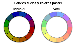
i believe that, from the beggining, this palette wasn't made for such brigth /saturated scene. vista colors do resemble(at least for me) pastel colors that would look better in a piece with a more subtle light source, in despite of it's XP counterpart and its strong colors.
 |
|
|
I ate leel's babies
|
|
|
IP Logged |
|
| |
||
Forum Jump |
You cannot post new topics in this forum You cannot reply to topics in this forum You cannot delete your posts in this forum You cannot edit your posts in this forum You cannot create polls in this forum You cannot vote in polls in this forum |
|
