| Active TopicsSearchRegisterLogin |
| WIP (Work In Progress) | |
| |
  |
| Author | Message |
|
zi-double
Commander 
Joined: 05 October 2021 Online Status: Offline Posts: 277 |
  Topic: lunar prototype Topic: lunar prototypePosted: 08 July 2008 at 11:40pm |
|
I'm not add to PJ one of my first work because he is very disgusting :)
Ok take decision to Re-pixel as one weekly challenge one of my first work which I make and because Pixelmoon is with new design ... here is current result ... I keep idea and outlines and just work everywhere ... About colours I'm not shure but want to be dark and to have like ship is in shadow of the moon - with sunny reflection and to have colours which are near to gamma colours of the ground ... will try to keep colours to 16 ... Here is old work and where I'm now ... 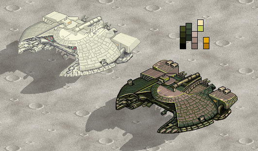 |
|
 IP Logged IP Logged |
|
|
Artisan
Commander
Joined: 29 August 2023 Online Status: Offline Posts: 219 |
Posted: 09 July 2008 at 3:59am |
|
seems a little pillow shaded in places, you could try fixing that.
also try makeing it so that your highlight colours are more saturated than your shadows. see if that helps. |
|
|
I like shiny things, i do indeed. |
|
|
IP Logged |
|
|
Sasuke-ish
Seaman 
Joined: 11 August 2006 Online Status: Offline Posts: 34 |
Posted: 09 July 2008 at 10:53pm |
|
Some of the lines I see are slightly crooked but it's hardly noticeable so it might not even be worth it to fix.
By the way I don't know why but, I love the look of the shadows on the ground they seem to be placed perfectly. |
|
|
IP Logged |
|
|
zi-double
Commander
Joined: 05 October 2021 Online Status: Offline Posts: 277 |
Posted: 10 July 2008 at 11:45am |
|
Artisan If you talk for back parts of the ship - they aren't finished ... also I'm not shure for main fuselage ... yep shadows now is better and need some AA somwhere
Sasuke for which lines you talk, because I don't know where to look it's important to fix if you dislike somwhere. Shadows have small repairs ;) 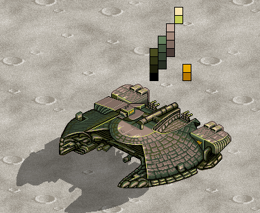 |
|
|
IP Logged |
|
|
Arachne
Seaman
Joined: 18 October 2021 Online Status: Offline Posts: 8 |
Posted: 10 July 2008 at 4:38pm |
|
It's a really interesting ship you have there. One thing you should think about, though, is if you're making the most of your palette. You have some colors that are barely used at the moment. For instance, you can replace the brightest yellow with the darkest green from the brightest green ramp and easily free up a color.
I'm not sure how much of this is unfinished, but I also think the lines on the body of the ship (the "scales") look a bit too sketchy. I think it would look better if they were arranged in neat, consentric circles. For instance, the outer edge of the wings suggests that the ship is round, but on the green part towards the back, under your two yellow color blocks, the lines dividing the scales are straight and make that part look as if it's bent upwards. Hope that makes sense. If you want to give it a worn appearance, I suggest you first make them look neatly arranged, and then maybe tear some of them off or chip off parts instead. Lastly, are you going for a realistic background, or do you just want to suggest that it's there? I'm asking because a lunar background would have way more contrast and any shadows on a horizontal surface would be black. It would make the ship stand out a lot less, so if you just want to show off the design, it's probably not such a good idea. Looking forward to seeing it finished.  |
|
|
IP Logged |
|
|
zi-double
Commander
Joined: 05 October 2021 Online Status: Offline Posts: 277 |
Posted: 11 July 2008 at 1:21pm |
|
First I think just to change colours, but work look disgusting, than start to improve it and think for fast finish, but that process is very hard because work over old work. With more time spent over ship, see that will need entire improvement and all parts need repairs :)
Background is template and shadow is with transparent black because else maybe will look poor If make shadow only with 2-3 colours maybe must try ... here is small update 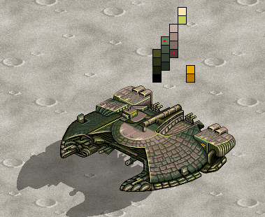 Arachne Have many parts unfinished :( Yep 2 colours /with red points in palette/ I put in the end and they aren't used enough - but I need them for update in more parts further. "replace the brightest yellow" - you talk for line where place red point ? "(the "scales")" - is place which I marked with red circle ? "but on the green part towards the back, under your two yellow color blocks, the lines dividing the scales are straight and make that part look as if it's bent upwards." - maybe you talk for place where I make little repairs under red circle ! Sorry that I can't understand all  Thanks. Thanks. |
|
|
IP Logged |
|
|
Arachne
Seaman
Joined: 18 October 2021 Online Status: Offline Posts: 8 |
Posted: 11 July 2008 at 2:02pm |
|
Oh, that's quite alright. I had trouble explaining it. Hope this helps.
I also noticed that the far side should curve more, so that's in there too. |
|
|
IP Logged |
|
|
zi-double
Commander
Joined: 05 October 2021 Online Status: Offline Posts: 277 |
Posted: 13 July 2008 at 11:19am |
|
In right front part need to be round more to be perfect, but than must move too many parts, now make aligned with right back parts ...
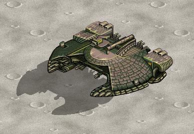 ... and small animation - must keep size 50kb ! 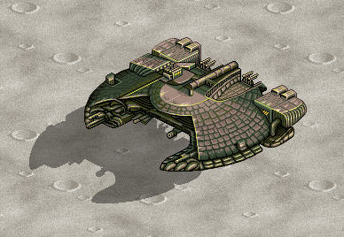 |
|
|
IP Logged |
|
| |
||
Forum Jump |
You cannot post new topics in this forum You cannot reply to topics in this forum You cannot delete your posts in this forum You cannot edit your posts in this forum You cannot create polls in this forum You cannot vote in polls in this forum |
|
