| Active TopicsSearchRegisterLogin |
| WIP (Work In Progress) | |
| |
  |
| Author | Message |
|
PATBUTCHER
Seaman 
Joined: 19 April 2009 Online Status: Offline Posts: 4 |
  Topic: New pixel art C+C welcome Topic: New pixel art C+C welcomePosted: 19 April 2009 at 5:04pm |

Hi, this is actually first post/pixel art ever. props for telling me how to upload. tried this pixel art b4 with to much thinking but working in an office gives me hours to contemplate my next pixel. whaddyatink?
ps. i love the old demo scene and probertson, dont be a hater |
|
 IP Logged IP Logged |
|
|
Mabelma
Midshipman 
Joined: 21 May 2023 Online Status: Offline Posts: 56 |
Posted: 19 April 2009 at 5:54pm |
|
I like it but the outline is a bit jagged. The shading on the face is awesome but shading on the other places are a bit bad. I tried fixing the outline of some of the problematic places. I think it's ok but really need some work. Also the crown has too many colors.
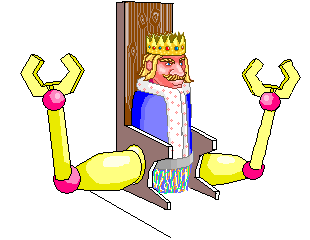 Hope you don't mind I edited it. I know it still needs some work. Also why doesn't the right hand/left hand has no shading?Shading is jagged too. Edited by Mabelma - 19 April 2009 at 5:59pm |
|
|
IP Logged |
|
|
JosephSeraph
Commander 
Joined: 09 August 2016 Online Status: Offline Posts: 55 |
Posted: 19 April 2009 at 6:17pm |
|
Why recent Pixels are all giving me the creeps?!
Anyways, i don´t like much the texture of the chair, i think it has to do with tha 'white' but i am not sure.. OH, redirect the chair feet lines, because they´re on an almost perrfect angle... |
|
|
IP Logged |
|
|
PATBUTCHER
Seaman
Joined: 19 April 2009 Online Status: Offline Posts: 4 |
Posted: 20 April 2009 at 10:46am |
|
hey thanks! im gonna go ahead and get the composition together b4 i colour or fix anything
|
|
|
IP Logged |
|
|
God_Is_Evil
Midshipman
Joined: 11 March 2009 Online Status: Offline Posts: 97 |
Posted: 21 April 2009 at 12:36pm |
|
Hey patbutcher i noticed that your shading was a little odd.
So here i did a edit. 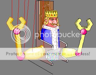 I did it as fast as i could but i just wanted to show you something, The shading on your dudes arms is coming from more than one direction. And when your choosing gold colors make sure your highlights have enough contrast to be discernable. Checkout this pic with great looking gold. http://www.pixeljoint.com/pixelart/25148.htm Here are the colors he used to make that gold.  If you look at it up close you can see that it is almost all brown and orange. Then the color right under white is yellow and you can still see the white clearly when it's on the yellow. EDIT:: lol i just read the post saying that your gonna work on the comp then work more and the shading.... Well whatever. Edited by God_Is_Evil - 21 April 2009 at 12:37pm |
|
|
IP Logged |
|
| |
||
Forum Jump |
You cannot post new topics in this forum You cannot reply to topics in this forum You cannot delete your posts in this forum You cannot edit your posts in this forum You cannot create polls in this forum You cannot vote in polls in this forum |
|
