Not exactly a dragon (WIP for challenge)
Printed From: Pixel Joint
Category: Pixel Art
Forum Name: WIP (Work In Progress)
Forum Discription: Get crits and comments on your pixel WIPs and other art too!
URL: https://pixeljoint.com/forum/forum_posts.asp?TID=10269
Printed Date: 14 June 2026 at 3:18pm
Topic: Not exactly a dragon (WIP for challenge)
Posted By: Velrio
Subject: Not exactly a dragon (WIP for challenge)
Date Posted: 29 April 2010 at 5:10pm
Posted in the challenge thread with the first one.

Here's an update: 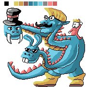
I'm still fairly new at this whole pixel art gig so I don't know some of the terms and how to apply them. After I made this I saw Kaiseto's excellent 3 headed dragon, but I didn't really take inspiration from his piece. Anyway please tell me some things to fix. |
Replies:
Posted By: Manupix
Date Posted: 30 April 2010 at 3:38pm
|
Cool idea, I like the funny faces. You should refine your design and clean the linework. Depth / volume are not obvious: maybe make the lower neck straighter, and show some tail on the right side for starters. There's lots of jaggyness and randomness in the outline. A lot depends on this! Then you might improve shading and colors: shift hues between the highlights and shadows, maybe add one more highlight, try to unify your palette by bridging between blues, yellows and pinks. |