Sidescrolling game mockup
Printed From: Pixel Joint
Category: Pixel Art
Forum Name: WIP (Work In Progress)
Forum Discription: Get crits and comments on your pixel WIPs and other art too!
URL: https://pixeljoint.com/forum/forum_posts.asp?TID=10275
Printed Date: 09 June 2026 at 12:53am
Topic: Sidescrolling game mockup
Posted By: Relix
Subject: Sidescrolling game mockup
Date Posted: 30 April 2010 at 11:26pm
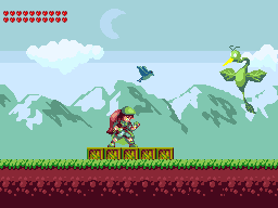
Should I keep going with this?: Sorry if it looks a bit empty, still trying to find right style for it. Edit:  |
Replies:
Posted By: Ninja Crow
Date Posted: 01 May 2010 at 11:05am
|
I like your grass, and your green bird (leaves for wings!), and your character design.
I think, though, that you have too many health pips by far (I know adventure games like Zelda do it, but theirs are horizontal at the top so as not to distract the binocular field of vision, whose main area is the centre horizon). Your mountain background layer is shaped more like nearby rocks than far peaks because of their gravity-defying shapes (in which case they could be made to look even more like nearby piles of stone with fingers of thrusting rock by lighting them in a style similar to http://www.pixeljoint.com/pixelart/5835.htm - this image . Notice the flat planes and how highlights are restricted just to the edges - by being angular like this, these are obviously nearby stones because otherwise weathering and distance would make the planes less flat and the edges less crisp.) If mountains is what you are going for, then http://www.pixeljoint.com/pixelart/17298.htm# - these http://www.pixeljoint.com/pixelart/33420.htm# - two images suggest a way to light them in a way that is similar to the adventure-platformer style you have so far (the colours don't have to be ramps of red or orange, since greens like you have would work, too). The first of those two images, and http://www.pixeljoint.com/pixelart/40107.htm - this one also show a way you can hide the dither line between the layers of colour in your sky. Since these sky texture lines are supposed to suggest clouds, you would have to make sure that any pop-out clouds (as in your second image) look good on top (either by stretching them out with tapering ends, or try making the sky texture more bubble shaped - though I can't be sure that would look good without trying it). Sorry for so much! ------------- 
!Strange Atoll - The Amazing Wilbot Game Project! |
Posted By: Relix
Date Posted: 01 May 2010 at 11:40am
|
Heart bar: I kinda want it to be from three to maxium of 20, just like in Zelda games. Would it help, if I made them smaller? Mountains: I'm not sure if I understood, but I'll try something. Sky/Clouds: The picture helped, but could you clarify just a little bit more, please? What about the moon, is it clear that it's a moon? You know how you can sometimes see the moon on daylight, it's supposed to look like that - does it look like that at all? And I also noticed that I used wrong colors for the characters eye, I've to fix that too. |
Posted By: Ninja Crow
Date Posted: 01 May 2010 at 12:52pm
|
Heart bar: I understand the need, but the bar is very distracting (nicely pixelled, though, just very large). Action games rely on a small number of hits so that the bar isn't overwhelming, but if you want more health just make each heart count for more than one point. If an action game needs a lot of health, then it becomes a solid bar or similar, where a single pixel can be a point, and it's very compact.
Adventure games, on the other hand, need a lot of health, but you'll probably notice that Zelda games try very hard to minimise how much of the screen all those hearts take up. As for making them smaller, or changing them in some way, I wouldn't want to presume too much on a method, since I was merely pointing out what I thought might be an error, in an attempt to be helpful. If what I mentioned, though, seems correct to you and your artistic vision for this piece (don't worry about hurting feelings by not taking advice!) and you are also interested in an opinion for a solution, then I'd say that making the hearts smaller might be one way of doing it - as would be grouping them more closely, or moving them out of the way of the main action, or being brave and trimming how many there will be, and so on. Often, all that is necessary is to be aware of a need while you are working (e.g. I've had to learn about hue shifting, and shadow desaturation, and mid-tone colour 'obtaining' - none of which I would have known about before joining PJ), and the solution will be part of the creative process as you go. Mountains: I'll clarify anything I said incorrectly if you need - and does that mean that they are mountains and not nearby hills or quarry rocks or whatever? Sky/Clouds: Could you specify what you need to know, exactly? And the moon looks fine at the moment, to me, and definitely came across as the way you have described it. -------------
!Strange Atoll - The Amazing Wilbot Game Project! |
Posted By: Relix
Date Posted: 01 May 2010 at 11:22pm
|
Heart bar: I was thinknig myself too, that it might be too big, I was originally going for bigger screen, but everything else looks better this way. I'll try to make them a bit smaller but if that doesn't look good, I'll just make them disapprear when you've full healt or after five or seconds after altering the healt values - like the healt bar in 3D Marios. Would that work? Mountains: They're supposed to be mountais, I think I understood what did you mean. Sky/Clouds: I really didn't understood what I should do with the pop out cloud. But maybe it'll look better once I change the background sky. Edit:  I got rid of the darkest sky part, changed the hearts and mountains. Fixed the extra color in the characters eye and added more white to it. Didn't touch the cloud yet. The sky has to be tileable, so I did only three variations for the pattern. I'm not happy at the mountains, I'll alter them more, but is this going on the right direction now? |
Posted By: Ninja Crow
Date Posted: 02 May 2010 at 11:31am
|
Yes, I would say that you have definitely been doing strong work!
I have noticed that my old CRT monitor (hey, anybody else have a CyberVision C70?) displays dark colours as very dark, so please keep that in mind with the next couple of things I mention: Mountains: I really like the shape of the lightest-coloured "planes" you put on the mountains (they're all notched and interesting) except for maybe the far left one, which seems a bit too round for that kind of texture (I don't know if you want to make its outline more angular or anything, though). The middle shade you are using on the mountains has good shapes up by the highlights, but I don't think the parts that droop down into circles looks like a good way to transition into the dark colour (I wish I was more of an expert on mountains, but if I had to give advice here - something I'd try myself - I'd say take some chunks out of the circles so that they have a jagged shape that mirrors the sawtooth outline your mountains have). Also, their colours are very dark (on my monitor at least) and I can't see the shapes at all until I zoom in. One thing that might come out well is to try putting in some good "counterpoint" colours on the mountains (especially at the edges of the areas where you want the light to fall on them). Try some yellows or reds or greens or whatever looks rich and interesting to you and see if you can find something that contrasts in a complimentary way. I've been trying to saturate midtones in my own practise stuff, and I'd like to see how it works for you. Small Bird: I love specular highlights, so take this with a grain of salt, but I think your small bird needs a spot or two of shine, as you've done on the hair of your character. I get the sense that this is a "helper" bird, and so you might also theme some colour onto it - either some red to match your character (I don't mean to turn it into a bright red robin or anything, just a touch here or there since bird plumage is iridescent and the colours might show up in the highlights) or a contrasting colour such as emerald or blue. I kind of feel it looks like a humming bird, which would be cool, so using jewel colours (and maybe it's even named after a jewel type?) seems appropriate. Character: For me, I no longer see enough blue in her eyes (again, that may just be my monitor) so a little bit in the opposite corner from the highlight might help. What do you think? -------------
!Strange Atoll - The Amazing Wilbot Game Project! |
Posted By: r1k
Date Posted: 02 May 2010 at 9:45pm
I made this edit yesterday but didnt post it. Im not sure how much itll help but here it is I basically made the mountains lighter to show they are farther in the background. Changed the hue of the sky, made the hearts more zelda style, and I think thats all I did. The hearts kind of suck but I didnt want to spend alot of time on them |
Posted By: Relix
Date Posted: 02 May 2010 at 11:31pm
|
Originally posted by Ninja Crow Mountains: I really like the shape of the lightest-coloured "planes" you put on the mountains (they're all notched and interesting) except for maybe the far left one, which seems a bit too round for that kind of texture (I don't know if you want to make its outline more angular or anything, though). Okay, but I'm not happy with them myself, I'l try to alter them more. Originally posted by Ninja Crow The middle shade you are using on the mountains has good shapes up by the highlights, but I don't think the parts that droop down into circles looks like a good way to transition into the dark colour (I wish I was more of an expert on mountains, but if I had to give advice here - something I'd try myself - I'd say take some chunks out of the circles so that they have a jagged shape that mirrors the sawtooth outline your mountains have). I'll see what I can do. Originally posted by Ninja Crow Also, their colours are very dark (on my monitor at least) and I can't see the shapes at all until I zoom in. All the colors or just some? I can change some of them, my monitor is very bright so I can't really tell if it's okay or not with others. Originally posted by Ninja Crow One thing that might come out well is to try putting in some good "counterpoint" colours on the mountains (especially at the edges of the areas where you want the light to fall on them). Try some yellows or reds or greens or whatever looks rich and interesting to you and see if you can find something that contrasts in a complimentary way. I've been trying to saturate midtones in my own practise stuff, and I'd like to see how it works for you. Well, the mountains I used as reference had a little red and blue when seen from distance, I'll try that. Originally posted by Ninja Crow Small Bird: I love specular highlights, so take this with a grain of salt, but I think your small bird needs a spot or two of shine, as you've done on the hair of your character. I get the sense that this is a "helper" bird, and so you might also theme some colour onto it - either some red to match your character (I don't mean to turn it into a bright red robin or anything, just a touch here or there since bird plumage is iridescent and the colours might show up in the highlights) or a contrasting colour such as emerald or blue. I kind of feel it looks like a humming bird, which would be cool, so using jewel colours (and maybe it's even named after a jewel type?) seems appropriate. You're right, it's a helper bird and it's supposed to be a black raven. Maybe I could add some metallic blue, some ravens seem to have blue on them. Originally posted by Ninja Crow Character: For me, I no longer see enough blue in her eyes (again, that may just be my monitor) so a little bit in the opposite corner from the highlight might help. I changed the blue for darker color, as she's supposed to be green eyed... I can change it back tho. Originally posted by r1k I made this edit yesterday but didnt post it. Im not sure how much itll help but here it is I basically made the mountains lighter to show they are farther in the background. Changed the hue of the sky, made the hearts more zelda style, and I think thats all I did. The hearts kind of suck but I didnt want to spend alot of time on them Those mountains are amazing, do you mind if I steal the palette for them? I also like your sky, but I want it to be more blue myself. |
Posted By: r1k
Date Posted: 02 May 2010 at 11:36pm
| ya feel free to use the mountain pallete. Looking at my edit I think my sky is a bit desaturated too. I just wouldnt personally go a cyan as yours. Maybe try something inbetween mine and yours and see if you like it or not. |
Posted By: Relix
Date Posted: 02 May 2010 at 11:39pm
|
Okay, thanks. I'll try to play around with the sky too. Edit:  Changed the sky's coloring, redid the mountains with the new palette. Changed characters eye back to lighter blue, added blue to the sidekick. I kept the heart bar like this, I guess it's okay now? I didn't anti-alias the mountains like you did, mostly because I'm not big fan of it... I think I should start adding more variations for the grass and clouds now. |
Posted By: Zeratanus
Date Posted: 03 May 2010 at 8:38am
|
Mountains are looking better now, but pay attention to the shapes of r1k's mountains. they look a lot more natural, with their gradual slopes. specifically, the one to the left of the character is very odd and unnatural looking. Also, the health bar looks okay, but I'll tell you, as a gamer, i would despise that thing. Trying to gauge how much health I had left among those 20 icons would really be irritating, doubly so since you seem to have it go in columns instead of rows (the 3 remaining health bars are on the left column). Seriously, cut those in half and make each one indicate two hit points (either they cut in half when hit, or the red part shrinks). As it is it's just too complicated to look at quickly. To continue nitpicking; your character's pose is very off looking. She's leaning very far to the right, making it look unbalanced, and her right arm is just sticking straight out, which isn't a very natural position to hold your arm. I did a quick redraw to show you:  (click on it to enlarge it so you can see the differences better) The red outline is how your pose looks, the middle one is my redraw, and the right is your original. This is a very Megaman X like pose, http://www.sprites-inc.co.uk/files/X/X/x1sheet.gif - so you might want to look at those for a bit of reference . In short, I moved the arm down at the shoulder, changed the angle of the right leg (her right) so it was facing out a bit instead of just to the side, and the left leg I moved forward quite a bit to make her look more balanced. I also lowered the belt a bit to make her look less extremely bent over. And your lighting doesn't match up either. On the blue sleeves and pants on the hair, and the back of the coat/dress/thing between the legs, the light is coming from the left. on the rest of it (hat, skin, green under the belt) it's coming from the right. You need to pick a side and stick with it. Phew, that was quite a bit of text wasn't it? Anyway, keep it up! |
Posted By: Relix
Date Posted: 03 May 2010 at 10:46am
|
I'll try to make those changes, but I was going to make the hearts like in Zelda, so one heart equals four hit points, but it makes more sense to do it with code and not making different spriters for each piece. I personally like the hearts that way, I probally won't change them. I'll also make the first heart animated and have it beat faster if you've less healt, making it easier to notice it. Trust me, they will be fine in action. |
Posted By: Hatch
Date Posted: 03 May 2010 at 10:59am
|
The trouble with the hearts is that they don't look like two separate column. It just seems like a big jumble. They also seem to still take up far too much screen real estate, and could even obscure enemies approaching from the rear on certain terrain. Are you totally opposed to having them laid out horizontally? ------------- |
Posted By: Relix
Date Posted: 03 May 2010 at 12:05pm
|
Yeah, I can separate them a little bit and maybe make them transparent when an enemy is behind them. Also like I said earlier, I can make them go away if not needed. But I really want them to be a vertical drop. Look at Megaman for example, it has vertical healt bar, I never seen or heard anyone complain about it. In the handheld Megamans, it usually takes up a half a screen when at max. Anyway, it's late here so I can't make the new revision yet, feel free to post anything that comes to mind. |
Posted By: Zeratanus
Date Posted: 03 May 2010 at 12:23pm
|
except that in Megaman it's a single column, probably about a third of the width you have now, so it blocks a lot less, and it's easy to read how much health you have left by how full that bar is. However, if this is just like all my mockup stuff in that it probably wont ever actually become a game, just practice for making stuff and whatnot, then feel free to do whatever you find most aesthetically pleasing to you. |
Posted By: Relix
Date Posted: 03 May 2010 at 9:55pm
 I dunno what to do with the mountains, waah. I put the character on the boxes to show it better and it looks too silly without the grass. And this is why I hate mockups, people immediatly think that it's never gonna be anything, I've been already working on the coding stuff for a while and now started doing the graphics. I intend to make at least something playable out of this - and this's not my first game project either. |
Posted By: Zeratanus
Date Posted: 04 May 2010 at 9:08am
Sorry, didn't mean to insult ya  anyway, the character's lookin better now, as are the mountains. |
Posted By: Ninja Crow
Date Posted: 04 May 2010 at 11:07am
|
Great improvement on the character - I especially like the new legs.
The mountains look really good now, too - perfectly acceptable for what looks to me to be the style of the game. Did you change the shape of your moon? It looks less round now, in the bottom left corner. If you, too, feel that the hearts look like too much of a jumble, I would recommend organising them just a bit. Here's an edit to show what I mean: 
You'll notice how they don't have to be spread so far to read as a zig-zagging column. I also put three grey pixels on the heart container to return it to the heart shape. And, finally, I shaded them to help the brain see them as overlapping properly. I used two colours from your mountains to achieve this, and I only need four unique versions of the heart container four each column, as shown at the right. There is a top and a bottom version of the container for each column, and two centre containers per column for the zigging back and fourth (as long as the bottommost container in the column is always zagged to the right, it'll work). So, you're going to be making this into a game - that's a pretty cool prospect. Any details you mind sharing, such as what language, what system, etc.? -------------
!Strange Atoll - The Amazing Wilbot Game Project! |
Posted By: Zeratanus
Date Posted: 04 May 2010 at 11:50am
|
I like that organization a lot better. the lack of the zig-zagging motion, while it is kinda neat, makes it a lot easier to read. What would be even better, in my opinion, is if you can code it so it goes right to left, bottom to top, so it would go by row instead of by column which it looks like you have now. Then make it so whatever the current heart is always is 'on top' of the others, and maybe a bit bigger, or brighter, something different about it to make it stand out. Then it would be easy to read exactly where your health is at. another idea - instead of empty heart containers, what if they shrink to just small dots or something? that would also free up the screen from health you dont have while also still letting you know what your health is compared to the maximum. (Does zelda work that way? I forget.. guess i didnt spend enough time dying in those games ;P) |
Posted By: Relix
Date Posted: 04 May 2010 at 12:08pm
|
Originally posted by Ninja Crow Did you change the shape of your moon? It looks less round now, in the bottom left corner. No, but the lighter sky color is same as the anti-aliasing color I used, I've to change it, again. Originally posted by Ninja Crow If you, too, feel that the hearts look like too much of a jumble, I would recommend organising them just a bit. Here's an edit to show what I mean:
You'll notice how they don't have to be spread so far to read as a zig-zagging column. I also put three grey pixels on the heart container to return it to the heart shape. And, finally, I shaded them to help the brain see them as overlapping properly. That actually would work. I've to try that. Originally posted by Ninja Crow So, you're going to be making this into a game - that's a pretty cool prospect. Any details you mind sharing, such as what language, what system, etc.? Language: (Standard) C++ and using OpenGl via SDL. Planned systems for now are Windows and Unix systems, as they both support the standard C++ making the porting easy withouth changing too much of the code. Macs are a little iffy, so I won't be supporting them... Originally posted by Zeratanus another idea - instead of empty heart containers, what if they shrink to just small dots or something? that would also free up the screen from health you dont have while also still letting you know what your health is compared to the maximum. (Does zelda work that way? I forget.. guess i didnt spend enough time dying in those games ;P) It has empty hearts, and in the earlier 2D Zeldas they shirnked when you lost healt, but were still left empty in the end. Anyway, I've to put this for hold for a week or two, I've a couple of exams coming up and I've to study for them. |
Posted By: Hatch
Date Posted: 04 May 2010 at 1:01pm
|
Originally posted by Relix
Planned systems for now are Windows and Unix systems Originally posted by Relix
Macs are a little iffy, so I won't be supporting them Mac OS X is UNIX. Has the official badge and everything. Funnily, of the big three, only Windows is completely non-standard (as in non-POSIX). ------------- |
Posted By: linx
Date Posted: 04 May 2010 at 6:20pm
 Character edit :) |
Posted By: Relix
Date Posted: 05 May 2010 at 7:54am
|
Originally posted by Hatch Mac OS X is UNIX. Has the official badge and everything. Funnily, of the big three, only Windows is completely non-standard (as in non-POSIX). I've been misinformed then, I guess I can support Macs afterall. Originally posted by linx Can't see what did you do other than got rid of the outlines and some inner coloring... Expect you accidentally (It looks accidental) made a nice slope tile. |
Posted By: Zeratanus
Date Posted: 05 May 2010 at 8:07am
|
The head and hat were changed, along with some shading. might be some other stuff too, but its hard to see if anything else has changed without a direct comparison. so here's the two of them side by side. |
Posted By: linx
Date Posted: 05 May 2010 at 12:17pm
| Yeah it was mostly a facial edit and some shading edits. |
Posted By: onek
Date Posted: 06 May 2010 at 2:53pm
heres an edit
tried to give more volume to stuff... also ur colors seemed grayish and dull, tweaked them so they look more candy-ish |
Posted By: Relix
Date Posted: 10 May 2010 at 11:38pm
|
Originally posted by linx Yeah it was mostly a facial edit and some shading edits. Okay, kinda hard to see. Originally posted by onek heres an edit
tried to give more volume to stuff... also ur colors seemed grayish and dull, tweaked them so they look more candy-ish That looks too bright, and not really the style I'm aiming for. I like the crates and ground texture though, just not the colors. Still one exam left, so no mockupping yet. |
Posted By: PixelSnader
Date Posted: 11 May 2010 at 5:58am
|
The hat and the cape are blending into the BG a bit much.
------------- ▄▄█ ▄▄█ ▄█▄ ▄█▄ |
Posted By: Relix
Date Posted: 19 May 2010 at 8:59am
|
Exams ended. I'll fix the moon and I'll change the way I did the cloud(s). anything else I should fix? If not, I might start animating the main character. Here's a oldish and very quickly made animation for the bird , does the animation look right at all?  (It's kinda slow for some reason - also a white background in one of the frames, I don't have proper animation program...) Also a conversation portrait for the main character:  The shadowing on the hat is abnormal, but it looks better this way, imo. |
Posted By: Ninja Crow
Date Posted: 19 May 2010 at 10:32am
|
The bird's animation is pretty good, but the tail flutters a bit. As for animating GIFs, I use GIMP for that, even though it seems overpowered for the job - it does everything at least. I wouldn't worry about animation speed, since that can be controlled perfectly by a game engine (unless you need it for your mock-up?).
Your character portrait is very good, but there is too much space between her eye and the bridge of her nose, and there isn't enough volume for her shoulder (try showing the top of the shoulder pad rather than the edge of it). Good stuff, and I hope your exams went well! (p.s. when are we going to see what the latest version of your original scene looks like?) -------------
!Strange Atoll - The Amazing Wilbot Game Project! |
Posted By: Relix
Date Posted: 19 May 2010 at 10:39am
|
I've GIMP, but I don't know how to animate with it... Anyway, like you said, i'm animating them form spritesheet ingame, so it doesn't matter right now. How do I fix the tail? As for the eye...dunno...it's wrong, but it looks okay to me, you know? But I'll alter the shoulder pad. And I'll post the newest version of the mockup tomorrow, kinda tired right now, didn't wan't to start doing it now. (I hope too, I hate exams...) |
Posted By: Ninja Crow
Date Posted: 19 May 2010 at 12:16pm
|
Think of each layer in GIMP as a frame of your animation. Use the "eye" to turn layers on and off repeatedly to see how well they make the transition from previous layers. If you want a frame of your GIF to last a shorter or longer time than other frames, put "(XXXms)" in the name of the frame (replace "XXX" with a duration in miliseconds, keeping in mind that 60-100 is about standard for a frame of GIF animation).
Then "save as" or "save a copy" and make sure the extension is "gif" and you will be asked if you want to save as an animation (say yes!) and then asked what frame speed you want (for any of the frames you didn't specify a duration for). You'll also be asked whether you want each frame to combine with older frames (say it's just a dude blinking, then each new frame only has to be the eyes, and by combining you can save a ton of file size space) or replace them (each frame being totally new). In frames 5 & 7 of your bird animation, the tail pops out into a kind of shark fin shape. I don't know if you have the resolution to suggest the slight fluttering that a bird's tail feathers have as they move through the air, so since the tail's job is to stabilise flight, then keeping it pretty still is okay (it can dip a bit as the bird pulls its wings back). Some of this is because frame 6 is a copy of frame 4, but it will be worth your while to make a new frame 6, because a bird does not lift its wings back as it flaps, it pulls them back (bending the tips forward). Here is a slow-motion video to demonstrate: http://www.youtube.com/watch?v=IkodGHtV31M - A dove in flight . For the eye placement - it does seem fine, so the area you can most get away with changing is the bridge of the nose. Try moving it closer to the eye (the nose will look a bit longer after this, but it probably needs it). >I'll post the newest version of the mockup tomorrow Okay, I look forward to seeing it. >I hate exams... Who doesn't?  Good luck with them! Good luck with them!-------------
!Strange Atoll - The Amazing Wilbot Game Project! |
Posted By: Relix
Date Posted: 20 May 2010 at 8:23am
Urgh, still tired so I only made a quickie showing how I'm going to remake the clouds, I'm not keeping the current clouds: I also made the sky a little lighter blue. I want the clouds be at the mountain height, scrolling behind them. Then I'm gonna add some slightly lighter clouds in front of them. I'll try that with GIMP...as soon I can. I wish I could do more now. |
Posted By: Ninja Crow
Date Posted: 20 May 2010 at 10:24am
This is looking good, and I like the new sky colour. I also like seeing a hint of blue in the helper bird.
I also like the idea of the clouds scrolling behind the mountains. Thanks for the update! -------------
!Strange Atoll - The Amazing Wilbot Game Project! |
Posted By: Relix
Date Posted: 21 May 2010 at 11:29am
|
Originally posted by Ninja Crow I heard mention a few times recently how sprites often go without their bottom line of outline (on the bottoms of feet) for standing sprites, so that they can rest more convincingly against the ground. It now seems to me that your girl "floats" just a little too high for what she's standing on. (personally, I would rather move a sprite down than affect its outline - what do you think?) My mind just blew up. How I didn't realize this? >> Here's a tiny update...I really should to rest a bit:  I didn't change the clouds yet. I'm gonna change the moon because I saw it today during daylight and it looks slightly different. Anyway, I think I'm "done" with the fields and I'm gonna do a forest mockup next, I need plants and all. And I took the hearts of for now, I got too much negative feedback because of them ,_, |
Posted By: Ninja Crow
Date Posted: 21 May 2010 at 6:40pm
|
Those updates look great.
>"I really should to rest a bit" By all means, don't compromise your immune system through lack of sleep! I also apologise if I was ever too negative about your hearts - in the end you have to do what feels right to you of course. Looking back at them, it seems not so much that they were too big, but that they looked a bit jumbled. Maybe if you offset the rows with a smaller zigzag my brain could interpret them more easily? I really like the idea of a forest level. Are you going for a happy forest or a spooooky one? (p.s. you mentioned that you liked the ground texture that onek showed, and I was wondering if you were therefore going to have one?) -------------
!Strange Atoll - The Amazing Wilbot Game Project! |
Posted By: Relix
Date Posted: 21 May 2010 at 11:38pm
|
Originally posted by Ninja Crow By all means, don't compromise your immune system through lack of sleep! Yeah...but I'm too tired to even get asleep, stupid exams >> Originally posted by Ninja Crow I also apologise if I was ever too negative about your hearts - in the end you have to do what feels right to you of course. Looking back at them, it seems not so much that they were too big, but that they looked a bit jumbled. Maybe if you offset the rows with a smaller zigzag my brain could interpret them more easily? Don't worry, basiclly almost everywhere I posted that, everyone said the hearts suck - but they'll be back, I just took them out so people can comment on the other points in the picture instead of concerating on the hearts. I'm going to shadow the bottom row like you showed earlier. And I'll play around with the organizing. Originally posted by Ninja Crow I really like the idea of a forest level. Are you going for a happy forest or a spooooky one? Well, it's going to be a normal forest and you know...sometimes a forest can be spooky even on broad daylight. Normal forest where I live is filled with big pine trees and they're pretty moshy and sometimes gloomy even in direct sunlight. Most of them have swamps in them. Originally posted by Ninja Crow (p.s. you mentioned that you liked the ground texture that onek showed, and I was wondering if you were therefore going to have one?) Nah, I made a textured ground before, while it looked great as a standalone piece, in larger scale it just looks messy and with a simple pattern, it's easier to get rid of the grid. And with this simple pattern, it's also easier to make more variations of that one tile. Actually, I could post the old mockup which is like from last fall:  The resolution was way too big, the character wasn't made by me and the ground texture...urgh. Compared to this, the new mockup is way better and more readable, don'tcha agree. Edit: Did a quickie scethes of the trees, the "Christmas" tree is really lame and I'm gonna burn it down. I actually like the birch, even in this quickie scetch state. I'm not sure what the last one is supposed to be, some random tree.  And here's this:  I removed the clouds, I couldn't get them to look right. I altered the bird a bit, needs a little work still. |
Posted By: Ninja Crow
Date Posted: 22 May 2010 at 12:12pm
|
I didn't think there was anything wrong with the clouds, but maybe they looked funny moving?
The bird looked fine, too, but now it has some kind of odd-shaped head (looks a bit like a bat, actually)! Trees...very scary to pixel for me, but you seem to be handling them with a fine boldness - however...try scaling them up by about 300% (no stretch/skew obviously) before putting them on the same screen with your character! (based on the screen size of your most current mock-up, you would not be able to see the tops of any appreciably-sized trees) And are any of these trees the type found in the forest where you live? I would say that, no matter the type of average forest you see on TV or read about in books, if you make it feel like the one that you can stand in and look around and feel the vibes from and be inspired by directly, then it will resonate with audiences a lot better. I believe this is what Miyamoto did with Zelda - being influenced by his youthful adventures into the countryside. I'm also looking forward to the new ground tiles, which I assume will be more brown like a leafy/needly layer than green like the grass? -------------
!Strange Atoll - The Amazing Wilbot Game Project! |
Posted By: Relix
Date Posted: 22 May 2010 at 11:52pm
|
They looked funny moving, and someone on tigsource pointed that I already have a nice cloudline going there. Should I change the bird back then? I really want it to be a raven, but I can't raven. Tree's come in many sizes, this sized trees you expect to see near the borders of the forest (provided that it's not been cut down), and when you go deeper the trees are getting huge - so I will make different sized trees. Here's a picture from taken my balcony: http://img97.imageshack.us/img97/2527/19092007009.jpg It's kinda low quality, taken with my old phone, but you should be able to see at least 4-5 different trees, birch and pine being the majority. So yes, I'm basing the forest on what I've seen myself near me, tall leafy trees, swamps in them (even that forest has a huge swamp in it) and boulders everywhere. And the ground tile will be something like, tattered path and fallen leafes. You'll see. |
Posted By: Ninja Crow
Date Posted: 23 May 2010 at 11:01am
|
> "They looked funny moving"
Try making duplicates of that cloud line, in a couple colours that ultimately end in white, each one lower than the next, and have them scroll offset in some manner in a cool oldschool fashion. > "I really want it to be a raven" Okay then, unflatten the forhead, put a concave curve under the beak, make the back of its head smaller (even a clever bird probably shouldn't have a huge brain case bulging up from the back of its neck) and make sure there's a good distinction between the beak and the head. (I would have thought a "cuter" bird style was more a match, but that may be because it was the first version I saw here?) > "Tree's come in many sizes" Yeah, you definitely have to go with what you have experience with (I don't live near trees, so...) I was mainly going on assumptions. It was because the trees you showed looked more like small pictures of mature trees, not normal pictures of small, immature trees. > "you should be able to see at least 4-5 different trees" Wow, I would not have thought you could so easily mix conifers with deciduous trees in the same forest - that should definitely make for a cool setting. > "And the ground tile will be something like, tattered path and fallen leafes" I look forward to it. -------------
!Strange Atoll - The Amazing Wilbot Game Project! |
Posted By: Relix
Date Posted: 24 May 2010 at 12:08am
 Tried to fix the bird, now it looks like a ... dunno what it looks like... Can you show what you meant with a picture? Did the clouds like you said, didn't get to test how they look if they move yet, tho. Started the forest tiles, I accidentally made all the bottom parts green, the green is supposed to be the swamp tile, the rest should be dirt brown or something greyish. The top part doesn't prolly look like anything yet, but it's a start (= lazy recolor). |
Posted By: Ninja Crow
Date Posted: 24 May 2010 at 11:11am
|
Bird
Wow, I did not realise just how few pixels you were working with on the bird until I tried an edit of my own. It's going to be tricky to get this looking right, I guess, but here's what I came up with: 
based on http://www.istockphoto.com/file_thumbview_approve/8143367/2/istockphoto_8143367-potrait-of-crow-descending-and-flying-on-blue-sky.jpg - these http://static.howstuffworks.com/gif/willow/raven-info0.gif - three http://www.shades-of-night.com/corax/flying.jpg - images . I think the third may look the most like a raven at this resolution? Clouds The background cloud layers look like they will work really well, but:
Trees I thought you were going to burn down that middle tree... :) Based on the thickness of its trunk, the foliage would be at least three times as tall (remember that the tip of a tree trunk is where the lines of its profile meet at the top, since it tapers all the way) but I also actually really like the way you have represented the pine tree shape with the star shape. Your birch:
And I'm afraid that the third tree is like some kind of bonsai - it has a very restricted crown size. You'll notice from http://www.infovisual.info/01/002_en.html - these http://www.freefoto.com/images/15/19/15_19_15---Tree_web.jpg - five http://soyouwant2.com/assets/tree.jpg - pictures http://extension.missouri.edu/explore/images/af1011photo01.jpg - of http://cordis.europa.eu/esprit/icons/tree.jpg - trees how much of a crown usually needs to be given to the average amount of viewable trunk (or bole). I hope it all helps! -------------
!Strange Atoll - The Amazing Wilbot Game Project! |
Posted By: Relix
Date Posted: 25 May 2010 at 12:00am
|
Nice edit on the bird, and I agree, the third one looks just right, I'll try to make something similar. And the clouds, I move em closer and dunno about the offsets, maybe for mockup reasons. They're tileable after all, so ingame they wouldn't be at same axis. And I can't really change the color on the midle layer, so I've just get rid off it. And the trees...eh, they're still scethes and I'm gonna redo the midle tree. Nice tips thought. About the birch though, some of them have "fat" trunks if they grow on area with tons of water, it's rare though and usually it turns out that it's actually two birches grown into one (I've seen some freaky birches...), so I'll make it slimmer. And it turns out that I've still two exams left, one is tomorrow >> So, expect a new mockup after tomorrows exam is over. Edit:  I made the ravens head longer and slimmer, I made it's belly (or whatever) a little slimmer too. I made the wings a bit longer (the back wing might be too long?) and tried to make them more feathery. I changed the sky a bit, pure white isn't prolly that great, I've to play around a bit more. So many unfinished things, so little free time... |
Posted By: Relix
Date Posted: 04 June 2010 at 1:22am
|
I knew I shouldn't buy Monster Hunter Tri... Anyway, I think I should start doing animations for the two characters, I would like to know if there's still something off in them before I start. Sorry for double posting...but the last post was made ages ago. |
Posted By: Ninja Crow
Date Posted: 04 June 2010 at 11:15pm
|
The bird looks okay, and yes, I agree that the white in the sky is a bit stark. http://www.pixeljoint.com/pixelart/43859.htm# - Here's an image from one of my favourites that may help give you some colour ideas. -------------
!Strange Atoll - The Amazing Wilbot Game Project! |
Posted By: Relix
Date Posted: 30 June 2010 at 4:12am
My first ever human animation, my first ever running animation: Try to ignore the hair, it's just kinda slapped in there - I'll change it once I've time (= once I get bored of Monster Hunter...) It appreaers to be slower than it's supposed to be, at least on my browser... I don't have to start a new topic for this right? |
Posted By: Ninja Crow
Date Posted: 01 July 2010 at 11:34pm
|
Hey, Relix - glad to hear from you. When I checked this yesterday, the image was broken, but it's working now, though I don't have time at the moment to say anything about it! There are a couple points to address, I should note, in the interest of full disclosure, but I really like your character still, so I don't think it should be too much. I'll edit this post later if there's nothing in between. Till then.... -------------
!Strange Atoll - The Amazing Wilbot Game Project! |
Posted By: Relix
Date Posted: 04 July 2010 at 12:51am
|
I'd like to hear to those points, so far the only complaint I've heard was from the hair. I'll be starting another animation soon too, dunno how long it'll take to make it though. |
Posted By: Ninja Crow
Date Posted: 07 July 2010 at 1:38am
|
Okay, so I've seen a lot of advice on how to make a running character, but before that I had to learn to do it myself from scratch, and that has been the baseline I always use to judge the quality of further advice I find. For example, I see running animations that use many more frames than I feel are absolutely necessary, even though the result is very fluid. So how does a person know what technique to use?
Well, I'm basically a very economical kinda guy, and I say do it in as few frames as possible. Plus, you'll save yourself a ton of work just from the difference of a four frame repeat vs. a five frame repeat. So the system I use hits all the major steps the eye wants to see in a run for the logic to make sense (think of them as keyframes). For example, if you wanted to show a baseball being pitched, it would be more important to show the frame where the arm was pulled back to the farthest point before the throw than any of the frames leading up to it - it's a stage in the throw we expect to see, and we can fill in much of the rest with our minds. For running, I feel that the key frames are when (for one of the feet) the heel first catches the ground, then the next frame should have the foot flat and taking the body's weight, then the third frame should have just the bent toe in contact with the ground as if it is kicking off, and finally the foot is up in the air behind the runner. And in only these four frames we've seen the foot do everything that the average understanding of the foot knows about - that it stands flat, that it bends, that it has a heel in back and toes in the front - really the whole picture. Anything else, I feel, is just 'in-betweening'. Obviously the opposite foot has to be ready to start its own four frames at this point, and while each foot is going through these motions, the other foot should be swinging forward and getting ready for action. For your animation, you have the perfect number of frames, so you're good to go there (as far as my own experiences anyway!) but the two frames in which the one foot or the other is first flat and carrying the weight of the body (frames 1 and 5) have the foot too far in front of the body to realistically carry the weight. So try and put the foot, when flat, under the center of gravity, if possible. Next, notice that you have the far foot spend two frames in the flat position (1 & 2) but only one frame for the near foot (frame 5), while the near foot spends two frames with the bent toe against the ground (6 & 7) instead of just the one necessary frame, as the far foot has (frame 3). So if you want a silk-smooth, symmetrical, convincing animation, I would suggest taking care of these points first. A tip that might also help, is (if you have a program that can do layers?) to keep track of the location of your character's knees/hips/feet for each frame on a separate layer (all on a single frame for each leg, with the locations superimposed) and try to keep the distances that each point (hip/knee/foot) moves per frame to be about equal (more distance for feet than knees, obviously, and almost none for hips). This will do a lot to reduce any perceived jerkiness in the final product. And if that's not too much work for you, we can move on to any issues that remain in the arms, or whatever, afterward, if you like. I hope it's not too much! -------------
!Strange Atoll - The Amazing Wilbot Game Project! |
Posted By: Relix
Date Posted: 12 July 2010 at 1:19am
Took a little longer than I intended: I changed the legs in frames 1 & 5. I "redid" the 6th frame, it needs a bit more refifing but should show the intended motion. I hope I understood what you meant, me sometimes fail english. |
Posted By: Ninja Crow
Date Posted: 12 July 2010 at 12:54pm
|
Hi, Relix, I appreciate your taking a crack at the points I made - I wasn't sure how useful they were going to be.
I notice in your new version that each foot gets two frames being flat on the floor (instead of 'heel, flat, toe, kick', you have 'heel, flat, flat, toe, kick'), which looks fine actually (it does seem a little weird that the advice from my post wants to have the last frame not really be on the ground, doesn't it? I may have to reconsult my references...) so no issues there. 1. However, each leg has a slightly different animation, which is going to work against the smoothness of the final product. Where I notice this is for the first leg of the animation (the far leg), in frame 4. This is the frame after the 'toe' frame, so I'll consider it the 'kick' frame. Notice how the heel is about level with the waist? That's fine, but if you compare it to the next leg (the near leg) you'll notice that frame 8 (which is the frame that follows its 'toe' frame) doesn't have the foot raised at all. So making the foot of frame 8 be in the same position as the foot of frame 4 is the first thing I think needs to be fixed, if you think it's a good idea. (basically, each leg, if overlaid with the opposite leg, should have its frames line up perfectly with that opposite leg.) 2. Frames 1, 2, 3, and 4 are the frames you should use to position the opposite legs of the remaining four, because the next thing I notice is that these last four frames look a bit distorted. Particularly in frame 7, where the near leg is quite stretched. As well as frame 8 (which I mentioned above) where she looks to be doing a split. Legs are so close together that perspective is almost invisible, so I've saved myself a lot of trouble before by making the outlines of opposite legs pretty much identical, and relying on the inner lines and shading to distinguish them. So depending on what program you are using, either copy the legs from the first frames and alter them to be opposite legs, or overlay the first frames and trace the outlines onto the last frames to see where they need to be. By the way, I particularly like frame 4 - my pick for the best of the lot, and a great job of posing and shading! So, yeah, I didn't want to be just nitpicking (particularly a second time - although my first post may not count because I was pretty tired when I made it...) and even though it looks to be a lot, it really boils down to these two points: 1. the two sets of legs need matching frames (accounting for a four frame offset, of course). 2. make the two sets match by using the first four frames as the master reference. I won't be able to tell very well about any other points (such as the animation of the coat, or the placement of the arms) until after this, so I hope it's not too much to work on - sorry! -------------
!Strange Atoll - The Amazing Wilbot Game Project! |
Posted By: Relix
Date Posted: 19 July 2010 at 2:38am
I need cure for procrastination... I replaced the 3th frame with similar motion that was on the 7th frame, then the frames 4, 5, 6 and 8 with similar motion on frames 1, 2 and 4. I liked the 7th frame myself, and it adds a little kick to the whole animation. |
Posted By: Zeratanus
Date Posted: 21 July 2010 at 8:02am
|
A few problems I notice right off the bat: the arm motions are very jagged. It seems that there is more movement between some frames than others, specifically the arm closer to us seems to jump from behind her to in front of her. You need a frame where its in the middle. Second, the back arm goes straight when it goes out in front, making it look like a punch. Keep that elbow bent. The legs also look almost completely identical, if there is indeed any difference. I can't tell which leg is moving at all. The older ones actually had more obvious differences, so was this an accident? But even in the older ones theres -too- much difference between the legs. Try to get them to be separate but not too obviously so. IE just a few pixels difference between their movements. You'll have to go 8 frames and not 7 though - that would give an extra frame to one of the legs/arms and not the other, which is jumpy Here's a run animation I did a few months back. It's not perfect by any means, but the pose is pretty similar so maybe it'll help A few things to notice - the body turns as it moves right to left, and the shoulders move forward and back with it. This part isn't too hard to animate(torso only has 3 frames - twist left, center, twist right), just takes a bit to get it looking right She also has a skirtish thing that may or may not move the same as yours (hers would be a heavier material more than likely, so yours might bounce more). The ponytail's got a lot of movement too, but again, hers is braided so its a lot heavier in its movements. You obviously don't have to tackle all of this, and I honestly wouldn't recommend trying to do them all at once. Get one portion going before moving on to the next (I usually do legs -> torso/arms -> head -> hair) |
Posted By: Relix
Date Posted: 21 July 2010 at 8:28am
|
In a hurry so quickie responses: There's a middle frame for the near hand, but I might've misplaced it so it doesn't look right, I'll fix it. The legs are in same places yeah, I'll alter them a bit. Dunno about the turning, the character's so small that it would be barely visible that her body is twisting, and I'm not very good at making things away or facing the camera. Dunno what I should do with the skirt~ish thing, your characters skirt obviosly seems to be somekind heavy leather or chainmail while mines not - if you've something in mind, please tell. Hair is still "just there", but it'll be more flowing than jumping, for the reason you said. And I remember seeing your character a while ago, it has a nice style. |
Posted By: Relix
Date Posted: 31 July 2010 at 3:47am
10 days so I guess it's okay to double post again. I changed the arms and legs... I don't think that the legs looks right at all, I tried to alter the far legs, but couldn't make them look like - or make them look like they really are the far legs. |
Posted By: StepDragon
Date Posted: 31 July 2010 at 11:04am
| it looks like she's galloping. I really think you could do wih some more frames. |
Posted By: PixelSnader
Date Posted: 01 August 2010 at 2:24pm
|
You don't need to detail so early on.
Here's a quick step-by-step of how I animate: 
1st frame - putting down a skeleton and seeing if the animation is believable 2nd-4th frames - blocking in bodyparts and checking if the animation still makes sense mass-wise 5th-7th frames - Adding in the actual clothes, shading and details Edit: forgot to put in the endresult. 
Also, in the first few steps, the most important thing to do is making sure the movement is fluid. Which is why I first start with just the hands, it makes it easier to focus on the path the hands follow. ------------- ▄▄█ ▄▄█ ▄█▄ ▄█▄ |
Posted By: Relix
Date Posted: 05 August 2010 at 9:48am
 Hair done (yes it's supposed to look like that), truly fixed arms. I added darked blue so it's easier to regonize which leg is which, aswell on arms. Not perfect, but meh, I think I'll keep it for now at least. I'll use the above method on the next animation, maybe it'll go better. Edit: Bird Feather falling Edit2: Title screen mockup (I know...the text isn't pixeled by hand, sue me)  |
Posted By: Relix
Date Posted: 30 August 2010 at 9:45am
|
Jumping animation: Only one "take-off" and landing frame, for gameplay purposes. The middle frame is there twice, won't be visible that long in game. And I somehow managed to mess up the transparency again. |
Posted By: Relix
Date Posted: 01 September 2010 at 10:58am
|
I guess it's okay to double post again... |
Posted By: Ninja Crow
Date Posted: 03 September 2010 at 1:54pm
|
Hi Relix. The running looks fine, but her arms seem to rotate backwards.
I like her pose for the title screen, and the screen's composition looks great (except for the two itty-bitty trees on the left -- maybe they can be replaced by bushes or man-made objects like bits of a ruin?). I like her falling animation, except that her head looks a bit too narrow in all the frames with the ponytail straight up. Cool animations with the guns. Thanks for all the great new content! -------------
!Strange Atoll - The Amazing Wilbot Game Project! |
Posted By: Relix
Date Posted: 04 September 2010 at 1:51am
|
I can't see the backwards rotation on the arms, is it that bad? And that title screen is slightly older version:  She's supposed to be coming from a forest here, so I'll just redo the trees once I get motivation to do it. The shoulder pad kinda eats her head there, should be easy fix. And, I tried the animation ingame, it actually looks pretty good, that gif doesn't do justice to it. I uploaded some slightly updated animations on the gallery here, appreantly they still need more punch to them. And finally... I was actually hoping to get comments on the bird >> |
Posted By: Zeratanus
Date Posted: 04 September 2010 at 8:44am
|
for the bird I'd say have two frames where the head is down in a row. right now it seems out of place. otherwise looks alright :) The first title screen had me worried - the main character was almost invisible with the colors, but now she's easier to see. i know you said you're going to redo the trees but that one next to her neeeeeeeeeeds to be a lot taller (maybe make the trunk bend to the left out of the frame and then the leaves come back into the frame, that way it doesnt take up too much of the screen) The jump bugs me because it simply -is- the Megaman X4 Zero's jump. :\ and I gotta say, the gun looks alright, but that is not something I was expecting to be in the game lol |
Posted By: Relix
Date Posted: 04 September 2010 at 8:52am
|
Should the birds head always be at same position then..? And I'vent played MMX4 nor never seen anythink about it, so what's wrong with it? Too frantic? |
Posted By: Zeratanus
Date Posted: 04 September 2010 at 9:39am
|
Looking back its more of MMX1's jump (arms out like that when falling) but Zero's hair. the jump's pretty much the same in all the games, but in the later ones its more detailed - http://www.kingdom-hearts2.com/zerov/sprites/zerox4.gif - http://www.kingdom-hearts2.com/zerov/sprites/zerox4.gif - That's the Zero spritesheet. his arms dont flare out at the end of the jump like the older games, but the poses are still similar and the hair is actually very similar in design lol (not accusing you of anything. just explaining why it strikes me as being so much like the MMX animations) But yeah, I think the arms flying up like that at the end is a little too weird (thought that in MMX too lol). I'd try to keep the arms around shoulder level, pointed outward from the body (closer and further from the screen, not left and right) I'd do a quick mockup for you but I've gotta head out the door in a minute. I'll throw one together tonight. |
Posted By: Relix
Date Posted: 04 September 2010 at 9:50am
|
Well, Megaman X is one of my favorite games (and maybe even most played) and one off the reason why I'm making my own game, I can't deny that the it hasn't influenced me. I didn't realize that I made the animation so similar tho. |
Posted By: Zeratanus
Date Posted: 04 September 2010 at 9:45pm
 Quick edit, with one arm down lower. Though while I was doing it I thought it'd be cool if she held on to her hat as she fell with the other arm :P. |
Posted By: Relix
Date Posted: 05 September 2010 at 1:13am
|
Yeah that looks better, but - she's already holding onto her hat, maybe it just wasn't clear enough. I'll start redoing the animations. Edit: Quick job because I spend more time on the rifle animation... I changed the arms and face in the falling frames and the (her) right arm on the midle frame. Also added small amounts of shading to the legs - I forgot to shade them last time. Edit: Changed the darkest red, green outline and blue outline to a bit softer colors. Also, I'm trying to come up with idea for idle animation, so far I have got nothing, any tips? Say, if she's supposed to be a person who doesn't want to stay in one place for too long. |
Posted By: Relix
Date Posted: 08 September 2010 at 4:50am
Double post waah. I started doing the attacking sprites, no animations yet...unless you want to see stick(wo)mans? The stick is not perfectly straight on purpose. Edit: I already noticed a silly mistake. Edit: I finally got around fixing the mugshot:  Also managed to lower the color count a little. |
Posted By: Relix
Date Posted: 26 September 2010 at 10:36am
|
Time to update a little here... First attack, needs fine tuning, just want to know if there's anything horribly wrong. This will receive a second animation later, so it ends a little jerkishly now. |
Posted By: Ninja Crow
Date Posted: 30 September 2010 at 10:45pm
|
I like that she uses a stick for a weapon. The Japanese bo is perhaps my favourite martial arts weapon. -------------
!Strange Atoll - The Amazing Wilbot Game Project! |
Posted By: Relix
Date Posted: 15 November 2010 at 6:09am
|
Stupid Uni loading me with too much work... I managed to break the transparency again, waah. Idle animation, take #5, all other attempts looked too horrible. Might need a frame near the end, but the main thing... Is it too pervy? Edit:  I had trouble animating the stick attacks, so I made this one. I'll try doing the stick again later... The attack in the end is sort of spin attack, does it need more frames? |
Posted By: Zeratanus
Date Posted: 15 November 2010 at 2:45pm
|
@ sword swings - Its really stiff at the moment, and oddly the one time the legs do move (with the 3rd swing) they pop forward. And the spin attack doesnt seem to go as far as either the first two swings do, so the sword seems to get shorter.
But its a good start, and definitely better than my first sword swinging animation x3 Just keep in mind that the whole body goes into swinging a weapon, not just the arms. I'm certainly not the best, but this animation of mine shows a pretty strong body movement with the swing. yours would be different since its two handed, but that makes the body movement even more important to convey the strength and weight of the weapon. 
The biggest thing i learned going through the animation for the second time (as it was my second attempt at it) was that being scared to redraw everything really, REALLY gets in the way of good animation. Just block out the body and draw it all in manually, as so: 
Its harder and more time consuming, but without it the animations will have a hard time breaking the stiffness they have now @idle - get rid of the forward bump frame. It looks nice except that weird forward bump. Its hard to get a good bouncing idle without having some sort of weird chest bump, but you can do it :) *wrote this in a bit of a rush. hope it all makes sense :) |
Posted By: Relix
Date Posted: 16 November 2010 at 2:39am
|
Yeah, I kinda made it lazily because I just wanted to try and see how to do motion blur, that's why feet pop forward too, tried to see if motion blur can help there. Dunno why the sword seems to get shorter in the spin, it's the same size in every frame. And...I did that so sloppily for the same reason, but looking at your second animation, that doesn't seem to be so bad. I'll redo most of the sword swings, maybe it'll help me do the stick animations too. And I'll get rid of the forward bump in the idle, or change it to something else. Now to figure out why Graphics gale breaks transparency if you use layers... |
Posted By: Zeratanus
Date Posted: 16 November 2010 at 2:55am
 its a small thing, but its there. The motion blur looks like its on the right track though :) (and i dont use Graphics Gale so i cant help there ><) |
Posted By: Relix
Date Posted: 17 November 2010 at 6:56am
 I redid the first two attacks, didn't have time to redo the last two, waah. I'll might add one transition frame to first two attacks, if it needs one. The hair needs to animate as well, but that's not top priority. Altered that one frame here. And I figured out why the transparency broke here, I saved it as a gif, and then as a gale file...go me. |
Posted By: Relix
Date Posted: 05 January 2011 at 7:18am
|
Asd, stupid Uni ect... Everyone still keeps saying, that the palette is too muted, so, I made these:  Which one would be the best? Also started editing the jump animation: Some silly issues there, but getting there..? Edit:    Edit:  (I took the boots flapping away from the falling, it looked dump afterall) (I took the boots flapping away from the falling, it looked dump afterall) Edit:  |
Posted By: Zeratanus
Date Posted: 05 January 2011 at 10:25am
|
I'm not sure any of those pallet edits get it x3. most are either undersaturated, too dark, or too saturated and painful lol. The current one is probably better than those. If I have time I'll see if I can mess with the colors tonight to see if I can find anything I'd personally like more.
The running animation seems to have a weird bump forward, i think when the knees go up. I think it'd look a lot smoother without that. The standing animation still has a bit of a bump, but its because of that one frame that you have the shoulder, hat, and face shading suddenly jumping around when they dont move in any other frame. Either make it more fluid with those moving in more frames (preferably :P) or take the bump out (only if you cant get it to look right the other way) I do have to say though, I love the legs in the falling animation, and I'm glad you took out the boots flapping. |
Posted By: Relix
Date Posted: 05 January 2011 at 11:18am
|
Yeah, I'm pretty bad at choosing color >> I see what you mean by the weird bump, I'll try to tone it down. I'll see if I can make the idle ani smooth before removing anything. And,  This one turned way worse than I intended (the last two attacks), the charging part is just there for now. |
Posted By: Zeratanus
Date Posted: 05 January 2011 at 7:48pm
|
I may have done a bit much in the edit. Forgive me if it bugs you ^^; started out with me editing the colors, then I noticed the ponytail was shaded in the opposite direction as the body and i kept making little tweaks. I wasn't really consciously keeping a list of what I was doing so I'll see if I can recall what I did.  -edited colors, may have gotten rid of one, i cant recall -edited shading on: *hat (slightly) *ponytail *bangs *face (changes the face slightly) *right arm (her right) *back of cloth between the legs (made it all darker) *Chest (made it flatter, and less busy) - edited how the cloth hung on the legs - that also changes where and how it hangs between the legs (these two were more for my own tastes for things not being symmetrical, e.i. to make the cloth not hang in the center) - Edit: oh yeah, removed the 1 pixel on the shoulder. being a single pixel it looks kind of odd to me now that ive been looking at it close up for a while. - also added 1 pixel to each boot to make it look less round. Disregard if that's what you're going for. Anyway, hope I didnt overstep my bounds and actually helped instead  also for the spinning animation, have you considered having her spin it at arm level, ala Link from Zelda? Think it looks more like she's trying to trip than chop as it is. UGH image wont show >:\. well heres the page its from - http://super-smash-bros.wikia.com/wiki/Spin_Attack - The Young Link spin at the bottom of the article in particular |
Posted By: Relix
Date Posted: 06 January 2011 at 6:20am
|
Not sure about those colors, but, I don't really have eye for colors so I'll try playing around with those before judging them. The hair being shaded "wrongly" was intended for a reason I can't remember anymore. I know I had a reason for making the boots like that too...can't remember it either for now >> I think I'll redo the chest like you did, but maybe won't bother with the rest. You had good points there, but I'm too lazy to go changing them. Replacing colors should be fast with the right tools. The spinning - I guess I tried sort of spinnig top motion, like that first pic on that page, the blade going up and down, but failed hard. I think I'll just make a standard three hit combo and then do the spin attack like in Megaman games, charging indicator around the player and then the spinning animation. Or dunno. |
Posted By: Relix
Date Posted: 16 January 2011 at 5:17am
|
Blargh, dunno what I should do with the running or the idle - I tried this with the idle: Still haven't decided on the colors. |
Posted By: vlad61
Date Posted: 16 January 2011 at 4:21pm
|
Any idle animations where she doesn't look like she wants to kill a bunny?
And I would add more strands to her hair instead of making it look like a sausage. All in all i really like the variety of action animations. Keep it up |
Posted By: Relix
Date Posted: 17 January 2011 at 1:43am
|
Originally posted by vlad61 Any idle animations where she doesn't look like she wants to kill a bunny? Oh snap. Originally posted by My planned story document - Right after the previous scene, the main character wakes up and notices that her sword has been stolen by a bunny. She dashes after it leaving her other stuff behind. Player gains control for the first time. That idle animation is more than fitting then? >> Originally posted by vlad61 And I would add more strands to her hair instead of making it look like a sausage. I can try, there's not much space tho. Originally posted by vlad61 All in all i really like the variety of action animations. Keep it up Thanks. |
Posted By: Relix
Date Posted: 17 January 2011 at 8:12am
 I redid the third attack almost from scratch, I think it turned out fine now. If it looks fine enough, all that is left is to animate the hair too.  This is the spinning, maybe I should slow it down just a bit..? Edit:  |
Posted By: Relix
Date Posted: 19 January 2011 at 11:43am
|
So, I started the stick animations again: The final attack is unfinished, durr. Edit:  The final attack still unfinished, but pretty close to finalish. |
Posted By: Relix
Date Posted: 21 January 2011 at 12:22pm
|
I'll be changing the final attack of the stick attacks, it looks too dump. But, now... STOP! Hammer time!! 
|
Posted By: Zeratanus
Date Posted: 24 January 2011 at 2:28pm
|
The third swing looks good now, especially with the new swing effects :D. The eye looks a bit strange but thats it.
The spin still looks odd. Particularly because it pauses for a moment on the left and right, so it looks very start-stop-start, and whenever she stops it seems the sword pops up and down. change it so it alternates top to bottom after she spins around instead of as it is now (ie, spin high, then spin low) Edit: It may actually only be on the right where she stops. Do both the first and last frames have her completely on the right? cuz that would do it. Also, i think the lack of dark lines in most of the spin is distracting. You dont have to put any real detail into it but i'd include the lines to at least suggest some detail The stick looks like it attacks very low to the ground for the first two (the first attack clearly aims low but the second, if she was fighting herself, would strike her in the pelvis just below the belt it looks like. Coming along well though :) Hammertime is looking good, but you should have her put her back into it for some real UMPH! |
Posted By: Relix
Date Posted: 26 January 2011 at 8:09am
|
I see what you mean with the eye looknig strange, I'll try to fix it. I might redo the spinning entirely, but I'll keep that spin high, then spin low in mind. Is it a bad thing if she hits low with the stick..? And the hammer, you mean something like this: ? I can do that, makes the weapon even slower to use and I want that. Anyway, I'll be busy for two weeks so I'll update after that. |
Posted By: Zeratanus
Date Posted: 29 January 2011 at 11:19am
|
actually I meant when she swings it down. Her back still looks pretty straight when that happens but if you get up and do the motion yourself, you'll probably notice your back will bend over with the swing, your upper body reaching forward. However, having more of a wind-up like you're thinking would be a nice addition. I don't think it should start with the thing completely vertical though (like in the first frame of your image, with the thing's head resting even with the ground) As for the stick, I'd guess it more depends on what kinds of enemies you'll be facing. If there'll be human males she may end up looking like she's smackin them in the nether-regions lol |
Posted By: Relix
Date Posted: 30 January 2011 at 5:51am
|
Ah, gotcha. I'll do that too then. And I guess I gotta make a few human male enemies then. And speaking of enemies, I did a quick doodle on my breather of the first boss:  The head/ arms are pretty much how I want them to be, the rest was just finishing up the doodling. Why I posted it here is, I've no idea how to make the legs, so that they make sense in side scrolling world. |
Posted By: yaomon17
Date Posted: 30 January 2011 at 12:48pm
| maybe he should be facing sideways instead of facing front with his head turned. ;| |
Posted By: TXPA_Supp.
Date Posted: 30 January 2011 at 12:52pm
| The legs are slightly backwards. |
Posted By: Relix
Date Posted: 11 February 2011 at 8:08am
 The impact flash was literally a last second thing, I'll alter it later. I'll get back to the dino later. Edit:  Gotta start two more animations, then I'll get back to the original thing, the mock up >> |
Posted By: Zeratanus
Date Posted: 15 February 2011 at 12:47pm
|
Wow, i was going to say a few days ago that the swing was way too fast, etc, but the current one looks really good. A bit jumpy between pulling it back and lifting it up, which you may want to look into, but otherwise very nice. REALLY like the end of it with when the hammer gets back to the shoulder.
Ponytail does get a bit smaller at the start of the animation though, just making sure you're aware |
Posted By: Relix
Date Posted: 20 February 2011 at 6:45am
|
Hmm, it does look jumpy now that you mentioned it. Anyway, started this:  Might be too unfinished for any good feedback, but meh. |
Posted By: Zeratanus
Date Posted: 21 February 2011 at 9:27am
|
Too smooth. Have her fall to her knees then onto her face, as two separate motions rather than all at once. It may look fine as-is once fleshed out but i think there should at least be a moment's pause after she lands on her knees before slumping over.
Also her foot curves backwards when in the last finished frame you have. Makes it look like she's breaking her ankle and falling lol |
Posted By: Smilecythe
Date Posted: 25 February 2011 at 2:28am
|
Good looking stuff you got there, very inspiring! Are you getting this project forward from mere pictures to a game in the future, or is it on already? Got no much crit to speak of, other than I think you should avoid using same body parts/pixels too often. Frame-by-frame work looks always tastier. |
Posted By: Relix
Date Posted: 25 February 2011 at 9:03am
|
Originally posted by Zeratanus Too smooth. Have her fall to her knees then onto her face, as two separate motions rather than all at once. It may look fine as-is once fleshed out but i think there should at least be a moment's pause after she lands on her knees before slumping over. Also her foot curves backwards when in the last finished frame you have. Makes it look like she's breaking her ankle and falling lol Too smooth? Well I'll try something. And the ankle was supposed to look like it'd painfull, but maybe it went too extreme. Originally posted by Smilecythe Good looking stuff you got there, very inspiring! Are you getting this project forward from mere pictures to a game in the future, or is it on already? Got no much crit to speak of, other than I think you should avoid using same body parts/pixels too often. Frame-by-frame work looks always tastier. I've coded a engine for this and now making animations so I can propely implent things that require mostly finished animations. Yeah I know..but I've tight schedule /excuse. But! I've started redrawing things frame-by-frame more instead of using same parts all the time - like in the sword animations (then I used them on the other weapons...<<). Update coming tomorrow. |
Posted By: Relix
Date Posted: 02 March 2011 at 9:50am
|
Unexpected stuff happened - still in middle of small chaos. I managed to make this need to smoothen it and gonna add a frame or two. |