WIP Narwhal
Printed From: Pixel Joint
Category: Pixel Art
Forum Name: WIP (Work In Progress)
Forum Discription: Get crits and comments on your pixel WIPs and other art too!
URL: https://pixeljoint.com/forum/forum_posts.asp?TID=10548
Printed Date: 11 June 2026 at 10:12pm
Topic: WIP Narwhal
Posted By: kaedeneubauten
Subject: WIP Narwhal
Date Posted: 25 June 2010 at 7:26pm
|
Hi everyone, just to show my new project, i like the draw but... i haven't ideas yet about background or color. Any advice, Ideas?? Thanks 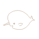 |
Replies:
Posted By: StepDragon
Date Posted: 25 June 2010 at 9:07pm
|
right now your picture looks like the wall for a baby's room, or a shower curtain. I would suggest getting (and posting) some references, which illustrate both what you're going to draw, as well as the style.
you say you're working on a 'project'. is it just that picture? a game? an image set? movie? what? even for a cartoon, i would work on the anatomy a little bit, add a little bit of 3d to the lineart. and shade with a blue-hued gray. as for the background are you looking for underwater? the problem i see here is conflicting subjects. you're subject is a whale (or whale-like creature). but you have a happy child-like innocence in the style. for a whale picture, i would suggest going deep sea with dark colors, maybe the sea floor, and some volcanic vents, to make it interesting. but for a more innocent, colorful picture, i would add choral and a reef, even if it dosen't match the (whale-like being). It gives you more colors to work with, and higher saturation. Hope this helps! |
Posted By: kaedeneubauten
Date Posted: 25 June 2010 at 9:53pm
|
Thanks for the reply StepDragon This is only a personal proyect. An artic scenario works fine for now  Some references here: http://en.wikipedia.org/wiki/Narwhal   |
Posted By: StepDragon
Date Posted: 25 June 2010 at 10:36pm
|
ok, now that i know what you're getting at...
the tail is sideways, flat with the body, instead of perpendicular. the boddy is stubby short. it could be lengthened without disturbing your style. (which i'm still not really understanding, but lets go with it) the horn is WAYYYY too short, i know its hard with sea creatues, but throw something in the picture to indicate size. right now i'm imagining your version as the size of a goldfish, hardly three times the size of a man, as per the image on your wikipedia article... 
as for shading, this reference is good...
you just need to decide how you want to interpret it with your style. cheers! EDIT, you said arctic right? maybe you could have its head popping out of an ice hole or something, that way you can show underwater, and above water, to get a more complex scene... just an idea |
Posted By: kaedeneubauten
Date Posted: 25 June 2010 at 10:40pm
|
UPDATE Smoothing the tail, and working on pallette http://i221.photobucket.com/albums/dd250/kaedeneubauten/Pixelart/Narwhal_V02.gif">  |
Posted By: kaedeneubauten
Date Posted: 28 June 2010 at 10:54pm
Another update working on dithering and colour |
Posted By: kaedeneubauten
Date Posted: 30 June 2010 at 10:42pm
|
One more update.... the dithering its too hard!!! i will try to mix 2 or 3 blues Well... Comments? 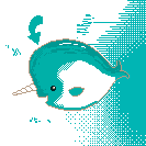 |
Posted By: Manupix
Date Posted: 01 July 2010 at 3:02am
|
It's too early to think dithering. You should work on the main issues first: layout (what with the bg?), lines (not the best outline yet), shading (light source?) and colors. I'd suggest editing your former posts so we can see the images. |
Posted By: kaedeneubauten
Date Posted: 01 July 2010 at 11:21pm
|
former posts updated!!! Thanks for the advise Im working on the outline, what do you think? 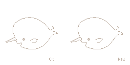 |
Posted By: Manupix
Date Posted: 02 July 2010 at 3:14pm
|
Honestly, I don't really understand what stops you there. Outline looks good, except a little jaggyness on the top. But is a plain side view the best option? What about the bg if any? |
Posted By: kaedeneubauten
Date Posted: 08 July 2010 at 8:48pm
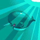
Another Update I think I'm pretty close to a decent piece, but not satisfied yet. It's a test-error work |
Posted By: StepDragon
Date Posted: 09 July 2010 at 1:34am
| it needs CONTRAST!!! |
Posted By: skamocore
Date Posted: 09 July 2010 at 2:00am
|
The tusk is looking good. But you've definitely gone over the top with the dithering everywhere else; dithering shouldn't be used as a substitute for detail. Take this piece http://www.pixeljoint.com/pixelart/22666.htm - here as an example, there is hardly any dithering at all. ------------- |
Posted By: cure
Date Posted: 09 July 2010 at 7:09am
| definitely needs contrast, either in hue or value- unless you want the narwhal to disappear into the background :P |
Posted By: onek
Date Posted: 09 July 2010 at 7:30am
maybe this helps
|
Posted By: Buddy90
Date Posted: 09 July 2010 at 9:33pm
|
both the narwhal and the sea are almost the same colors. the narwhal should definitely pop out from the sea, not melt into it. Try changing the colors. Raise the saturation and value in the colors of the narwhal, as well as a hue shift (maybe a blue-violet) and lower it in the sea, and the piece will be more balanced. ------------- http://ps3trophycard.com/profile/vilocon"> 
|