Trying some 8 bit.
Printed From: Pixel Joint
Category: Pixel Art
Forum Name: WIP (Work In Progress)
Forum Discription: Get crits and comments on your pixel WIPs and other art too!
URL: https://pixeljoint.com/forum/forum_posts.asp?TID=10573
Printed Date: 30 September 2025 at 5:10am
Topic: Trying some 8 bit.
Posted By: Niallywially
Subject: Trying some 8 bit.
Date Posted: 30 June 2010 at 1:27pm
|
Hey everyone. So I've been dabbleing with spriting again after roughly... 3 years or so of doing Sonic fan characters a long time ago. I've been playing alot of old school games again recently so have been inspired by alot of 8 bit stuff. So yeah, don't get me wrong, some 8 bit games look god damn awful, but they can also be really good looking if done right. So I was trying to make some decent looking, 8 bit sprites.
The problem I'm having is a I don't really understand 8 bit in terms of the pallets etc. From what I've gathered (And I'm most likely wrong) the pallet can be a maxium of 16 colours on screen at any given time? I though this was an awful lot for some of the games I've seen so it may be system based? Anyway, I've been throwing around some ideas and heres what i've got so far.
 I wouldn't worry to much about the body at the bottom, that was just really to work out how I could get the leg to look seperate from the body with just using two colours. Also the left tigers head was before I looked at reference... So what do you guys think? C&C what ever you want on the sheet, it will all be appreciated.
Thanks
|
Replies:
Posted By: Pragz
Date Posted: 30 June 2010 at 3:23pm
|
8-bit is actually a maximum to 256 colors. Remember that to find the maximum number of colors in a certain bit, you just put 2 to the power of the bit. I.E. - 1-bit = 2 colors 2-bit = 4 colors 3-bit = 8 colors 4-bit = 16 colors Etc., etc. That's the common misconception of color counts via bit-restricted palettes. ------------- Hello - I'm new here. :) |
Posted By: Hatch
Date Posted: 01 July 2010 at 7:17am
|
I'm guessing he meant "8-bit" as in "NES-style" (Nintendo having pushed their 8-bit processor as part of their marketing strategy) rather than bits per pixel. ------------- |
Posted By: Niallywially
Date Posted: 01 July 2010 at 8:38am
|
I'm so confused! Yeah Hatch, thats what I was going for. I guess thats more about the system than the graphics then? I just thought it was 8 bit because of the likes of Final Fantasy with the webcomic '8 Bit' or whatever its called. Thats nothing to do with the graphics then? Update is on the way by the way. Sidenote: I'm going to be working to a 16 colour palette.
|
Posted By: Hatch
Date Posted: 01 July 2010 at 9:48am
|
Yeah, all the various bit numbers that were thrown around in the early days of video game consoles referred to the size of integer that the processor could handle, which makes almost no difference to the end user and only affects graphics tangentially. They were pure marketing fluff--people like a good solid number to quantify the power of their hardware, even if it's largely meaningless, so the video game companies delivered. To give you an idea how meaningless it is, compare your 32-bit computer to the Nintendo 64.
Bits per pixel, or image depth, is entirely different. Most color images you come across are 24 bits per pixel, which is about 17 million colors. Believe it or not, sometimes this isn't enough, and so some image formats support 48 bits, or about 281 trillion colors. Some also have an 8-bit alpha channel that defines the parts of the image that should be transparent and by how much. There are a lot of bits flying around. What's a bit, you ask? A switch that can be in one of two positions. That's it. The two positions are often referred to as 1 or 0, or even on and off, but either position can represent anything. So a 1-bit pixel can only be one of two colors corresponding to each position of the switch--usually, but not always, black and white. With 2 bits, you have two switches working together, and they can be in 4 unique configurations: 00 01 10 11 So a 2-bit pixel can only be one of four colors, each mapping to one of those unique configurations. Each time you add a bit, you add a new switch to the mix, which math reveals will double the number of possible configurations (as Pragz mentioned, this boils down to 2 to the power of the bit). ------------- |
Posted By: Niallywially
Date Posted: 01 July 2010 at 12:31pm
Awesome Hatch. That helps alot, thanks for taking the time! 
So is it like... Acceptable(?) to work to a limited palette? Say 16 colours? If so are there any rules to the colours you use? I plan on making the colour quite dramatically diffrent due to the limit and wanting the diffrent pieces to stick out from the background. I was planning on having something like 11 colours in the foreground, 5 in the back or atleast something along those lines. Does this sound viable? Thanks again.
|
Posted By: Hatch
Date Posted: 01 July 2010 at 12:49pm
|
There are no rules for restrictions you impose yourself, obviously. Just make whatever challenge you want. What you're doing sounds perfectly viable to me and your designs look nice. On the other hand, if you want to specifically restrict yourself to a certain piece of hardware, the NES for example, then you have to look up the exact specs. The NES used 8x8 tiles for backgrounds (I think) and it had restrictions on number of colors per sprite as well as a global palette that those colors had to be drawn from, so you can't just shoot from the hip. ------------- |
Posted By: onek
Date Posted: 01 July 2010 at 12:55pm
|
there were a lot of different 8bit machines, which also had different graphic restrictions, such as palettes, sprite limits, bg/ fg colors, etc etc... also one machine can have different graphic modes, for example the c64's mCol mode which supports all 16 colors of the fixed c64 palette, but only 4 different colors per 4x8px square ( in this mode the pixels are actually double wide so that the effective resolution would be 8x8px) also one of the 4 colors has to be a global background color (in most cases black)... other modes support only 2 colors per 8x8px but therefore have a higher resolution... much weirder graphic modes can be found on machines such like ZX spectrum
its pretty intresting stuff and playing with restrictions can create beautiful pictures.... if ur going for a NES style its best to use its original palette 
also here is the c64 palette which is quite awesome and said to be one of the best fixed 16color palettes ever... also some really interesting informations included 
|
Posted By: Niallywially
Date Posted: 01 July 2010 at 1:58pm
| Right, this is all alot to take in after a 12 hour shift so I'll thank you very much, read over it again once i'm awake and probably post an update Saturday at some point. Thanks for your time guys, hopefully you'll see an improvement come Saturday! Quick edit: Just out of interest, I just rediscovered an old favourite called Cave Story (I'm sure you guys have heard of it? If not, its Freeware, check it out. Best indie game of all time.) and was wondering if you knew the palette and restrictions for that? I love the colours in that. The C64 palette is very, very nice, but to dull for what I am going. It seems more aimed towards shading where as I was wanting flat colours etc. |
Posted By: onek
Date Posted: 02 July 2010 at 6:19am
|
i dont think there are any real restrictions for cave story, its a modern game.... today, everything is possible....
if ur going for flatness id suggest u use the NES palette.....perfect... EDIT: i just noticed the link to the NES palette isnt working right?... so let me try again 
|
Posted By: Niallywially
Date Posted: 02 July 2010 at 8:18am
| Ah, thanks Onek, that looks like a really nice pallet. I'm going to try and learn the NES limits and try using that but if not, I might just go free style! I'll update soons guys! |
Posted By: Niallywially
Date Posted: 04 July 2010 at 10:54am
Right, so I finished the Tiger on the left but he's ment to be a Tiger 'Avatar' therefore I was thinking of going more furry with the one on the right, will need to edit the body if so. Messed around with the 'Main' character. I chose the armour I liked most which I've pointed out with an arrow. I'll probably touch up the Tiger (bad choice of words I know) as I think I want to sort out the white of the belly and add some to his bee-hind. The little guy in the cloak was ment to be like an older mage/elder. You guys'll probably think that a Tiger and an 8-bit character on the same sheet is odd but I'm writing a story for it so once I've a 'brief' of the story I can post it here if you guys so desire? C&C Much Appreciated.
 |
Posted By: Niallywially
Date Posted: 05 July 2010 at 10:11am

So I was messing around with the character when I thought 'I can't restrict myself with size and colour!' and as keeping the colours was important to me I decided to make the character taller. What do you guys think of this one? Sorry for the... TRIPLE?! post. C+C would be much appreciated. |
Posted By: Hatch
Date Posted: 06 July 2010 at 6:08am
|
You're missing a joint in the tiger's rear leg. Google for references. Love the new character design! ------------- |
Posted By: Niallywially
Date Posted: 06 July 2010 at 7:42am

The top one is the edit. Is that looking better Hatch or am I completely getting the wrong idea? Not man pictures of tigers lying down from the side that I could find. If its looking better I'll go ahead and re-add the white fur and tail. On a side note, any tips on how to keep a character looks... the same? When spriting new poses. I love my original pose for my new character but any other pose I try to do doesn't hold the same sort of lanky look etc. |
Posted By: StepDragon
Date Posted: 06 July 2010 at 9:02am

google is your friend... i added some outlines on the legs to help illustrate the joints. forgive me i saved as a jpeg, but no worries its a ref, NPA... |
Posted By: onek
Date Posted: 06 July 2010 at 9:58am
|
the tigers leg looks strange indeed..
anyways....i realy like the new bigger version of the character, nice stance there.... just for the fun of it i tried to do an 8x16px edit, to keep it more 8 bit-ish ... 16x8 tiger included 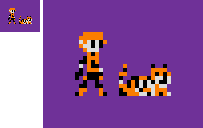
|
Posted By: cure
Date Posted: 06 July 2010 at 12:13pm
|
i think the forelimbs are too short in the front and too long in the back. also the front legs seem like he's all chill but the face and back legs makes me think he's ready to strike. i also think you could make the growlface more extreme and scary. closest refs i could find:    |
Posted By: Niallywially
Date Posted: 06 July 2010 at 12:15pm

I think what I've done is got the proportions of the leg wrong? I'm getting confused with the joints due to the fact the tigers sat down aswell. Thanks for the love of the bigger version of the character! Loving the 16x8 Onek. I tried and failed miserabily! Edit: Beat me to it TINC, I'll work on it some more and see what I can do! |
Posted By: StepDragon
Date Posted: 06 July 2010 at 1:11pm
|
at this point, i think the BIGGEST problem you have (entirely in my opinion) is your image is COMPLETELY FLAT, no light source of any kind... i understand that you're working with a 16 color pallette, but that dosen't mean you need to skimp on the lighting... especially on an image that large. (on the small sprites, i can understand)...
I probably wouldn't make such a big deal about this if you didn't already have like 5 other shades that go really well with the orange that you have there. 
*this is just a scribbled edit for conceptual purposes)* |
Posted By: Niallywially
Date Posted: 06 July 2010 at 1:58pm
| Ok, so I'll let you in to a little secret, I'm TERRIBLE at shading... Like, pillow shading terrible hence why I went for the flat colours as I felt I could get away with it. The pallette isn't set in stone but I'll mess about with the shading and see what I come up with. |
Posted By: Niallywially
Date Posted: 06 July 2010 at 2:36pm

I thought two shades of orange is enough for a 16 color pallette. What do you guys think? |
Posted By: onek
Date Posted: 06 July 2010 at 4:26pm
|
the old colors are better... the two different orange tones are barely distinguishable.... u need much more contrast
the tigers head looks good, but the bodys kinda off and lacks dynamics ... good points by TINC..... also, overall, it looks like its tilted to the right a bit.... heres a dirty edit... 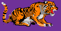
|
Posted By: Niallywially
Date Posted: 07 July 2010 at 2:59am

So I took your advice Onek and was just wondering if the general (new) shape of the tiger looked alright before I went ahead and started attempting to finish it off and shade it. I also made a more 'muscular' character that you can see at the top. I like the design on the right except he looks like he belongs to the circus. C+C always appreciated guys. |
Posted By: StepDragon
Date Posted: 07 July 2010 at 7:45am
|
I really like the new character design. as for the tiger, his feet look broken (back legs)... they should be level with the ground... also his hind legs are too short the knee should extend further forward. also, his (knee cap?) on his hind legs looks cut off. unless he has 2 joints, and almost no muscle the knee needs some beefing up.
and did you chop off his tail? here's a suggestion for you... because you want to do him in all orange (with little shading) and the fact that you're in the process of remaking him, for the sake of getting anatomy right, you should start over, but this time, draw each part of the body a different color, just so you can see it better. this will not be the final product. what this does for you is allows us to crit about anatomy easier, and not have to guess as to where the lines are. then once we have the anatomy down, the next thing would be to add the black. why? because then you can form it in a way that defines the shapes which will soon not be visible if you make it all orange. (even though hopefully by then we'll convince you of doing the shading) Hope this helps! |
Posted By: Niallywially
Date Posted: 22 July 2010 at 10:01am
|
Hey guys, sorry I haven't posted in awhile, I'm currently helping in building my new house and lets just say there's been a hella'lot of hiccups along the way so I've really had no time for spriting.
Saying that I tried some little bits of shading. Here's a couple of characters I tried it on just to give you a taste. What do you guys think? I could do with some help I reckon as my shading skills are poor. 
|
Posted By: onek
Date Posted: 23 July 2010 at 9:16am
|
i quite like the outcome of the orange guy, but i think u should stay with the old, more saturated palette...
the other guys shading isnt too subtil imo... it looks more like AA of somte sort, i think u could be more daring with them shades... also i think u shoulg try to stay within a colors range of 4 colors per sprite, helps keeping readabiltity 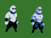
|