[WIP] Tips for a beginner?
Printed From: Pixel Joint
Category: Pixel Art
Forum Name: WIP (Work In Progress)
Forum Discription: Get crits and comments on your pixel WIPs and other art too!
URL: https://pixeljoint.com/forum/forum_posts.asp?TID=10644
Printed Date: 22 April 2026 at 5:04am
Topic: [WIP] Tips for a beginner?
Posted By: dataclast
Subject: [WIP] Tips for a beginner?
Date Posted: 14 July 2010 at 12:48pm
|
Hey guys, I've recently tried my hand at pixel art after being infatuated with it for so long (and recently discovering this site).
Anyway here is a little something I've been working on. Kinda big, I know. 
I was wondering if anyone could point me the right direction in what I should be doing next. I was thinking of dithering the shading but I think I might practice my dithering techniques on a much smaller piece first. Also any advice / feedback / constructive criticism on what I've already done would be helpful as well. Thanks! |
Replies:
Posted By: Vectomon
Date Posted: 14 July 2010 at 1:14pm
| Start with something smaller. Don't resize parts of the image like you did with that eye. |
Posted By: W M
Date Posted: 14 July 2010 at 1:18pm
|
First of all, since you're just starting out, try working much smaller. I'm talking 5-10% that size. Large sizes are good after you've refined and learned the skills you need at a much smaller level. Try something around 50x50. Working at a small size forces you to focus and refine technique. I see that you've changed resolution in certain spots in the picture (like the eye and eyebrow)'. This is something that you should never do: it breaks through the picture and destroys the consistency that you've set forth with the rest of your piece. Do not rely too much on dithering: dithering has the side effect of both texture and noise, which can destroy a piece if used too much. I know I just named several problem areas, but it's not a bad start at all for a first piece -- just keep at it and practicing.  |
Posted By: dataclast
Date Posted: 14 July 2010 at 1:25pm
|
Originally posted by Vectomon
Start with something smaller. Don't resize parts of the image like you did with that eye. Yeah, the eye was some idea I had to make it look more "8-bit". I understand where you're coming from though, I was planning on completely redoing the eye. Originally posted by W M
First of all, since you're just starting out, try working much smaller. I'm talking 5-10% that size. Large sizes are good after you've refined and learned the skills you need at a much smaller level. Try something around 50x50.Working at a small size forces you to focus and refine technique.I see that you've changed resolution in certain spots in the picture (like the eye and eyebrow)'. This is something that you should never do: it breaks through the picture and destroys the consistency that you've set forth with the rest of your piece.Do not rely too much on dithering: dithering has the side effect of both texture and noise, which can destroy a piece if used too much.I know I just named several problem areas, but it's not a bad start at all for a first piece -- just keep at it and practicing.
Yeah I figured starting with a large piece would be incredibly tedious / daunting, but I like the challenge. I will take your advice though and move onto smaller pieces to refine my technique, and work my way up. |
Posted By: onek
Date Posted: 14 July 2010 at 2:10pm
|
http://www.pixeljoint.com/forum/forum_posts.asp?TID=5692 - take a look at tutorials..... ,
...especially focus on such things as: clean lines, shading , contrast, color ramps etc.... ur dithering doesnt make sense... u already have a almost 50% grey, so why try to create that illussion with the checkerboard pattern.... the metal structure thing looks very flat and doesnt match the perspective, indeed its oblique perpective which is kinda strange here.... the boys expression desnt work for me, hes smiling? looks like some nice portrait shot or something why that satanic crucifix on a rastafari background,... seems kinda random to me.... much more to say but most important.... go smaller! heres an edit, maybe it can give u some ideas... 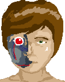
|
Posted By: dataclast
Date Posted: 14 July 2010 at 2:27pm
|
Originally posted by onek
http://www.pixeljoint.com/forum/forum_posts.asp?TID=5692 - take a look at tutorials..... , ...especially focus on such things as: clean lines, shading , contrast, color ramps etc.... ur dithering doesnt make sense... u already have a almost 50% grey, so why try to create that illussion with the checkerboard pattern.... the metal structure thing looks very flat and doesnt match the perspective, indeed its oblique perpective which is kinda strange here.... the boys expression desnt work for me, hes smiling? looks like some nice portrait shot or something why that satanic crucifix on a rastafari background,... seems kinda random to me.... much more to say but most important.... go smaller! heres an edit, maybe it can give u some ideas... Yeah, my intent wasn't necessarily realism. More along the lines of an evil android in the body of a seemingly innocent person. Thank you though, I'll keep all of this in mind. The edit is a lot of help as well, thanks. |
Posted By: dataclast
Date Posted: 14 July 2010 at 4:13pm
Alright so I decided to try a little something new on a 75x75px canvas

I'm mainly having difficulty with the beard. I'm also not sure why I put upside down crosses in everything. They're fun to make? edit: current version: 
|
Posted By: cure
Date Posted: 14 July 2010 at 5:01pm
|
You need to use reference images. This goes for anything and everything, regardless of skill level, but is especially important when depicting human anatomy. There is not enough cranial space for a human brain. This part of the skull is a very large and significant structure and should not be understated. You've drawn the facial features (nose, eyes) as if they were independent features, but in reality the features of the human face relate to the forms around them. The nose doesn't promptly end, but curves out to form a continuum with the the top of the eye socket (lower brow). The bottom of the nose is dependent on the upper lip. The ears appear to be behind the head rather than at the sides. This may be because your head bows out at the sides, while actual human skulls are relatively flat in the area (the bowing occurs at the cranium, which you've omitted). I like the use of symbols in art, but I feel their usage should hold meaning to the piece, and not just there without purpose- using powerful or striking symbols with no reference to anything outside themselves just seems a bit pointless. Unless their misuse is significant to the work (that is, their lack of a relationship or improper relationship to the image creates has intentional meaning beyond the typical translation of the symbol.) |
Posted By: dataclast
Date Posted: 14 July 2010 at 5:14pm
|
Originally posted by ThereIsNoCure
you need to use reference imagesthere is not enough cranial space for a human brain. this part of the skull is a very large and significant structure and should not be understated.you've drawn the facial features (nose, eyes) as if they were independent features, but in reality the features of the human face relate to the forms around them. the nose doesn't promptly end, but curves out to form a continuum with the the top of the eye socket (lower brow). the bottom of the nose is dependent on the upper lip.the ears appear to be behind the head rather than at the sides. this may be because your head bows out at the sides, while actual human skulls are relatively flat in the area (the bowing occurs at the cranium, which you've omitted). After comparing it to reference pictures I see what you mean now. I've been working on facial / head structure composition in not only pixel art but just regular drawing as well. I'll keep practicing with that in mind! |
Posted By: cure
Date Posted: 14 July 2010 at 5:29pm
|
yeah, learning human anatomy is actually easiest with pencil and paper since pixels are much more difficult to push around, so keep at it! Studying references and drawing from life are immensely helpful practices. Also, ninjaupdate with a bit about the usage of symbols. |
Posted By: dataclast
Date Posted: 14 July 2010 at 5:37pm
|
I messed with the cranium a bit.
i just need to round out the sides and move the ears outward a little bit i think 
as for the symbols, usually my art deals with a demonic creature of some sort, so i always end up putting stuff like that in i try not to go overboard with it though edit: updated piece 
|
Posted By: Vectomon
Date Posted: 14 July 2010 at 7:00pm
| You might want edit your pallete a little bit, it's kinda boring. Try varying your hue a little bit. In your case, highlights could be yellower, and shadows, bluer. |
Posted By: dataclast
Date Posted: 14 July 2010 at 7:10pm
|
Originally posted by Vectomon
You might want edit your pallete a little bit, it's kinda boring. Try varying your hue a little bit. In your case, highlights could be yellower, and shadows, bluer. I'll try that out and make various versions. also another update
made him more of an android |
Posted By: StepDragon
Date Posted: 15 July 2010 at 1:15am
|
I'm seeing some great improvement on this thread!
I agree that the pallete needs changing, something to keep in mind though, if somebody says 'keep it simple' they're lying. the more hue shifting, contrast, and dynamics you throw into your palette the better! just have fun with it. as for your line art, i think the head could be brought up just about one more pixel, right now its not smooth enough, to me it looks like its slightly angular. beard is a little too big IMO, but that could just be a taste thing. to me it almost looks like a gotee which is the same color as his shirt collar. also, the color of the beard IMO, is too close to the skin color. a different ramp altogether would be best, but at lease shifted would make it stand out more. But still, Great Improvemet. Cheers |