Palette Advice
Printed From: Pixel Joint
Category: Pixel Art
Forum Name: WIP (Work In Progress)
Forum Discription: Get crits and comments on your pixel WIPs and other art too!
URL: https://pixeljoint.com/forum/forum_posts.asp?TID=10662
Printed Date: 29 December 2025 at 2:59pm
Topic: Palette Advice
Posted By: eliotfellow
Subject: Palette Advice
Date Posted: 17 July 2010 at 3:20pm
|
I began this piece with an idea for the two-framer challenge, envisioning a cathedral with candelabras along the aisles, flickering, but I decided that not only was that boring, but it wouldn't be polished enough by Sunday night, so I threw the idea out. But a little while into working on this piece I realized. . . I really hate the palette. It's not right. The palette is currently 13 colors, but I imagine it could be a lot less, maybe as low as 8, if it's going to stay monochromatic. I think the dark could be darker. What kind of a palette would you suggest for a dark, candlelit cathedral? It's obviously unfinished but any other advice is welcome. (Haven't put in the candelabras.) Also, does the vaulted ceiling look right? Some of the arches look a little awkward, but is it spatially sound?
Thanks in advance. 
PS: Yes, I posted a WIP thread not too long ago. Piece was not abandoned, but. . . put aside. 
|
Replies:
Posted By: jeremy
Date Posted: 17 July 2010 at 6:53pm
Quick colour balance change in PS, put the shadows more towards purple and highlights towards yellow. It often happens in nature that way, and reflects a warmer sort of atmosphere. If you wanted more austerity you could always go for blues and greens. |
Posted By: jalonso
Date Posted: 17 July 2010 at 7:00pm
Jeremy, PJ just wouldn't be the same without you 
------------- |
Posted By: eliotfellow
Date Posted: 17 July 2010 at 7:24pm
|
Funny, I was actually just playing with some more purply tones. I like that. I was taught the traditional blues for shadows and reds/oranges for highlights, but I think the purple actually works for this.
I posted a thread on the support page about finding a program (besides photoshop!) in which you can easily change out color for color. Any suggestions? (I love your avatar. So much.) |
Posted By: onek
Date Posted: 17 July 2010 at 7:51pm
|
yeah jeremy is right... but i think the idea doesnt get too clear in his edit... its more like a monochrome shift towards the blueish side...
a technique for nice, natural color ramps that im recently using, is to spice up the colors simply by putting some 10% opacity fill of (full!) blue, magenta, red and yellow, from dark to bright, the result then (because of the full tones) looks very comic-ish, (sometimes thats nice too...)... if im not satisfied, i pretty much try to edit the colors as i would do editing a photo, meaning 'color balance', 'hue/ saturation', contrast etc editing... maybe this makes it more clear 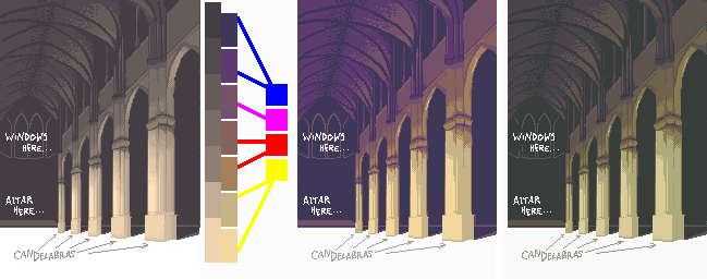
original > 10% 'rainbow' fill > tweaking |
Posted By: jeremy
Date Posted: 17 July 2010 at 9:15pm
|
That's pretty much what it was XP @eliot: What program d'you use? If it's MS Paint, you can use the http://windows.microsoft.com/en-US/windows-vista/Paint-tools - eraser-colour change trick . (Foreground colour changes to background colour when you use right click with the eraser). It sometimes doesn't work with Win7 for some reason :< @jal:  |
Posted By: StepDragon
Date Posted: 18 July 2010 at 2:19am
|
@jeremy & eliot, I used the Eraser trick for years in win98, but noticed some problems in XP (although i use 7 now and no longer use paint, Ggale all the way). I'm not sure if this is a common problem, but sometimes, you can't make a nonstandard color transparent using the eraser/Copy/paste technique. If so, converting the color to a standard one manually will definately both make it work, and defeat the whole purpose.
(that sounds mean, but i'm trying to help) Cheers! |
Posted By: eliotfellow
Date Posted: 18 July 2010 at 7:58am
I was all about that eraser technique when I had a PC, but, alas, I don't anymore. I used ColorSync Utility, which came with my Mac, to adjust the saturation, contrast, gamma, blah blah blah, and here's where I think I'll work from now. Obviously there are issues on the pixel level but I thought I'd post this first. (694 colors, omfg DX ha ha ha)

EDIT: Eeeh, I'm not sure I like the rosiness. What do we think of this? 
Ouch my eyessss. . . |
Posted By: onek
Date Posted: 18 July 2010 at 9:28am
|
top-secret-eraser-color-change-trick, ColorSync ... e=mc2..?
if u guys only would know how easy color management is with photoshop.... tsk tsk tsk ^^ |
Posted By: StepDragon
Date Posted: 18 July 2010 at 10:27am
|
(offtopic) I'm going into graphic design, and i HATE photoshop... (/offtipic)
Gale works well with color changes too, the universal pallete, just changes the image as you adjust it. |
Posted By: eliotfellow
Date Posted: 18 July 2010 at 3:39pm
|
Ha ha, your formatted aside. . .
I have a Mac, dammittohell. Doesn't support Gale. |
Posted By: jalonso
Date Posted: 18 July 2010 at 4:32pm
|
I use Macs too, it makes no diff. Try Paint, Acorn if you dislike Photoshop (the best). Anyhoo, your image is a tad boring this monochromatic. Me thinks onek's last image shows a more interesting direction and yet still reads monochromatic. This image has enough promise that if you fail to meet the deadline its cool and might be worth the effort to make a great piece. ------------- |
Posted By: eliotfellow
Date Posted: 18 July 2010 at 5:51pm
|
Acorn? I'll look into it. I know nothing about pixel programs, so I've just been sticking to Pixen for while now. (No, I'm not a fan of Photoshop, sorry Onek.) And I tossed out the challenge a while back, but it was what sparked it.
I was worried it was kind of boring. . . I'll keep working at it, more updates to come. Thanks for everyone's guidance thus far. |
Posted By: jalonso
Date Posted: 18 July 2010 at 6:21pm
|
My bad. I meant Paintbrush http://paintbrush.sourceforge.net/. I also use this (rarely) Pencil (mostly for animation and intel macs only) http://www.les-stooges.org/pascal/pencil/ Also Grafx2 has a Mac version (old school pixellin') Acorn costs about $50 but you can try for free to test Pixen is very risky for me + no support or upkeep. ------------- |
Posted By: eliotfellow
Date Posted: 19 July 2010 at 1:39pm
|
Yes, Pixen has let me down a few times.
What version of Grafx2 should I download? (Probably a stupid question?) There isn't a working version for Mac OS X as I'm sure you know. http://code.google.com/p/grafx2/wiki/Downloads - Grafx2 Downloads |
Posted By: domox
Date Posted: 20 July 2010 at 8:04am
| I havent had any luck with Grafx2 for mac on Snow Leopard, but I do run the latest Win32 on DarWine and it works like a charm! ASE works pretty good too even though palettes are a bit wonky (www.aseprite.org) |
Posted By: eliotfellow
Date Posted: 20 July 2010 at 5:56pm
|
To whoever cares. . .
I'm going away for a week so don't think my silence is any sort of rudeness. I may resurrect this thread when I come back though for more advice on the cathedral. |
Posted By: eliotfellow
Date Posted: 29 July 2010 at 5:47pm
Okay! A few new suggestions needed, folks. I've put in the candelabras and beginning to detail the floor, and I'm wondering how to go about finishing the floor with shadows and reflections. I can't find a really good reference pic for this, but here's as close as I got.


Another thing: I realized that if we assume the cathedral is symmetrical, a column from the left side of the nave would make it into the picture. Should I include this column or not? I think it would be very cool and could make it feel like the viewer were standing right behind this column, but I'm wondering if it would throw off the composition. . .? (The line marked would be the line along which the arcade would run.) 
Thank you! |
Posted By: Pragz
Date Posted: 29 July 2010 at 10:11pm
|
Your lighting is basically... off. If your candelabras are lined up perfectly (which your perspective lines indicated) then the light extending from them should extend out to a common line that follows the perspective. Also, light comes out like a sphere. So you wouldn't have a straight line of light. It'd look more like little overlapping circles. Having noted the light's omnidirectional pattern, you're forgetting to light the sides of the columns. You seem to only be shading each pillar as if lighted individually from the front, forgetting that light would be hitting the sides from the adjacent candelabras. So the sides would need to also be shaded as if being hit from the front, but with a softer light. There's more I can see, but I'm pushed for time so that's it for this post. Hope it helps! :) ------------- Hello - I'm new here. :) |