Dungeons and perchance a Dragon
Printed From: Pixel Joint
Category: Pixel Art
Forum Name: WIP (Work In Progress)
Forum Discription: Get crits and comments on your pixel WIPs and other art too!
URL: https://pixeljoint.com/forum/forum_posts.asp?TID=10757
Printed Date: 27 June 2026 at 2:36pm
Topic: Dungeons and perchance a Dragon
Posted By: Zeratanus
Subject: Dungeons and perchance a Dragon
Date Posted: 03 August 2010 at 8:44pm
|
Yo again Pixel Joint So I recently began playing Dungeons and Dragons thanks to a friend of mine pulling me into a group. Guess as far as ways to waste an entire day goes its pretty decent, blah blah blah. anyway, so i started spriting our player folks, and maybe eventually some of the monsters and jazz we've been going up against. The campaign's an anti-hero (evil) campaign so the 3 of the 4 folks are monsters themselves, which I'm really looking forward to spriting. not much, but here's what I got so far - my blind cleric chick and one of my friends little Kobold wizard:  Still got two party members to go - a Gnoll (big bipedal jackal thing) and a BugBear (goblinish caveman type thing) Anywho, any critiques, pointers, and whatnot would be appreciated~ (and no, Ninja Crow, if you're around, i still havent forgotten about my previous projects :P) |
Replies:
Posted By: Manupix
Date Posted: 04 August 2010 at 5:38am
|
I love them already. The girl's legs look weirdly bloated though. |
Posted By: Zeratanus
Date Posted: 04 August 2010 at 8:46am
|
Shoot, i knew it was too close to the skin (actually uses the same color). Added a lot more white now, does it look more like baggy pants? Added the Gnoll and edited the wizard's hat and colors  |
Posted By: Ninja Crow
Date Posted: 05 August 2010 at 2:50am
|
There's nothing that could make these better that wouldn't involve doughnuts - I love them.
(well, if forced, I'd say your Gnoll is a bit too green for that colour of outline, and also may need to be more compact, or maybe beefier to match the others in style - he looks more realistic than they do. Would he look good with larger arms?) (Oh, and, thanks for thinkin' of me!) ------------- 
!Strange Atoll - The Amazing Wilbot Game Project! |
Posted By: Zeratanus
Date Posted: 05 August 2010 at 7:16am
|
You know, you're right Ninja~ Added a new dark blue outline color and
used it for all three peeps. also smashed the Gnolls body down a little
and beefed up his upper arms and legs. As for other changes, the wizard's had another color revamp and I opened up his book more and the Girl's arm on the left has been changed a bit.  Thanks for nitpicking =P |
Posted By: cure
Date Posted: 05 August 2010 at 9:48am
| maybe make the gnoll look more like a hyena and less like a wolf? (shorter snout, scruffier fur, etc). removal of that red outline was a good move. |
Posted By: Zeratanus
Date Posted: 05 August 2010 at 11:54am
It is too wolfy aint it? Darn. I was just so happy that it looked dog-like at all  Well I shortened the snout like you suggested, rounded off the ears some more, and shortened his legs a bit (that bits not to make him more hyena like, just closer to the others) Made him a bit shaggier too in places, like the tail. Unfortunately the more telling Hyena spotted coat isnt an option, since the character has this colored fur, no spots.  Just realized the tail looks a bit flat now though :\ ill fix that up later. Also - wow, first update where the wizard's colors didnt change! (im working on the 4th character too, but its a real pain. the characters actually a freaking mixed breed and changed the look of the character from others drastically, so i have little to go on) |
Posted By: MrWeirdGuy
Date Posted: 05 August 2010 at 1:43pm
| I don't really play D&D, but aren't clerics supposed to wear huge badass plate armor? |
Posted By: Ninja Crow
Date Posted: 05 August 2010 at 1:56pm
|
Great updates on your Gnoll! He really looks like a powerful scrapper now, and definitely matches the style of the others. And terrific colours for this, too! -------------
!Strange Atoll - The Amazing Wilbot Game Project! |
Posted By: Zeratanus
Date Posted: 05 August 2010 at 2:07pm
|
Our Dungeon Master has voiced how odd of a cleric i made - blind and dexterity based, and I use Weapon Finesse - essentially uses dexterity instead of strength for trying to hit people. Because of that I cant wear heavy armor (restricts bonuses from high dexterity). But I'll be damned if I'm not a good Cleric - I've never gone into negative HP (unconscious) and I've saved every one of my teammates from -10HP (literally moments from death) multiple times and before anyone tries to be funny - they got to -10hp from taking Massive Damage (1/2 total HP or greater) and failing the Fortitude save thing, basically insta-death. =P but yeah, to prove its still on topic - that's the reason my cleric doesnt wear massive plate mail like so many others. Actually she does wear a Chain Shirt over that corset but it would be a less interesting design that way IMO Edit: ah! Ninja Crow lives up to his name and posted ahead of me D: @ninja - thanks man :D |
Posted By: Manupix
Date Posted: 05 August 2010 at 4:16pm
|
So, my brain knows these are no legs, but my eyes won't listen and still see legs. No clear idea why. Maybe I'm confused about the whole area: hips - thighs - legs vs clothes? Also if that is a rounded belly, it is very low, and that might affect the perception of short crooked legs I have. I love her upper part though, most of all the delicate hands. Wolf thing (what's a Gnoll???) looks good but more 2D flat than the others, and its mouth doesn't work well for me. |
Posted By: A.B. Lazer
Date Posted: 05 August 2010 at 4:36pm
|
Girl has a tumor on her right leg!
The reason for such impression is that this color goes more in line with skin than with the rest of the clothing. There's no fur texture to show that they are gaiters. Color and shape are used just once (it is not seen on other leg and color is not repeated in upper half of the costume). Also other colors of costume are darker. |
Posted By: cure
Date Posted: 05 August 2010 at 5:12pm
|
if you removed the skin color used on the pants and used a cooler shade instead that might fix it. @manupix: gnoll is the dungeons&dragons name for a werehyena. |
Posted By: Zeratanus
Date Posted: 05 August 2010 at 6:35pm
okay hopefully this will be the end of the tumor comments  Added the fourth character too! A Bugbear/Tiefling hybrid, and the characters really strong but really lightweight to boot. Trying to figuring out how to draw it was killing me. She may have a tail, but ill have to ask the player tomorrow. Gave the Gnoll another darker shade too so hopefully hes a bit less flat than before. Also various minor tweaks on the girl and Wizard  @Cure - well thats the basic idea, except theres no changing from man to beast. Pretty much just "Hyena-Man" Edit: Tried to add more volume to the Gnoll's arm Edit2: Aaand another edit. This time to give the Kobold a more slightly more interesting pose, holding the book further out.  |
Posted By: ekobor
Date Posted: 05 August 2010 at 8:57pm
|
Sorry to go a bit off topic, but how did you manage a bugbear/Tiefling? Considering the official story says that Tieflings will bear only Tiefling young, regardless of the other parent(s)... (In fact important for mt Tiefling character who has a dragon father-- but isn't a half dragon)
I'm just wondering 'cause the homebrew rule set would be a neat addition for a campaign I want to start someday.. Anyway, I'll stop derailing now ^^;; ------------- |
Posted By: Zeratanus
Date Posted: 05 August 2010 at 9:29pm
| Its a bugbear with a modified (no level adjustment) Tiefling template, and judging from what happened in a previous campaign, its probably more like a magical fusion thing than a birth. In the previous campaign our elf ranger went behind everyones back and drank some demon blood and got the Fiendish template (and erupted spikes from his body and eyes turned black, resembling the demon it was from), so i assume the backstory went something like that. |
Posted By: ekobor
Date Posted: 05 August 2010 at 9:50pm
|
Oh, neat, thank you! I suppose it would have been relevant to ask the edition; I remember 3.5 had Tiefling templatesd, 4.0 doesn't ^^;;
Anyway, thank you, and the obligatory on-topic comment: If you were to define the spine-fur in a more tuft-y way, it would scream Gnoll a bit better; along with ading more volume to the cheeks, making them pouchier. It seems that hyenas have much rounder ears than your original, but you've only rounded them a bit so far. (Though it does depend on breed, but it could help) http://www.wizards.com/dnd/images/gnoll_med.jpg http://www.natureartists.com/art/resized/1016_Wali_WNAG.jpg Good luck! ------------- |
Posted By: cure
Date Posted: 05 August 2010 at 9:58pm
 slight palette/anatomy edit felt some of the darker colors lacked significant jumps in contrast, so basically pushed the darkest shades darker since that was easiest/makes them pop a little. moved tiefling's head back a pixel, made slight adjustments to gnoll it's coming along nicely, especially love the cleric, probably due to the dynamic pose. smooth, fresh style. |
Posted By: Zeratanus
Date Posted: 06 August 2010 at 7:19am
|
@Ekobor - yeah we play 3.5. The rest of the group seems to hate 4th ed. I'll give the tuft-ish hair another go too. I've never done fur in pixel art before so its a real strange experience. @Cure - Thanks! I'm loving the changes to the Gnoll's head especially. I have a tendency to have too little contrast in my art (pixel art or not) so thanks for the darker colors! I really need to get it through my head to use darker darks. Edit: 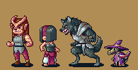 Using Cure's edit as a reference/stole the darker outlines here's some changes. Tried to make the Gnoll's shading align to draping hairs and edited the chest shadows on the two females. few other tiny corrections here and there. |
Posted By: Manupix
Date Posted: 06 August 2010 at 8:39am
|
I don't know how close to a hyena you want to get, but it doesn't look like one a lot. It mostly reads wolf to me: color, fur, tail, limb sizes, head and ears. Hyenas have a somewhat straighter forehead-to-snout line, round and backwards ears, longer front limbs. The parallel jaws would be wrong for any animal too, I think. http://www.jahmasta.com/photo/photo_fr/xmedia/christophe_courteau_02.jpg - One hyena among many from google . Ekobor: that's one cute baby hyena! |
Posted By: Zeratanus
Date Posted: 06 August 2010 at 9:05am
|
man these hyenas need to learn to look more like how I draw 'em! Alright here's another try - Facial reconstruction powers go!  -switches every 2 seconds- I'll be giving the tail a go soon too |
Posted By: ekobor
Date Posted: 06 August 2010 at 1:35pm
|
Manu: It really really is~
It certainly looks more hyena-y in the new face (And at the same time makes him face slightly more in the direction of his torso!) But I'd go and tilt the whole muzzle a degree further down, bringing it more against the chest, the jawline seems too human for a gnoll right now. ------------- |
Posted By: Ninja Crow
Date Posted: 07 August 2010 at 2:19am
|
The new Gnoll head definitely reads as more of a hyena to me.
I've never seen either of the two creatures your fourth character is made out of! Very interesting, but the lack of familiar elements is throwing my poor visual processors out of kilter. I'm not sure if the thing on its head is fleshy or bony, though the shape is bony (which is pretty cool). Ignore me if I'm just too ignorant here, but would they look more bony in a paler (or at least, contrasting) colour? Also, this next bit is totally subjective and based entirely on personal taste, but I have a bad habit of going overboard with symmetry, so I'm thinking I see that each character has their own colour scheme: is this intentional? Yet your fourth character has enough red in her design to start competing with the red in your cleric. I'd say your bugbear's visual strengths are leather and mail (especially with the brown hair). So she needs more of it, especially since this would enhance the power of her pose, which is a classic "power star" (notice the dynamic is from the core out in the five directions, implying a charge-up to readiness) and needs a visual bang at the termination of each of the five directions. For the head, she has horns; for the arms she has the contrast of bare muscles and curled fists; but there's not much for the feet (not enough visual bang) I don't think. Sorry, I guess I'm just not too sure what's going on down there (are those holes in the pants? are those pant cuffs or bare ankles?). I think I'd give her calf or hip boots to help finish up that iconic, unified look - so necessary for the instant 'pop' that heaps of memorable characters seem to have. Oh, and a nice wide leather belt while I was at it. If none of this is useful, pay it not a bit of heed! -------------
!Strange Atoll - The Amazing Wilbot Game Project! |
Posted By: Zeratanus
Date Posted: 07 August 2010 at 7:35am
|
Yeah i suppose the bugbear's color scheme could use some tweaking. Buuuuut turns out its Kiefling instead of Tiefling, which DOESNT have horns and a tail (UUUUUGH!) so she's going to need a redesign anyway... not to mention last night the Kobold got crushed by a dragon. So that character's dead now << I'll keep your advice in mind while reworking her though Ninja :D @ekobor - I'll tweak that a bit while im at it too, see how it looks :) |
Posted By: Zeratanus
Date Posted: 12 November 2010 at 8:16pm
|
my goodness its been a while since I last posted, and last pixeled! Not without decent reason though (marriage and a job :B) anyway, finally looked back on these and noticed a lot of improvements I could make, so I went ahead and made them. Sorry if i forgot about any critiques since i last replied, its kinda been near 3 months?.... Old vs New (old top) 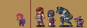 (also started on my dwarf character i played the first time we played, just for the sake of it) |
Posted By: PixelSnader
Date Posted: 12 November 2010 at 8:36pm
|
The hair of that woman does not look like hair, it needs more strands. And you might want to add a bit more contrast on the chain mail. ------------- ▄▄█ ▄▄█ ▄█▄ ▄█▄ |
Posted By: Zeratanus
Date Posted: 12 November 2010 at 11:31pm
|
I think it looks fine as hair, but I added a bit of strands anyway cuz compared to the others it is rather flat. ah well. The dwarf im still FAR from happy with. gonna give her a shield sometime too. but i can hardly keep my eyes open much less focus on this. i have a feeling most of the changes i made in the last hour im gonna hate in the morning... ah well.  edit: here's a bit better:  |
Posted By: Ninja Crow
Date Posted: 13 November 2010 at 1:29pm
|
Hi, Z, congrats on the marriage!
I love this project, and it's looking great so far -- nice tease on those shadow characters, and terrific update for the dwarf character. -------------
!Strange Atoll - The Amazing Wilbot Game Project! |
Posted By: Zeratanus
Date Posted: 24 April 2012 at 8:57pm
|
NECROMANCY! wow. big necromancy too. But anyway, started redoing these folks for the hell of it. Kobold Wizard is in progress, but Im liking how the other two are looking so far~  |
Posted By: cure
Date Posted: 24 April 2012 at 9:13pm
| wolf looks much better. pose on the chick is better too. and these sprites carry as much information as the last set, just in a smaller space. I approve. |
Posted By: Friend
Date Posted: 25 April 2012 at 9:36am
| great progress. Readability on the green monster has decreased a bit too much with the newest edit I think. All of the colors and shapes jumble together, especially around the face and book area. Maybe readability could be improve with more contrast or different colors. More distinction between the robe and the book, brighter colors to distinguish the facial features |
Posted By: Zeratanus
Date Posted: 25 April 2012 at 11:27am
|
Thanks Cure and Frost :D And yeah, I've been worried about the readability of the Kobold. Let me know if its still a problem in this update :\ Mostly Kobold, with minor changes on the other two.  |
Posted By: AngelOTG
Date Posted: 27 April 2012 at 9:08am
| Make his skin a bit more yellow and change the book's color to a red-orange or blue-green. That will help improve readability, because it is mainly your color choices that are muddling the details together. |
Posted By: Cyangmou
Date Posted: 27 April 2012 at 10:42am
 werewolf: -the armor don't seems metalish, yhade it with harter contrasts, this will add the most. -In general you can play a bit more with light and shadow to improve 3d effect. Also with the depth of space (feet) -don't let the hand interfere with the tail. |
Posted By: Zeratanus
Date Posted: 29 April 2012 at 8:07pm
| Awesome edit! Thanks! I'll keep workin on it! (works startin' up so i've been a bit preoccupied for the moment) |
Posted By: Zeratanus
Date Posted: 04 June 2012 at 10:57am
Got back to this. Hopefully the wolfman looks a bit better now. Been messing with the colors and some minor junk on the kobold too. Started on the bugbear lady too, but its very much WIP, colors and all. Still havent messed with some of the wolf stuff addressed in that crit, but I'll get to it soon hopefully ><

edit: some more edits to the wolf and the kobold and got a bit further on the bugbear~ 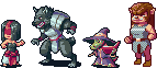
|
Posted By: Zeratanus
Date Posted: 05 June 2012 at 7:11am
|
and another. Also got a slight color variant which I'm not sure of yet.
You folks should really let me know how this is going :B 
|
Posted By: Gamamoto
Date Posted: 05 June 2012 at 8:18am
|
I'd like to answer you but my pixel art level is way lower than yours. I'll just say that in my opinion the geenish armor doesn't really fit your chars. |
Posted By: Zeratanus
Date Posted: 05 June 2012 at 8:41am
|
Bah, skill is all well and good, but anyone who sees something funky looking or off is valid and helpful :B
Thanks for your input :) the green saves a color, but I wasn't sure if it was worth it. |
Posted By: Gamamoto
Date Posted: 05 June 2012 at 9:12am
| I guess it doesn't affect your work that much but i find it weird |
Posted By: philippejugnet
Date Posted: 05 June 2012 at 12:00pm
| You don't have so save colors... unless it looks good... I would keep the grays rather then removing them and adding greens instead. What you could do: mix the purple with the red. |
Posted By: dpixel
Date Posted: 05 June 2012 at 12:25pm
|
For some reason the shade of red on the wolf seems to clash (mouth and belt) Might just be my eye though. These are all coming out great. ------------- |
Posted By: Zeratanus
Date Posted: 05 June 2012 at 1:55pm
|
@Philippe - yeah, but if it looks decent with less colors then that'd be good. I just wasnt sure if it looked worse with the green or not. I've toned it down but kept some green in the armor now. It doesnt make much of a difference, but it breaks up the blue I think.
I've also thrown in some red to the armor... but the red seems different in the gif than my photoshop document, so i think this copy of PS might have odd color settings. Someone let me know if it sucks! @Dpixel - hm. well I've edited the mouth a bit, but with the added red into the armor now, not sure if that'd make the problem better or worse (and like I mentioned above, the red seems to change between programs for me on this computer, so I cant judge it well yet ><) And thanks :D - Newest is the bottom row:

Edits: Girl's back arm has more of an elbow Wolf's mouth has less red around it, added red to armor (really iffy due to reds changing between programs) Kobold's yellows changed to silvers. Not sure I like the change or not yet. Smoothed out the Kobold's face and got rid of an unnecessary color Added red to the Bugbear's armor, changed her foot slightly kept some green on both armors to break up the blue |
Posted By: Zeratanus
Date Posted: 06 June 2012 at 7:32am
NEW ON BOTTOM

Took out the red from the wolf's armor completely, but made the red on his arm more prominent changed a fair amount of the girl's body and arms |
Posted By: philippejugnet
Date Posted: 06 June 2012 at 8:25am
| stil... those greens aren't good. |
Posted By: Zeratanus
Date Posted: 06 June 2012 at 8:36am
|
Any suggestions?
I think the newer versions with some green is much more visually interesting than the pure blue older ones. |
Posted By: Zeratanus
Date Posted: 08 June 2012 at 8:19am
|
Alright, changed the green slightly, but not sure if its better or worse.
Also a ton of minor tweaks here and there. As always, new on the bottom:

If anyone's got any more advice I'd be happy to hear it. otherwise I'll probably call it done. |
Posted By: Friend
Date Posted: 08 June 2012 at 10:17am
| I'm really not liking the green color mixing in the girl's pants and in the wolf's armor. I think you're going a little too color-mixture-crazy. Also, I think you still need more contrast in the metal, even closer to Cyangmou's edit from a while ago. I think you're starting to lose a bit of the crispness of the sprites with adding to much detail and colors. Lastly, perhaps the wolf could look furrier with a different texture of the light grey on his thighs. |
Posted By: Zeratanus
Date Posted: 08 June 2012 at 1:20pm
|
Alright, alright, no one likes the green lol. I've removed it now.
Though really I think the armor I had in the last edit had way more contrast than Cyangmou's edit, I have completely reworked quite a bit of it. In fact, I've changed a lot of the wolf guy to make im a bit fuzzier looking and fix his mouth so it fits his head better. Minor edits to the girl and Kobold. Nothing but the removal of the green for the Bugbear. New under old~

edit: I had also removed a red and replaced it with an existing purple, but between the removal of the green and that replacement the girl's lower body just lost a lot of contrast I think. I'll make sure that gets fixed. editedit: Damnit! Forgot my flash drive and I gotta head off from work. Uploading where I'm at... 
|