Giant Octopie (Weekly Contest)
Printed From: Pixel Joint
Category: Pixel Art
Forum Name: WIP (Work In Progress)
Forum Discription: Get crits and comments on your pixel WIPs and other art too!
URL: https://pixeljoint.com/forum/forum_posts.asp?TID=11317
Printed Date: 08 July 2026 at 12:09am
Topic: Giant Octopie (Weekly Contest)
Posted By: littlesapphire
Subject: Giant Octopie (Weekly Contest)
Date Posted: 30 November 2010 at 8:51am
|
So my hubby and I came up with a bunch of puns for the weekly contest, and one I liked a lot was the idea of a giant octopus (sometimes called the kraken, which can either be a giant octopus or a giant squid) mixed with a raspberry pie. I dunno. I've always wanted to draw an octopie anyway, just because the pun is so awesome. Here's some rough lines I drew to get me started: 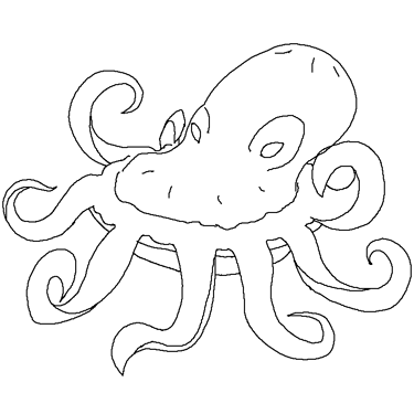 |
Replies:
Posted By: littlesapphire
Date Posted: 30 November 2010 at 9:26am
Got the lines done and a little shading. I wanted to block in the colors so that it's easier to see that it's a pie. I eventually want the red part of the tentacles to look like the inside of a raspberry pie. |
Posted By: EdJr
Date Posted: 30 November 2010 at 9:41am
|
Hey, it's really very creative!
The concept looks interesting, I'll wait for the finished piece! ;D |
Posted By: Karv
Date Posted: 30 November 2010 at 9:59am
|
Remembers me of Ultros.
Concept is great and colours are good too, but I really really think you should make the sprite bigger. |
Posted By: littlesapphire
Date Posted: 30 November 2010 at 10:49am
| Me too, Karv. But the limits for this week's challenge are 75x75 :) |
Posted By: littlesapphire
Date Posted: 30 November 2010 at 12:52pm
Little more work on it, mostly the texture of the crust. I'm trying to make it look like the pie tin has a lip, but I'm having a little trouble. Any advice?
|
Posted By: kevink
Date Posted: 30 November 2010 at 1:02pm
| that's coming along great, sapphire. keep it up. |
Posted By: littlesapphire
Date Posted: 30 November 2010 at 2:05pm
Little more editing. Working on getting some texture in the tentacles. Haven't addressed the pie tin lip. No, I don't have a life, thanks. Also, should I put vents in the pie? Like real pies have. And if so, should they be down below, or on top of his head? |
Posted By: dpixel
Date Posted: 30 November 2010 at 3:06pm
|
Originally posted by littlesapphire No, I don't have a life, thanks. If you enjoy what you do, that's a fine life. Nothing wrong with that. And I think the vents should be in the pie down below. Because it looks more like an octopus right now than a pie. This is really coming out cool.  ------------- |
Posted By: H|F
Date Posted: 30 November 2010 at 6:02pm
|
I think this is totally awesome!
I got an idea... not sure what you will think but oh well.
What if a piece was cut out, with a leg/showing the berries?
|
Posted By: littlesapphire
Date Posted: 30 November 2010 at 6:47pm
| LOL H|F, that's an awesome idea. Gotta see if there's enough room for it. |
Posted By: littlesapphire
Date Posted: 02 December 2010 at 9:46am
|
Decided to try H|F's idea about cutting out a piece of pie. I think I
have just enough room to include the pie piece at the bottom. I changed
up the colors of the tin and I hope it looks a little more life like.
Let's see... worked on the tentacles as well. I drew a black outline
around them but that made them way too bulky. Gonna try to preserve the
shape and colors I created but also have a black outline. Or should it be a colored outline?   Man, I hate how Firefox makes pixel work look so fuzzy in this forum. It makes me feel like I'm going blind. |
Posted By: littlesapphire
Date Posted: 02 December 2010 at 10:18am
Added the pie vents. Also decided to try a thinner black outline vs a colored outline. Which looks better?  Also, I realized I have enough room for either the piece of pie or a dollop of whipped cream on top of the octopie's head. I don't think I want to show the piece of pie. I see it as like a scar, lost while battling a giant gummy whale or something :D |
Posted By: Sai
Date Posted: 02 December 2010 at 10:25am
| The yellow could use a more golden brown maybe? It doesn't exactly look baked. Darkening the colored outline might be good. I feel like the shape of the head could be a bit more octopus-like though. The head of a real octopus usually droops down a bit at the back. Perhaps the eyes can be a bit close as well. I'm loving the idea though. Keep it up! |
Posted By: littlesapphire
Date Posted: 02 December 2010 at 10:57am
Ok, how about these colors? I darkened the outline just a little where it was the most light, but I'll work more on it later. Thanks for the ideas, Sai. I don't think I'll work more on the head though. I did put it back like a real octopus, but I didn't want it to be exactly like the real thing because then it would look like I took a picture of a pie and an octopus and sliced the two together. I wanted something that's like morphed between the two. ....I'm not sure if I got it though, lol. 
|
Posted By: littlesapphire
Date Posted: 02 December 2010 at 1:35pm
Little more fiddling. I fixed the lip of the pan a little (I hope), and darkened the outline of the tentacles. I think the last thing I want to try is a dollop of whipped cream, but I'm A) not sure if that's a good idea and B) scared to try. But I guess I'd better give it a shot! |
Posted By: littlesapphire
Date Posted: 02 December 2010 at 1:58pm
This is fun! I think I like the whipped cream, but I'd really like some feedback. What's everyone think? |
Posted By: skamocore
Date Posted: 02 December 2010 at 2:11pm
|
It kind of loses the distinctive silhouette with the cream and makes it harder to read as an Octopie. I think you could still make it a little bit more golden brown. Also, the pie tin seems a bit out of shape on the left. ------------- |
Posted By: littlesapphire
Date Posted: 02 December 2010 at 2:26pm
|
I can see what you mean about the cream, Skamocore. I'm not sure what you mean about the tin, though. Unless you're talking about the very left, where the lip is overhanging. I'm not really certain how to make it more golden... So I tried more saturation :D  |
Posted By: skamocore
Date Posted: 02 December 2010 at 2:37pm
|
Yeah, the very left. To me it just seems like it's going off on an angle and not quite circular. Also, yep, more saturation and darker, I think. Anyway, looking good, can't wait until it's finally finished. ------------- |
Posted By: carokann
Date Posted: 02 December 2010 at 3:07pm
|
This is very good! Who would have thought of an octopus pie monster! I agree with member_profile.asp?PF=10332&FID=8 - skamocore about the plate. I think you could help Edible Arrangements make their "arrangements" more entertaining :) |
Posted By: littlesapphire
Date Posted: 02 December 2010 at 4:07pm
Reverted the pie tin to the way it looked before, more or less. I think I'm happy with that. Also, the more I look at it, the happier I am with the whipped cream. |
Posted By: littlesapphire
Date Posted: 02 December 2010 at 5:39pm
|
Ok, I think I'm done with it. I'm excited to get it out there and also tired of working on it o_o Have you ever looked at something so long that you can't tell any more if it looks good or not? |
Posted By: Ambient
Date Posted: 02 December 2010 at 6:39pm
|
I think you need more contrast, and there's a color on the pie pan highlight that you only used once.
Here's a quick edit: 
|
Posted By: littlesapphire
Date Posted: 02 December 2010 at 6:50pm
| I actually found the loose color myself, Ambient :) Did too much palette changing, I guess. Anyway, I like your choice of colors. That's more what I was looking for but got tired of trying. |
Posted By: Ambient
Date Posted: 02 December 2010 at 7:17pm
| I don't know what program you use, but all I did was scroll through the pallet increasing/decreasing value in Gale. I also made a few modifications to some of the tentacles, the head, pie pan, and whipped cream. |
Posted By: H|F
Date Posted: 08 December 2010 at 12:57pm
| Oh wow, it looks so cool! IDK what made me think of cutting a piece out... just think it looked more like pie. I love this!!! |