Contrast visual problem
Printed From: Pixel Joint
Category: Pixel Art
Forum Name: WIP (Work In Progress)
Forum Discription: Get crits and comments on your pixel WIPs and other art too!
URL: https://pixeljoint.com/forum/forum_posts.asp?TID=11542
Printed Date: 21 April 2026 at 11:39pm
Topic: Contrast visual problem
Posted By: zi-double
Subject: Contrast visual problem
Date Posted: 11 January 2011 at 2:26am
|
In last 3-4 days make this piece. I want to look dark, because plan to make 2 pieces like extension with dark and light ideas. The problem is that: when I work on the piece in the home all look at clear. Easy to see all details including dark colour near to the black, but in the work is a bit different. Not so easy to see last 1 or 2 colours /near to the black/. The work look at a bit spread. I think in home I have proper vision, but I can't make 2 laptops to have the same parameters. That is why will be glad to hear your opinions. 8 colours in the work in work I see something like this 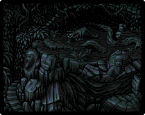 in home I see something like this 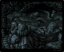 this is example what similar I see in home and in work, but what is better ? About work - just want Indiana Jones to go there :) |
Replies:
Posted By: jalonso
Date Posted: 11 January 2011 at 7:42am
|
Depending on where the light areas are and how strong they are, both are ok. Monitor differences are unavoidable. Macs show brighter images than PCs (generally) and the darker one is quite dark to me so on PCs the first may be too dark. When I ever have a doubt, I pick lighter to be safe. ------------- |
Posted By: zi-double
Date Posted: 11 January 2011 at 10:45am
Thanks Jal. I hope you aren't weary to be right always  Add the piece in PJ gallery :) |
Posted By: DawnBringer
Date Posted: 11 January 2011 at 4:31pm
|
Ah, that's a common problem...everybody should make sure their monitor brightness isn't too far off...esp. when about to do some gfx. Whipped up a basic "calibration" tool. It's basically a 16 color grayshade image; displaying a comparison of the two darkest and the two brightest colors. If your settings are ok the difference between the circles and the background should be somewhat similar for both the dark and bright scene. If you can't even see either the dark or bright circle - you have a problem. http://goto.glocalnet.net/richard_fhager/bricalibrate.html - http://goto.glocalnet.net/richard_fhager/bricalibrate.html |
Posted By: cure
Date Posted: 11 January 2011 at 8:52pm
|
Both look fine on my non-mac laptop. I'll have to remember to check them and Dawn's test on my home computer, as it also tends to skew colors. Looks great btw, personally I prefer the darker one, but not by a significant margin. |