Little help for a noob?
Printed From: Pixel Joint
Category: Pixel Art
Forum Name: WIP (Work In Progress)
Forum Discription: Get crits and comments on your pixel WIPs and other art too!
URL: https://pixeljoint.com/forum/forum_posts.asp?TID=11915
Printed Date: 22 June 2026 at 3:05am
Topic: Little help for a noob?
Posted By: esloc03
Subject: Little help for a noob?
Date Posted: 31 March 2011 at 4:01am
|
Pixel Art is very dificult Pixel art is very dificult
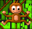
 Hello everyone! i'm new and i'm just starting to get a little into all of this stuff... anyway me need help, i dont really have a particular project i'm working on but i can show you some of the things i've done and maybe you could help me with some tips? :]    |
Replies:
Posted By: cure
Date Posted: 31 March 2011 at 7:15am
|
can't give any crit on the first because it's just a thumbnail the second piece: the blue and green seem too saturated. not sure what the sticks/planks in the back are, if it's a fence they should touch the ground. not sure what the lumps on the ground are, if they're rocks they should be less uniform in size and spacing. the anatomy is bizarre, even if you're not trying to go for realistic, use references. neck is as thick as the torso, arms are too short, and his legs are attached sideways. be careful about overusing black outlines, especially on the interior of the sprite. there's a pixel art tutorial in the resources/support section that I'd recommend thumbing through if you haven't already. |
Posted By: esloc03
Date Posted: 31 March 2011 at 11:28am
|
You guys really do know what your talking about, i am using the very very simple program PAINT, it is possible to do this kind of thing using paint isnt it?
And thank you, i just had a look at the tutorials and they look really great and they're well explained... So i'll practice them and hopefully i'll get better :) thanks alot And i'll post the 1st image again when i get on my computer Thanks for your help! :D |
Posted By: cure
Date Posted: 31 March 2011 at 12:04pm
| i used paint for years, so it's certainly possible. paint just isn't very user friendly (so I know use the free program grafx2, which is more suited for pixel art). |
Posted By: esloc03
Date Posted: 31 March 2011 at 12:16pm
|
I will try that! Thanks alot for your help
|
Posted By: esloc03
Date Posted: 31 March 2011 at 3:44pm
 |
Posted By: cure
Date Posted: 31 March 2011 at 4:07pm
| it's still not at 1x, its shrunk down considerably. from this size I can still tell that the angles on most of the buildings are way off. plan your construction a lot more, learn about vanishing points and use lines in the preliminary stages to ensure everything's at the right angle. learning perspective could take a while, it might be best to pick less advanced perspectives and study that stuff with pencil and paper for now. |
Posted By: esloc03
Date Posted: 01 April 2011 at 1:26am
OK i think i did something pretty good here, but i'll let you decide...
|
Posted By: onek
Date Posted: 01 April 2011 at 2:21am
some suggestions what u could do to spice things up
|
Posted By: esloc03
Date Posted: 01 April 2011 at 3:00am
WOW thats amazing! thank you 
|
Posted By: Seitilaer
Date Posted: 01 April 2011 at 5:48am
|
Paint is your best friend for the next few months before you adapt to new and advanced programs such as Paint.NET , Photoshop or GIMP.
I noticed that your houses are not in it's isometric form. Some of the parts are not parallel to each other so it makes a weird impression that your house is not .. stable :P. Make sure that your lines are parallel to each other. 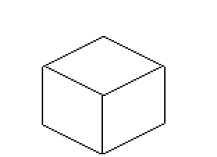
Try using this as a guide. Image courtesy of Google. And as for the others, I could not make up my mind about the second one because it looks like a Hawaiian wearing a Tiki Mask performing a strange ritual. Try narrowing down the palette and use as less colors as possible if you're doing simple images like that. And make sure the colors aren't too saturated or has a high-contrast to avoid eye sore. And as for the third one, it looks like a Bouncer since it has a well-built body. Try looking up on Google on human anatomies to give you a rough guide on how to create your own character with the right posture and etc. Phew, I guess that's a lot for today. If you are still skeptical don't be afraid to ask our friendly users here that are mostly experienced in this sort of stuff. :) Good luck in advance and never stop pixelling ! |
Posted By: esloc03
Date Posted: 01 April 2011 at 10:39am
|
Seitilaer, your right about my isometric shapes, as for the monkey i looked on google for cartoon monkeys and then i sketched on paper afew drawings, i'm not good at drawing on paper... Is that i problem when it comes to creating pixel art?
Also @commander could you just talk through what you did to my original monkey so i could try, i think the background is amazing it looks really complicated when i zoomed in i saw rectangles... would you be able to teach me how to create something like that? |
Posted By: esloc03
Date Posted: 05 April 2011 at 5:43pm
this is my attempt at what Commander did... any tips for me? i know its not perfect, can you suggest anything to help me?
|
Posted By: cure
Date Posted: 05 April 2011 at 7:02pm
| why not stick with one piece, and focus your efforts on it? if you keep making new stuff, but not improving the old stuff, then it kinda defeats the purpose of a WIP thread, and you don't really learn as much. |
Posted By: esloc03
Date Posted: 06 April 2011 at 2:05pm
| I do agree, but the monkey is completed i dont think i could improve it, so i created this bear in order to try and learn how to create something like commander did with my monkey image, and i'll learn from that... You see? :) |
Posted By: onek
Date Posted: 07 April 2011 at 10:20am
|
my name i s'onek' ;D ... my status is 'commander' :)
also ... my edit was moreabout showing what simple shading, clean lines and some background can do to a piece... ok u got the background now, but its more or less a copy of what i did.. try something urself, be creative... still theres no shading and the lines are pretty unclean/ jaggy.. also ur colors seem a bit dull and washed out... |
Posted By: esloc03
Date Posted: 09 April 2011 at 2:02pm
|
thank you for that, haha i'm sorry about the name thing, i was on my ipod when i wrote that, i was zoomed in pretty far and i just saw commander :) thank you for the C & C i will try my best to learn from it an i'll post my piece here in a day or two :] - Edit Ok so here goes i got rid of the background , then changed the background to black and got my shades of colour ready beside the image incase something went wrong i would still have that shade, so i tried my best to shade the bear and make it look less flat, then i just created some background to fit the bear into... what do you think? i hope i can get more advice, i've really tried to listen to what people have been talking about in other threads about shading and stuff, anyway. i hope you like it :) (i know its not perfect thats why its my WIP)    |
Posted By: ChrisButton
Date Posted: 10 April 2011 at 8:59pm
| The way you've shaded it reminds me of pressed metal, it's flat but gets deeper or higher when there is something on top of it. Shade the whole thing as one object. I can't really explain how to shade, that's up to your brain to interpret the bears shape, but it shouldn't be hard. :-) |
Posted By: esloc03
Date Posted: 11 April 2011 at 3:19pm
|
I think i understand, i didnt want to change much on the bear but i did add a little bit if you notice, i think i'm getting it now :) What do you think? Thank you 
|
Posted By: cure
Date Posted: 11 April 2011 at 4:59pm
|
you're just shading/highlighting the edges, which makes him look flat like a cookie. he's a three-dimensional bear, no? think in three dimensions, learn how to shade spheres/etc, right now you're just shading circles. the stomach fur doesn't really need its own shading, right? I assume it's just a shift in color. the tree's shadow falls straight over the bear, passes through him. it should warp when it hits his leg, as his leg is a new three dimensional surface that light affects differently than the ground. sky is too saturated, that blue detracts from the bear. I'd use black more consistently or not at all. (and no, the monkey wasn't completed- I think onek's edit showed that it could certainly be improved upon) |
Posted By: onek
Date Posted: 12 April 2011 at 4:55am
|
made another edit yesterday which adresses the same points cure mentioned...
wasnt able to upload cause photobucket.com is giving me some troubles lately... anyway... temporary uploaded it to my blog to show here.... hustle for pageviews ;D http://oooonek.blogspot.com/ - oooonek.blogspot.com and here the edit (super sloppy but yeah.....) 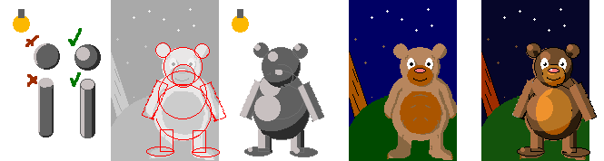
|