[WIP] Retro Evolutive Game & Mockup
Printed From: Pixel Joint
Category: Pixel Art
Forum Name: WIP (Work In Progress)
Forum Discription: Get crits and comments on your pixel WIPs and other art too!
URL: https://pixeljoint.com/forum/forum_posts.asp?TID=12145
Printed Date: 12 June 2026 at 4:59pm
Topic: [WIP] Retro Evolutive Game & Mockup
Posted By: [thUg]
Subject: [WIP] Retro Evolutive Game & Mockup
Date Posted: 14 May 2011 at 11:48am
|
Hi, I'm actually working on a personnal game project that I don't know if I can make it real one day, but I'm quite motivated to see how far I can go. For the moment it's only mockup to try to find any coder motivated by them, it's a kind of wonderboy plateformer with some retro effect ideas, that's why I need to make all tiles 4 time (4,8,16,32 colors), here is one screen with 1 kind of effect as example:  Now, my problems are the 32 colors palette and maybe the 8 colors one. To keep a retro feeling, I use GameBoy palette for the 4 colors and C64 for the 16 colors. I'm not very satisfied of the 8 colors palette I've used, because I intend to make whole game with this 4 palettes (no worlds, it's a big map with various places, ice, desert, city, forest, undersea, castle, cave, futuristic and more). I'm not sure I can do all with this 8 colors palette (desert seem compromised without yellow). And, I've no idea for the 32 colors palette, I'm not sure I would push to 64 colors, so I think the 32 should look very fresh like new pixel games. Here are the same screens with 4, 8 and 16 colors:    Anyone got any idea of a good 8 and 32 colors palettes to make all places or a known system palettes maybe? Anyone got name of known games I can use as ref for the 8 colors (I want that we feel evolution in fact)? Or do you think I have to use more than 8 colors for the really retro one? Do I have to go to 64 colors to make it more nice? I think GB palettes look less retro than 8 one, am I right? |
Replies:
Posted By: jalonso
Date Posted: 14 May 2011 at 6:13pm
|
I like 16 colors for some reason. ------------- |
Posted By: tanuki
Date Posted: 14 May 2011 at 8:33pm

That's an 8 color palette I was using on another project yesterday. 4 blues, 2 reds, 2 yellows. Not exactly an all-scene palette, but I kind of like it on this scene... |
Posted By: skamocore
Date Posted: 14 May 2011 at 9:01pm
|
I really like the 16 colour one, it has a very Gods-esque vibe to it :) Also, for 4 colours - why not CGA? For 8 colours you could use one part of the ZX palette. Not quite sure about 32. edit: maybe add a 2-colour palette too? If you were to do that black and white would be the obvious choice. Or maybe green? ------------- |
Posted By: DawnBringer
Date Posted: 15 May 2011 at 4:37am
|
Hehe, that's interesting. So what's gonna display/cause the different modes...a radius like in the image, or do you have some other ideas? Here's a balanced, multipurpose, 32 color, 12bit palette (Amiga500). Maybe it could be a place to start? Feel free to adjust it to your needs.  |
Posted By: [thUg]
Date Posted: 15 May 2011 at 11:20am
|
@ tanuki Thanks, but I really need to make the 8 one feel like a nes or master system. @ skamocore ^^ you got me, yes, I've learn a lot from Bitmap Brothers gfx! For the CGA, I've tryed (white/cyan/pink/black) and (white/cyan/red/grey) but the hign contrast between colors really hurt and it must be playable by the end. 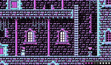  I've think about a 2 colors one at a moment (green/black), and wasn't able to know how to do, but now that I've done the 8 one, I can imagine how to make a 2 one and maybe I can forget the 64 idea. @ DawnBringer Really big thanks, your palette just look perfect to make anything, I'm gonna give a try with it, lots of work left, I think I have to make a mockup for each place to see if it fit, but it look really great, all colors seems to be there and usable with various gradient. For more detail about the different modes, for the moment all are not clear, but first idea is to start game in 2 colors and finish in 32, by getting some item that will used the radius effect that you see, the character will change of colors number too and you can't kill baddys with more colors than you. And the most complicated part is that according to the color of tiles, you can see or not see some elements, use or not use others, things like walking on water or not, or even see more in the dark rooms. For the moment, it's more ideas than finished things ^^ |
Posted By: [thUg]
Date Posted: 28 May 2011 at 1:38pm
Here is the 2 colors :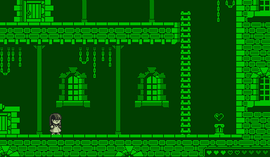 And the 32 colors, with DawnBringer palette:  And a new test with the 5th styles:  |
Posted By: MacDeath
Date Posted: 23 July 2011 at 6:05am
|
Hi I'm new here. I don't quite see why you want to get all those different palettes, beside having a graphical compatibility with most retro systems... just like good old Hercules/CGA/EGA/VGA/Amiga and NEC PC88 perhaps... Ok, you actually aim at this being part of the gameplay, fun then. concerning your 32 colour palette, perhaps you should have a look at the Amstrad CPC palette. http://cpcwiki.eu/index.php/Main_Page http://cpcwiki.eu/index.php/Video_modes It it's a "cubic" RGB of 3x3x3 = 27 colours. (ternary digits based) So yep, not exactly 32 colours. But it is completely balanced, yet a bit brightly colourfull... Its only flaw is that it has only 1 grey. But as it is only a 27 colours palette it lets you 5 slots for custom colours... 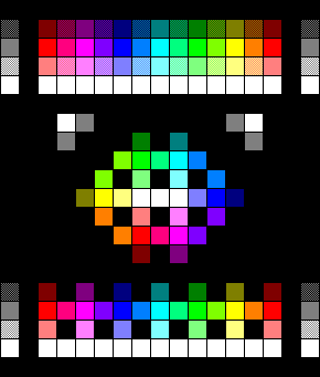 With heavy dithering it can lead to a lot of stuff... 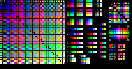  Perhaps just customise this palette a bit to add some extra greys and brown/oranges would be enough. concerning your 4 colour mode, I guess you aimed at some monocolour 4 colour mode. But a 4 colour palette can also be somewhat used to get a coloured feeling, just look at the CGA picture posted earlier... but I guess you need to simplify a bit the complex BitmapBros styled ditherings in order to get the game more playable...  Also, why does your 8 colour mode use no dithering ? I guess because it is WIP... CGA palette : this is not a good palette. fairly unbalanced IMO... And EGA was screwed because of its CGA legacy with only the full CGA palette available in 320x200x16 mode... such a shame while it had a sweet 4x4x4 RGB palette actually. Anyway, i tapped into the CPC palette to do some tries from the CGA mockups...   This is perhaps more balanced... Or perhaps stick to the simplified 8 colours version, but in dithered 4 colours.  Or a mix of both the "CGA" and the "8 colours" in dithered 4 colours |
Posted By: Miumau0
Date Posted: 23 July 2011 at 12:12pm
| To me it looks good with 8 colors, with 4 dithered. |
Posted By: DawnBringer
Date Posted: 24 July 2011 at 10:16pm
|
Dithering primaries is an artist's very last option. All (1-5) bitspace palettes suffer from the fact that they have very few levels of brightness (the most important aspect of a color/palette) and many colors are too perceptually similar to be useful (like the 4 bright green). With such palettes it's almost impossible to pixel anything that doesn't give both the artist and the viewer bleeding eyes...especially in low-res ;) |
Posted By: MacDeath
Date Posted: 25 July 2011 at 7:02am
 perhaps another way (regardless the palette chosen) to deal with the 4 colour (and perhaps the 8 colour) versions is to mix tiles in 1bpp (ZX spectrum like, 2 colours) with 3 colours tiles and 4 colours tiles... There : =the basic background is only 2 colours tiles (the bricks in dark-red) =the foreground bricks are in 3 colours (Black+white+grey) and some element are in 2bpp (4 colours) such as the doors and windows. This should also work well with 8 colours, as most average colours can be dithered with Black and white... and some colours can also be dithered together alongside black and white. |
Posted By: Smilecythe
Date Posted: 28 July 2011 at 5:28am
|
Very cool idea, I tried something similiar once but instead of palette I used different texture techniques. My coder at the time managed to use my work for a neat effect with sort of a hallucination/distortion feeling. Whole tileset was practically like an animated sprite and frames would change randomly or on specified patterns. We did not get anywhere with the project though, but I might still try it again on my current project. |