Cavern Backdrop
Printed From: Pixel Joint
Category: Pixel Art
Forum Name: WIP (Work In Progress)
Forum Discription: Get crits and comments on your pixel WIPs and other art too!
URL: https://pixeljoint.com/forum/forum_posts.asp?TID=1265
Printed Date: 21 April 2026 at 11:30pm
Topic: Cavern Backdrop
Posted By: EyeCraft
Subject: Cavern Backdrop
Date Posted: 19 December 2005 at 12:48am
Here I am, once again working on game graphics. The level I'm working
on at the moment is set in the caverns and passages of an artificial
planet. The first graphic I'm working on is the far backdrop, here's
how it's shaping up: I'm finding the lighting to be very tricky indeed! Besides the blue spotlights there is also an ambient lightsource coming from below. What I've got so far doesn't seem to look right, I feel. C+C plzzzzz  |
Replies:
Posted By: neota
Date Posted: 19 December 2005 at 6:05am
|
* The perspective confuses me. are the pillars actually pillars -- ie do they run from floor to ceiling or along the floor? * how rocky are the bottom of the pillars intended to be? if they are fairly rocky i suggest highlighting the lower edges to start with (show some jags). * personally i would wipe over all the grey on the pillars with the darkest grey, then add brighter shades incrementally. this helps me perceive and exaggerate light more accurately vs drawing light-to-dark. * i also suggest extending the radius of the ceiling lights so that they fight more with the floor ones, this should help to add definition to the pic. * If i was drawing this pic I'd also consider redesigning the pillars to emphasize light contrasts. An edit to illustrate some of this stuff (far right pillar): 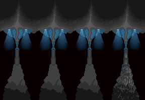 I probably made it too rocky. anyway hopefully that will help you to imagine how the light would fall. ------------- absolutely. |
Posted By: EyeCraft
Date Posted: 20 December 2005 at 1:12am
|
The perspective I'd say has the horizon along the vertical middle of the picture, at where the glows from the spotlights stop. You've guessed the rockiness pretty accurately, they are pretty much just sections of rock. I haven't really moved onto the pillars yet, but I get what you're saying, I think, hehe. With the ceiling light radius, do you mean how much they shine on the ceiling? Or overall how far down their intensity goes? Or both, I suppose.. My main problem is the ceiling, how the blue light mixes with the bottom lighting (which will probably be green or orange, but at the moment is pretty much white light), that line of greyness running between the two blue pools just looks crap, haha, I suppose I'll have more of a play with the contrasts, make it blend more. It's suppose to be like how the arches converge in the ceilings of cathedrals, hmmmm I'm getting more ideas now that I look at it, maybe I just needed a good nights sleep, hahaha. Thanks for the help. |
Posted By: EyeCraft
Date Posted: 20 December 2005 at 5:32pm
After having a rethink about it, I did a quick doodle of what I think the lighting should look like: Does this look wrong to anyone? |
Posted By: neota
Date Posted: 20 December 2005 at 6:54pm
|
the blue lights should widen fuzzily somewhat after hitting the pillar top(diffused light from the pillar top) otherwise looks fine. ------------- absolutely. |
Posted By: EyeCraft
Date Posted: 20 December 2005 at 8:32pm
Ok started on the pixel version, wondering if more light is needed on
the arches from the blue lights...god why do I have to pick such
complex sh*t to shade?! |
Posted By: Di0xygen
Date Posted: 20 December 2005 at 10:51pm
|
the only thing i dont like is that this peice is very flat, no depth whatsoever. Maybe you should think of adding smaller collums in the middle to simulate depth cause right now it lacks something. its jus not of your usual peice quality really |
Posted By: EyeCraft
Date Posted: 20 December 2005 at 10:58pm
|
what i plan to have is 3 layers of backdrop, this is the very far, and
i intend to make a mid and near distance, and they all scroll at
different rates, hopefully creating some very nice depth. |