Sub-terror-aneon WIP
Printed From: Pixel Joint
Category: Pixel Art
Forum Name: WIP (Work In Progress)
Forum Discription: Get crits and comments on your pixel WIPs and other art too!
URL: https://pixeljoint.com/forum/forum_posts.asp?TID=12656
Printed Date: 13 June 2026 at 4:34am
Topic: Sub-terror-aneon WIP
Posted By: Melee
Subject: Sub-terror-aneon WIP
Date Posted: 05 August 2011 at 12:27am

Ummm, sorry for all the little monster dudes. :) It's so much easier keeping little step-by-steps on my canvas just in case I mess something up and want to go back. (Habit I got into when I still used the old MS Paint.) Anyways, I think I've gotten shading alright. But I might not. Mostly what I'm concerned about is the forearm on (our) left and the glow in his mouth/eyes. The bone/whatever thing extending on his head/shoulders-- would that reflect the light from his eyes and mouth as much? I don't think it's a big glow-- not enough to reach his shoulders, but definitely enough to hit the helmet-part. But I feel like those look almost metallic. I don't want to add more colors (palette restriction)... would adding dithering or texture help make it feel more bone- or claw-like, instead of metallic? Any crit is welcome. Aside from some practice a few weeks ago, I haven't pixelled in almost a year (so busy!). |
Replies:
Posted By: cure
Date Posted: 05 August 2011 at 12:12pm
|
reposting this from the challenge thread for convenience's sake: why is one leg higher than the other? also, the legs don't look connected to the body. In my edit, I bumped up the saturation (palette is rather dull) and improved the contrast in the palette so the values weren't so close together. tip: never dither if you have a color in your palette that works just fine in that spot. 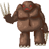  |
Posted By: CELS
Date Posted: 05 August 2011 at 2:33pm
|
Bah, I wrote a long reply to this and it was lost. But I'm glad to see that cure basically fixed everything I commented on already, without typing his fingers to the bone. The edit looks a lot better, having fixed the feet and the legs. In regards to the "helmet", I think that you should either remove it (as per cure's edit) or make it very clear that it's a helmet. In the original you posted, it just looked like the monster had been standing out in the snow. If you want the claws to look more like bone and less like steel, I suggest giving them more of a yellow / beige tinge, rather than a cool grey. |