WIP Lance.
Printed From: Pixel Joint
Category: Pixel Art
Forum Name: WIP (Work In Progress)
Forum Discription: Get crits and comments on your pixel WIPs and other art too!
URL: https://pixeljoint.com/forum/forum_posts.asp?TID=12743
Printed Date: 18 March 2026 at 7:42pm
Topic: WIP Lance.
Posted By: slick
Subject: WIP Lance.
Date Posted: 14 August 2011 at 3:34pm
|
This is my first pixel so go easy :)
Any problems? 
|
Replies:
Posted By: Friend
Date Posted: 14 August 2011 at 8:35pm
are you sure it's a lance? Lances are those giant prodding spears that knights would duel with on horses. It looks more like a decorative arrow. The stick part of it would be way too short for it to be a lance compared to the tip. |
Posted By: slick
Date Posted: 14 August 2011 at 8:48pm
|
Originally posted by Frost Butt
are you sure it's a lance? Lances are those giant prodding spears that knights would duel with on horses. It looks more like a decorative arrow. The stick part of it would be way too short for it to be a lance compared to the tip. Although there are some definite scale issues with my pixel I was designing it more on this 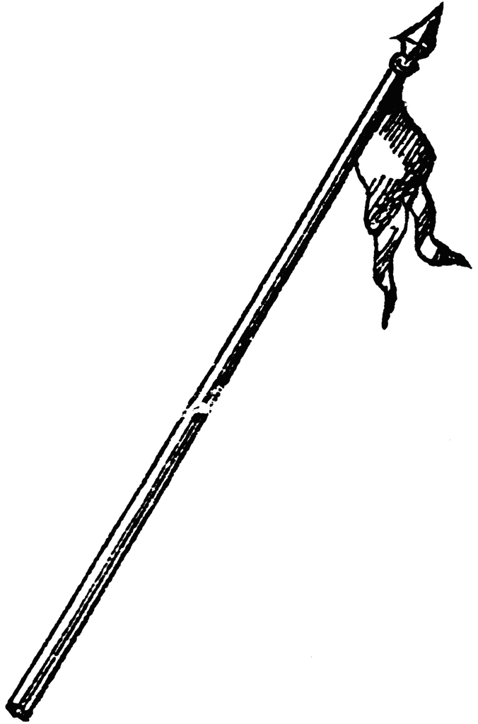 with a decorative piece on the back. Now that you point it out, It does seen to look more like an arrow. . . with a decorative piece on the back. Now that you point it out, It does seen to look more like an arrow. . .
|
Posted By: Friend
Date Posted: 14 August 2011 at 8:54pm
|
I think just make it longer and it will be fine. I actually really like it. All of the details on it are very readable. Perhaps the gradient shading could be improved, but it still works well IMO |
Posted By: slick
Date Posted: 14 August 2011 at 9:29pm
|
Originally posted by Frost Butt
I think just make it longer and it will be fine. I actually really like it. All of the details on it are very readable. Perhaps the gradient shading could be improved, but it still works well IMO I fixed the size issue, explain more about the gradient? 
|
Posted By: Friend
Date Posted: 14 August 2011 at 9:54pm
actually, it still isn't long enough. I estimated you can have about 15 ish spear tips cover the shaft on most lances. On your WIP, you can fit around 8 ish spear tips in your shaft, so it still should be longer to help it look more like a lance. You see the red arrows pointing inside the "feathered" areas? You've used a shading technique known as gradient shading, which is basically shading in bands of varying contrast. Generally, this type of shading is best avoided as it isn't very realistic. Cure is quite spiffy with shading, maybe he can help you out if you ask |
Posted By: slick
Date Posted: 14 August 2011 at 10:26pm
|
Originally posted by Frost Butt
Cure is quite spiffy with shading, maybe he can help you out if you ask Alright, I'll ask him and fix the length, when he replies Ill do my best to fix the shading. I also realized my light source was kind of off. Size to your specification, I'm not to big on it: 
|
Posted By: cure
Date Posted: 14 August 2011 at 10:54pm
you just have to think about which planes are facing toward your light source and which planes are facing away. then account for any cast shadows. when working on small pixels, remember more colors/low contrast makes for less readable work than less colors/high contrast. |