Isometric Perspective Problem
Printed From: Pixel Joint
Category: Pixel Art
Forum Name: WIP (Work In Progress)
Forum Discription: Get crits and comments on your pixel WIPs and other art too!
URL: https://pixeljoint.com/forum/forum_posts.asp?TID=12806
Printed Date: 08 June 2026 at 10:30pm
Topic: Isometric Perspective Problem
Posted By: Qemist
Subject: Isometric Perspective Problem
Date Posted: 20 August 2011 at 8:56am
|
Hey guys! New to pixel joint here. My pixel experience goes way back to about 10 years ago. I felt like getting back to pixel art and have always been into the isometric arts. Want to make a mech game myself and have recently started on it. Heres the first concept from the front that walks wich I'm pretty happy with:  but I'm struggeling on the back of the mech. heres what I got so far:  anyone able to help me out a bit? thanks in advance! |
Replies:
Posted By: Qemist
Date Posted: 20 August 2011 at 1:25pm
because im waiting for replies heres a start on the colours that serves as a nice little bump on the thread   |
Posted By: Lathien
Date Posted: 20 August 2011 at 3:55pm
|
I've never been much for iso view so I may a little out of my depth here, but I think that you're problem is that the...cockpit? of the mech is further forward on the front view than the back. You may notice that in the front view the upper section of the legs lean forward, whereas in the back view they are straight lines. That may be a place to start. Hope I helped. |
Posted By: Qemist
Date Posted: 20 August 2011 at 3:57pm
|
Originally posted by Lathien I've never been much for iso view so I may a little out of my depth here, but I think that you're problem is that the...cockpit? of the mech is further forward on the front view than the back. You may notice that in the front view the upper section of the legs lean forward, whereas in the back view they are straight lines. That may be a place to start. Hope I helped. Hey Lathien, thanks for your reply! This is what my problem is indeed, the straight leg and the cockpit. Now to find the solution! Ive drawn quite a few leg lines aswell as fiddling for ages now with the cockpit but I cant find what I need. Tips, tricks.. anyone?  |
Posted By: CELS
Date Posted: 20 August 2011 at 5:28pm
|
Cool to see some mechs on here. This site needs more Battletech. Speaking of which, perhaps you could google the 'catapult mech' to get a reference of what the legs should look like? Right now, I don't understand how this thing would be able to do anything other than walk on a straight line on a completely flat surface. Use the battletech mechs for more realistic design. I've made a quick edit to suggest how the angle would look if the legs were in the same position. However, you should consider the fact that the legs are positioned too far apart considering how narrow the mech's body is. That is part of the reason why similar battletech designs have the legs attached to 'hips' rather than sticking out from the cockpit itself. 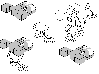 |
Posted By: Qemist
Date Posted: 20 August 2011 at 6:23pm
|
Hey Cels thanks for the help! it still looks weird as you say it might be the attaching to body, but on the front one it looks quite "ok" so maybe its more the shading and such? Now what is even more of a pain is that window on the side that one because of the curve is probably the hardest to do on this thing. |
Posted By: CELS
Date Posted: 20 August 2011 at 6:56pm
|
It looks ok from the front because one of the legs is hidden by the body. That doesn't mean that it is ok. If you compare the distance between the outside of the feet with the width of the cockpit, you'll see that the legs don't fit at all. They're too far apart, because the 'toes' take up so much space. So while the front image may look ok to you, the leg that is hidden by the body would actually be connected to nothing but thin air |
Posted By: Qemist
Date Posted: 20 August 2011 at 7:16pm
|
ok I see what you mean.. but looking at mech models it shouldnt be to hard to adjust I think http://inmyexperience.com/ma2_mechs/catapult.gif - Check the catapult Would just have to add another bend on the top end of the leg right? I wanna keep it relatively simple and just have one base design wich I can script with. Again, thanks for the help I've been fiddling too much with the view to have a proper opinion on whats wrong with it |
Posted By: CELS
Date Posted: 20 August 2011 at 7:22pm
|
I would recommend using something similar to http://www.solaris7.com/Images/TRO/BattleMechs/madcat.jpg - this . The body should be mounted on a plate, with the legs connected to either side. This would give the mech much needed mobility. You don't want a mech that doesn't have space to move its legs sideways, otherwise it would fall over when walking in sloped terrain. As you say, it's not hard to adjust. You just need to draw a wide plate below the cockpit and attach the legs to that. Preferably, the top of the legs should be a bit bulky, for the sake of realism. If they were just nailed to the side of the plate, they would not be dextrous enough. |
Posted By: Qemist
Date Posted: 20 August 2011 at 7:29pm
|
yeah I see. The way it looks right now I'm better off with doing that aswell as putting the missile pods on the "shoulder" position like the image shows. If you look at the back of the mech it looks quite weird. If the front stays this big it might be better not to as it seems to be balanced atm. As you can see I'm quite confused right now  |
Posted By: Qemist
Date Posted: 21 August 2011 at 8:30am
Just coloured the backside a bit and gave the window shape another try..
|
Posted By: Qemist
Date Posted: 21 August 2011 at 9:59am
Trying to fix the legs
|
Posted By: Qemist
Date Posted: 21 August 2011 at 1:13pm
Better now:
|
Posted By: Qemist
Date Posted: 22 August 2011 at 3:37pm
Some (re)tries on physics  
|
Posted By: Qemist
Date Posted: 22 August 2011 at 3:44pm
|
Conclusions: 1. Creating a walking isometric robot is hard 2. The 3rd image is the best so far but 3. If I could get the smooth bar in the middle shown in picture one and two to work it could look alot better. Any tips or help is apreciated :) |
Posted By: Lathien
Date Posted: 22 August 2011 at 3:44pm
| It's looking good, and I think the back leg of this current animation is quite smooth but the front leg is kind of twitchy. Even though I realise you can't move the leg much considering the angle, I think you just need to move it slightly each frame and make the front leg's step last as many frames as the back leg to make it smoother. |
Posted By: Qemist
Date Posted: 22 August 2011 at 4:13pm
|
Yeah I kinda figured that too. The weird part is the back animation is the same as the front, its just hidden. I want to end up with picture 1 (it needs to be double the lenght because the bar needs to go the other way also) and even the "toes" to be turning down like a claw. If I could get that to work that'd be awsome. Things I havent fixed are above, but I still need to have the back of the mech done aswell wich caused me so much issues I just tried to work on the walking :p Thanks for your opinion it shows me that its not just me. |
Posted By: Qemist
Date Posted: 22 August 2011 at 5:01pm
heres all the angles of the moving bar between the legs. Not sure if its gonna work because the isometric stuff is pretty heavy on the head :p Heres a newer version:  |
Posted By: CELS
Date Posted: 22 August 2011 at 5:57pm
|
Well, this is better. Now you have an equivalent of a hip bone, which makes it a bit more realistic. But it seems to me that this design would benefit so much if you had used some references. Instead of reinventing the wheel, why not make use of the brilliant work of others? For example, it's natural to start by looking at animals that have similar legs as this. Specifically, birds. Look at it in slow motion, and study the way they move. Also, you could look at videos from MechWarrior games and study how similar mechs walk. The Mad Cat, the Vulture (aptly named as its legs are reminiscent of those of birds) and similar designs. You'll notice that their legs are not connected by a moving bar in between. For one thing, it's almost physically impossible, because the movement in your last animation would require the edges of the moving bar to be soft. Instead, most mechs have their legs mounted on ball joints. This is no coincidence, as its also the way biological legs are attached to hips. It gives the leg enough mobility to move on sloping surfaces. If you choose to just use artistic license, I would at least recommend giving the robot a longer stride than you've shown above. Keep up the good work :) |
Posted By: Qemist
Date Posted: 22 August 2011 at 6:01pm
|
see the edit I just posted :) I think it looks quite good? Ive been looking at the mechs with the hip thing but couldnt get it to work on what I have here. I think this might work out well tho Edit: oh yeah and dont forget, this is just concept art I want to use to start the scripting with. Once I have the walking on the "client side" and being able to see eachother live trough the server connection I will try to make it all as good as possible (but I expect to fix things more and more as I go because thats what I always do) |
Posted By: wuhu
Date Posted: 22 August 2011 at 10:46pm
|
Looks like your working hard on the animation at the moment. I have a small comment about the coloring which was one of the first and easiest technique changes i did to make my pictures look more pixel-arty. The edges/corners of square blocks should be the lightest color instead of a dark outline.  From the http://www.pixeljoint.com/forum/forum_posts.asp?TID=5692&PN=2 - noobtorials thread |
Posted By: ChrisButton
Date Posted: 23 August 2011 at 12:21am
| It's not hard you just don't know how to animate it lol. |
Posted By: Qemist
Date Posted: 23 August 2011 at 4:34am
|
Originally posted by ChrisButton It's not hard you just don't know how to animate it lol. I guess if you are really experienced it probably is, wich I'm not. But thanks for pointing out not everyone would struggle this much. Do you think the last walk I posted isnt right? If so, what would you do to improve it? @Wuhu: yup, as you can see the lines inside allready have this but some games work with hard outlines and since I dont know where this will be going I'm keeping the hard black outlines for now. The full detail isnt done at all as you can see the legs and the front have more detail then the back but I dont worry too much about that for now as this is concept art to make basic coding. So the views and walking physics should be 100% acurate but everything next to that I'd rather keep at a basic level to work with. Thanks for all the feedback! |
Posted By: Qemist
Date Posted: 23 August 2011 at 7:47am
|
I guess I didnt explain how I want to do it but: Concider this movement as the first generation of mech technology, where you cant shoot and walk at the same time. This way, the game can upgrade into having the second generation of technology making it interesting and worth it to "grind" for better gear. Game Mechanics. :) |
Posted By: Qemist
Date Posted: 23 August 2011 at 1:23pm
|
http://www.youtube.com/watch?v=GUmYXJactSc&feature=related - Interesting walking cycle vid |
Posted By: Qemist
Date Posted: 24 August 2011 at 6:52am
|
Because I'm not sure if I want to keep the cockpit thing above the legs I just created a square to see if it would actually look / work the way I want. I think the leg movement makes it really look like a heavy machine wich is what I was going for in the first place. I dont know if the other leg option would give me that look, and even if it does, I cant really get my head around it yet. With this kind of leg movement the body will look insane also  |
Posted By: CELS
Date Posted: 24 August 2011 at 6:59am
|
I really like what you've done with the "toes" on the feet. Very much like the MechWarrior games, and it adds a lot of realism, reminiscent of bird feet. As mentioned above, the fact that you're using a flexible bar, whose angles and corners are bent for every step, is not only almost physically impossible, but it also has some weird consequences on anything attached to it. The cube you've attached on top is now being warped back and forth, like an empty cardboard box. It doesn't appear solid. |
Posted By: Qemist
Date Posted: 24 August 2011 at 8:21am
|
Yup I had the same tought there and I dont like my top design either so its time to start over with simulair feet and work from there. This is gonna be my reference  |
Posted By: Qemist
Date Posted: 26 August 2011 at 5:56am
|
Actually went for the madcat instead because a dude I game with loves it. Doing the windows is a pain tho. Worked out a tile size together with a name of the game: "RUST45" The icon in the bottom left could be a health icon.  EDIT: I once found this picture on google, and resised it.. more or less traced it, never mentioned as I was (or am) new to pixelart. I decided not to use it and still try to create my own thing. I just got a comment on my first posted gallery piece (wich is not this one) and the guy who made the original noticed. Again, this is the only piece I did like this and I regret doing so. I did learn alot from it and props to the original owner for not being too bad about it but just poinint out "thats not ok, sir!" original can be found http://www.pixeljoint.com/pixelart/44537.htm - here |
Posted By: Qemist
Date Posted: 02 September 2011 at 4:12am
|
I was trying too hard to make it look fancy while I think I achieved more result by just creating all the line art first. Heres my sketchy (=unfinsihed / WIP) 8 angle artwork:  now to fix the shapes and such :D |
Posted By: jalonso
Date Posted: 02 September 2011 at 5:06am
|
Great job on this. kutgw.
------------- |
Posted By: Qemist
Date Posted: 02 September 2011 at 5:54am
|
Originally posted by jalonso Great job on this. kutgw. Thanks I guess? What do you mean with Kutgw? sorry I'm not a native  Oh and I love your artwork sir!  |
Posted By: Club Beuker
Date Posted: 02 September 2011 at 5:58am
kutgw = Keep up the good work 
------------- Without me, it's just aweso |
Posted By: Qemist
Date Posted: 02 September 2011 at 5:58am
|
Originally posted by Club Beuker kutgw = Keep up the good work
Ahh! Thanks! I love being back into pixelart so hope its gonna pay off |
Posted By: Qemist
Date Posted: 02 September 2011 at 6:21am
|
beside some size and line issues I noticed the fully front and back facing perspectives are wrong. The one thats facing front looks more like its facing down. Back to work! Edit: I was fooled by the isometric perspective again, it actuall is facing right I guess its more a size of shape thing (comparing it to the other views. Defenitly working on fixing stuff atm) |
Posted By: Qemist
Date Posted: 12 September 2011 at 6:39pm
 Another sketch wich looks alot better I think. Still some minor adjustments to make lineart wise. I guess once I get more finished artwork that I'll open a new topic thats more organised. |
Posted By: Delicious
Date Posted: 13 September 2011 at 2:06am
| incredible improvement. I look forward to seeing what you have in store for the colors and all. Keep it up! |
Posted By: CELS
Date Posted: 13 September 2011 at 2:57am
| Awesome. As a huge Battletech fan, I will give you two hundred internet points if you do a walking animation cycle with these mechs. :) |
Posted By: Qemist
Date Posted: 13 September 2011 at 2:57am
|
Originally posted by Delicious incredible improvement. I look forward to seeing what you have in store for the colors and all. Keep it up! Thanks! Im that "rise and repeat" type of person. Keep trying to improve the piece until I'm fully satisfied. Im lurking around for colours allready but feel like I should perfect the lineart and walking cycle! cool to see people are actually "following" the topic and enjoying the art! |
Posted By: mase0ne
Date Posted: 13 September 2011 at 8:23am
|
Great improvements! The main thing that your walk cycle is missing is forward movement. With every frame, the foot should either be traveling backward (when in contact with the ground) or traveling forward (when not in contact with the ground). Without this constant motion, your mechs will look like they're stamping their feet instead of moving forward.
It's super hard to do, but will be worth it.
|
Posted By: Qemist
Date Posted: 13 September 2011 at 10:16am
|
Originally posted by mase0ne Great improvements! The main thing that your walk cycle is missing is forward movement. With every frame, the foot should either be traveling backward (when in contact with the ground) or traveling forward (when not in contact with the ground). Without this constant motion, your mechs will look like they're stamping their feet instead of moving forward. It's super hard to do, but will be worth it. I realised that later, but it was a concept / try to see how it would work and soon after I realised the whole design wasnt able to do what it needs to do (or didnt look as cool if it would). Thanks to you and everyone who has been helping me out so far! Wuhu, it took a while before I figured out what you meant but I applied it this time! Thanks for that tip! As for delicious his post I started working on some colours. I actually used some colours for this like you've used in one of your designs. Hope you dont mind I did but it suited my needs well. Not sure what to do with the window yet. I lost transparancy because Photoshop was being a b*tch and I used Paint to colour. Thats why I added the funky yelleuw!  |
Posted By: Cyangmou
Date Posted: 13 September 2011 at 11:43am
|
In my opinion the weightpoint is obvious behind the central axis and because it seems that it'd keel over behind. You can fix it if you move the driver's cab approxemately10-20px forwrds (dont forget the 10-5px y-axis movement too...) |
Posted By: Qemist
Date Posted: 13 September 2011 at 12:33pm
|
Originally posted by Cyangmou In my opinion the weightpoint is obvious behind the central axis and because it seems that it'd keel over behind. You can fix it if you move the driver's cab approxemately10-20px forwrds (dont forget the 10-5px y-axis movement too...) Hey Cyangmou, Thanks for your opinion, but if you look at all the angles you'll see that the legs are bent backwards and in this case they would carry the weight and balance you are talking about. And if you mean by Y-Axis that I shouldnt forget it has to riotate on top I wont. Theres a circle in the middle wich allows this to do so. |
Posted By: Cyangmou
Date Posted: 13 September 2011 at 1:05pm
Ah really interesting point. I'll show you the problem from the engineer's side. The backwrd bended legs move the centre part a little bit behind, that's right. Although you have added behind the centre two very heavy looking weights and this moves the balance point even more behind. Now you have a huge hinge moment and a weak point where I drew it in. If you are going to balance it that way, you should also rotate the feet (as i did in the second big image), because it makes the gravitation force which is effecting the ground only half as big (in front there is no weight so there don't need to be two toes, it's senseless). Also if you want to rotate it you should keep the balance, an unbalanced rotation (drew it in in the second big image) is hard to control and good maschines always uses balanced rotations if they move often and need to be highly manoeuverable, it'll also make the whole thing faster (if you'd build it in real or as modell) If you have some basic phisyc knowings you can also make a short mechanical calculations and you'll see that the things I tell you are OK. Even if you do the changes I made it'll keep tipping backwards. But we are here artists and not engineers, because of this I just said it looks weird in my opinion (just that you know some technical facts about your construction =) just show you this to explain you my point of view ) And your reference makes a better weighting allocation then yours, study it after the points I made out and you'll see that it's centered on it's feet. |
Posted By: Qemist
Date Posted: 13 September 2011 at 1:17pm
|
ahh I see.. yeah it would probably ruin my entire picture tho.. Maybe work for later when I get the walking cycle. Also, the feet seem to be more logical the way you put it, but again.. it looks less cool? I dont know it can walk and not tumble so as you said maybe for now better off to just make it look good. I can always turn back and fix that kind of stuff just because its possible. Your info is really cool tho and I appreciate it alot! :) Interesting |
Posted By: Cyangmou
Date Posted: 13 September 2011 at 1:25pm
because of this you just have to put the driver's cab a little bit forward. It's an easy edit even for all 8 directions and it adds a lot. Take a look at this gif here =) |
Posted By: Qemist
Date Posted: 13 September 2011 at 1:36pm
|
ow sh*t.. :D sorry if I sounded a little cocky, just read back what I wrote and I didnt understand you completely till you posted the gif! Awsome help this is great I love all of you guys!! |
Posted By: Qemist
Date Posted: 14 September 2011 at 8:34pm
A progress of my work: Is the front from the third of the top (and first from the second row) correct if you look at the mech in the top left corner and compare? Im not sure if its too small or a wrong line but it seems weird. Guns are all messed upand will edit those soon too. I flipped the views so lightning isnt correct yet. Didnt move the body yet either. It all aint easy for me but I'm getting there step by step..  |
Posted By: mase0ne
Date Posted: 14 September 2011 at 10:06pm
Looks great so far! When you animate it in perspective, the easiest way to do it is to animate the feet, then connect the everything from there. In this image, the green marks are feet pushing backwards against the ground, and the red marks are the feet resetting while being held above the ground. This is set up for an 8-frame walk cycle. Make them farther apart for a longer stride, add more for a smoother animation:
 I'm not sure of the articulation, so if the lower leg pivots then just do the feet, but here's a test animation:
 |
Posted By: Qemist
Date Posted: 15 September 2011 at 7:26am
| dude you are my hero haha that is so cool :D |
Posted By: Cyangmou
Date Posted: 15 September 2011 at 2:54pm
| keep in mind that you have to change the position of the orange stripe in frame 5 6 and 7 (at th moment it's just mirrored) |
Posted By: Qemist
Date Posted: 15 September 2011 at 5:27pm
|
Originally posted by Cyangmou keep in mind that you have to change the position of the orange stripe in frame 5 6 and 7 (at th moment it's just mirrored) yes thats correct and the shadows will need to be changed also. I havent updated them (I only update them when I add changes, and mirror it). Its just for me to get more of a complete image of the mech. To see if things work and to see what I still need to do. But thanks I guess it could have been forgotten, but in this case I havent got to the point yet as the views I flipped itself arent even finished yet. When I finish those I will flip them again and recolour for the light and shadows. Been working hard on fixing the shapes to all become as exact as possible. Like the anatomy for each of them to match each other. Dont know if that makes any sence. Everyone has been really helpfull so far I cant express how awsome community Pixel Joint is but I'm defenitly gonna stick around here to one day become as sick as some of you guys! |
Posted By: Qemist
Date Posted: 17 September 2011 at 2:10am
|
Man the perspective is still killing me!! updated the last pic I did on page 1 |
Posted By: Qemist
Date Posted: 17 September 2011 at 8:22am
Ive been thinking about the articulation.. 1. Under the hood 2. The leg joint that makes the leg able to move and turn back and forward 3. The top of the bar under the round leg joint will end up at this hight with a flat top 4. The end of these legs have a small cillinder, wich makes it able to extend a little, and move back once it hits the ground (suspension). 5. The leg and feet would pretty much end up 100% horizontally.. wich looks weird, but if the toes (and possibly the foot) move down like a birds feet and toes it will look awsome. Beside, theres alot of room for those toes to move this way! Didnt really know what to do with the views today. Worked this out and by the replies in this thread so far I tought some of you might find this info interesting and/or usefull. |
Posted By: ChrisButton
Date Posted: 17 September 2011 at 6:41pm
|
Ohh, I forgot about this thread.
It's good to see that you've tweaked your walk cycle (the treadmill), but
there's still a greater way to animate something. If you're going to
animate a walk cycle, animate it walking - but NOT on the spot, it makes
life incredibly difficult. All animators I know swear by this technique,
(myself, my classmates, my teachers, etc) when opposed to animating
walk cycles on the spot.
Once you've managed to get a good walk cycle out of him walking across the screen, that is when you put every frame directly on top of each other.
Make sence? Hope I helped and sorry for the super late reply. |
Posted By: Qemist
Date Posted: 18 September 2011 at 3:01am
|
Hey Chris, thanks for your reply. Is this replying to the old walking cycle I made? So you are saying I need to make it walk, then after I did make it walk in spot? I tought there was no other way for this kind of game then to make it walk in spot and just slide it to another tile? Im curious to see what you are on and open for any advice always :) thanks for your reply. Edit: ah yeah.. you're saying move it forward.. then once the animation is right put it all in 1 place to use for the game. Thanks! totally understand gonna give it a try once animation comes! |
Posted By: Qemist
Date Posted: 19 September 2011 at 3:01am
|
I was really unsatisfied with the model for some reason I felt it was flat and boring. After messing alot I got it to look way more 3Dish with better lightning and shadows. Still a WIP. the one facing backwards I didnt work out as much detail yet but overall the lightsource is the same. This time I went for a more messy start with the colouring method people use instead of starting with lines. This worked well for me as I allready had the colours from the last mech and edited it into this. Originally the thing was gonna have alot of curves but after all the edits I made on the views it turned out with alot of straight lines. I dislike that altough I do like clean stuff. Check it out:  Edit: Replaced with image that contains all wip angles I got so far (+ flipped without lightning edit) |
Posted By: Qemist
Date Posted: 19 September 2011 at 2:39pm
|
so far the back and front view have been the hardest for me to do.. again with the edited variant I cant get them to look cool. Any ideas? Feel free to help by doing a little edit too its all cool. Made a quick riotation spin to double check on sizes etc. The back one is most obvious of kneeling down but I have no idea what to extend to make it look better??  |
Posted By: Gecimen
Date Posted: 21 September 2011 at 1:53am
|
Excellent thread. Now there still are black outlines inside the sprite. I'd remove them completely. And add some details, like dirt, decorations or bullet holes/other damage. |
Posted By: Qemist
Date Posted: 21 September 2011 at 4:41am
|
Originally posted by Gecimen Excellent thread. Now there still are black outlines inside the sprite. I'd remove them completely. And add some details, like dirt, decorations or bullet holes/other damage. I didnt know this was actually a excellent thread but thanks for the compliment! To me it looks more like a junkyard with all the crap I put out so far haha Im aware of the black outlines and all of the new views still need to be finished (including the one that looks pretty good). My main concern is the shapes when it comes to isometry. Are they acurate? Im having trouble with the back view if it needs to stand on the same tile, it will look like its smaller. Maybe its the legs, but how to fix them to look good? Been trying for a while now and just like last time I cant do it right. Front view is also something Ive been struggeling with to get the same depth into it. Compared to the other sides this looks rather weird and inacurate. Wich is what I would like to hear solutions for fixing it. So I know the designs can be better, but before polishing it like a mad man I want to get this all to be acurate. I'd love to add some mounted armor plates and such but with the perspective problem I think its hard enough as it is for now. Adding more detail is just gonna make me more Right now I'm just working on the code a bit and hopefully when I return to it I can see whats off.. Edit: for fun I just put all the concepts next to each other and think in the last 30 days I think I learned alot and am doing perhaps better then I feel.  |
Posted By: CELS
Date Posted: 21 September 2011 at 1:48pm
|
I say leave it clean and sexy, without adding too much texture to it. At this scale, clan markings and bullet holes will be hard to do well. I do hope you're planning to do some more work on the feet, to show how the joints work. Also, I think the guns look a bit strange. I do realize it's hard to do cylinder shapes of varying thickness at this scale, but right now the guns look a bit bent. Other than that, I think the shape of the Vulture looks great. This must have been a lot of work. |
Posted By: Qemist
Date Posted: 21 September 2011 at 3:16pm
|
Originally posted by CELS I say leave it clean and sexy, without adding too much texture to it. At this scale, clan markings and bullet holes will be hard to do well. I do hope you're planning to do some more work on the feet, to show how the joints work. Also, I think the guns look a bit strange. I do realize it's hard to do cylinder shapes of varying thickness at this scale, but right now the guns look a bit bent. Other than that, I think the shape of the Vulture looks great. This must have been a lot of work. Thanks! It sure has been a lot of work so far! The guns are tempolary, I want them to be bigger in width and have some sort of crystal ball in it. Ive started on the animation of the best looking view just because I didnt make any progress on the angles today. Its work in progress and the legs are wireframes I drew quickly and started to improve but not perfect yet at all! Its also pretty fast moving and only has a few frames. Need time to improve it but take a quick peek :)  sneaky edit: forgot to mention alot of the work for the animation I did was create folders within photoshop with all the parts split up and having their own folder. In that folder they all have their frames (so left leg folder has layers with names 1, 2 and so on. Made things alot easier to render quickly and refer to close layers and see where the leg or whatever needs to be!) |
Posted By: Gecimen
Date Posted: 21 September 2011 at 4:39pm
|
Originally posted by CELS I say leave it clean and sexy, without adding too much texture to it. At this scale, clan markings and bullet holes will be hard to do well. I beg to differ. This is quite a large piece and it looks empty at the moment. I can forsee how it can become amazing with some textures on it. |
Posted By: Qemist
Date Posted: 22 September 2011 at 7:33am
|
Originally posted by Gecimen Originally posted by CELS I say leave it clean and sexy, without adding too much texture to it. At this scale, clan markings and bullet holes will be hard to do well. I beg to differ. This is quite a large piece and it looks empty at the moment. I can forsee how it can become amazing with some textures on it. Hes saying its not unpossible, but its hard to do. So hes stimulating my progress by saying leave it for now, as it can always be done later. And who knows time will tell. |
Posted By: mase0ne
Date Posted: 22 September 2011 at 10:32am
|
I keep seeing the larger section in front of the cockpit as the cockpit. It would reduce the scale significantly, but I think it'd look a lot better, and would address some of the balance issues. Also, if this thing swivels, the operator should be as close to the pivot point as possible to reduce the G's involved.
For the texturing, it'd be awesome if the sprite degraded as the health went down. I love when games do that.
|
Posted By: Qemist
Date Posted: 22 September 2011 at 10:55am
|
Hey Mase, I have the same thing.. it might be the round yellow/orange thing at the front that makes it feel like that. Honestly, I have no idea where its going right now but I do know that: 1. It wasnt intended to make this a mech game, but yet it should have robot movement and such. 2. My initial plan started with the name "Battle Bots".. or well.. thats the name that came up in to mind when I was thinking about the entire concept. Ofcourse, the name is way too cheesy but the concept should remain the same. 3. The idea was to make it look cartoony rather then uberrealistic. Reasons are my freedom in creativity and pixelart totally suiting the design style. As for degrading its probably gonna be hard. Thinking about it, what wont be? haha. Obviously something that ive been thinking of so far and I'd rather keep it polished so to make it more textured that might be a cool solution. Starting to realise if I actually get the base of this game down I might need to look into having a few people to help me out.. as all of this is so time consuming. Then again I'm relatively new to the art so maybe in the future things will be easier. |
Posted By: Qemist
Date Posted: 22 September 2011 at 5:57pm
Have been watching mechs on youtube today and I think I got the wireframe movement more or less right. if I can get all the lineart to be totally acurate in angle and size to look exactly like the original leg but in a diffrent position / angle. As you can see the legjoint riotates back and forward, making the bar move up and down. Ive screenshotted the youtube videos frames and numbred them to the feet position to the frames where my feet had the same position. When I get the leg right I'll probably start on the feet as the screenshot shows how they move (really cool)
|
Posted By: Stratto
Date Posted: 22 September 2011 at 7:57pm
|
I'd recommend you add detail on that small platform that the legs are attached to. it looks too.. simple and flat. also, wheres the cockpit? |
Posted By: Qemist
Date Posted: 22 September 2011 at 8:32pm
|
Originally posted by Stratto I'd recommend you add detail on that small platform that the legs are attached to. it looks too.. simple and flat. also, wheres the cockpit? Ive explained this all earlier in the topic. The platform originally has detail but I removed it because I made the entire platform on a layer so that I can double check the sizes etc. The cockpit is on top but the yellow / orange thing on the front seems to make it look like thats the cockpit or something. |
Posted By: Qemist
Date Posted: 24 September 2011 at 8:39am
Riotation Test.. one big lulz  |
Posted By: Qemist
Date Posted: 24 September 2011 at 11:41am
trying to make it look more professional and keep some minimalism untill I figure out a good cockpit. |
Posted By: Lathien
Date Posted: 24 September 2011 at 3:40pm
| I liked where the cockpit was before. It was at the top of the head so it made sense design wise and yet it wasn't that noticeable so your eyes were drawn to the orange spheres at the front which resembled eyes. And I think that those orange spheres were the best part, it made the mech look like it could be a creature all on it's own, like it's some kind of new species of animal. And I've always loved that in mechs. |
Posted By: Qemist
Date Posted: 24 September 2011 at 4:04pm
|
Hey Nathien thanks for replying again Ive decided to not give it a face at this time, and add it later on when I decided what kind of "face" I should give it. Ive got ideas about the guns to have them point infront out of that shoulder thing. So I can make them deploy with opening, closing up and having the gun go out and in. That'd be sick too :) Remember its not just about this game, its about its artwork! <3 love doing pixelart again so far. I'm working on a website to hopefully find someone who knows how to code that be so great! If not, I'll have to work on learning more myself (and I am) but its just alot of work all together. Gonna update the walking to the new improved legs wich will allow me to make turning easier, while next to that.. it looks really good too. (Thanks to member_profile.asp?PF=8207&FID=8 - Stratto because he made me realise I could improve it more then just adding shadow on it. Forgot to mention that I put it up in my gallery as the prototype for the META4 project. |
Posted By: Qemist
Date Posted: 25 September 2011 at 8:44am
|
is it true that .png makes images darker if you save on the same the file over and over? This might be the problem for my colours to act weird.. |
Posted By: Cilein
Date Posted: 25 September 2011 at 9:31am
|
This has been an amazing topic so far, serious improvement with you taking on suggestions and pouring so much effort in, keep it up Qemist it's looking fantastic!
------------- -Building an engine- |
Posted By: Qemist
Date Posted: 25 September 2011 at 2:22pm
|
Thanks dude! Yeah just listen to what poeple have to say one of the main reasons why I'm here right! I'm really enjoying the project so far. Little struggle here and there but cant wait till I get some demo up and running to have some fun with. You know, designing the main game lobby and such after the basic mech can walk and all. Awsome! I got a cool teleporter idea from glass (yes, in game it would have transparancy) that closes when you step in an activate it. A lightning would go up and down or something, once it goes up it would take away the transparancy or something  Love it, thanks again for all the replies! |
Posted By: Qemist
Date Posted: 26 September 2011 at 12:38am
|
Recently found a coder in real life that has the ability to support this indy game for free with educational purposes. This means him and me like to finish the walking and views soon so we can get the basics to work. I've opened a job offering incase anyone is interested http://www.pixeljoint.com/forum/forum_posts.asp?TID=13021&PID=152134 - the link is here May sound weird to some and reasonable to others but theres so much I would like to create I'm pretty sure not all would be able to get done by myself. I'll still be working on it unless I find someone I can afford thats able to do the job well. |
Posted By: Qemist
Date Posted: 10 November 2011 at 6:46pm
|
Finally have some time on my hands. Obviously got scammed (last post, link) and felt really bad about it. Been trying to learn the more complex style most people on here seem to have mastered, or working on mastering it. Heres a wip of what I got: 
|
Posted By: Qemist
Date Posted: 18 May 2012 at 8:09am
|
Been working on 3D for a while and got back to pixel after all. Anyone able to help me a bit with the legs? (note: other stuff then mech is not mine, but was there to give my scripter a little idea of what it would look like) 
|
Posted By: Reppis
Date Posted: 18 May 2012 at 8:16am
| Maybe you could make the legs look more like "mechanical" and add detail in where the knees are supposed to be or are the legs meant to be like without rotating knees? |
Posted By: Qemist
Date Posted: 18 May 2012 at 8:19am
Its behind the gun for a bit (but the top is going to be able to riotate so you are going to see it) |
Posted By: Reppis
Date Posted: 18 May 2012 at 8:23am
| ahh, okay it's like that. Though there is something with the shadows or am I talking nonsense? |
Posted By: Qemist
Date Posted: 18 May 2012 at 8:25am
|
Originally posted by Reppis ahh, okay it's like that. Though there is something with the shadows or am I talking nonsense? There is but after being at it for hours I cant tell what exaclty. Also note the right leg (left if you are facing in the area he is) is lifting for the first step of the walkcycle. |
Posted By: Reppis
Date Posted: 18 May 2012 at 8:27am
|
I showed it to my friend, and he says that maybe more contrast and stronger shading to the feet/legs. EDIT: like there is on the top part of the mech For me it looks nice but I'm no expert in pixel art |
Posted By: Reppis
Date Posted: 18 May 2012 at 8:42am
| The mech's upper part's left weapon looks like it's on different place than right side's. IF they are supposed to be in symmetrical positions |
Posted By: Qemist
Date Posted: 19 May 2012 at 1:20am
|
Thanks, I will work on the lines of the shapes of the legs a bit more to hopefully be able to make use the shadow colours from the top. (it didnt look right before) As for the guns I'm pretty sure you're right. I'll have to fix that too! Anyone else any tips, tricks or suggestions? |
Posted By: Qemist
Date Posted: 19 May 2012 at 4:57am
 I tought maybe making them more blocky would help.. and it does a little.. but I still cant figure it out. Anyone able to help with a edit? that'd be awsome |
Posted By: Qemist
Date Posted: 21 May 2012 at 4:17am
  working on the animation for a bit :) |
Posted By: Qemist
Date Posted: 27 May 2012 at 6:01am
 Progress on the project! Ive allready split up all the old angles that I have and currently polishing them to look like this one. Its about 60% done! |
Posted By: Cheetah
Date Posted: 27 May 2012 at 8:08am
| This is progressing well. I think the mech design would really benefit from removing the platform attached to the legs and have them connect to the body of the mech directly. There is also something about the colors on the legs compared to the mech where they aren't quite matching up. |
Posted By: Qemist
Date Posted: 27 May 2012 at 8:56am
|
Originally posted by Cheetah This is progressing well. I think the mech design would really benefit from removing the platform attached to the legs and have them connect to the body of the mech directly. There is also something about the colors on the legs compared to the mech where they aren't quite matching up. Thank you for your reply! Ive been thinking about attaching the legs to the top too but I stumbled upon some problems such as when the top turns to aim the legs dont nessesairily need to walk (or face) in that direction but if the legs would be attached to the body then it would have to. Im messing with the colours from the bottom for a while now and I'm still not sure whats causing it either. |
Posted By: Cheetah
Date Posted: 27 May 2012 at 9:47am
| Perhaps make the platform smaller and circular instead of rectagular? I think the legs need more of the silver color, and consequencely less light highlights. |
Posted By: Aeranima
Date Posted: 03 June 2012 at 8:27am
| Nicely done! :) Good job people! |
Posted By: Qemist
Date Posted: 04 June 2012 at 1:31pm
 Full WIP sheet can be found http://dl.dropbox.com/u/28310677/META4/spritesheet.png - here |
Posted By: Qemist
Date Posted: 09 June 2012 at 5:12am
More work on the legs, lighting and placement of parts. Not sure about the weight of the mech yet (top vs bottom)
|
Posted By: Qemist
Date Posted: 27 June 2012 at 2:07pm
 We've paid for a freelancer to finish the job. Incase you are actually interested in playing the game we are expecting to launch around august. You can sign up for a beta notification mail on our website http://meta4online.com - METAonline.com Thanks for all the help on this topic! Really appreciated! |