[WIP] Worker
Printed From: Pixel Joint
Category: Pixel Art
Forum Name: WIP (Work In Progress)
Forum Discription: Get crits and comments on your pixel WIPs and other art too!
URL: https://pixeljoint.com/forum/forum_posts.asp?TID=12872
Printed Date: 21 July 2026 at 9:34am
Topic: [WIP] Worker
Posted By: Mikhalych
Subject: [WIP] Worker
Date Posted: 03 September 2011 at 1:39pm
Greetings, guys, I'm new here and this is my first pixelart.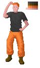 There's must be something wrong with this picture, but I can't put my finger on it. Can you help me out? |
Replies:
Posted By: Mr Special
Date Posted: 03 September 2011 at 2:44pm
Well you should probably try lowering your color count first of all. It looks like you have way too many. Also, although you're not really pillow shading, this could benefit from a more dramatic light source. You could also try upping the contrast. Hope this helps some 
NOTE: If you're unfamiliar with any terms, check out cure's thread that pretty much defines everything you need to know about pixel art. http://www.pixeljoint.com/forum/forum_posts.asp?TID=11299 - http://www.pixeljoint.com/forum/forum_posts.asp?TID=11299 |
Posted By: Mikhalych
Date Posted: 08 September 2011 at 12:14pm
Thanks for the tips!  I guess he looks better, but something still bothers me I guess he looks better, but something still bothers me And sorry for the late response. I recently have found a job, and most of my free time suddenly disappeared |
Posted By: Mikhalych
Date Posted: 27 September 2011 at 11:21am
Well, it's been a long time and no comments so far. So I tried to find out my own mistakes and made a small update of the picture.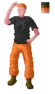 So please tell me how am I doing? |
Posted By: Melee
Date Posted: 27 September 2011 at 12:19pm
| I think the contrast could be upped a bit more (don't be afraid to hit too much-- you'll know to bump it down a little, then.) I think it also looks weird because his right arm (to our left) is too long in comparison to his left. Maybe if you tweak it, it'lll look better to you. :) |
Posted By: CELS
Date Posted: 27 September 2011 at 3:53pm
| I would get rid of the dark outline on the left side of the arm, or at least tone it down. Now, you have a light source on the left side, but the nose seems to be lit from the right side. I also think that the clothes are a bit "noisy" and that they would look more crisp if you would smooth them out and highlight the folds more carefully. It depends on whether you want to go for photorealism, but the face certainly does not look photorealistic. Lastly, the left forearm is much longer than the right forearm, and the right forearm is too straight of a line and doesn't show the shape of the muscles. |
Posted By: reis
Date Posted: 02 October 2011 at 7:31am
|
I think it's high-contrast, the anatomy is great. For the first pixel art is great. See this tutorial
http://www.yarrninja.com/pixeltutorial/ - So You Want To Be a Pixel Artist? |
Posted By: Mikhalych
Date Posted: 02 October 2011 at 9:46am
Thanks for the tips, guys!  I tried to correct his face, but failed. So I just partially covered it by his cap. Everything else is fixed (at least I hope so). member_profile.asp?PF=33718&FID=8 - luizfelipespr , thanks for the positive comment, but there was anatomical flaws which I didn't noticed before. Also thanks for the link, but I already had read it before :) |
Posted By: Melee
Date Posted: 03 October 2011 at 4:48pm
|
I think his head might be a little small for his body, but maybe it's just that his neck isn't very long. Or maybe the hat's just super close to his head. Not sure (then again, I'm super tied. :P)
Better arm for sure. If you address the "noise" CELS mentioned, you could probably eliminate some of the folds in the clothing-- mainly the shirt. (Generally you have folds, but probably not that many unless someone is drowning in cloth.) I like the alteration of the face/hat. |
Posted By: mase0ne
Date Posted: 04 October 2011 at 10:35am
|
His stance is slightly off-balance. Both legs are bent forward slightly, so both feet are in front of his center of gravity, meaning he'll fall backward. For proper balance, position one of his feet back a little bit. |
Posted By: Mikhalych
Date Posted: 10 October 2011 at 9:49am
|
I lost my count how many times I tried to redraw folds on his shirt. I guess it's called practice. Or maybe it's called: "Mikhalych didn't read tutorial How to draw clothes" :) Anyway, here's the picture.  |