Pixel Minions (AKA Hi Everyone)
Printed From: Pixel Joint
Category: Pixel Art
Forum Name: WIP (Work In Progress)
Forum Discription: Get crits and comments on your pixel WIPs and other art too!
URL: https://pixeljoint.com/forum/forum_posts.asp?TID=12880
Printed Date: 13 June 2026 at 1:15pm
Topic: Pixel Minions (AKA Hi Everyone)
Posted By: G[3z]
Subject: Pixel Minions (AKA Hi Everyone)
Date Posted: 04 September 2011 at 6:39am
|
Hi everyone, first post here!
i would like to show you some work i did in the past couple of days. I've started thinking of a game i would like to make Basically a 2d pixelated edition of http://en.wikipedia.org/wiki/Evil_Genius_%28video_game%29 - Evil Genius (wikipedia) with some nice twists These are the animations for the warrior minion Sprites are saved with 2x zoom because i will probably use them like that in the game    
what do you think of these ? be gentle ;) EDIT: I fixed the GIFs I think the problem was with dither/non dither settings. photoshop "save for the web" with 32b dithered preset solved the thing |
Replies:
Posted By: Hapiel
Date Posted: 04 September 2011 at 2:11pm
| I think you would have to look at your gif saving software why the frames are overlapping. Find the right settings or get some other software, this is terrible :( |
Posted By: G[3z]
Date Posted: 04 September 2011 at 2:25pm
|
these are made with sprite something for the iPad.
can you explain (or point me to a reading about it) this overlapping problem you see because, dumb me, i can't really understand what you mean. thanks |
Posted By: CELS
Date Posted: 04 September 2011 at 2:46pm
| We're seeing all the different frames on top of each other, instead of one at a time. Makes it hard to comment. |
Posted By: G[3z]
Date Posted: 04 September 2011 at 2:57pm
is this any better ?


|
Posted By: Hapiel
Date Posted: 04 September 2011 at 5:00pm
|
Don't worry, it does not mean that you are dumb! Yes, it is cool that you posted the single frames, but still the animation needs to be fixed. Have a look at the animations you posted here, instead of on your ipad software. You will notice there is something quite wrong with them! If not, it is more likely that your computer is displaying it differently from ours than that you are dumb. Onto the artwork: The character is okay, could use some work, especially on the colors but it is not nececary. Why did you choose to give his hair the same color as his body? I now do not know if it is hair or a cap of some kind. I would prefer pure black. You do however seem to need some help on the animation, but it would be easier for me to crisisize if the animations were fixed! In the meanwhile, you could make the red more interesting:  Good luck! |
Posted By: Qemist
Date Posted: 04 September 2011 at 5:53pm
|
we are seeing the frames on top of eachother because he made it transparant on the wrong way (or animated with software that didnt support it) Ive seen it before (actually had the problem myself) |
Posted By: G[3z]
Date Posted: 05 September 2011 at 9:46am
|
i did my homework and after some research i can say that you are all using firefox :P
i'll dig into that but, if you can, please open *any* other browser (i've tested IE, safari and chrome). i'll try to fix that. on the comments: i was trying to give them a faceless henchmen look like: 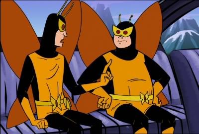
or 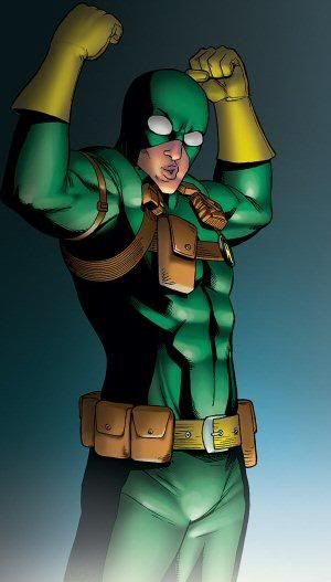
|
Posted By: Hapiel
Date Posted: 05 September 2011 at 4:30pm
|
Thanks for fixing the animations! Lets have a look at the animations. First one, I assume you tried to show walking? Walking animations are horrible to make, and hardly ever turn out how you want them to be. Yet just moving the legs back and forth a few pixels is not an option. I suggest you create 4 frames. On frame on the leg goes up, on frame 2 it goes forward, on frame 3 it goes down and on 4 it goes backward. Or something like that. The other leg does the same pattern but starts 2 frames later of course. Make his arms swing in opposite directions of the legs, don't be lazy and actually redraw the frames! Good luck! |
Posted By: G[3z]
Date Posted: 05 September 2011 at 8:40pm
before reading your comment i was trying to do this.

i made it in 6 frames, i'll work on the 8version... probably i'll change shades as in the test above or the legs will not be recognizable. i'll work on the arms too, thanks |
Posted By: Hapiel
Date Posted: 06 September 2011 at 8:33am
| Better! How about lifting the legs up? |
Posted By: G[3z]
Date Posted: 11 September 2011 at 8:21am
|
I had to much problem with the size of this guys so i decided to scale them up a bit. since these are the first sprites it has "no" impact.
here is the updated standing sprite: 
and the updated walk animation(still unshaded): 
animation is still 6 frames but it's not to bad...is it? anything to report ? |
Posted By: Hapiel
Date Posted: 11 September 2011 at 11:23am
Yes, he is still not lifting his legs as he walks so it looks more like he is kicking instead of walking... Not perfect either, but it shows what I mean by lifting the legs. ------------- |
Posted By: G[3z]
Date Posted: 11 September 2011 at 3:18pm
|
i did some edit to follow your suggestions,
it still need refinements, but i think it's much better, thanks: 
now it's 8 frame and the back leg is lifting |
Posted By: Hapiel
Date Posted: 11 September 2011 at 3:34pm
|
That worked out suprisingly well! Congratulations G3z! Right now I am tired, but how about we work on the colors tomorrow? ;) ------------- |
Posted By: G[3z]
Date Posted: 11 September 2011 at 3:44pm
|
Thanks! I'm glad to hear that!
I'll get back to work in 18 hrs, after ....uhm... Work :P Slapwel (my dutch sucks) Oh and i get that your dutch from the url on your sig. I'm no stalker :P |
Posted By: Qemist
Date Posted: 11 September 2011 at 7:30pm
| never noticed.. but it looks like hes actually a dutch.. dude.. :o no wai not another one |
Posted By: ChrisButton
Date Posted: 11 September 2011 at 8:36pm
| The trick to walk cycles is that you animate them moving across the screen, and once it works you just plop it all on the same spot for a cycling effect. |
Posted By: G[3z]
Date Posted: 12 September 2011 at 10:44am
I tired to follow Hapiel's color advices and i came up with this

here is the colored version 
I'm not really happy with these colors, too dark. i wanted a more saturated, cartoonish coloring. i'll keep experimenting |
Posted By: dpixel
Date Posted: 12 September 2011 at 2:16pm
Those colors seem fine. Made an edit to try'em out. I changed a few things around to give you more ideas. Also knocked the colors down to 11.
------------- |
Posted By: G[3z]
Date Posted: 12 September 2011 at 2:39pm
|
i love what you did there... it looks like a total different thing, i'll see what i can do with your suggestions.
but still i think the palette should be lighter/more saturated how about: from this to 
|
Posted By: Qemist
Date Posted: 12 September 2011 at 2:50pm
| yeah looks alot better with those colours |
Posted By: Hapiel
Date Posted: 13 September 2011 at 9:49am
|
Dpixel made a wonderful edit! Even more important than showing you pretty colors by doing a little hue shifting and lowering the saturation, he showed how this thing should be shaded properly. Think about the shapes before you randomly add light and dark pixels! Of course you can still do a lighter palette  ------------- |
Posted By: G[3z]
Date Posted: 15 September 2011 at 1:38pm
|
i tried a different coloring.
still long way to yours, i've always hated coloring since i was a kid and it shows :P 
|
Posted By: Lathien
Date Posted: 15 September 2011 at 2:02pm
| I really like what you've done with it so far. Especially the walk, it looks very militaristic which totally suits a minion. With this new coloring, I'd say you need to darken the yellow rim of the goggles on the bottom so that the color you have now becomes more of a highlight than a defining color, because right now it just kind of blends in and hurts the eyes to look at. |
Posted By: G[3z]
Date Posted: 15 September 2011 at 2:05pm
| thanks for your appreciation. i agree with you: goggles still needs work, also the skin should be fixed. |