CHALLENGE 9/5/2011: Last Light
Printed From: Pixel Joint
Category: Pixel Art
Forum Name: Collaborations/Challenges
Forum Discription: Submit pixel art project ideas/templates or contribute to an existing pixel art collaboration.
URL: https://pixeljoint.com/forum/forum_posts.asp?TID=12887
Printed Date: 14 June 2026 at 4:14pm
Topic: CHALLENGE 9/5/2011: Last Light
Posted By: administrator
Subject: CHALLENGE 9/5/2011: Last Light
Date Posted: 05 September 2011 at 12:01am
Replies:
Posted By: AirStyle
Date Posted: 05 September 2011 at 6:06am
|
can the candle produce sparks, then those sparks, in turn, create light?
How about the candle lighting other candles? Just want to cover all my bases, here... |
Posted By: Spherical Ice
Date Posted: 05 September 2011 at 8:39am
| Could it just be a candle? Or does it have to be a scene with little light (from the candle)? |
Posted By: greenee22
Date Posted: 05 September 2011 at 9:00am
|
Originally posted by Spherical Ice Could it just be a candle? Or does it have to be a scene with little light (from the candle)? I guess you could only make a candle... dunno if that's better though |
Posted By: showtime
Date Posted: 05 September 2011 at 9:13am
|
Would I be allowed to incorporate somebody using an aerosol spray to use the candle as a flamethrower, kind of like http://www.youtube.com/watch?v=P9jtzNAvWjg - this ?(Don't try this at home, kids!) Just for some context, my idea is kind of an elaborate one for an animation, and most of the time it would be just the candle lighting up the scene as you would expect it to... I'm pretty busy lately, though, so not sure if my brilliant idea will ever see the light of day. : ( |
Posted By: greenee22
Date Posted: 05 September 2011 at 10:08am
ok I started this: and I think I'm coming along pretty well (don't expect to win though =P) |
Posted By: baah
Date Posted: 05 September 2011 at 10:57am
|
First participation from me. I doubt i'll have the necessary skills to do correct lighthing but i'll try...  |
Posted By: Mrmo Tarius
Date Posted: 05 September 2011 at 11:24am
|
Haha greenee22, that looks exactly like what I've first tried to sketch for this challenge :)
I've since abandoned the concept, instead trying to make a portrait-type piece :P Will show WIP tomorrow (currently too unfinished to showcase) |
Posted By: greenee22
Date Posted: 05 September 2011 at 11:26am
|
Originally posted by Mrmo Tarius Haha greenee22, that looks exactly like what I've first tried to sketch for this challenge :) I've since abandoned the concept, instead trying to make a portrait-type piece :P Will show WIP tomorrow (currently too unfinished to showcase) .. lol i first wanted to do a portrait =P |
Posted By: maganegorap
Date Posted: 05 September 2011 at 2:33pm

Mario with fireball.Caricature!!! |
Posted By: GreyScale
Date Posted: 05 September 2011 at 3:00pm
|
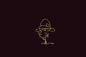
So I'm pretty new to pixel art (having only done maybe two things) and all, and am most comfortable working on canvases thousands of pixels tall and wide. I figured that I would like to try this challenge for multiple reasons: to practice pixel art, to work on more dramatic lighting, and simply because it sounds fun. While it's only a REALLY ROUGH oekaki (or whatever the term is) at the moment, I'm wondering if something like this is fine?  I was considering attempting to use the pallet in a previous challenge for practice restricting colors, and because I remember some really dramatic and cool-looking pieces when I was poking around. Any advice/help? |
Posted By: cure
Date Posted: 05 September 2011 at 3:09pm
| there are some pretty liberal interpretations of 'candle' here so far |
Posted By: CELS
Date Posted: 05 September 2011 at 3:17pm
|
No idea what you mean, cure. I often use sticks of dynamite to give my living room some nice, romantic atmosphere. It doesn't last very long, but for a few seconds, it looks great. |
Posted By: Chibiwing
Date Posted: 05 September 2011 at 3:58pm
|
CELS - XD
I have a really ambitious idea to try a dusty magical items store room with old mirrors so I can light a larger area. It's technically still a single candle.
|
Posted By: jeremy
Date Posted: 05 September 2011 at 9:39pm
|
Originally posted by Spherical Ice Could it just be a candle? Or does it have to be a scene with little light (from the candle)? since the challenge is literally to pixel a scene lit by a candle: yes. |
Posted By: CELS
Date Posted: 05 September 2011 at 11:55pm
|
Hm, this is odd. I would have thought Tarius would be finished by now :) Here's my WIP. Just posting a very early version, in case I've made some critical errors already. If I have, please be so kind as to point them out.   |
Posted By: Mrmo Tarius
Date Posted: 06 September 2011 at 12:43am
Here's that wip I said I'll be showing :)
...oops no, wait, that's the initial sketch :D Here's what I've done so far: 
That candle is like, BRIGHT :P |
Posted By: greenee22
Date Posted: 06 September 2011 at 12:59am
|
nice, mrmo, you're brilliant! here's another wip:  posting these is keeping me motivated =) |
Posted By: Chibiwing
Date Posted: 06 September 2011 at 1:34am
|
Mrmo... T_T
My wip (Galaga candlestick ftw):
 I ditched the magic based room for a retro gaming artifact room, though I like the idea of coming back later and replacing the items with similar magic stuff.
|
Posted By: Mrmo Tarius
Date Posted: 06 September 2011 at 1:55am
|
Chibiwing, keep on it. I like it because you've actually used contrast here :D
Here's some modified, creepy copypasta: 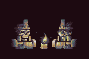
I'm trying not to use any references (though I have seen quite a few skulls in my time), thus the face&skull anatomy probably sucks. But who cares! :D *edit* added moustache because everyone should wear one. |
Posted By: baah
Date Posted: 06 September 2011 at 2:06am
|
Impressive work by you all... I especially like CELS' scene with the hooded figure, and Mrmo's texturing is brilliant, as usual! I updated the candle but maybe you'll be angry at me: i used PoV raytracer to make a cylinder, used a homebrew software to make 1x2 and 2x1 ordered dithering (H & V lines) then modified the result by hand. Is this way of doing accepted? |
Posted By: Chibiwing
Date Posted: 06 September 2011 at 2:08am
|
Halleluja! Thank you for the feedback. <3
Love that palette, hate that nose.
|
Posted By: Mrmo Tarius
Date Posted: 06 September 2011 at 3:00am
I thought this would be interesting to see:

|
Posted By: Chibiwing
Date Posted: 06 September 2011 at 3:11am
| Awesome... ;_; |
Posted By: a3um
Date Posted: 06 September 2011 at 7:34am
Temple of Wax. Chamber of the Last Candle. WIP:

|
Posted By: ThePixelKnight
Date Posted: 06 September 2011 at 9:59am
|
Some great WIPs here, I see Mrmo Tarius is showing off as usual lol. ;) Anyway here's my wip still in it's early stages but I'm getting there. :) Is a scene were a man is looking through a magnifying glass at a tiny man. |
Posted By: Cammymoop
Date Posted: 06 September 2011 at 9:59am
My WIP, loosely based off the ending of the book City of Ember.

|
Posted By: Alex Pang
Date Posted: 06 September 2011 at 1:49pm
|
@Mrmo Tarius his right shoulder looks to flat, otherwise good work :)
Btw, do you want to do a collab with me? =P |
Posted By: GreyScale
Date Posted: 06 September 2011 at 2:56pm
So...as far as colors go, which do you guys think looks better?  I'm thinking the higher contrast and saturation of the first, but maybe a bit more orange-y? I'm new at this. *bad with color choices* |
Posted By: fawful
Date Posted: 06 September 2011 at 3:12pm
|
make it brighter methinks. bring in more saturated oranges however i have absolutely no idea how colour works ------------- |
Posted By: Sublyme
Date Posted: 06 September 2011 at 3:44pm
|
I think i'll do a spellbook lit by a candle, if i have the time that is |
Posted By: PureAwesomeness
Date Posted: 06 September 2011 at 9:10pm
|
I told myself I wouldn't do another one for this week, but I just couldn't help it. :) Here's my very, very early WIP. The entire left side is unfinished, but I'm sure you can understand it. This would have been animated if I had the time, with stuff coming from both sides. Maybe after... 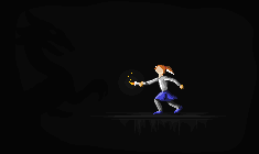 Oh, and you didn't specify that it had to be a normal candle, so there you go. (Don't go stealing my idea! I mean it! :) )  |
Posted By: wuhu
Date Posted: 06 September 2011 at 10:27pm
Here's my WIP, hope it fits into the challenge theme.   Going all Disney on this one. |
Posted By: Mrmo Tarius
Date Posted: 07 September 2011 at 3:10am
|
Updaet tiem!
*edit* final update for today, busy busy busy 
|
Posted By: ThePixelKnight
Date Posted: 07 September 2011 at 4:07am
|
Here's an update, I've now done the candle, table top and the tiny man, which I'm fairly happy with but needs a bit more work. @ wuhu Looks great can't wait to see it finished. :) @ Mrmo Tarius Just when I thought it couldn't get any better... Great work. :) |
Posted By: Crazy_Leen
Date Posted: 07 September 2011 at 5:44am
|
Holy cheesecake are you guys insane O_______O?! *feels like a 2 year old child with her work right now* Even your WIPs are looking better then my stuff X'D |
Posted By: CELS
Date Posted: 07 September 2011 at 6:56am
My latest WIP. Not huge changes, but there you go. PixelKnight: I really like the concept. Very fairy tale-like. And that table is gorgeous. Wuhu: Disney style ftw. Cool idea and nice facial expressions. However, the two closest candles seem to have slightly assymmetrical faces. Is that on purpose? a3um: Great idea. Looking forward to seeing the temple develop. Greenee22: Looks good, but I hope you're going to work more on getting more dramatic lighting. Specifically, the front of the robe will be a lot brighter than the rest, I assume. Chibiwing: Very nice colors and improved contrast :) |
Posted By: greenee22
Date Posted: 07 September 2011 at 6:56am
|
Originally posted by Crazy_Leen Holy cheesecake are you guys insane O_______O?! *feels like a 2 year old child with her work right now* Even your WIPs are looking better then my stuff X'D welcome to the internet =P practice makes perfect |
Posted By: ThePixelKnight
Date Posted: 07 September 2011 at 11:03am
|
Another update, I've got rid of the magnifying glass and given the big chap some specs which I think looks better. :) Oh yeah I increased the colour saturation a bit as well. @ CELS Thanks! :D the wood texture turned out better than expected. :) Yours is looking good too, I can see some arch like shapes in the background, will they be arches or something else? |
Posted By: CELS
Date Posted: 07 September 2011 at 12:53pm
|
Aww, I was looking forward to seeing how you'd solve the problem of the magnifying glass. Seems like it would have been fun to pixel, as it warps everything you see through it. And thanks. Yeah, those will probably be arches. I guess the character is in some kind of dungeon. The perspective was all wrong, I just put something up quickly.  Some further changes. I'm especially interested in feedback regarding the face. It's my first time pixelling a face at this scale. |
Posted By: Lathien
Date Posted: 07 September 2011 at 2:33pm
|
It's looking really good CELS, but I'd say you have too much shadow on the side of the nose closest to the lamp. You need to brighten up the bridge of the nose and blend the sides more so that they're not just straight lines. Also, you have a strange line on the lighter side of the face that I assume is a shadow of a cheekbone. This shouldn't be a thick line and shouldnt be so defined with that much light shining on the face. But it's looking really good and I can't wait to see it finished. |
Posted By: wuhu
Date Posted: 07 September 2011 at 8:13pm
 @PixelKnight : Thx man, a bit lost on what to do with the floor though, was thinking of attempting your wood effect coz it looks great @CELS : Thx man, the two candles in front are supposed to have their heads turned a little to the side. Yours is turning out great |
Posted By: Chibiwing
Date Posted: 07 September 2011 at 8:25pm
Update:
 Are there any obvious errors in shadow that I'm missing? The top half of the lock isn't done, by the way. And the inside of the lid is going to be mostly blocked by what I put into the chest.
Wuhu - The short candle's face looks like the annoying orange. It looks pretty choppy and I don't like that palette with the piece.
Cels - The style makes me think of flash animations. TPK - Love the wood texture. Mrmo - No words for the awesomeness. PureA - Like the swipe of flames and the descending floor shading. Greyscale - The more saturated one. More oranges still. Liked your original a lot more. Felix - Don't know about it, but the style is looking very rough; needs smoothing and added detail so I can see something happening without having to know ahead of time what it is. A3um - Looks way too awesome for just scribbly wipness. Looks like it'll be great. Greenee - Dislike the palette a lot. |
Posted By: wuhu
Date Posted: 07 September 2011 at 8:50pm
@Chibi : It looked like kung pow's http://profile.ak.fbcdn.net/hprofile-ak-snc4/50352_23311635441_1085274_n.jpg - tongue when i started out  . .Could you elaborate on 'choppy' do you mean jagged ? |
Posted By: Chibiwing
Date Posted: 07 September 2011 at 9:14pm
| Sloppy/choppy like the shadows are just thrown in wherever. It's just a matter of personal taste, but I don't like the Disney feel/style either. |
Posted By: PureAwesomeness
Date Posted: 07 September 2011 at 9:42pm
|
Okay, really long post! First of all, I don't think anyone noticed the shadow dragon in my piece. I'm not going to shade him in at all (since he IS a shadow creature) so should I perhaps darken him as well as making the outline transition smoother? The final piece is going to be an irregular circular shape instead of the rectangle, by the way. (Oh, and I'm not sure how I should do the girl's face. Should I just leave it, or somehow figure out a way to do a determined expression in a really small space? I mean, which would look better artistically?) And what else do you think I should have/add/change in terms of random details? --------------------- Also, here are my views on everyone's pieces so far! greenee: Pretty nice so far, I like how the candle casts sort of a circular area on the ground, but honestly, it's a wizard with a candle. There are a lot of things you could add, like a background, something to make it more exciting. baah: Ahahaha that's awesome! Not really a candle, but if you can finish it and shade it properly, it'll look wonderful! maganegorap: Looks a little rough, but then again, it's only your first draft. Keep going! GreyScale: I really like the idea! You should still make it so that he's obviously a candle, maybe put something large in the background along with a table, so that he appears to be the size of a candle. The first one looks better to me, but you should finish it off first so that there's the context to look at. CELS: I like it. :) The candle just looks a little small and sort of the wrong colour to be lighting up such a huge area, though. If you put something yellow-brown under a bright white light, you'll notice that it appears to become paler instead of retaining its saturation. Mrmo Tarius: Wow, nice! How long have you been doing this? Chibiwing: I like it so far. The candleholder needs a little more definition and/or contrast though, it seems a little flat compared to everything. a3um: This could definitely be one of those desolate, empty scenes with that one (maybe animated) candle flickering in the distance. Nice so far. ThePixelKnight: Love the wood texture. Gotta see this finished. Felix: I can't really tell what that is... Is it a rock, or a cave, or Stonehenge? wuhu: Cute picture. You should dither the ground instead, and maybe tone down the brightness of the candlelight. |
Posted By: GreyScale
Date Posted: 07 September 2011 at 10:09pm
|
Thank you both for the feedback! I did indeed go with the saturated one, and had already been planning to work in a lot more oranges through the flame and the light it casts. Sadly, he's not actually a candle, though that would be cool. *contemplates changing around the piece* >w> His hair was intended to emulate flame, though. The first piece is by no means any form of pixel art. I worked it with a canvas size probably twice that size and shrank it down so I could have my sketch done at a size I am more comfortable drawing. The actual concept is that he is lifting the flame away from the actual candle via magic. =n=;; Obviously I'm going to need to work to make that more obvious. For instance, here is my current progress (obviously the candle and the shading on the hands are just roughed in at the moment to see how the shadows should block in. I haven't gotten to the hair yet.  What with how I'm restricting my pallete, shading the hands so that they still are visible against the rest will prove quite the challenge. xD PA: Wow. There IS a shadow dragon there! o_o I totally missed that until you pointed it out, so you might want to up the contrast just a tad. It's a really cool idea, though. ^ ^ As for the face, it's all up to what you think you can accomplish. An expression could add a lot to the piece, but on the other hand could be a detriment if poorly executed. In the end, it's your call. ^ ^ And to ALL of you: OMG. You are so much more knowledgable in the ways of the pixel than I.  I'm sure they'll all turn out beautifully. I'm sure they'll all turn out beautifully.At the moment, the one that stands out to me most is obviously Mrmo Tarius'. I mean seriously. o_______o How fast do you work? And such pretty colors and wonderful shading and- But honestly, to all of you, just wow. *-* |
Posted By: Chibiwing
Date Posted: 07 September 2011 at 10:12pm
| I'm not sure I have the skill to alter the Galaga candleholder much more... ^_^' I noticed the dragon in the background. You won't be able to make it round because transparency isn't allowed for this challenge. |
Posted By: Mrmo Tarius
Date Posted: 08 September 2011 at 2:14am
|
I'd say I've been working on that scene for 5 or 6 hours now. The left character is a modified copypasteflip of the right one, tho. That saved me time! :)
@Chibiwing, I have made some edits to your piece, hope you don't mind. 
Quick list of the edits: -the shadow under the candlestick: a bit more accurate regarding the lightsource and shape of the thing (@wuhu, you might want to check the shadow under your candle-guy, too) -Galaga ship: specular highlights, moar contrast etc -table top: ultraquick specular stuff :D -chest face: some AA. also, stuff. @CELS: you might want to consider doing some AA and adding some pattern dihter to the robes. @PureAwesomeness, you might want to consider modifying the color of the candle lighting. Right now, your bright orange flame seems to produce a pure white light. @GreyScale and @TPK: I need to see your works finished! :D @a3um: MOAR WIPS PLZ |
Posted By: CELS
Date Posted: 08 September 2011 at 2:36am
Made slight changes everywhere.  Can someone please tell me how to improve the hands? I can tell that they're not good enough, but not sure how to fix them. Also not sure how to improve the lighting on the face. @Lathien: That's exactly the kind of feedback I was hoping for, so thanks a lot for that. I've tried to address some of the issues in the latest version. @Wuhu: I know they're turning to the side, silly. It's possible to tell whether or not a face is symmetrical, even if you're viewing at an angle. For example, the candle in the bottom right seems to have his entire mouth to the left of his nose. His mouth isn't wrapping around his candle-head, as you have done with his eyes. @Chibiwing: Looking good, but I think it looks a bit flat right now. I think the table should be somewhat brighter at the center than at the edges (except for the parts covered in shadow). Similarly, the closest edge of the chest should be brighter than the distant surfaces. @PureAwesomeness: I saw the dragon when you posted it, but I refrained from commenting because cure commented elsewhere that the challenge was to make something with a candle, not torches, fireballs or sticks of dynamite. And at the risk of sounding defensive, if my candle is too bright, you should take a look at your own nuclear-powered candle!  In my opinion, the whole idea of this challenge is to work with a single, weak light source. Saying "hey, this is a magic candle shooting a five foot flame" seems to go against the spirit of the challenge. In my opinion, the whole idea of this challenge is to work with a single, weak light source. Saying "hey, this is a magic candle shooting a five foot flame" seems to go against the spirit of the challenge.With that said, I've tried follow your advice to tone down the brightness of my own candle, and will continue to do so. I did experiment with decreasing the saturation on the robe, as you recommended. Let me know what you think. @Tarius: Thanks. I'll definitely be using more AA, and I've already tried to use some on the hood. I'm not very good at dithering, but perhaps I'll try using small amounts. |
Posted By: a3um
Date Posted: 08 September 2011 at 2:37am
|
@Wuhu - Great expressions :)
@Mrmo Tarius - Kinda weird RPG party :D @Chibiwing - nice, but I'd suggest add more contrast to define objects' volume. I made an edit to illustrate my point: 
1. Darken the background. 2 Brighten the metal highlights, made them almost white. 3, 4 added shadows to the lid and casing to define shapes, and make it pop out. 5. Darken the casing color on the shadow part of the chest. 6 Darken the bottom of candle so it doesn't look flat. Also, imo, those lines on chest are distracting from actual contrast and volume. I hope that will help :) UPDATE: Luckily, Mrmo Tarius made an edit regarding table stuff :D !emit etadpu, oslA 
|
Posted By: wuhu
Date Posted: 08 September 2011 at 2:54am
|
@Chibi yea.. i have to find out how to refine it @a3um thx man.. yours is looking great as usual @CELS ooooh thats what u mean |
Posted By: Mrmo Tarius
Date Posted: 08 September 2011 at 3:20am
|
Well, I submitted mine.
Also great edits there, a3um. And your piece is shaping up well, I love how the wax looks like... wax :D |
Posted By: baah
Date Posted: 08 September 2011 at 4:42am
Very, very impressive work by you all! 
Voting will be, as usual, very hard with only three choices.
Also, i tried to continue the head of my frightened guy, but everything's wrong. Let's face it I must get my hand on much simpler things before! So i leave the challenge... :(
If someone wants to take over the dynamite "idea", please do!
|
Posted By: CELS
Date Posted: 08 September 2011 at 6:07am
a3um, that's very awesome.  |
Posted By: ThePixelKnight
Date Posted: 08 September 2011 at 6:45am
|
Another update, Ive done the hand and most of the face. :) @a3um yours is looking great and I love the atmosphere, and I like the edits you made to chibiwing's wip. @ CELS Yours is looking great too, I like the perspective of the brickwork and the spooky eyes in the background. :) |
Posted By: baah
Date Posted: 08 September 2011 at 6:58am
| @CELS: i expected the hood to be left black, or showing only the eyes... |
Posted By: ThePixelKnight
Date Posted: 08 September 2011 at 8:15am
|
Another update, nearly finished. :) |
Posted By: Chibiwing
Date Posted: 08 September 2011 at 11:49am
|
You guys are epicly amazing; thank you soooooo much for the help! I have close to zero experience with shadow and I'm afraid of contrast, so this is extremely helpful. *ten billion hugs* Do I just use the edits or something, or how do I do this? I mean, I'm not, like, plagerizing or something if I use them, right?
I have so much left to do. -.- I'm planning on a Mario totem pole, a Zelda themed wooden staff, a Tetris mobile, and standing Pong mirror, and a Pacman round mirror that'll sit in the chest. All of this would be a lot easier if my tablet hadn't broken before I started doing pixel art.
|
Posted By: neofotistou
Date Posted: 08 September 2011 at 4:42pm
 Brilliant stuff you guys! Here's my WIP, a chiaroscuro scene, since candles are so ideal for these kinds of things. 17 colors. Any objections/crits? |
Posted By: Muiriled
Date Posted: 08 September 2011 at 9:49pm
|
Hi guys. can the candle fire magic missiles that when exploding creates fluorescent tubes that enlight the scene? :D Damn, the challenge is looking so normal now..
Anyways i'm not sure i'll have the time to end this for the challenge but here's the wip.  [/IMG] [/IMG]
Not so readable yet... |
Posted By: Chibiwing
Date Posted: 08 September 2011 at 10:17pm
| Looking cool, Mui. <3 |
Posted By: Muiriled
Date Posted: 08 September 2011 at 11:12pm
|
Man don't be discouraged like that, search for refferences when you don't know how to continue. and simpler things helps you to learn, but sometimes the complexes ones teach you faster. Also don't compare your work with the ones of people who may have many years working on graphics or even pixelart. compare it with your previous works and try to improve. I'm not seeing nothing wrong with your work except that the guy is holding a dinamite instead of the candle required in the challenge :D you can fix it easily by adding a candle to ignite it. anyways the wicks don't light almost anything. i'll see if i can find the time for a quickly edit but go trying something ;)
And sorry.. my english must stink.. |
Posted By: Muiriled
Date Posted: 08 September 2011 at 11:21pm
| Thanks chibi, your work is also looking very good so far. |
Posted By: CELS
Date Posted: 09 September 2011 at 12:19am
|
Muiriled, I'm very glad that you posted your early WIP in such an unpolished state, so I can learn how good pixel artists start their work process. Your use of colours is also very fascinating, I look forward to seeing the next update. The only things I would do different are the nostrils of the big creature. The nostrils are so big that they look almost like ears. It's a stylistic choice though. |
Posted By: drlemon
Date Posted: 09 September 2011 at 7:50am

My crap WIP, i think. I have no clue where to go with this. All your submissions are amazing. The only tool i have is MSpaint. Feedback, anyone?
|
Posted By: neofotistou
Date Posted: 09 September 2011 at 8:02am
| Sure, drlemon. Ok, if you have a candle in the middle of the room, which is brighest? The candle, which is the lightsource, or the room around it? Why is the candle yellow/red and its glow white? It makes no sense. Check photo references on the internet, and then come back and choose gradated colors, going from yellow to black. 4 or 5 should be enough |
Posted By: Alex Pang
Date Posted: 09 September 2011 at 11:19am
Ok I'm in looks like fun :D
 ack.us]ImageShack.us[/URL] ack.us]ImageShack.us[/URL]
|
Posted By: baah
Date Posted: 09 September 2011 at 11:40am
@Muiriled: thank you for your encouragments... I got again my hand on the image, but as i said earlier all in it is fake  : dynamite and "head" were made with the raytracer PoV, then dithered with a homebrew program and reworked a bit by hand. The background is also processed with my program. But you're right, even if it's disqualified for many reasons (dynamite whom i was quite proud of as a "last light", using programs...) i'll try to finish it. : dynamite and "head" were made with the raytracer PoV, then dithered with a homebrew program and reworked a bit by hand. The background is also processed with my program. But you're right, even if it's disqualified for many reasons (dynamite whom i was quite proud of as a "last light", using programs...) i'll try to finish it.You're also right when saying i should not compare with others' work, they are simply IMPRESSIVE (yours included)! |
Posted By: Night
Date Posted: 09 September 2011 at 3:00pm
I am probably not going to finish this, but w/e.

|
Posted By: Alex Pang
Date Posted: 09 September 2011 at 3:04pm
|
Woah!!!!
Awesome! |
Posted By: Geoglatico
Date Posted: 09 September 2011 at 4:49pm
this is my entry for the challenge, I hope to finish the time!

|
Posted By: AirStyle
Date Posted: 09 September 2011 at 4:57pm
| Flame look a little too small and subdued for the statue of liberty. From looking at the different WIPs here, I would say that the main focus should be the candle itself. Try to make the torch a little more outstanding: pull the focus back to the torch and off of lady liberty. |
Posted By: CELS
Date Posted: 09 September 2011 at 5:56pm
|
Baah, I love the latest version. Reminds me of Little Big Adventure. However, I don't know why you would use programs to the dithering. It seems to defeat the purpose of pixel art, if you're just applying a filter. |
Posted By: Night
Date Posted: 10 September 2011 at 1:27am
|
@Alex Pang Thanks. =)
Another wip.  , ,
edit* Never mind, I am probably going to finish it. :P |
Posted By: baah
Date Posted: 10 September 2011 at 2:59am
|
@LBPixels & Geoglatico: please do finish them! @CELS: thanks, and you're right about pixel art...  When trying to submit, one can read "6. Any art you post should be PIXEL ART! Pixel art implies that each pixel is placed by hand (no filters, paintbrushes, gradient fills, etc)." So my piccy just can't qualify for the contest and i have my answer, i'm not doing pixel art, sorry for annoying you. In fact, being a programmer i'm more into finding algorithms to imitate pixel art (my program is here: http://abrobecker.free.fr/fab/fab.htm - http://abrobecker.free.fr/fab/fab.htm and will be updated at the end of the WE). Seeing you all in action is marvellous though and i love what you do... |
Posted By: Muiriled
Date Posted: 10 September 2011 at 7:37am
|
@CELS: Thanks man, but i'm a newbie at pixel art yet, I just have some background in other graphic arts that helps me here. I need a lot yet to acquire an accuracy level such as Tarius for example. As for the colors I take as a base http://www.pixeljoint.com/pixelart/18395.htm - this work of tomic and added some others to fit my own insanity :D Also i'm a very disordered worker so i'm not sure that's the appropiate way to do it, but again thanks .I'm glad to receive such a comment for a skilled pixelartist like you. Your work is looking relly good so far too.
@baah: Hey your work is looking good. I don't know how raytrace works but i supose it makes the dithering thing. you can use it as a base for doing something by your own. As i say before 'search for some references' for http://www.pixeljoint.com/forum/forum_posts.asp?TID=11299 - dithering in this case. just keep in mind that giving up is finishing behind the last. other people won't but you'll know it and that's worst. Sorry i didn't had time to make some edit for you but i'm glad (and you may too) to see you don't really need it isn't it? I didn't had any time to pixel until just now. Anyways let me know if you need some help. So far the only thing i'd add in your work is a little bit more of lighting in the dinamite's corner as a spark's reflection. Good luck and keep the hard work! |
Posted By: Alex Pang
Date Posted: 10 September 2011 at 8:29am
|
Done
XD |
Posted By: baah
Date Posted: 10 September 2011 at 2:45pm
|
@Alex: very nice light effect!
@Muiriled: thank you for your encouragments. What CELS and you said is enough to cheer me up, but my work will be refused since it's no pixel art, so it's too late for this one piece of drawing... But the kindness/expertise found in this forum is enough to make me want to come back with real pixel art! :)
http://en.wikipedia.org/wiki/Ray_tracing_%28graphics - http://en.wikipedia.org/wiki/Ray_tracing_(graphics) don't do the dithering, my software does. The difference with other software is that i have fine control over what i'm doing and i can choose the dithering:
 1. nearest neighbourgs 2. random dithering 3. ordered dithering 2x1 (vertical lines)
4. ordered1x2 (hlines)
5. ordered 2x2 with classic pattern (Bayer)
6. ordered 3x3 with bubble matrix
7. ordered 4x4 with classic pattern
8. ordered 4x4 with diagonals
9. floyd steinberg (error diffusion)
10. stucki (error diffusion)
I used 2;3 and 7 for the picture above.
|
Posted By: Muiriled
Date Posted: 10 September 2011 at 7:14pm
|
@baah: Hey that looks like a good software. Will become handy for some people NOT AROUND :P
See you later then. |
Posted By: surt
Date Posted: 11 September 2011 at 6:15pm
Chances are I won't get this finished: ------------- 
|
Posted By: GreyScale
Date Posted: 11 September 2011 at 6:16pm
| Wow. I have to say I hope you do, because that's already very pretty. *-* |