Anatomy practice
Printed From: Pixel Joint
Category: Pixel Art
Forum Name: WIP (Work In Progress)
Forum Discription: Get crits and comments on your pixel WIPs and other art too!
URL: https://pixeljoint.com/forum/forum_posts.asp?TID=12950
Printed Date: 12 June 2026 at 3:06pm
Topic: Anatomy practice
Posted By: CELS
Subject: Anatomy practice
Date Posted: 13 September 2011 at 5:42am
Time to take a break from the weekly challenges and work on a long term project, where I have time to actually go back and change things.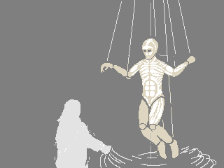 It's a big puppet, suspended in the air. I'm not sure how visible the anatomy will be in the final version, but I figure it'll be a nice exercise to draw the anatomy, even if I end up painting over it. Before I get too far, I'd appreciate any pointers, particularly if I've made some glaring errors already. I'm not concerned about getting a natural pose. In fact, an unnatural pose would underline the puppet-ness. But I do want it to be anatomically correct. |
Replies:
Posted By: Miumau0
Date Posted: 13 September 2011 at 6:30am
| He need shoulders, now its just a line going from point X to point Y. Arms are too short. If you imagine hair etc to the head its going to be enormous. So head is too big too. After making head smaller you got visible neck. To me, it looks more like mermaids tail than legs. Make space between knees and whole legs. |
Posted By: CELS
Date Posted: 13 September 2011 at 7:20am
Thanks! I see what you're saying, particularly about the head.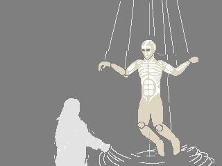 |
Posted By: onek
Date Posted: 13 September 2011 at 5:01pm
|
he looks very stiff...
the pose doesnt convey weight, it rather looks like hes floating the upper body is too short.. his left lower arm should be foreshortened the muscles on his torso are too 'symmetric' , and therefore look flat... should be foreshortened aswell his right upper leg seems too short heres an edit addressing some of these points 
thx ... was a good anatomy practice for me too ;D |
Posted By: Qemist
Date Posted: 13 September 2011 at 5:10pm
|
I love this forum!! who owns it so I can propose?? Anyways: Cool to see you're just going on and on Cels! Onek you put some good advise there totally dig the loose puppet alot more. I'm curious how you end up with this one Cels and dont forget those walking animations will arive soon with turning left and right upperbody  Quick tip edit: I just realised the person who's doing the ropes.. she stands in a position where the ropes never can be tight. Flip her horizontally and make the ropes go in the air.. like in a show if they where behind the scenes.. you know what I'm saying? I have a picture in my head where someone is standing up on a balcony doing it, but it needs to be in a different position to make the ropes tight and use the puppet?  |
Posted By: CELS
Date Posted: 14 September 2011 at 6:40am
|
Originally posted by onek he looks very stiff... the pose doesnt convey weight, it rather looks like hes floating the upper body is too short.. his left lower arm should be foreshortened the muscles on his torso are too 'symmetric' , and therefore look flat... should be foreshortened aswell his right upper leg seems too short heres an edit addressing some of these points Thanks so much for the edit. I've tried to address these issues, except that I didn't want its head to drop back lifelessly. The idea is really to do a suspended android, but to have him hanging by chains to evoke the image of a hanging puppet. But I do need the pose to convey weight, as you say.  Originally posted by onek thx ... was a good anatomy practice for me too ;D Hah! Glad to hear it. Originally posted by Qemist I love this forum!! who owns it so I can propose?? Anyways: Cool to see you're just going on and on Cels! Onek you put some good advise there totally dig the loose puppet alot more. I'm curious how you end up with this one Cels and dont forget those walking animations will arive soon with turning left and right upperbody Thanks for the support. To be honest, the last few challenges have been very good lessons for me, but they've put a stop to all my pet pixel projects, so it'll be good to work on something else. Looking forward to seeing those animations of yours. My inner child is filled with glee! Originally posted by Qemist
Quick tip edit: I just realised the person who's doing the ropes.. she stands in a position where the ropes never can be tight. Flip her horizontally and make the ropes go in the air.. like in a show if they where behind the scenes.. you know what I'm saying? I have a picture in my head where someone is standing up on a balcony doing it, but it needs to be in a different position to make the ropes tight and use the puppet? It's a good point, but she's not the puppeteer, she's just unraveling the hanging android. The latest edit shows this better, I hope. |
Posted By: mase0ne
Date Posted: 14 September 2011 at 7:17am
|
It's helpful to think of the chest and deltoids as one big muscle, as they're closely connected. The chest striations radiate out from a point near the armpit, instead of horizontally. The rest is looking good. |
Posted By: CELS
Date Posted: 15 September 2011 at 3:37am
Thanks mase0ne, that's a great point. It's something I was aware of, but should have done better in my last version.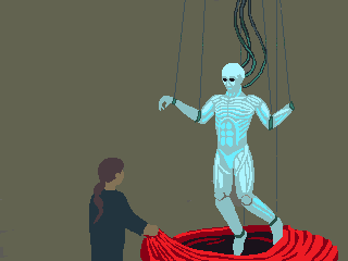 I've started thinking a little bit about the background in terms of composition. I'm not sure if I have the perspective right. I'm having difficulties determining the correct perspective based on the characters in the foreground. I'm also not sure if the background matches the foreground in terms of composition. Any advice as far as that goes? 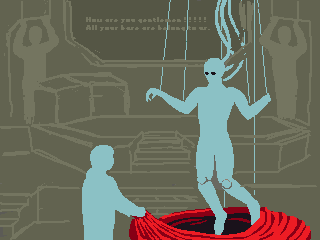 |
Posted By: onek
Date Posted: 15 September 2011 at 8:34am
|
compositon is a big thing to me so i cant resist to comment ;D
i think right now everything looks too much cramped together the space between the different layers isnt noticeable... a very important technique in, especially, painting is to draw 'air' to make distances perceptible, unlike early religious paintings or egyptian hyroglyphs which look very flat, almost like collages .... its hard to describe and there are diffrent ways to approach this, like convincing lighting/shadows.. proper perspective/ postions of objects in space, 'verblauung' [german] cant find the english word for this but http://c.e49.de/fotos/schaft/s010.jpg - here an example etc etc... your perspective for the background is ok... now it seems like the viewer is standing on a box or something since the motive has somewhat of a magician on stage feel i would recommend to put the horizon more down, like the viewer is sitting also the 2 characters should be more further away from the viewer, again to convey space, and to increase the stage like feel... heres another edit 
|
Posted By: Qemist
Date Posted: 15 September 2011 at 10:08am
|
totally agree on oneks space but personally I would have made the background diagonally (as in \ kind of fade) but oneks edit would work well too. |
Posted By: CELS
Date Posted: 15 September 2011 at 10:53am
|
Thanks onek, that's very helpful and it looks a hundred times better. Just give me a few days and I should have a new version ready. Qemist, I see what you're saying and I was originally going to show the background room from a different angle, to sort of create more depth and mystery of where this is going on. But ultimately, I was inspired by so much Warhammer 40,000 artwork (Google http://admintell.napco.com/ee/images/uploads/gamertell/horus_and_the_emperor.jpg - Horus Heresy and you'll see some of it) which indeed has (deliberate) similarities to religious paintings, as onek touched on. Very dramatic and theatrical scenes. |
Posted By: Qemist
Date Posted: 16 September 2011 at 12:17pm
|
damn cells that looks really good but because of the shading it gives it more of a diagonal background wich is what I was trying to say. So I guess its all about the left corner its depth (filled by a shadow) and the dark colours on the verry back of the piece. Cool stuff dude! I cant wait to see more |
Posted By: Miumau0
Date Posted: 16 September 2011 at 9:48pm
| I would make the other person slightly bigger. |
Posted By: CELS
Date Posted: 21 September 2011 at 1:25pm
|
Originally posted by Qemist
damn cells that looks really good but because of the shading it gives it more of a diagonal background wich is what I was trying to say. So I guess its all about the left corner its depth (filled by a shadow) and the dark colours on the verry back of the piece. Cool stuff dude! I cant wait to see more Thanks a lot. I know what you're saying. It would perhaps be more visually interesting, I guess I've just landed on this 'theatre' style presentation, for some reason or another. My muse is fickle :) Originally posted by Miumau0 I would make the other person slightly bigger. It's supposed to be a young girl. Still make her bigger? ------------- 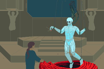 Here's another WIP. I am very open to any errors I have made in terms of perspective, and I'm very interested in feedback in terms of composition. |
Posted By: Miumau0
Date Posted: 21 September 2011 at 2:31pm
| if its child, its ok, if teen not ok. If its teenager or plus it should be bigger. Also her hand is weird :D |
Posted By: CELS
Date Posted: 23 September 2011 at 3:30pm
|
She's very much WIP, of course. Her entire figure is weird :) The anatomy of the background statues is obviously horrible at the moment. They're just temporary, to get a sense of the colours. 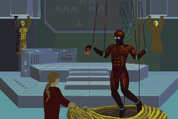 |
Posted By: Qemist
Date Posted: 23 September 2011 at 11:19pm
|
colours +1 space invaders = fav finished piece = gonna be amazing :D keep at it! nice stuff cells! |
Posted By: CELS
Date Posted: 24 September 2011 at 1:31pm
Thanks for your support, Qemist! Although I'm not sure the finished piece will actually have Space Invaders on them. :)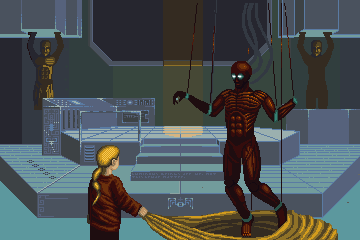 |
Posted By: Qemist
Date Posted: 26 September 2011 at 8:39am
| you should have some easteregg... :D |
Posted By: CELS
Date Posted: 27 September 2011 at 5:00pm
That's a good idea, actually. Can you find the easter egg? This first one should be pretty easy. There's also a Star Wars quote, which was already there. |
Posted By: Qemist
Date Posted: 28 September 2011 at 4:33am
|
Its probably less easy to find then you think, but I think its on the right and its a space invader that has the arm in the same position as the statue above it? Cool you did actually want to put in a easter egg thats less obvious then what you had before (the big invader screen). I really like how you are ending up. Really good colours on that android puppet thing. Keep up the good work! |
Posted By: Friend
Date Posted: 28 September 2011 at 1:06pm
|
reminds me of the final scene in bioshock |
Posted By: Melee
Date Posted: 04 October 2011 at 9:28am
| Not a whole lot of anything constructive to say; just that the emergence of this piece is fantastic. I love the shading on the puppet's "muscles." |
Posted By: Cyangmou
Date Posted: 04 October 2011 at 10:35am
| Is the anatomy of the android thing and the girl near to final? If it comes to the android I am asking myself if you are going more towards robotic or "naked" human design in terms of musculature. |
Posted By: CELS
Date Posted: 04 October 2011 at 4:40pm
|
@ Melee: Thanks for the words of encouragement. Just the boost I needed to keep working on this. @ Frost Butt: Never played it. @ Qemist:: Thanks! And yeah, it's an upside down space invader :) @ Cyangmou: Nothing here is final, I'm open for suggestions everywhere. Actually, I sort of wanted to have a human body with texture from the muscles, and then put some sort of machine parts over that. But I quickly realized that combining anatomy with the angular lines of machinery is a complete nightmare for a beginner like me. Perhaps I can do some organic machine parts, I don't know. I haven't found a robot that looks like I want this android to look. Here's the latest version. I thought the background looked rather flat and uninspired before, so I've tried to create some depth by shading. I'm probably going to spend months getting it right, but oh well. 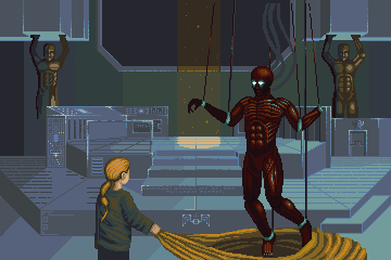 |
Posted By: onek
Date Posted: 05 October 2011 at 6:18pm
|
hey there again ;D
i like where u are going with the background... but still i think it has too much of a top down view feel. put the horizon lower the girl in the foreground is very emotionless... u should give her a more dynamic pose like some insane professor laughing in a thunderstorm the cyborg guy is too big compared to the girl and makes them seem to be on the same level and makes it look flat like a collage..put him more in the background to add more space and improve the compositon... the overall contrast is too high in my opinion. make the background darker also some more dramatic lighting would be nice i coulntd resist doing another edit ;) (..using dirty techniques and unholy NPA methods...) 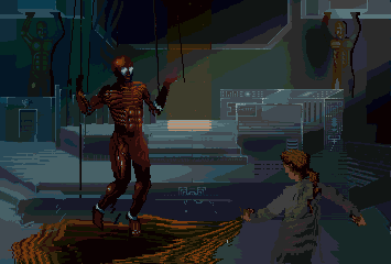
NOTE: its colored reduced and everything so palette management isnt on my account, but still this is just 32 colors, and, with manual clean up could probably be like 24 or so... urs was 36 colors, i think, so yeah , just to stress the importance of palettes once more |
Posted By: CELS
Date Posted: 05 October 2011 at 6:50pm
|
Originally posted by onek i coulntd resist doing another edit ;) (..using dirty techniques and unholy NPA methods...) "Unholy" seems to be the right word. I can't understand how you made that edit, except with some kind of pixel sorcery involving animal sacrifice. Thanks a million for the edit! I realize that in order to achieve the dramatic lighting and perspective you're suggesting, it'll be quicker if I just start over. But the light rays just look so good, it creates exactly the kind of adventurous and mysterious atmosphere I was going for. I will also change the girl's pose, so it looks more like she's pulling the curtain away in a rapid motion, like a magician, or like she's unraveling a birthday present. I think it's very interesting that you've flipped the image horizontally. I do think it looks good, but I wonder about the logic. After all, the eyes drift from left to right. The idea was that you'd first see a girl holding a curtain, and then move on to the android. But now, I'm wondering if people will notice the android first, and then go "Oh, and there's a girl in the dark on the bottom right". Which seems backwards. EDIT: And the colours.... the colours...  |
Posted By: Friend
Date Posted: 05 October 2011 at 7:47pm
|
I swear, Onek deserves a special trophy of his own for his edits. The darker colors really bring out the maturity of the piece. I think who is on which side is a matter of who you want to be the main character Having the android on the left makes me almost gasp on sight of the piece, and makes you connect more with the girl, because it is as if you are discovering it with her. This gives a sense of awe to the android, and a sense of familiarity with the girl. Having the girl on the left side gives more of a third person feel to it. "At last the girl unraveled the huge cloak to find just what she was looking for; the first true human robot." To conclude, I think having the robot on the left gives a stronger sense of shock and disturbance, whereas the reverse has a more literary, story-like feel to it |
Posted By: onek
Date Posted: 05 October 2011 at 7:52pm
|
Originally posted by Frost Butt
Having the android on the left makes me almost gasp on sight of the piece, and makes you connect more with the girl, because it is as if you are discovering it with her. This gives a sense of awe to the android, and a sense of familiarity with the girl. Having the girl on the left side gives more of a third person feel to it. "At last the girl unraveled the huge cloak to find just what she was looking for; the first true human robot." To conclude, I think having the robot on the left gives a stronger sense of shock and disturbance, whereas the reverse has a more literary, story-like feel to it well put! 
|
Posted By: Qemist
Date Posted: 06 October 2011 at 4:37am
| CELS can you please get to work and work on your piece until it has the same aspects as that edit?? WOW!! |
Posted By: CELS
Date Posted: 09 October 2011 at 2:39pm
Well, I've barely started version 2 of this piece. Trying to change the perspective and rework the lighting. It's quite difficult getting the colours right, as I'm not working with layers or anything futuristic like that.Still, I imagine it's a good exercise to do things manually, to understand how the colours blend together in such a complex scene with multiple light sources. It might end up taking a few months, but I've got time...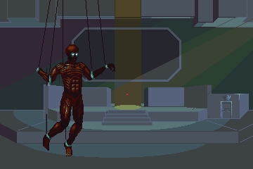 |
Posted By: mdog95
Date Posted: 09 October 2011 at 2:43pm
| I'm sure you've already pondered this, but you need to add a lot more contrast. |
Posted By: PixelSnader
Date Posted: 10 October 2011 at 12:05am
|
Is this supposed to be an actual anatomy study? Because the muscle groups and flow don't make much sense. Mostly the shoulder/chest - they are not parallel, but rather at a 90 degree angle with eachother. Your trapezius (triangle on the sides of the neck) muscles are also nearly non-existant. And keep in mind that between the serratus anterior (rib muscles) and abdominals there is a smoother flat space, the oblique muscle.
Here's some random reference:   
Also (though this might be a stylistic choice) your muscle fibers are far, far too separated and too high in contrast. Real muscles are relatively smooth do not nearly have as many ridges and grooves. You can think of the muscle tissues as wood: there's lines in the form of woodgrain, but overall it's pretty flat. The following link is not for the faint of heart: http://www.thedenverclinic.com/services/mangled/images/stories/Arm_crush_Intraop_prep_for_recon.jpg - http://www.thedenverclinic.com/services/mangled/images/stories/Arm_crush_Intraop_prep_for_recon.jpg ------------- ▄▄█ ▄▄█ ▄█▄ ▄█▄ |