WIP and C&C Dwarf Sprite
Printed From: Pixel Joint
Category: Pixel Art
Forum Name: WIP (Work In Progress)
Forum Discription: Get crits and comments on your pixel WIPs and other art too!
URL: https://pixeljoint.com/forum/forum_posts.asp?TID=13013
Printed Date: 12 July 2026 at 6:11am
Topic: WIP and C&C Dwarf Sprite
Posted By: fbepyon
Subject: WIP and C&C Dwarf Sprite
Date Posted: 24 September 2011 at 8:27pm
 Im trying to work on the animation as well  Walking Walking  Mining MiningThanks, FBEpyon |
Replies:
Posted By: skn3
Date Posted: 25 September 2011 at 4:52am
| hehe he is cool, you could get away with a few more frames of animation seeing as he is so small. Is he for a game? |
Posted By: fbepyon
Date Posted: 25 September 2011 at 8:19am
 Here is a quick mockup of my tile sheet and everything put together, and yes its for a game... |
Posted By: skn3
Date Posted: 25 September 2011 at 4:00pm
|
Hey that looks really cool! Where can I download it ;) I like the style reminds me of a game somone I know started making years ago (and never finished) called blobthing. |
Posted By: onek
Date Posted: 25 September 2011 at 6:03pm
|
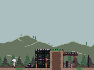
i would make the trees bigger to support the dwarf feel
maybe like so: 
also played with the colors a bit maybe a bit too much saturation and contrast because i forgot to darken those highlights on the dirt |
Posted By: fbepyon
Date Posted: 28 September 2011 at 1:09am
|
(Update) Took suggestion of onek, and increased the size of the trees..  I'm working on the game engine tomorrow.. Thanks... |
Posted By: reis
Date Posted: 02 October 2011 at 7:15am
| The trees were so good, but adds a few clouds in the middle of them. |
Posted By: fbepyon
Date Posted: 29 December 2011 at 1:56am
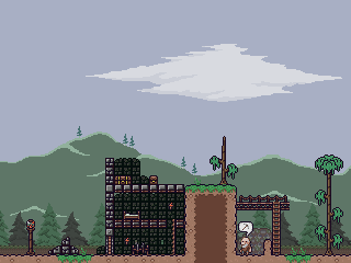
 *** UPDATED EDITS AND MOCK UP **** Hello all I wanted to post an update, Let me know what you think... Thanks, William Mc |
Posted By: fbepyon
Date Posted: 02 January 2012 at 2:11pm
|
Sorry for the double post... I wanted to give everyone a link to see the start of the engine i'm working on using the sprites.. http://www.fallenflames.net/flash/MonkeyGame.html LMB - Digs dirt from from ground Left/Right - Moves Terrain Let me know what you think and if anyone is willing to help me let me know.. Thanks, William Mc. |
Posted By: PixelSnader
Date Posted: 02 January 2012 at 9:56pm
|
So far the engine works smooth.
Art is decent but not great. You're missing some consistency in visual language, and parts are a bit flat (like the tree). Also, I think 16x16 is a bit small for a game like this, not because of the art, but because the elements take up so little space on screen and are harder to click. So I'd either use a bit larger sprites, or use them at 2x the resolution/pixel size. Have you got a good idea of where you want to take the gameplay yet? ------------- ▄▄█ ▄▄█ ▄█▄ ▄█▄ |
Posted By: fbepyon
Date Posted: 02 January 2012 at 11:33pm
|
Originally posted by snader So far the engine works smooth. Art is decent but not great. You're missing some consistency in visual language, and parts are a bit flat (like the tree). Also, I think 16x16 is a bit small for a game like this, not because of the art, but because the elements take up so little space on screen and are harder to click. So I'd either use a bit larger sprites, or use them at 2x the resolution/pixel size. Have you got a good idea of where you want to take the gameplay yet? I don't understand what you mean by "You're missing some consistency in visual language, and parts are a bit flat (like the tree)" As far as the game play I'm going for play similar to Sim Ant.. Battling other dwarfs and etc.. Well trying to max out your resources dug up from the ground. I was thinking of taking the tiles a different direction though. Anyways Thanks, William Mc |
Posted By: jalonso
Date Posted: 03 January 2012 at 6:29am
|
Sprite is sweet. I like the color sense onek used in his edit far better as it helps make the player sprite read better.
------------- |
Posted By: jalonso
Date Posted: 05 January 2012 at 8:10pm
|
note: the sprite sent back for revision was only cuz of the useless BG, k. Remove it, re-upload and resubmit (button at bottom of art page) not submit as new ;)
------------- |
Posted By: fbepyon
Date Posted: 19 May 2012 at 10:41am
|
Hello All, I haven't been around much because of work, and I wanted to see if anyone has anymore comments that they could give me.. Thanks |
Posted By: fbepyon
Date Posted: 26 May 2012 at 9:53pm
|
Sorry for the DP.. I'm needing more help on these, I'm looking for any major C&C PLEASE... The art is stopping me from going an further with the project and I would like to know where I need to improve.. 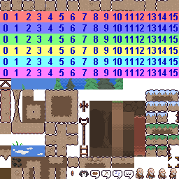 Thanks, |
Posted By: Cheetah
Date Posted: 27 May 2012 at 8:16am
|
Are any of the mockups you have posted current? The gradient backgrounds for the insides of the tunnels really don't work well, particularly for the larger areas. It looks like you have some rock textures in your tileset right next to the gradients, how do those look? Also you could use the candles to create light differences and break up the color monotony of the tunnels. |
Posted By: fbepyon
Date Posted: 28 May 2012 at 12:17am
| Thanks I have been working on that, but as of right now my main concern is color and style.. I have been looking up a lot on theory.. I have also gotten further on the game engine and hoping to post something as well about that soon.. |
Posted By: fbepyon
Date Posted: 02 October 2012 at 7:05pm
 I have been working on the graphics for a while and I was looking for new C&C. |
Posted By: Safouin
Date Posted: 03 October 2012 at 2:10am
| That's really nice ! Clean and beautiful. |
Posted By: Zeratanus
Date Posted: 03 October 2012 at 7:07am
| Needs some saturation. Not a big fan of everything looking so brown. I like the previous update's colors more :\. Looks good otherwise though. |
Posted By: fbepyon
Date Posted: 03 October 2012 at 9:38pm
 Here is a update on the graphics a bit of adjustments to the Saturation.. |
Posted By: Lehmure
Date Posted: 06 October 2012 at 6:28am
| Remember me a little bit of Terraria, i like it, but the sky could be more blue. |
Posted By: AirStyle
Date Posted: 06 October 2012 at 9:52pm
| Actually it reminds me of KAG: http://www.youtube.com/watch?v=EtVTOkkB2JM - King Arthur's Gold |
Posted By: fbepyon
Date Posted: 07 October 2012 at 8:21am
|
Well I haven't seen King Arthur's Gold until a week ago, and Terraria is okay.. King Arthur's Gold is based around King Arthur's World old SNES game (I own it) :P I have been playing around with the sky stuff for a while, but could never could find a good match. |
Posted By: fbepyon
Date Posted: 17 November 2012 at 11:38pm
|
Sorry for the double post, but I wanted to show you all some progress on the engine its self.. not much.. moving of the terrain and what not.. http://www.fallenflames.net/flash/MonkeyGame.html - http://fallenflames.net/flash/MonkeyGame.html Arrows move the map.. Thanks.. |
Posted By: tzen
Date Posted: 21 November 2012 at 12:03am
| I personally prefer the old, more contrasting character sprite and level tiles. I like the visible whites of the eyes, the white beard, and the more defined outline. These are really small sprites to have so much shading, and the little guy gets kind of lost in the background. |
Posted By: fbepyon
Date Posted: 16 April 2013 at 1:26pm
|
Hello All, Its been a long time, I have been working lots and having much time to go further with this, but I have been adding more to the graphics and game design. I should have more to show you tonight.. Thanks.. |
Posted By: fbepyon
Date Posted: 17 April 2013 at 10:06pm
|
Sorry for the double post on this one, but I was excited to show you the redo for the dwarf character.. much better I think now.. Let me know what you all think.. |
Posted By: Mishok
Date Posted: 17 April 2013 at 10:20pm
|
fbepyon, I like your pictures's style. And don't know what could be better there. )
Will it be the game? If yes, what is the idea of gameplay? |
Posted By: fbepyon
Date Posted: 20 April 2013 at 2:28pm
 Here is another sample of the game, its just a mockup.. But if you see I have the PIGGY!! |
Posted By: fbepyon
Date Posted: 21 April 2013 at 12:02am
|
Double post : I have made some attempts to animate the dwarf.. http://s270.photobucket.com/user/fbepyon/media/dwarf_walk_zps87ceebf2.gif.html">  I need some help with making look smoother.. or possible CC please |
Posted By: AteOneZero
Date Posted: 21 April 2013 at 5:32am
Maybe you should bounce his head a little so it has a more natural walking look. Something like this, maybe? It's a rush job, you can probably do better, but you get the idea.

Edit: Woops, some of the outlines got mixed into the other frames. Might be my settings. |
Posted By: fbepyon
Date Posted: 21 April 2013 at 10:31am
http://s270.photobucket.com/user/fbepyon/media/dwarf_walk_zpsfdcb4300.gif.html"> Major improvement thanks AteOneZero It might need some more work, but its getting somewhere.. |
Posted By: Mr.Fahrenheit
Date Posted: 21 April 2013 at 3:19pm
| Swing the arms, rotate the hips and shoulders if you can, maybe even the head. |
Posted By: fbepyon
Date Posted: 23 April 2013 at 10:21am
|
Okay so I fixed some of the walking, let me know what you think now.. Thanks. http://s270.photobucket.com/user/fbepyon/media/dwarf_walk2_zps63811081.gif.html">  |
Posted By: Hapiel
Date Posted: 24 April 2013 at 7:30pm
|
Nice, but why are his arms hanging in the air for 2 frames when the left arm is in front? In the other direction it looks fine.
------------- |