Some kind of monster / fantasy scene
Printed From: Pixel Joint
Category: Pixel Art
Forum Name: WIP (Work In Progress)
Forum Discription: Get crits and comments on your pixel WIPs and other art too!
URL: https://pixeljoint.com/forum/forum_posts.asp?TID=13195
Printed Date: 30 December 2025 at 8:20am
Topic: Some kind of monster / fantasy scene
Posted By: CELS
Subject: Some kind of monster / fantasy scene
Date Posted: 18 October 2011 at 7:05pm
|
Drawing this monster here, inspired by a monster from http://www.youtube.com/watch?v=0y8F0dQM1DI - Castlevania (at 00:40) and the Beauty & the Beast, and one of http://www.pixeljoint.com/pixelart/58287.htm - Theoden 's pixel art pieces. I'm really not sure what I want to do with this. I want to leave the face obscured, but it might be boring to just do a silhouette. Time will tell. 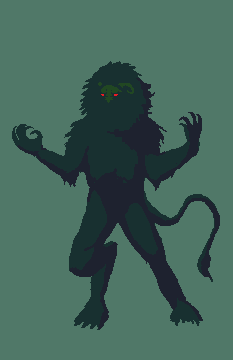 The pose is kind of a primal "rawr, I'm gonna eat you" thing at the moment. Not quite howling at the moon, but in the same vein. |
Replies:
Posted By: mdog95
Date Posted: 18 October 2011 at 7:08pm
| It looks good for a start. I recommend organizing your palette by hue, saturation, value, red, green, and blue though. It makes it easier to work with. |
Posted By: CELS
Date Posted: 18 October 2011 at 7:10pm
| Thanks. The palette is just leftovers from my gameboy piece, which I forgot to edit out, it doesn't really have anything to do with this. |
Posted By: mdog95
Date Posted: 18 October 2011 at 7:15pm
| Oh, okay. |
Posted By: onek
Date Posted: 19 October 2011 at 4:04am
|
ur quite improving
i like the colors as they are... the eyes stand out nicely against the green anatomy is kinda of tho... the feet should be further apart now he doesnt seem very balanced his left arm should be foreshortened more hips and shoulder slightly angled and less straight 
|
Posted By: Alex Pang
Date Posted: 19 October 2011 at 6:06am
|
Good work, the only thing I don't like is the left hand it seems unfitting...
|
Posted By: Sahrab
Date Posted: 19 October 2011 at 7:35am
| too hairy :P i saw some place a monster like this the neck part was a bit darker with more a coat fell to it |
Posted By: onek
Date Posted: 19 October 2011 at 7:42am
|
@ Sahrab
thats no critic, just a matter of taste it doesnt matter what YOU saw somewhere.. and if CELS picture looks anything like it O_O if he wants it hairy its his choice... id say make it even more hairy! :D |
Posted By: Sahrab
Date Posted: 19 October 2011 at 8:04am
| again you misunderstand me im just saying i saw a design with a coat like fur didnt say YOUR SUCKS MAKE THE ONE I SAW im just saying i saw this guy somewhere quote cels castlevania 40:0 :) and too hairy was supposed to be a joke hence the monster being like a werewolf and the :P |
Posted By: CELS
Date Posted: 19 October 2011 at 7:24pm
|
Thanks for your comments, guys :) Onek, your edit is as useful as always. I've tried to follow your suggestions, with a few modifications. He may be slightly out of balance still, but I wanted the pose to be dynamic and imply a sense of motion like the monster is bursting out of the shadows, rather than standing still and howling at the moon. I hope the compromise looks alright. The only thing I left untouched is the right arm, as I feel the extended arm looks more threatening. The shoulders are fairly square (i.e. we're seeing him from the front, not the side), so I figure the arm should be pointing to the side. I tried to fix the legs, the hips and the left arm. 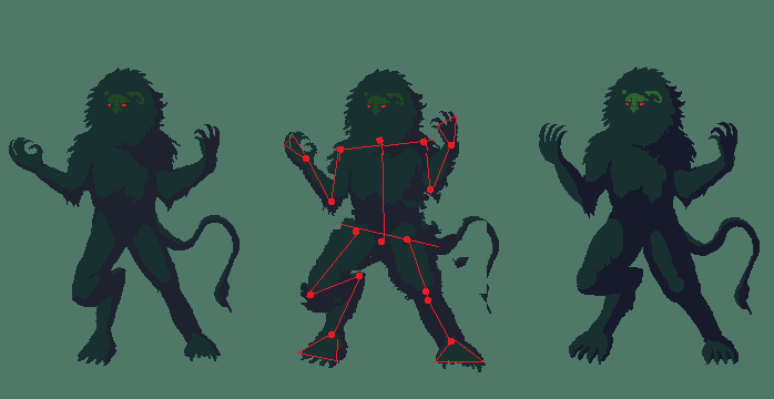 I may shrink this image to 50%, so I can do a nice background without spending weeks. My last image was so big that it got sloppy towards the end, and I lost pixel control. 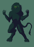 |
Posted By: onek
Date Posted: 19 October 2011 at 7:31pm
| hooray for shrinking! |
Posted By: Friend
Date Posted: 19 October 2011 at 7:38pm
|
For some reason, the face looks the awkward to me. It's like, at an improper angle compared to what angle I imagine his neck to be at.
And, just saying, you have 3 WIP's :^ ] (mwahaha) |
Posted By: CELS
Date Posted: 19 October 2011 at 7:47pm
"The worst"? That's an interesting way of putting it.  I will do more work on the face, but I don't quite understand what you mean. The shoulders are square and the face is roughly in the middle, slightly to the left (as it's looking slightly to the left). How would you have me change it? At the moment, I have 3 WIPs. All my previous 7 or 8 WIP threads have resulted in gallery submissions. I think that should be alright.  |
Posted By: Friend
Date Posted: 19 October 2011 at 8:00pm
|
Gah I didn't mean it like that!! I dunno.. Maybe it's where it's sitting in the big ball of fur.. It's like you should be seeing much more of the right horn, and his face should be slightly to the right and down. Maybe I'm just looking at the silhouette incorrectly
K I think I know what's wrong now. You have the huge puff of fur around his face in a very round shape and symmetrical position that really suggests that his face is straight forward portrait style , but his face is drawn to be looking off to the side |
Posted By: CELS
Date Posted: 19 October 2011 at 8:50pm
|
Ah, that's what, I thought you meant. Hopefully others can voice their agreements or disagreements, because I don't quite see what you're seeing. As I see it, the face is not in a symmetrical position, it's quite a few pixels to the side already. I may be wrong though, or there may be another problem. 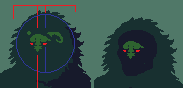 WIP background: 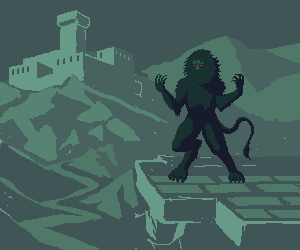 (I know the perspective is FUBAR, it's just for an idea of composition) |
Posted By: Sahrab
Date Posted: 20 October 2011 at 4:50am
| got a idea maybe you well like it maybe put a flashlight ( not sure the name) the ones from prisons etc poiting towards him ? giving it nazi experemints feeling ? just an idea |
Posted By: CELS
Date Posted: 20 October 2011 at 6:10pm
|
Originally posted by Sahrab got a idea maybe you well like it maybe put a flashlight ( not sure the name) the ones from prisons etc poiting towards him ? giving it nazi experemints feeling ? just an idea Thanks, but I'm going for a fantasy / medieval thing, not nazi experiments :) 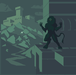 |
Posted By: Sahrab
Date Posted: 22 October 2011 at 4:38am
| bunch of lights with torches ? and one of them pointing at the beast ?? |
Posted By: Sahrab
Date Posted: 22 October 2011 at 9:13am
| ^ meant knights |
Posted By: reis
Date Posted: 22 October 2011 at 4:56pm
| Liven up monster, more colors, more detail. I know this is a technique, but to innovate. |
Posted By: Alex Pang
Date Posted: 23 October 2011 at 2:39am
| Lover the saturation on the monster, it pops out to much, it looks like hes on totally different plane(level(layer))... |
Posted By: Partack
Date Posted: 23 October 2011 at 3:58am
|
Great work so far but I noticed a few things that I'd like to point out if I may.
The edit to the leg with the red dots showed the hind leg on the left going more upwards/diagonal than you have edited it to. you made the top rather flat and still looks awkward to me. kinda like, |_ Your edit / | . '/ red dot edit (if that makes sense) The beast still looks..... I don't know.. calm.. Like.. it's just standing there with its arms up for some reason. The anatomy is great but the pose is .. not so much. Perhaps you might consider flexing the beasts muscles a little more to give the arms being raised more purpose? or clenching its claws/fists to show some power or anger? the beast looks muscular which is why I suggested the flexing. Based on your background (very nice by the way - great perspective and sizing) the beast is standing on a building but its left foot is kinda... askew/awkward looking. Perhaps you might consider bending it at the heel? like a _/ and if you do that perhaps you could give it/show a back claw (imagine a chickens foot which has 3 front claws and a back claw) kinda how your beasts foot is but with a back claw. the beasts face reminds me of a yeti's which is awesome I love the bushyness. Perhaps you could give the thick bushy mane a bit more depth somehow? shadowing perhaps in strategic places? maybe suggest where the chin is with shadowing. or not. it's nice how it is really. The beast's brow could perhaps use a LITTLE more definition with a darker tone on the left side to show it protruding OUT of the bushy hole and give it depth and also maybe use that same darker tone on the inside outline of the mane to show the manes depth against the face (showing the face is INSIDE this hole of a bushy mane) or, if the face is protruding OUT of the mane then use that dark colour (or a highlight colour actually, if there is a light source hitting it) on the whole left side of the face to show it protruding OUT of the mane's hole. all this and maybe give the beast toe nails? (just an after thought.) Just throwing out ideas and brainstorming with fresh eyes =) good luck! |
Posted By: CELS
Date Posted: 23 October 2011 at 5:22am
|
Thanks for your comments, guys :) Originally posted by Sahrab
bunch of knights with torches ? and one of them pointing at the beast ?? Thanks, but at the moment I'm really looking for things like compositional errors, anatomical errors, etc. It's always good with some input, but comments like "draw a dinosaur", "throw in a zeppelin in the sky" or "make him into a pirate" isn't what I need at the moment. My problem isn't a lack of ideas, it's the inability to carry out my ideas. Originally posted by luizfelipespr
Liven up monster, more colors, more detail. I know this is a technique, but to innovate. It's still an early WIP, so adding more colors and details is a given. Originally posted by Alex Pang Lover the saturation on the monster, it pops out to much, it looks like hes on totally different plane(level(layer))... Again, this was just an early mock-up to get a sense of composition before adding details and fixing colors. Originally posted by Partack Great work so far but I noticed a few things that I'd like to point out if I may. The edit to the leg with the red dots showed the hind leg on the left going more upwards/diagonal than you have edited it to. you made the top rather flat and still looks awkward to me. I'm not quite sure what you mean. If I draw his leg more diagonal, then his stance will be very broad. Is that better? Originally posted by Partack The beast still looks..... I don't know.. calm.. Like.. it's just standing there with its arms up for some reason. The anatomy is great but the pose is .. not so much. Perhaps you might consider flexing the beasts muscles a little more to give the arms being raised more purpose? or clenching its claws/fists to show some power or anger? the beast looks muscular which is why I suggested the flexing. I see what you mean about it being calm. It's an usual pose, I suppose, as it's clearly doing something, but it's hard to get a sense of what it is exactly. If his head was leaning back, I think it would be very clear that it was howling like a werewolf, for example. And I'm going for something similar, just without the howling. It's just showing off. Originally posted by Partack Based on your background (very nice by the way - great perspective and sizing) the beast is standing on a building but its left foot is kinda... askew/awkward looking. Perhaps you might consider bending it at the heel? and if you do that perhaps you could give it/show a back claw (imagine a chickens foot which has 3 front claws and a back claw) I see what you mean and I've tried to fix it. Of course, it doesn't really have a heel in the same sense as humans do. Its "heel" is as high up as its knee. The back claw was a good idea. The monster is clearly inspired by lions, but I don't want it to look like a lion-man. Originally posted by Partack the beasts face reminds me of a yeti's which is awesome I love the bushyness. Perhaps you could give the thick bushy mane a bit more depth somehow? shadowing perhaps in strategic places? maybe suggest where the chin is with shadowing. or not. it's nice how it is really. The beast's brow could perhaps use a LITTLE more definition with a darker tone on the left side to show it protruding OUT of the bushy hole and give it depth and also maybe use that same darker tone on the inside outline of the mane to show the manes depth against the face (showing the face is INSIDE this hole of a bushy mane) or, if the face is protruding OUT of the mane then use that dark colour (or a highlight colour actually, if there is a light source hitting it) on the whole left side of the face to show it protruding OUT of the mane's hole. How's this? 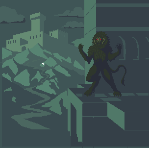 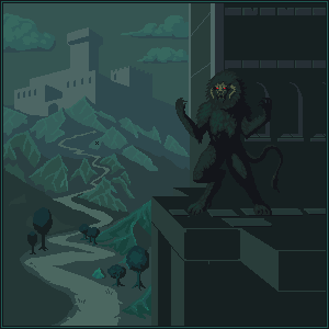 Haven't really worked out the horns yet. Will need to shade them better. Originally posted by Partack
all this and maybe give the beast toe nails? (just an after thought.) Just throwing out ideas and brainstorming with fresh eyes =) good luck! Will definitely work out details like toe nails eventually :) Thanks for your help, it's exactly the kind of feedback I need the most. |
Posted By: Friend
Date Posted: 23 October 2011 at 10:03am
the horns make perfect sense now. You're getting so good! I know it's very much WIP, but I think I prefer the hue to be more purple though-fits the mood a little better, and somehow makes the detail in the face and horns easier to see |
Posted By: Partack
Date Posted: 23 October 2011 at 10:52am
|
I think I've got what bothers me about the leg bend, ignore what I said before about it, I believe the bend should be lower. Looking at dogs legs gives you an idea of how it should look, the foot (if you can imagine) would be like a dogs toes and that mid-bend is actually it's ankle. So pretend you're drawing a human foot that's bent
like: | _/ and you might get what I mean.. I kinda preferred this creature with its mouth concealed in it's mane.. ok running out of time so I'll just make a quick sloppy edit and you can get what I mean. not saying you should do any of these, just saying , take a look at them, see if you like any of the ideas. 
will post back later. |
Posted By: Cyangmou
Date Posted: 23 October 2011 at 12:04pm
| Background castle seems to be to big (destroys the depth) and out of the perspective |
Posted By: CELS
Date Posted: 23 October 2011 at 5:06pm
|
Originally posted by Frost Butt the horns make perfect sense now. You're getting so good! I know it's very much WIP, but I think I prefer the hue to be more purple though-fits the mood a little better, and somehow makes the detail in the face and horns easier to see Thanks! I see what you're saying, and I agree that it creates nice contrast, but the green colours were a conscious choice because blue is more realistic. I wanted this to look more alien and mysterious, like a fairy tale. Also, I like to work with different colours and I've already done something in a blue / purple background (the tower above the clouds, don't know if you remember) Originally posted by Partack I think I've got what bothers me about the leg bend, ignore what I said before about it, I believe the bend should be lower. Looking at dogs legs gives you an idea of how it should look, the foot (if you can imagine) would be like a dogs toes and that mid-bend is actually it's ankle. So pretend you're drawing a human foot that's bent Ah, I see what you're saying now. Actually, I absolutely agree with you. The leg looks much better now. I was imitating werewolf art, you see, and they're often drawn with this silly long legs. As for the clenched fists, I think this makes it look like more of a yeti / human monster, and not so beastlike. Claws make it scarier, I think. Even if the clenched fists make the pose seem more natural. Originally posted by Partack
I kinda preferred this creature with its mouth concealed in it's mane.. Actually, I very much agree with this. I just couldn't for the life of me figure out how to leave so much of its face concealed whilst adding more depth and detail to the head and body. If you look at the reference I used from the Castlevania trailer, it's basically just a silhouette with glowing eyes and a visible brow / nose. Would it be better to just leave it a silhouette? Originally posted by Cyangmou
Background castle seems to be to big (destroys the depth) and out of the perspective Hm, you're right about the size. It really annoys me when I don't consider such obvious things. But I'm not sure about the perspective. This is the first time I've drawn a perspective drawing with vanishing points, where the walls of the buildings weren't parallel. So I did some research on drawing perspective with different angles and found this. http://www.ski.org/CWTyler_lab/CWTyler/Art%20Investigations/ART%20PDFs/TylerTwoPointHoropter.pdf (Page 3) I tried to imitate that, like this. 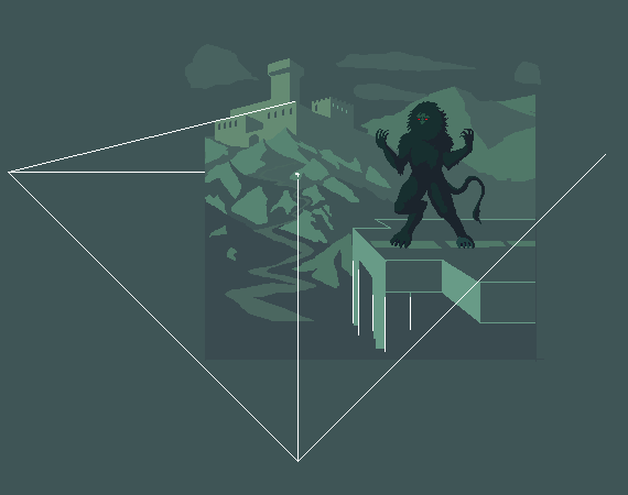 |
Posted By: Friend
Date Posted: 23 October 2011 at 5:15pm
yes, duh I remember. I'm interested on what time of day the piece is meant to be in though. I'll just wait and find out. DON'T SPOIL THE SURPRISE.  |
Posted By: Cyangmou
Date Posted: 24 October 2011 at 4:53am
jus of course you are right with the vanishing points, the position of them is right, but in this case you have to be consequent with your lines too. Check out some of the castles angles and especially the angle of the two square column things beneath the monster. The thing which is bugging about the castles size is that the tower itself seems to be bigger than a single mountain. THe small foreground trees'd fit in terms of size exactly to the castle, but the castle is further away then the trees. I'd sugest to increase the size of the trees in the foreground while decreasing the size of the castle. Furthermore it could be interesting adding perspective with more trees with always getting smaller to the castle. Also for the hills the size increasing and decreaing with the perspective would be a goold idea, also for the path. I played a bit further around with it just because I had the feeling there is something which really bugs me, e.g I changed the resolution (made it higher) and mirrored the whole thing. After the mirroring I reminded that the central perspective is leading away the watcher's eye from the monster right back to the castle (which gets now pretty important) and I think that this isn't rather good for the whole composition if you want to have the attention at the monster. The black background behind the monster decreases the readbility of it drastically, and it gets even lesser important. I think the composition of the piece has huge priority issues caused by the perspective as it is now.  left one has some of the things in it I reminded, but you won't see most of the composition issues as clear as in the right one. I guess you should really think about the composition and maybe redo all of to get the right composition. Or you could use the background with the castle as single piece (this'd work very well) and use the monster in some other illustration. |
Posted By: Partack
Date Posted: 24 October 2011 at 11:51am
|
Hay what happened to this post? I couldn't see it on page 1 any more.. just a quick note, I think you're right about the claws. They're much better pointing out, I like them more today than I did yesterday. do what you feel with the face hole in the mane, I think it was great before all the shading. those creepy eyes peering out from a bushy hair ball thing.
Glad you liked the leg, good luck with the perspective. my vanishing point stuff is pretty terrible so I wouldn't have been able to point that out nor can I comment on it. hope to see this finished sometime 
|
Posted By: CELS
Date Posted: 25 October 2011 at 1:00am
|
Originally posted by Cyangmou
jus of course you are right with the vanishing points, the position of them is right, but in this case you have to be consequent with your lines too. Check out some of the castles angles and especially the angle of the two square column things beneath the monster. Thanks, you're quite right, although some parts were just shoddily drawn. My WIPs are a bit messy.
Originally posted by Cyangmou The thing which is bugging about the castles size is that the tower itself seems to be bigger than a single mountain. THe small foreground trees'd fit in terms of size exactly to the castle, but the castle is further away then the trees. I'd sugest to increase the size of the trees in the foreground while decreasing the size of the castle. Furthermore it could be interesting adding perspective with more trees with always getting smaller to the castle. Also for the hills the size increasing and decreaing with the perspective would be a goold idea, also for the path. I agree on all counts. :)
Originally posted by Cyangmou I played a bit further around with it just because I had the feeling there is something which really bugs me, e.g I changed the resolution (made it higher) and mirrored the whole thing. After the mirroring I reminded that the central perspective is leading away the watcher's eye from the monster right back to the castle (which gets now pretty important) and I think that this isn't rather good for the whole composition if you want to have the attention at the monster. The black background behind the monster decreases the readbility of it drastically, and it gets even lesser important. I think the composition of the piece has huge priority issues caused by the perspective as it is now. Yes, it's quite bad and suffers from the fact that I was trying to draw a background around a creature shaded in a way I don't understand. I mean, the nearest building was just there as an attempt to make sense of the near silhouette form of the monster, but it doesn't really work in terms of composition, as you say.
Originally posted by Cyangmou left one has some of the things in it I reminded, but you won't see most of the composition issues as clear as in the right one. I guess you should really think about the composition and maybe redo all of to get the right composition. Or you could use the background with the castle as single piece (this'd work very well) and use the monster in some other illustration. You're quite right. I'll do the latter. I'll try to finish the background first and then come back to the monster. Though I have no idea what kind of background is needed to make sense of the way it's shaded. It's basically a silhouette, except that the nose and brow is lit by some strange light source. I could draw it without a background, of course, but I really want to figure this out. Bah!
Originally posted by Partack Hay what happened to this post? I couldn't see it on page 1 any more.. just a quick note, I think you're right about the claws. They're much better pointing out, I like them more today than I did yesterday. do what you feel with the face hole in the mane, I think it was great before all the shading. those creepy eyes peering out from a bushy hair ball thing. Glad you liked the leg, good luck with the perspective. my vanishing point stuff is pretty terrible so I wouldn't have been able to point that out nor can I comment on it. hope to see this finished sometime Thanks for finding the thread again, I guess the forum was scrambled after some spam bot. Hopefully, I can finish the monster again soon and restore it to the original vision without trying to find a compromise that works with this background.
|
Posted By: Partack
Date Posted: 25 October 2011 at 1:22am
|
Perhaps you're over thinking this, CELS. When I draw anything, I generally wanna get the lineart/general shapes of stuff done first. The shading and light comes after and even then it's just a matter of having a quick think about where the light is coming from. Pick a spot for your light source(s) and their colour, then *boom* that's all you need really.. I admire your diligence though on wanting to do this 'properly' and looking at every aspect. Were it me I'd have drawn my beast, drawn the background on a separate layer (layers still count as pixel art ;P) then based on the scene shaded and coloured and be damned to thinking too much into it.
Everyone has their own style and methods I guess. 
|
Posted By: CELS
Date Posted: 25 October 2011 at 9:08am
|
Originally posted by Partack Perhaps you're over thinking this, CELS. When I draw anything, I generally wanna get the lineart/general shapes of stuff done first. The shading and light comes after and even then it's just a matter of having a quick think about where the light is coming from. Pick a spot for your light source(s) and their colour, then *boom* that's all you need really.. I admire your diligence though on wanting to do this 'properly' and looking at every aspect. Were it me I'd have drawn my beast, drawn the background on a separate layer (layers still count as pixel art ;P) then based on the scene shaded and coloured and be damned to thinking too much into it. Everyone has their own style and methods I guess. I appreciate the input. I'll try not to over think things from here on out 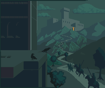 Another WIP. Note that I haven't really fixed the castle or hills yet. |
Posted By: Gecimen
Date Posted: 25 October 2011 at 3:49pm
|
The castle is not too big but the tower inside it is too high for that perspective. There's a problem with the monster's hip. It's too high. Its abdomen looks just under his chest. |
Posted By: Partack
Date Posted: 25 October 2011 at 4:17pm
|
love the army peoples and the crows =) castle could use a little more detail (dunno how though =<) I'm loving the choice of colours for your shading by the way. The purples and blues and greens are all coming together nicely.
'Tell you what, that one cloud up in the top right kinda bothers me.. I don't know why but it could be a little more whispy or something.. it looks like a picture/cardboard stuck ontop of your sky or something. maybe it's the dark shadow going along the bottom? maybe the clouds shape? I hate you cloud and I don't know why! 
|
Posted By: CELS
Date Posted: 27 October 2011 at 7:28am
|
Originally posted by Gecimen
The castle is not too big but the tower inside it is too high for that perspective. There's a problem with the monster's hip. It's too high. Its abdomen looks just under his chest. Agreed on the castle. Thanks for the comment on the monster, I will take a look at this. Originally posted by Partack love the army peoples and the crows =) castle could use a little more detail (dunno how though =<) I'm loving the choice of colours for your shading by the way. The purples and blues and greens are all coming together nicely. 'Tell you what, that one cloud up in the top right kinda bothers me.. I don't know why but it could be a little more whispy or something.. it looks like a picture/cardboard stuck ontop of your sky or something. maybe it's the dark shadow going along the bottom? maybe the clouds shape? I hate you cloud and I don't know why! Thank you! I agree on all counts. I have tried to draw the clouds in a different way. I could improve on the original design, but I think I prefer it something like this. 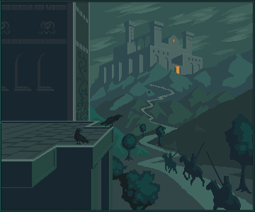 Also, http://1.bp.blogspot.com/_anqVy8b414Q/SF_XI8s4fRI/AAAAAAAAAcE/z33cDExnR0o/s320/oldmanyellsatcloud.jpg - this . |
Posted By: jalonso
Date Posted: 27 October 2011 at 8:08am
|
I think the clouds are too linear and follow the angle of the castle too closely. Try loose and flowy. Kinda like the bottom tree is but introducing circles and arcs into the composition. Perhaps the sky should only use gray colors and almost blend with the castle to introduce mist/fog/mystery???? Of course the castle at about 60-70% of the current size would make the mountain range more imposing and properly weighed in. ------------- |
Posted By: Gecimen
Date Posted: 27 October 2011 at 1:26pm
|
Not defying what Jal has said but all around I like the castle/clouds/hills. The front building looks like a modern one. Maybe lots of cracks etc. would make it look better. |
Posted By: CELS
Date Posted: 28 October 2011 at 6:21am
|
Originally posted by jalonso
I think the clouds are too linear and follow the angle of the castle too closely. Try loose and flowy. Kinda like the bottom tree is but introducing circles and arcs into the composition. Perhaps the sky should only use gray colors and almost blend with the castle to introduce mist/fog/mystery???? Of course the castle at about 60-70% of the current size would make the mountain range more imposing and properly weighed in. I didn't even consider the direction of the clouds, it just seemed to fit. I've tried something more loose and flowy with arcs, also tried to introduce a bit of fog. I have kept the castle rather large, for my own mysterious reasons. Same as my previous large castle pixels. Originally posted by Gecimen Not defying what Jal has said but all around I like the castle/clouds/hills. The front building looks like a modern one. Maybe lots of cracks etc. would make it look better. Well, cool to get a second opinion. Maybe if this doesn't look good, I'll try to find a compromise. I was already planning to do the front building as ruins, so stay tuned for that. (I'm just putting it off as it's going to be complicated to do rubble in perspective) 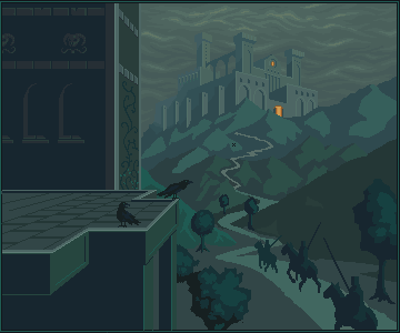 Notice the general lack of progress, except for the clouds and castle tweeks. That's because I lost a good 3 hours of work due to my laptop falling to the ground. Does grafx2 have an autosave option?  |
Posted By: jalonso
Date Posted: 28 October 2011 at 6:37am
|
If the castle is the size you like and wish to keep then the mountain below it needs some attention when coloring and detailing so they visually fit each other. Something between the mountain and castle seems disproportionate to me. The sky looks better but is still on a flat 2D plane. I think a sky that adds depth will help the piece. I know its touting my own piece but check http://www.pixeljoint.com/pixelart/13147.htm# - THIS sky and http://www.pixeljoint.com/pixelart/23563.htm - THIS one for pieces that have skies that add depth using very few colors. ------------- |
Posted By: Gecimen
Date Posted: 28 October 2011 at 7:40am
| http://www.pixeljoint.com/pixelart/55112.htm - This is an old crappy piece of mine. It might be a reference for bricks. |
Posted By: CELS
Date Posted: 28 October 2011 at 12:00pm
|
Originally posted by jalonso If the castle is the size you like and wish to keep then the mountain below it needs some attention when coloring and detailing so they visually fit each other. Something between the mountain and castle seems disproportionate to me. I agree in regards to the color and detailing. Will fix that. Originally posted by jalonso The sky looks better but is still on a flat 2D plane. I think a sky that adds depth will help the piece. I know its touting my own piece but check http://www.pixeljoint.com/pixelart/13147.htm# - THIS sky and http://www.pixeljoint.com/pixelart/23563.htm - THIS one for pieces that have skies that add depth using very few colors. You may not believe this, but I was actually already using those two very images as a reference. I tried the latter first, but couldn't imitate it very well, then tried to imitate the sky from the factory level. While mine isn't as pretty, I'm sure you'll see a slight resemblance. The problem is, I'm not sure how to achieve depth whilst still keeping the misty, foggy feeling. If I create too much contrast in the clouds, then the air will seem clear, right? And how can I achieve depth without creating more contrast in hue and brightness? Originally posted by Gecimen
../pixelart/55112.htm - This is an old crappy piece of mine. It might be a reference for bricks. Another one not afraid to promote his own work I'm just kidding, that's actually very helpful. I'll post later tonight with some progress.EDIT: Remind me never to pixel again without using a defined palette from beginning to end. Just spent an hour trying to rearrange my mess of a palette into something half-sensible. Also made some minor changes here and there. Will now address the bigger issues. <rolls up sleeves> 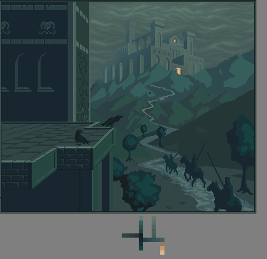 |
Posted By: CELS
Date Posted: 29 October 2011 at 4:56am
|
Started reworking the closest building as ruins, to increase the ominous feeling I'm trying to achieve here. I'm starting to like this now. It's got a Diablo-feeling about it. I hope I can get that across somehow. Now to rework the hills, trees and sky. 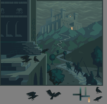 |
Posted By: Gecimen
Date Posted: 29 October 2011 at 9:58am
| The one yesterday looks in the right direction. The latest one looks more like construction more than ruins. Can't put a hyperlink so this is how a ruined brick wall looks like: http://en.wikipedia.org/wiki/File:St_Andrews_Cathedral_Ruins_Front.jpg |
Posted By: Delicious
Date Posted: 29 October 2011 at 4:26pm
| I agree with Gecimen on that. However, so far this is really awesome. Make sure to do some drastic shadows on those crows and riders. Keep up the excellent work. |
Posted By: CELS
Date Posted: 29 October 2011 at 5:45pm
|
Thanks for your help, guys. I definitely see your point about the construction look. Hopefully, these new changes are a step in the right direction. Will probably need to add more rubble, moss and cracks, and also some discoloration. Will definitely be adding some dramatic shadows in time! 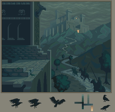 |
Posted By: Delicious
Date Posted: 30 October 2011 at 2:06am
| Definitely better. I feel as though the blocks at top stand out because of their outline, which makes them stand out and seem like they're just being constructed rather apart of the building as a ruin. |
Posted By: CELS
Date Posted: 30 October 2011 at 5:05am
 Tried to improve a bit on that. Will continue to work on the ruins. Right now, I'm just flicking around, adding shade, shadows and details. Maybe put some more trees in. I feel that the horses' anatomy could be better, but I can't find good reference pictures to help. It's a rather unusual angle, so Google isn't of much help. If there are some other errors I've made, please don't be shy. :) |
Posted By: Qemist
Date Posted: 30 October 2011 at 5:11am
The perspective.. it really made it all feel weird to me when I was looking at it. :)
|
Posted By: Cyangmou
Date Posted: 30 October 2011 at 5:35am
|
@Quemist: perspective is right, we don't have use a simplified cavalier projection here, CELS works with vanishing points, it's ok. |
Posted By: CELS
Date Posted: 30 October 2011 at 5:42am
|
With that said, I do feel that the gargoyle on top needs to be reworked. Not the part that you've highlighted, but the shape of the head itself. I'm not sure if it's the perspective or what. But yeah, I'm pretty sure that the buildings are in perspective. The rest, I don't know. The mounted knights might have the wrong perspective, I don't have enough experience drawing such things from different angles.  Added some windows to the ruins, I feel it gives the picture more air and unity. The composition doesn't feel like two separate halves like it did before. |
Posted By: mase0ne
Date Posted: 30 October 2011 at 11:27am
| I like it better with the peekthroughs on the taller building, but now the buliding seems too thin to be habitable. Maybe a wall of columns or a facade of some type could give you the same effect. |
Posted By: CELS
Date Posted: 30 October 2011 at 12:27pm
|
Thanks. Of course, the perspective makes it seem extra thin, but I've gone and added some extra pixels in depth so it appears to be a functional building rather than a wall. Also made some changes to the trees, added a few shadows and worked a bit more on the hills. Hmm, some of those trees are really too big, now that I think about it. Will fix. 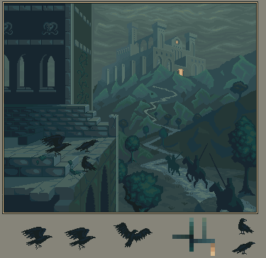 |
Posted By: Partack
Date Posted: 30 October 2011 at 2:28pm
|
Hey =) me again ^__^ LOL @ Simpsons picture.. Very fitting
So I love the new clouds, detail of the castle, the detail of the bricks, the crows.. it's a big improvement for sure =) I don't have enough time to critique properly right now but something that popped out at me was that bright vertical line on the bottom. Not too sure but I think it's contrasting with the light of the wall connected to it on the left which has a darker shadow.. they're the same angle so they should have the same lighting right? maybe the bricks are rounded so maybe the top of the bricks should be lit to the same brightness at least? Maybe make the bricks outline protrude slightly too if they're rounded, we're looking at them from a 3/4 angle so we should be able to see their outline I think? Don't know if I'm making myself clear.. sorry, gotta run. Good luck , looking great!
|
Posted By: CELS
Date Posted: 30 October 2011 at 2:43pm
|
Thanks! Good point about the bright line. I used to paint miniatures and it has left me with a bad habit of wanting to add bright lines to all the edges of things, even in pixel art. Here's the latest version with a number of small tweaks and adjustments. I've spent way too much time on this piece over the last few weeks. If I don't submit it to the gallery soon, it's going to absorb my life. Suggestions for last changes are still welcome. 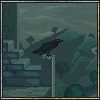 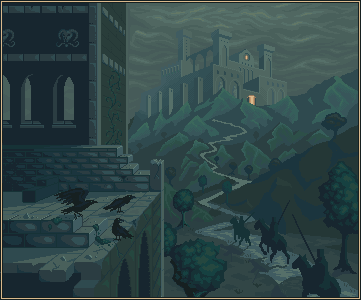 |
Posted By: snowk
Date Posted: 30 October 2011 at 6:28pm
|
cant wait to fave this! i know it might be a bit early to talk about color, but it might be cool to see some hue variation in there.
------------- -Snowk |
Posted By: Cammymoop
Date Posted: 30 October 2011 at 8:11pm
|
This looks really cool.
as far as suggestions, (even though I'm hardly qualified to be giving any) the clouds look kinda flat they could use some perspective. Let me explain with a picture: 
</tenseconddrawing> Your clouds look like they're perpendicular to the view (on the left), while they would really be much closer to parallel with the view. Anyway it looks really great, makes me wish I had more time to draw stuff >_< |
Posted By: CELS
Date Posted: 31 October 2011 at 12:48am
|
Originally posted by snowk
cant wait to fave this! i know it might be a bit early to talk about color, but it might be cool to see some hue variation in there. Thanks! I assume you mean 'late' rather than 'early'. And yeah, I've pretty much settled on the colours now. It's a stylistic choice where everything is shades of blue and green to give the piece a kind of ominous, sickly feeling. Maybe it would look better with some brown and purple in there, but... I'll do that next time. Originally posted by Felix20 This looks really cool. as far as suggestions, (even though I'm hardly qualified to be giving any) the clouds look kinda flat they could use some perspective. Let me explain with a picture: </tenseconddrawing> Your clouds look like they're perpendicular to the view (on the left), while they would really be much closer to parallel with the view. Anyway it looks really great, makes me wish I had more time to draw stuff >_< Hmm, I didn't really understand what you meant at first, but as I was thinking about it in the shower this morning (see what I mean about pixel art absorbing my life? ) I think I got it. I will make some changes later today.And yeah, I wish I had more time to draw stuff too! So many ideas, so much to learn. |
Posted By: Cyangmou
Date Posted: 31 October 2011 at 2:46am
|
I see tons of unused potential in this piece, if you think that you worked to long on it put it away and come back to it later. The hardest thing is always that you see the things for yourself. For me the picture doesn't really seem finished. I also don't know why you spend that much time with the foreground ruins instead of working at the really important parts, like the knights, the castle and the generall illusion of depth. The left side of the the building adds nothing to the image (I am talking of the part from the first gargoyle head to the boarder, you could delete it and it wouldn't hurt the image). As I said in my earlier posts the sky could use some more place, at the moment the castle looks squeezed in there a bit, 10-15 px + height would rather help. Then there is the perspectivic issue with the sky which were pointed out a few times and there is the same thing with the midground hills. They have the same size as the further away ones. The crow in the preview looks rather good for me, but I asked myself why don't only add that one in the image to have a small detail in there which is kind of fun and delete the other ones. The three crows you have in there have the same problem like the monster you added there before, they are unimportant, but seems to be the best outworked things. Also tweaking the anatomy and the shape of the knights and adding there the most detail would help a lot. The trees looks like candyfloss, not rather outworked, just like a rough wip. Also the path in the middle of the image looks like a loveless placed line. The atmospheric thing which could add a lot to that piece is fog. Fading away the castle into the of and placing it also between the mountains really helps, but that could be done as last step, if all other things are set down. And the next thing is to add some AA. At the moment you don't added any AA and this destroys the completely image. You usual add AA and details when the forms are OK. But Your biggest problem seems to be the majority problem. If I am looking at the image I see a castle in the fog and knights riding to it. That seems also to be the idea. If we are looking at the sentence we see "castle" and "knights". The castle seems to be outworked (except of AA and some things whhich could be solved better with lighting and shading) and the knights seems to be completely unfinished. Working out the ruin is nice, really, but it doesn't really help to make the painting better because it's simple unimportant (as I said earlier in the post). It adds a little bit to the atmosphere, but isn't a very important part for the idea and that's the reason for the building. Why not working out the most important stuff at first and after this you can play around with the unimportant stuff as long as you want. Adding new objects after the composition is done is always a really bad idea (e.g. like the 3 crows), make sure that you concentrate on the stuff you placed before and you are spending time with this. The piece itself as it is now will get maybe a place in the weekly showcase. If you'd work very hard on it I can easily imagine that it'd be a monthly top piece but that requires a seriously amount of work. P.S.: forgot to mention that you have perspectivical problems with the backwall windows and with the window ledges of the foreground windows. |
Posted By: onek
Date Posted: 31 October 2011 at 4:03am
|
-everything what cyangmou said-
tried to apply some of his points 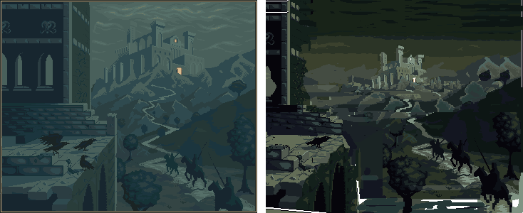
the castle this far back and small totally changes the feel of this picture and actually i like the overpowering feel of ur original much more... but yeah i wanted to show howu can illustrate more depth... the castle doesnt have to be THIS far back... keep working on this i really think u made lots of progress and this definitely has potential |
Posted By: CELS
Date Posted: 31 October 2011 at 6:57am
|
Originally posted by Cyangmou
I see tons of unused potential in this piece, if you think that you worked to long on it put it away and come back to it later. The hardest thing is always that you see the things for yourself. For me the picture doesn't really seem finished. I also don't know why you spend that much time with the foreground ruins instead of working at the really important parts, like the knights, the castle and the generall illusion of depth. Thanks for the feedback! Perhaps I'll take a break for a while and come back to it, as you say. To answer your question about why I focus on certain things, I just work with anything I see as lacking. If I don't understand how to improve something, I don't work on it. I'm still very much a beginner and I have limited amounts of time to work, so I don't like to just work by experimenting blindly. Which is why I keep coming back to this forum, rather than just posting stuff to the gallery immediately.
Originally posted by Cyangmou The left side of the the building adds nothing to the image (I am talking of the part from the first gargoyle head to the boarder, you could delete it and it wouldn't hurt the image). As I said in my earlier posts the sky could use some more place, at the moment the castle looks squeezed in there a bit, 10-15 px + height would rather help. Well, originally the left building was only there to create shadow for the monster. But now that I have begun to ponder the new meaning of the pice (in my childish, amateur ways), I'm thinking that the symbolism that I'm trying to communicate is about death. Three knights, three ravens (and I believe having two different groups of objects with the same number is usually a compositional no-no, as it's something the eye picks up on) and the fact that they're riding through a valley covered in shadow. You know, the whole valley of death thing, with the ruins and the vultures.
I guess the point of the building is to add shadow and create contrast. The left side of the piece is darkness, ruins and vultures. On the right side you have the knights, riding towards some sort of goal. There's a life and death dualism there.
Again, I'm very much a beginner when it comes to these things. I'm sure it's all very banal and cliché. But one has to start somewhere, right?
I will create more space though, as you say.
Originally posted by Cyangmou Then there is the perspectivic issue with the sky which were pointed out a few times and there is the same thing with the midground hills. They have the same size as the further away ones. Right. I'm not quite onboard concerning the hills, but I will look at it.
Originally posted by Cyangmou The crow in the preview looks rather good for me, but I asked myself why don't only add that one in the image to have a small detail in there which is kind of fun and delete the other ones. The three crows you have in there have the same problem like the monster you added there before, they are unimportant, but seems to be the best outworked things. I don't really feel that they're unimportant though. But I'm glad you like them. I could draw a single raven, but that would make the whole left side of the painting even more empty.
I do understand that the composition of the painting isn't ideal. After all, it was drawn around a monster and then the monster was removed. So if the suggestion is "why don't you remove this half and redraw everything on the other half", then I might as well start from scratch. Or draw something else entirely
Originally posted by Cyangmou Also tweaking the anatomy and the shape of the knights and adding there the most detail would help a lot. Agreed. If anyone has any suggestions, that would be much appreciated. As I said already, I think it's hard enough to draw horses, let alone doing it from this perspective.
Originally posted by Cyangmou The trees looks like candyfloss, not rather outworked, just like a rough wip. Also the path in the middle of the image looks like a loveless placed line. Alright, I'll look at this.
Originally posted by Cyangmou And the next thing is to add some AA. At the moment you don't added any AA and this destroys the completely image. My point of view is that AA isn't really something that must be done in pixel art, but I do agree that it would look good here.
Originally posted by Cyangmou You usual add AA and details when the forms are OK. But Your biggest problem seems to be the majority problem. If I am looking at the image I see a castle in the fog and knights riding to it. That seems also to be the idea. If we are looking at the sentence we see "castle" and "knights". The castle seems to be outworked (except of AA and some things whhich could be solved better with lighting and shading) and the knights seems to be completely unfinished. Cool. If you have specific ideas, I would appreciate it. "Could be better" is nice, but it leaves me with no direction.
Originally posted by Cyangmou Adding new objects after the composition is done is always a really bad idea (e.g. like the 3 crows), make sure that you concentrate on the stuff you placed before and you are spending time with this. As above, this piece is rather special in that it wasn't planned from the start. So yeah, I agree that it's better to have a plan and purpose for the composition before you start and that it's difficult to change sentral pieces underway. It goes without saying. Originally, the focus was a monster, and there were neither knights nor ravens. But if I remove those now, then I'm basically left with a dull, empty scene.
Originally posted by Cyangmou The piece itself as it is now will get maybe a place in the weekly showcase. If you'd work very hard on it I can easily imagine that it'd be a monthly top piece but that requires a seriously amount of work. I have no such aspirations yet, but I appreciate the vote of confidence (with the caveat of needing a serious amount of work). My gallery is filled with pieces that are unfinished, but I just feel that as a beginner, it doesn't seem like there is a point in spending several months on a single piece. Maybe I have the wrong attitude, but it just feels more appropriate to get some experience before I commit to a piece like that.
Anyway, I do appreciate your crushing feedback, actually. I was going to post this piece to the gallery later tonight, but now I see that it would be better to let it rest for a few days and then resume work.
Originally posted by Cyangmou P.S.: forgot to mention that you have perspectivical problems with the backwall windows and with the window ledges of the foreground windows. I thought a bit about this. I will look at the backwall windows, but I don't quite see the problem of the ledges.
Originally posted by onek -everything what cyangmou said- tried to apply some of his points the castle this far back and small totally changes the feel of this picture and actually i like the overpowering feel of ur original much more... but yeah i wanted to show howu can illustrate more depth... the castle doesnt have to be THIS far back... It's always useful to look at your remakes. As you say, the position of the castle carries a certain feel and symbolism, but I'll see if I can improve the depth of the image. I notice you've used much more contrast than me (a recurring principle in your edits of my work
 ), and it does look very pretty, but I wonder if it destroys the illusion of fog? I will try to experiment with the palette. ), and it does look very pretty, but I wonder if it destroys the illusion of fog? I will try to experiment with the palette.Originally posted by onek keep working on this i really think u made lots of progress and this definitely has potential Thanks, onek!
|
Posted By: Partack
Date Posted: 04 November 2011 at 11:52pm
|
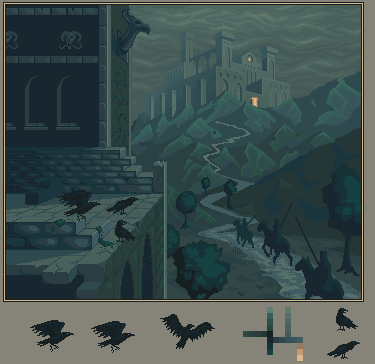
Just dropping in to say, wow... what a difference onek's edit made.. I've not seen such a dramatic edit on a piece before.. Really made me think more about looking past what I see and really shaping it into something.. more?.. no disrespect to you CELS, your work is wonderful but I really do like the edit..
as a side note, the edit DOES destroy the illusion of fog. but with the castle so bright, where is the light coming from?.. if there was fog, there wouldn't be much light, it would be an aura sorta light i think.. With the light pitching from the right, It would seem the sky isn't completely overcast and there are patchy clouds outside the picture. personally i prefer it this way.. although there are wisps of fog here and there at a dark kinda, brownish tone, maybe you could play with that? |
Posted By: CELS
Date Posted: 05 November 2011 at 4:07pm
|
As I wrote before, I think onek's edit is very pretty. I like the modification of the ruins, I like the increased contrast of the nearest scenery, I like the new skies... But I do want fog. And I may go with the flock of ravens, despite popular consensus. |
Posted By: Partack
Date Posted: 06 November 2011 at 4:08pm
| I personally like the crows. all of em. |
Posted By: onek
Date Posted: 06 November 2011 at 9:22pm
|
its true, because of the high contrast and the more vibrant colors scheme my edit doesnt lookfoggy anymore..
i understand that u want to go for the foggy look, but currently it looks more like moonlihgt imo to make it foggy the contrast should be even lower and the bg can get even lighter. also u should add patches of fog-- like clouds layin on the ground.. i tried that in my edit , but becasue of previos mentioned issues it doesnt really work... somewhat like so 
|
Posted By: sasuke91
Date Posted: 11 November 2011 at 6:31am
wow this is looking great, cant wait to see the final peice :D
|