20 Color Comp
Printed From: Pixel Joint
Category: Pixel Art
Forum Name: Collaborations/Challenges
Forum Discription: Submit pixel art project ideas/templates or contribute to an existing pixel art collaboration.
URL: https://pixeljoint.com/forum/forum_posts.asp?TID=13422
Printed Date: 15 June 2026 at 9:14am
Topic: 20 Color Comp
Posted By: jalonso
Subject: 20 Color Comp
Date Posted: 23 November 2011 at 12:43pm
|
This comp is open to everyone and is quite simple. Submit your ultimate 20 color unique + original color palette. These palettes are not to be considered art so no adding to your galleries. The winning palette will be used on PJs latest collab project so if you make a palette you acknowledge that it will be used by others for the purpose of this project and credit may not be posted by participants if they submit their project piece to their gallery but you will get overall credit for it. *Its best to assume that other's may use your palette so by entering you are giving permission to all. Win a spiffy trophy + points which are rare and will look great in your profile. *only 1 honorable mention will be given for this contest but its the best looking one so trying to get that one is a mini-goal on its own Judging will be held by your PJ Mods - Pie, cure, Hatch, ska, Jeremy, Reo, Delicious and jal along with some select PJ members. (You may comment on your fave palettes and sway the vote). Winning palettes will be picked on the basis of how it would work on the project theme, which will be kept a mystery for this contest to participants. A unique + original palette is the goal but a well balanced palette is important too. Use this template for your submission. You must name the HEX values and NO black - 000000 or white - FFFFFF  Post your entry on this thread!!! Comp closes Friday, December 2, 2011. (CLOSED) Submissions --- ------------- |
Replies:
Posted By: jalonso
Date Posted: 23 November 2011 at 3:43pm
Submissions member_profile.asp?PF=23494&FID=1 - KittenMaster
  member_profile.asp?PF=23494&FID=1 - KittenMaster II
 member_profile.asp?PF=17500&FID=1 - Jinn member_profile.asp?PF=17500&FID=1 - Jinn  member_profile.asp?PF=35054&FID=1 - codewarrior I (edit)
 member_profile.asp?PF=34158&FID=1 - Levaunt member_profile.asp?PF=34158&FID=1 - Levaunt  member_profile.asp?PF=30318&FID=1 - Juniorps
  member_profile.asp?PF=26361&FID=1 - antymattar
  member_profile.asp?PF=27872&FID=1 - Losm
  member_profile.asp?PF=35303&FID=1 - MrBeast I member_profile.asp?PF=35303&FID=1 - MrBeast I member_profile.asp?PF=22208&FID=1 - TropicalSnowcone member_profile.asp?PF=22208&FID=1 - TropicalSnowcone
 member_profile.asp?PF=15427&FID=1 - Pandora'sSecret
I
member_profile.asp?PF=15427&FID=1 - Pandora'sSecret
I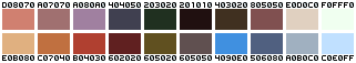 member_profile.asp?PF=8428&FID=1 - [thUg] member_profile.asp?PF=8428&FID=1 - [thUg]
 member_profile.asp?PF=20918&FID=1 - a3um
I member_profile.asp?PF=20918&FID=1 - a3um
I member_profile.asp?PF=35054&FID=1 - codewarrior
II member_profile.asp?PF=35054&FID=1 - codewarrior
II member_profile.asp?PF=35054&FID=1 - codewarrior
III
member_profile.asp?PF=35054&FID=1 - codewarrior
III member_profile.asp?PF=34792&FID=1 - mdog95
 member_profile.asp?PF=1177&FID=1 - Dennis
I
member_profile.asp?PF=1177&FID=1 - Dennis
I member_profile.asp?PF=35332&FID=1 - bem member_profile.asp?PF=35332&FID=1 - bem
 member_profile.asp?PF=15427&FID=1 - Pandora'sSecret
II (edit)
member_profile.asp?PF=15427&FID=1 - Pandora'sSecret
II (edit)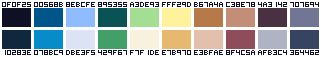 member_profile.asp?PF=30905&FID=1 - tanuki
 member_profile.asp?PF=33169&FID=1 - Meatermen
 member_profile.asp?PF=20181&FID=1 - dpixel member_profile.asp?PF=20181&FID=1 - dpixel
 member_profile.asp?PF=20918&FID=1 - a3um II
 member_profile.asp?PF=14858&FID=1 - Christoballs (edit III) member_profile.asp?PF=14858&FID=1 - Christoballs (edit III) member_profile.asp?PF=28528&FID=1 - shampoop
I member_profile.asp?PF=28528&FID=1 - shampoop
I member_profile.asp?PF=1177&FID=1 - Dennis
II
member_profile.asp?PF=1177&FID=1 - Dennis
II member_profile.asp?PF=20811&FID=1 - Nyno member_profile.asp?PF=20811&FID=1 - Nyno
 member_profile.asp?PF=873&FID=1 - eghost
 member_profile.asp?PF=34516&FID=1 - Super17
I member_profile.asp?PF=34516&FID=1 - Super17
I member_profile.asp?PF=34516&FID=1 - Super17
II member_profile.asp?PF=34516&FID=1 - Super17
II member_profile.asp?PF=20918&FID=1 - a3um III
 member_profile.asp?PF=33367&FID=1 - Frost Butt
(edit)
member_profile.asp?PF=33367&FID=1 - Frost Butt
(edit) member_profile.asp?PF=1177&FID=1 - Dennis
III
member_profile.asp?PF=1177&FID=1 - Dennis
III member_profile.asp?PF=35303&FID=1 - MrBeast
II member_profile.asp?PF=35303&FID=1 - MrBeast
II member_profile.asp?PF=28528&FID=1 - shampoop
II
member_profile.asp?PF=28528&FID=1 - shampoop
II member_profile.asp?PF=35071&FID=1 - thetallwalker member_profile.asp?PF=35071&FID=1 - thetallwalker
 member_profile.asp?PF=26426&FID=1 - crozier member_profile.asp?PF=26426&FID=1 - crozier  member_profile.asp?PF=23122&FID=1 - Manupix member_profile.asp?PF=23122&FID=1 - Manupix ------------- |
Posted By: KittenMaster
Date Posted: 23 November 2011 at 5:06pm
|
First.
EDIT inb4Jinn
^ I actually tested that one and it should work well enough. |
Posted By: Jinn
Date Posted: 23 November 2011 at 5:18pm
|
I dont know how to make those awesome palette charts that DawnBringer does, but I did a few tests color reducting some images using this palette, and I think it can work really well :)  |
Posted By: antymattar
Date Posted: 23 November 2011 at 5:45pm
I did a pallet and I drew some tests too.I'm having a hard time putting the numbers in place. I went for a colorful yet a bit soft style:

|
Posted By: codewarrior
Date Posted: 23 November 2011 at 6:11pm
|
@ antimatter:
here f.x if you dont wonna pixel them all in by hand. (04B-03B / second font from top) fits on 8 pt. just change to big letters. Dunno if theres a better fitting one for these templates, works for me =) http://dsg4.com/04/extra/bitmap/ - Bitmap Fonts |
Posted By: codewarrior
Date Posted: 23 November 2011 at 6:38pm
|
here is mine.
Based on a ramp with some of my most liked colors from my regular artwork. (obviously i'm digging beige, or grey tones, this one contains a wide ramp of beige to brown) 
They fade into the dark brown over to dark red. And contain a grey to neutralize. 
Did a Colorspace Test. They lack of a really bright highlight color but i hope they can still offer depth and light. 
Quick test:  hmmm.. need more contrast.. back to work i guess :) hmmm.. need more contrast.. back to work i guess :)
|
Posted By: Levaunt
Date Posted: 23 November 2011 at 7:31pm
|
This is my first time making a palette, so I hope it is original + unique (or even good at all). I went with a lot of purples, and a possibly daring range of saturation and values. No examples right now, I'll try and whip something up though. |
Posted By: Juniorps
Date Posted: 24 November 2011 at 5:40am
|
No time to make examples, busy day perhaps later I will. |
Posted By: antymattar
Date Posted: 24 November 2011 at 6:57am
|
Finally, Done. Also, I changed a few of the colors. Im tired of bland gray even colors. I want something... SPECTACULAR! :p |
Posted By: Losm
Date Posted: 24 November 2011 at 8:11am
|
I lurv muted tones.  And yet, I never seem to use 'em (or use 'em right) in my pieces. And yet, I never seem to use 'em (or use 'em right) in my pieces. 
I might work on it a bit more but I might as well post it before I get disinterested. EDIT: @Codewarrior Mind if I try your palette out? It looks very nature-y. :D |
Posted By: MrBeast
Date Posted: 24 November 2011 at 9:12am
Somewhat monochromish general purpose palette. |
Posted By: TropicalSnowcone
Date Posted: 24 November 2011 at 10:02am
|
I really like the palettes posted so far. They are amazing. This is my palette entry. I've never really had a preset palette but I took this opportunity to create one that I believe has some range. I'll post example if time permits. |
Posted By: codewarrior
Date Posted: 24 November 2011 at 10:15am
|
Edit:
Tests: 
|
Posted By: codewarrior
Date Posted: 24 November 2011 at 10:23am
|
@ Losm:
no, i dont mind at all =) feel free to use it, thats what we made em for. Would love to see it :) (theres an update now, would be interesting if you feel one of them being better) |
Posted By: TropicalSnowcone
Date Posted: 24 November 2011 at 1:04pm
| My entry does not appear in the judging post. Thank you. |
Posted By: Pandora'sSecret
Date Posted: 24 November 2011 at 2:59pm
same with black bg 
Really did my best on this one, perhaps my most balanced palet to date. Lets hope it gets some votes because the honourable mention award would look really good on my profile! ---- How do you all do those color reduction things with your palette? Or those really insightful saturation graphs? |
Posted By: jalonso
Date Posted: 24 November 2011 at 3:18pm
Some very nice stuff already  @ member_profile.asp?PF=22208&FID=1 - TropicalSnowcone , it takes a little time to add new entries. @ member_profile.asp?PF=15427&FID=1 - Pandora'sSecret , Everyone has their own way to go about this. A simple way is to get any pixelart you've already made and change the colors to your pallete and see if it works. If your software can handle it take any image from google and outout image with a 20 color limit and then use your palette to test the image. That's what I think Jinn did above. What codewarrior and Dawnbringer do is handled with GraFXwhich is free and excellent software for pixelart. Give it a try. @all, from now on if you see a Mod comment ending with UPDATE and your entry is above it but not added to judging post...then comment to let us know. UPDATE! ------------- |
Posted By: [thUg]
Date Posted: 24 November 2011 at 5:09pm
|
Ok, this time I won't do 100 one, but I think I'm gonna try something more shinny later, this one for now: |
Posted By: a3um
Date Posted: 24 November 2011 at 6:48pm
|
pewpew
|
Posted By: codewarrior
Date Posted: 24 November 2011 at 11:55pm
|
ok, ok.. i obviously had fun doing this.. if its good for anything we'll see =)
here 2 color-tables in "addition" to nr.1. Entry 2: hopefully more universal usable.

Entry 3: a x.mas-palette. since x-mas is soon to come you never know ^.- (was trying a different method on that one..digging through x-mas images and tried to grab a range of the most appearing colors and fiddle that into a palette)
and i think now you're safe of further entries of me. |
Posted By: mdog95
Date Posted: 26 November 2011 at 11:14am
|
I think this one is pretty good. And how do you get to the palette tests on Grafx2? I can't figure it out to save my life. |
Posted By: codewarrior
Date Posted: 26 November 2011 at 11:25am
|
@mdog95:
Simple Instruction for you: Download the scripts for it. Here f.x. http://www.pixeljoint.com/forum/forum_posts.asp?TID=12854&PID=150705 - Forumpost (dawnbringer) Make sure you got the latest version of the programm. (he mentioned that some of them only work above 2.3 i think) Run the Scripts: either start the main-script directly [see attached readme file, also for placement of the files] or rightclick the brushfactory in GrafX to open available scripts and localize the ones you want to use. Logical: ensure that you open an image only containing the colors of your palette or define a transparency(if you dont want surrounding colors being analysed too. It falsyfies the all-over results, at least for palette-analysis purposes). Reading the Results takes a bit of understanding for colors, hue, sat etc. But since everything is displayed in various ways (cube, color space views, brightness/darkness, closest colors, comparing etc) it should help you to understand when you inspect them. Was actually using other methods before with custom scripts for Photoshop, but that lua-pack for GrafX and the included palettecheck and 3D palette animation is pretty sweet for that purpose too. Hope this answer helped :] |
Posted By: jalonso
Date Posted: 26 November 2011 at 4:14pm
|
@[thUg], c'mon at least 50 :p UPDATE! ------------- |
Posted By: DawnBringer
Date Posted: 26 November 2011 at 5:11pm
|
Thanx codewarrior.
A few notes about the Grafx2 scripts/ToolBox: * Some of my scripts are bundled with Grafx2, but you'll have to download the ToolBox. * The scripts in the forum post should work ok, there's a newer version at my profile...but I made a mistake in that one (forgot to put things in a dir called "dawn"). I'll try to make an update soon. * My analysis screen are usually a composition of the results from several scripts (Analyze, Polar Bri-Hue Diagrams, Draw Bri-Hue Diagram). * Here's a http://goto.glocalnet.net/axe/dtb12/ - WIP Doc for the ToolBox |
Posted By: codewarrior
Date Posted: 26 November 2011 at 6:02pm
|
@ dawnbringer, thanks for the link.
Really digging that toolbox! And yes as far as i gone through them the ones from the forumpost seem to work just fine with GX 2.4 :] Looking forward to the update. |
Posted By: 0xDB
Date Posted: 27 November 2011 at 4:52am
|
append: numbers and letters are to be interpreted like in a http://en.wikipedia.org/wiki/Seven-segment_display - standard seven segment display |
Posted By: bem
Date Posted: 27 November 2011 at 10:01am
|
I like the palette, although it does not have a blue color. Her statement took me half a day but I'm happy. Test my palette:  |
Posted By: bem
Date Posted: 27 November 2011 at 10:18am
| Thank You all for Your help :) |
Posted By: mdog95
Date Posted: 27 November 2011 at 11:50am
| Upload the palette to imgur.com. |
Posted By: codewarrior
Date Posted: 27 November 2011 at 12:09pm
|
@ bem:
Open "my images" on your Imageshack account, and click on the small "i" icon ('share') next to your palette-image. In the popup you will find a field called "forums" Copy the link that starts and ends with: [IMG] http:// XXX[ /IMG] ..then paste it into your post here. :) |
Posted By: Pandora'sSecret
Date Posted: 27 November 2011 at 4:47pm
|
Okay, so i just figured out that my last palette was not al that good to actually work with.. haha, still like the colors though.
anyways, entry #2. Do you agree that it is much better? workable? Still feels a bit too saturated on some colors.
|
Posted By: mdog95
Date Posted: 27 November 2011 at 7:52pm
| No, it looks workable. the bright magenta doesn't seem like it would blend well with any of the other colors though. |
Posted By: tanuki
Date Posted: 27 November 2011 at 10:32pm
|
It was a little frustrating to decide which colors to include and which to leave out. I think mostly because I want to be as inclusive as I can, but can only have a few representatives from each category of colors, and didn't want a category to have just one color in it. I think I'll make a second palette that's more theme based instead of trying to get as many different colors in as I could.
The goal here was to include good representation from as many major categories of color as possible with interconnected ramps. Depending on how you look at it there's 6 blues, 4-5 greens, 2-3 yellows, 3-4 reds/oranges, 5 browns, 6 greys, 1 black, and 2 whites. About 30-32 total using 20 colors. When making this I set it up in a way where I could see every one of the 20 colors touching every other color to check for clashing colors. I was also focusing on taking the ramps as much as possible from near black to near white. 

|
Posted By: Pandora'sSecret
Date Posted: 28 November 2011 at 7:30am
|
tweaked the bright magenta. |
Posted By: Gecimen
Date Posted: 28 November 2011 at 7:37am
|
@tanuki; wow looks a lot like my rpg party palette. I like it, seems flexible. but I would saturate the gray ramp with some purple. @bem; love the taste! |
Posted By: tanuki
Date Posted: 28 November 2011 at 11:29am
| I had gone back and forth between a warm tannish grey, this blue grey, and outright purple. The tannish one left the palette as a whole too warm, and the purple was too similar to blue for me to see much difference. Purple is a hard color for me to use. @_@ |
Posted By: Meatermen
Date Posted: 29 November 2011 at 12:09pm
Here's my piece for the competition with white and with black background. :)

|
Posted By: dpixel
Date Posted: 29 November 2011 at 1:47pm
|
Let's see if I learned anything in the past few years. Worked hard at this one: Samples:   ------------- |
Posted By: Friend
Date Posted: 29 November 2011 at 7:51pm
|
tasty palettes!! I like the more stylistic ones rather than the all purpose ones so far. Yours is A-M-A-Z-I-N-G dpixel |
Posted By: a3um
Date Posted: 29 November 2011 at 11:04pm
|
test123 
|
Posted By: jalonso
Date Posted: 30 November 2011 at 6:20am
|
UPDATE!
------------- |
Posted By: Christoballs
Date Posted: 30 November 2011 at 6:36am
|
Yeah, you can delete my post Jal. :) I hope I'll have time to make a palette! :D |
Posted By: Jinn
Date Posted: 30 November 2011 at 6:50am
| This one looks delicious, a3um ;) |
Posted By: Jackman941
Date Posted: 30 November 2011 at 7:57am
| How are you guys naming your colors? |
Posted By: tanuki
Date Posted: 30 November 2011 at 10:47am
|
Do you mean the numbers and letters above or below each color? That's the hexadecimal value for them. There's always 6 numbers/letters in hex when it's used for colors. The first two represent the R, or red, channel in RGB, the next two are the green channel, and the last two are blue. It's a way of writing the RGB value of a color using just 6 numbers/letters instead of at least 9, plus punctuation, like this- 123, 234, 132
Here's a handy RGB to Hex converter- http://www.javascripter.net/faq/rgbtohex.htm - LINK If you mean a regular name, I like to call my colors things like "super blue" and "super red" etc. |
Posted By: dpixel
Date Posted: 30 November 2011 at 1:52pm
|
Great link tanuki!
------------- |
Posted By: DawnBringer
Date Posted: 30 November 2011 at 3:56pm
| That was a lot of code...this is all it really takes in JS: hex = (dec).toString(16); |
Posted By: shampoop
Date Posted: 30 November 2011 at 4:58pm
|
My votes in no particular order: dpixel & a3um II, thug, codewarrior I, and Losm.
Here is mine. I call it the slightly saturated 20 color HSV palette. 
Edit: I am disqualifying myself, Dawn has already made a similar palette! 
Mine:  His: His: I'm guessing we used the same technique. |
Posted By: Christoballs
Date Posted: 30 November 2011 at 6:10pm
 Here's mine. I was inspired by http://www.sai.msu.su/wm/paint/auth/monet/haystacks/wheatstacks.jpg - Monet's haystack paintings . A collage of some conversions I did: http://i.imgur.com/wc0G0.png |
Posted By: skamocore
Date Posted: 30 November 2011 at 6:47pm
|
Originally posted by shampoop Edit: I am disqualifying myself, Dawn has already made a similar palette!
Mine: His: I'm guessing we used the same technique. The palette on the right is actually the default Windows 7 Paint palette. ------------- |
Posted By: shampoop
Date Posted: 01 December 2011 at 1:56am
|
Wow, was my palette that bad! lol MSPAINT!
I would like to call that one a wip and submit(publish) this one instead.
|
Posted By: 0xDB
Date Posted: 01 December 2011 at 2:11am
|
I made another one which is more balanced than my previous one but lacks nearly perfect grays, so some things which are typically gray (rocks, statues, castles) would need to be improvised using other colors. :)
edit: Screwing around with it (it's been a while since I pixelled something): 
|
Posted By: Nyno
Date Posted: 01 December 2011 at 3:08am
|
Worked on this one quite a bit. Lots of browns... also put in a magenta shading color as a kick. Not many purples on this one but otherwise I think it's pretty varied. I put in pinks for something a little different. Some quick doodles and a couple recolors of a previous portrait:  |
Posted By: jalonso
Date Posted: 01 December 2011 at 7:02am
|
One more day left!!! UPDATE! ------------- |
Posted By: Jackman941
Date Posted: 01 December 2011 at 8:00am
| How do I post my palette on this forum? |
Posted By: Christoballs
Date Posted: 01 December 2011 at 9:26am
|
Originally posted by codewarrior @ bem: Open "my images" on your Imageshack account, and click on the small "i" icon ('share') next to your palette-image. In the popup you will find a field called "forums" Copy the link that starts and ends with: ..then paste it into your post here. :) It would help if you read through the thread more carefully Jackman941, and maybe other more general threads in future. I used Dawnbringer's toolbox on my palette:  And a piece of mine converted:  |
Posted By: eghost
Date Posted: 01 December 2011 at 12:17pm
|
Here's what I came up with, probably as close to final as I have time for atm:
EDIT: Ran it through DawnBringer's tools: 
Pretty pleased with the look of it overall... Decided to test it against one of my older pieces... Orig: 
Modified Palette: 
|
Posted By: jalonso
Date Posted: 01 December 2011 at 1:56pm
Posted By: Friend
Date Posted: 01 December 2011 at 2:29pm
| I kinda would like to try making a palette. Christoballs, how could I use Dawnbringer's toolbox, and how does one interpret it? |
Posted By: Christoballs
Date Posted: 01 December 2011 at 2:43pm
|
Well, you could check http://www.pixeljoint.com/forum/forum_posts.asp?TID=13422&PID=155474#155474 - codewarrior's post on the first page . Dawnbringer has written some scripts for Grafx2, which you can download/install into the Gfx2 folder. Then when you open the program up, you right-click on the Brush Factory button, then choose the destination and run the desired script! Check out this thread's first page for links posted, and DB's thread for more information. As for interpreting the diagrams: I admit I don't know for sure what half of these are exactly for, but they do help me understand in more detail how my palette's working. They show the way brightness and hue is distributed on the colour spectrum in the palette, mostly. What I do know is that if the colours in the second cube overlap, it means you can't tell them apart. You then change the hue and brightness to move it further in or out. The best is to experiment yourself with various palettes and compare results (I had fun doing that with the palettes submitted here). You'd have to ask Dawnbringer or somebody with more knowledge in these things to know better! One last thing: I don't think using these straight away is the way to go; there isn't that much time left so I suggest you scribble a quick palette up, do some quick roughs with your prototype and run the image through the scripts to see how you can improve it. My last test was to convert into my palette a series of pixel arts with a higher colour count, and tweak some more from there if necessary. |
Posted By: Trick17
Date Posted: 01 December 2011 at 3:29pm
|
Worked a lot on the palette, but I'm quite new to this. Second: |
Posted By: Christoballs
Date Posted: 01 December 2011 at 6:45pm
 I changed five colours, but make this my only and final entry, thanks! :) |
Posted By: a3um
Date Posted: 01 December 2011 at 7:20pm
|
The last one
test doodle 
|
Posted By: Friend
Date Posted: 01 December 2011 at 9:25pm
|
I am sorry for being such an idiot, but I can't figure out how to display my palette with the hex above each. Here are my hex numbers though. B63431 B61F1F 310000 663426 9C7A65 BD7025 BD9A45 AAA785 70964E 556B42 DAE9E3 CEFFFF 556264 99C5D9 4E95DA 827C8A 8F69B1 9A506E 25161C EBC3A6 |
Posted By: tanuki
Date Posted: 01 December 2011 at 10:02pm
| You just draw the letters/numbers onto the palette template, like you would pixeling any other text. |
Posted By: Friend
Date Posted: 01 December 2011 at 11:24pm
ugh.. I don't have time to do that now. Can I still participate?      |
Posted By: tanuki
Date Posted: 01 December 2011 at 11:53pm
This is frost butt's palette with the hex codes added

again, not my palette, just so there's no mix up. |
Posted By: DawnBringer
Date Posted: 02 December 2011 at 1:59am

* You never want really big gaps in the brightness plotting line * Try to spot colors that are redundantly similar, esp. in brightness. (however, if they are very different in Hue they could still be fine) * A balanced palette shouldn't have unproportionally large or small areas (colors) in the top left Bri-Hue diagrams (see how even the C64 palette is distributed). However a low-saturation color could be multi-purpose and allowed to cover pretty a good area. Use with judgement; f.ex a high-saturation color wouldn't be expected to be present or cover an equally large area in a diagram for colors of lower saturation, etc. etc. * The Grayscale / Bri-weight diagram is one of my favourite tools: it allows you to map you colors ability to double as a grayscales. (Starting on the left side with basic colormatching, ramping to right where colormatching is done only by brightness-level. |
Posted By: 0xDB
Date Posted: 02 December 2011 at 4:15am
|
All good things are three, so here's my third one. This time I used a color wheel to develop the shades, starting with flat grays and some red, green, blue colors and then mixed and tweaked everything until it seemed nicely balanced.
Test and the above mentioned color wheel: 
|
Posted By: jalonso
Date Posted: 02 December 2011 at 6:35am
|
Comp ends today at midnight! (US Eastern Time) UPDATE! ------------- |
Posted By: Christoballs
Date Posted: 02 December 2011 at 7:21am
 I'm done. :) Conversion:  ______ ______ |
Posted By: Friend
Date Posted: 02 December 2011 at 12:00pm
|
Great final outcome christoballs!!!
And thank you so much Tanuki. Really means a lot |
Posted By: MrBeast
Date Posted: 02 December 2011 at 12:31pm
Bright and shiny for my second entry.  |
Posted By: shampoop
Date Posted: 02 December 2011 at 1:25pm
I had time to make another palette. My first one was a bit specialized, this one is more general. It could handle almost anything I threw at it!

|
Posted By: Friend
Date Posted: 02 December 2011 at 3:57pm
I felt my lack of a good peach skin color was a problem. Sorry, it's my first shot at making a palette : D Would this palette be a small improvement over my original?  |
Posted By: dpixel
Date Posted: 02 December 2011 at 4:53pm
Nice tones in your palette Frost Butt. Super high contrast though. A couple more darker/mid tones would make this really nice. I'm missing a 2nd good flesh tone in my palette, but we have no idea what the callab will be focused on, so this might be perfect. Who knows? 
------------- |
Posted By: thetallwalker
Date Posted: 02 December 2011 at 6:14pm
|
Hey guys, really last minute to post it, I know, but here is mine.
Not very spread out as far as the color spectrum but it's good for its intended use that I had in my mind.
|
Posted By: crozier
Date Posted: 02 December 2011 at 6:18pm
|
Well here is my cartoony color pallet. Still have a lot to learn though, but that thumbs up trophy will look nice next to all those green ribbons :p And a few example I made. Mostly plantlife but whatevers. Also didn't use all the colors, I'll make one with all the colors soon.  The mushroom is from another piece of mine, but with slightly altered colors.
|
Posted By: Manupix
Date Posted: 02 December 2011 at 6:56pm
|
Hey, I almost forgot about this! :S Why does this seem more difficult than the 16-color palette? I just hope I don't get the same award than last year! XD |
Posted By: Christoballs
Date Posted: 02 December 2011 at 7:33pm
I love that palette, Manupix!  |
Posted By: dpixel
Date Posted: 02 December 2011 at 7:54pm
|
Originally posted by Manupix Why does this seem more difficult than the 16-color palette? I agree with you. Maybe the thought is to make it fit in with all the styles of all the participants of the collab. It really makes you think about the palette as a whole with the extra colors. Nice palette. The sky blue, orange, and pink is very Manupix of you. ------------- |
Posted By: jalonso
Date Posted: 02 December 2011 at 8:05pm
|
Next update will be the last one!! UPDATE! cept Frost Butt. @frostButt, Is that last a whole new palette or an edit? Please upload palette on its own, thx :) ------------- |
Posted By: Friend
Date Posted: 02 December 2011 at 8:23pm
|
They' you is Jalonso :) (final version) |
Posted By: Christoballs
Date Posted: 02 December 2011 at 9:11pm
|
Never say never... Sorry I keep posting more versions of this :s |
Posted By: jalonso
Date Posted: 02 December 2011 at 10:04pm
|
38 palettes! Comp is now CLOSED. Last 2 edits by FrostButt and christoballs are made. We shall deliberate, test and decide which best suits the mystery theme. Winners will be posted very soon! ------------- |
Posted By: jalonso
Date Posted: 08 December 2011 at 12:58pm
|
Congratulations to everyone who forum_posts.asp?TID=13422&PN=1 - contributed a palette . ../p/1287.htm - Dennis II
* Because of a tie we couldn't break in the final ballot we have decided to award 2 Honorable Mentions. Special mention goes out to ../p/20306.htm - dpixel and ../p/15535.htm - Pandora'sSecret for demonstrating how much they have learned about color selection and, ../p/33769.htm - Frost Butt
for such extra effort on his entry. Some palettes were for expert
usage only, some seemed limitless, some simply beautiful. Should
anyone use any of these palettes for any pixelart, please remember to
give credit in your description. ------------- |