Trexrell pixels
Printed From: Pixel Joint
Category: Pixel Art
Forum Name: WIP (Work In Progress)
Forum Discription: Get crits and comments on your pixel WIPs and other art too!
URL: https://pixeljoint.com/forum/forum_posts.asp?TID=13762
Printed Date: 14 June 2026 at 5:17am
Topic: Trexrell pixels
Posted By: trexrell
Subject: Trexrell pixels
Date Posted: 26 January 2012 at 6:11pm
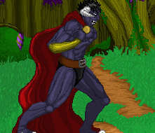
New to the site.Still new to pixel art and trying to get get better. Looking for c&c.
|
Replies:
Posted By: PixelSnader
Date Posted: 30 January 2012 at 12:16pm
|
The biggest issue you have right now is how flat and unnatural things seem. This includes the pose. Some real-life sketching should be able to fix that relatively quickly. (a few weeks if you sketch people on the street daily)
Pixel-art-wise, you're using a lot of pillowshading instead of actual shapes. Try making some simple shapes with accurate shadows, and work up from there. Not as simple as a sphere/cube, you're past that. Your muscles are a step in the right direction but not quite there yet. Then, your colors seem very uninspired. Red, and then the same color just lighter and darker. Green, and then just lighter and darker. In reality, colors are not the same in lightness and darkness. Hue and saturation change a bit. I see you've tried to add a bit of shine to the gold bracers, but it kind of ends there. Take a look at these materials and see how they differ in hue, saturation, shininess, reflection etc: 
Also note that the details such as the direction and shape of dents is different for each material. ------------- ▄▄█ ▄▄█ ▄█▄ ▄█▄ |