WIP: Pixel art videoclip for a song
Printed From: Pixel Joint
Category: Pixel Art
Forum Name: WIP (Work In Progress)
Forum Discription: Get crits and comments on your pixel WIPs and other art too!
URL: https://pixeljoint.com/forum/forum_posts.asp?TID=14167
Printed Date: 09 June 2026 at 12:57pm
Topic: WIP: Pixel art videoclip for a song
Posted By: Mattt
Subject: WIP: Pixel art videoclip for a song
Date Posted: 09 April 2012 at 6:34am
|
Hello, I originally posted my WIP in another pixel art community but I am not getting new replies and I guess it's a little bit less populated than Pixel Joint (and than it was before ).
So, this work is a couple of months old, I hope you can help me. I am new to pixel art and I am mainly a flash animator, so I'm more confortable with vectors and stuff. I was asked by a friend to animate a videoclip for his band and I had the idea to make it in a old school videogame style. That's the point when I started to research about pixel art, reading tutorials, exercise etc. I find it a very interesting and stimulating art. I'll post some of the older stuff A train car (with a shaolin monk inside just as a reference) 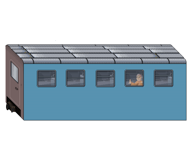
A the aforementioned monk. Pixelation community helped me a lot with this one. first try: 
a better one: 
a tree (i like this) 
a bedroom (for example in here I have a lot of problems with the wardrobe texture) 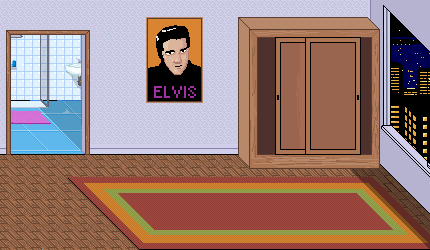
a punk guy to be fighted, I am having a lot of trouble with it right now. 
the outline came up ugly, although I liked what I did on paper to be traced. 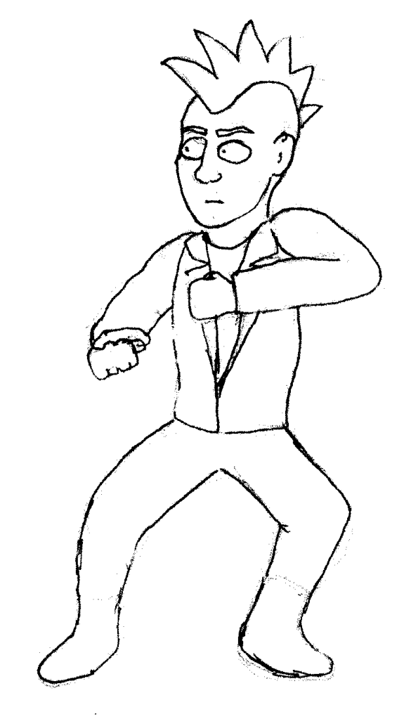
I know it's a lot of different stuff... whatever help is higly welcome! ps. I am italian, forgive me for any grammar errors |
Replies:
Posted By: EricKinkead
Date Posted: 09 April 2012 at 9:40am
|
Your martial arts guy looks great, mainly because he is in stance pose and those fight stances are so sure of themselves with good weight balance from legs to hip. I would suggest starting the punker out in his stance pose first. Then poise him from that into a fight pose might be easier. Currently it looks like his left leg is slightly off the ground. That could be a good thing if he his putting all of his weight on his right leg and bouncing off it and using his left leg to tap on the ground and keep balance. But it looks just a wee bit unsure of itself. also, I wouldnt test him with different line styles or half shaded hald unshaded. That will distract you from the pose, do that last. however with all those critiques, this is an AWESOME wip. really enjoyed looking at it, keep up the good work! |
Posted By: Mattt
Date Posted: 09 April 2012 at 2:24pm
|
thanks for the "awesome" :D
I do have other poses drawn for the punk. The thing is that I think I didn't trace it well. I don't understand if it is a matter of drawing (too big? 15 cm tall on paper), scanning (which dpi should i use?) or tracing. I thought that making 100 pixels tall sprites should give a good amount of details to be faithful to the scanned drawing. Was I wrong? |
Posted By: Mattt
Date Posted: 11 April 2012 at 6:01am
| I'm trying to study the dimensions of the sprite and i found out that the punk was too big. The monk should be a kid actually but making him too smaller i think would be an error. His head is 24 pixel tall, the punk one is much bigger. I tried to make the sprites tall an average of 100 pixels but probably I got triked by the bent legs stances... uhm. |
Posted By: Mattt
Date Posted: 12 April 2012 at 4:19am
new outline. what do you think? is it better?

|
Posted By: Mattt
Date Posted: 12 April 2012 at 5:29am
and a first try on the hero of the story. He's going to be ALWAYS on screen

with some shading experiments: 
Any suggestion to make him look a little less "childish"? I'm going to go for a cartoonish look but... how to make him look a little less "cute"? |
Posted By: Mattt
Date Posted: 15 April 2012 at 3:20pm

Right now I am working on the running animation for this character... there's something that still I don't like, please give me some feedback on this because I need to make it good! 
|
Posted By: Mattt
Date Posted: 02 May 2012 at 10:29am
newest running cycle lineart 
that other one had two switched frames too.. |
Posted By: LordHannu
Date Posted: 09 July 2012 at 2:15pm
| i like the new running cycle. |