Dragon Wars - Almolst done!
Printed From: Pixel Joint
Category: Pixel Art
Forum Name: WIP (Work In Progress)
Forum Discription: Get crits and comments on your pixel WIPs and other art too!
URL: https://pixeljoint.com/forum/forum_posts.asp?TID=14393
Printed Date: 10 June 2026 at 3:37pm
Topic: Dragon Wars - Almolst done!
Posted By: philippejugnet
Subject: Dragon Wars - Almolst done!
Date Posted: 19 May 2012 at 2:09pm
|
http://www.pixeljoint.com/pixelart/70842.htm?msg=thx - Done Thank you ALL! special thanks Slym Fool mrmo tarius a3um frost butt Jinn Angel Night Elk ADCRUSHER FrostButt Mille Jinn16 |||| !!!!!! |
Replies:
Posted By: Partack
Date Posted: 19 May 2012 at 4:16pm
|
... Interesting.
I don't really know where you're going with this though.. also, the bottom part of the welsh flag is green.. don't know if the blueish hue was intentional or not.. All i can say is i like it so far? good luck! (Rwy'n Cymraeg ^__^ Cymru am byth! =D) |
Posted By: philippejugnet
Date Posted: 20 May 2012 at 10:36am
u-updated =) |
Posted By: philippejugnet
Date Posted: 20 May 2012 at 10:45am
Fixed anatomy thanks slym |
Posted By: philippejugnet
Date Posted: 20 May 2012 at 5:03pm
Updated! again! |
Posted By: philippejugnet
Date Posted: 20 May 2012 at 6:34pm
| http://i1232.photobucket.com/albums/ff368/philippejugnet/WelshDragon2-2.png |
Posted By: philippejugnet
Date Posted: 20 May 2012 at 7:32pm
|
|
Posted By: Adcrusher
Date Posted: 20 May 2012 at 7:39pm
Here I threw you in an edit  Don't rush into details so fast. Make sure you have your forms down before going into scales. First off, some of the armor doesn't make sense. The armor that protects his chest is off center and is in an off place. The shoulder armor is too small and it looks like, based on his forearm, that his shoulder would be much bigger than what the armor is. Draw in the muscles beneath and then add in the armor to fit him. Down where the left leg armor meets the torso is very weird, it looks like a fight for which one is in front. Okay, onto the monster himself. The face is very good, its rendered nicely. The torso is off, he looks overweight. His pectorals are sagging and the back outline is not very thin. It's hard to see any forms in the legs, the back one looks like you were trying to add in his calf, but personally i think it would be much easier and readable if the back leg was in darkness, showing that it is behind him. Just saw the update: Legs look better, I'm confused about the shoulder, is that a band over it or armor? anway good luck im looking forward to seeing more progress |
Posted By: AngelOTG
Date Posted: 20 May 2012 at 7:41pm
| His tits look way too low, and he doesn't even have a rib cage. o___o |
Posted By: Friend
Date Posted: 21 May 2012 at 10:04am
|
Your dragon monster doesnt look very formidable at all. This is mainly because it looks like a fly could knock him over on his back with his pose and anatomy. I can't really say how to improve that now, but hs needs huge thighs and different leg and core chest/abdominal anatomy so he looks strong
|
Posted By: philippejugnet
Date Posted: 21 May 2012 at 2:09pm

|
Posted By: Zeratanus
Date Posted: 21 May 2012 at 2:28pm
|
Going off Frost Butt's comment, I moved his bits and pieces around a bit to make him look more like a big beasty. Also removed the back blade thing, but I just personally find those kinds of weapons silly looking.
Hope it helps ya some~ 
|
Posted By: philippejugnet
Date Posted: 22 May 2012 at 2:48pm
thanks ^^ Trying it out

|
Posted By: philippejugnet
Date Posted: 22 May 2012 at 7:12pm

=) |
Posted By: AngelOTG
Date Posted: 22 May 2012 at 8:23pm
| I don't understand what the poles/banners are connected to. They just look like they're floating behind him. |
Posted By: philippejugnet
Date Posted: 23 May 2012 at 8:07am
|
Its a war, heh so I am gonna add the other soldiers behind.
its still a WIP |
Posted By: philippejugnet
Date Posted: 23 May 2012 at 10:48am
last update:

|
Posted By: Arnaldo
Date Posted: 23 May 2012 at 11:43am
|
Sabe o q me encomoda, eh q vc ignora, os comentarios dos outros algumas vezes, o edit q o zeratanus e q o outro de cima fez, tão com uma postura bem melhor q a do seu...
Acho q deveria considerar as suas opiniões... Mas acerca do wip? Bem bacana |
Posted By: philippejugnet
Date Posted: 23 May 2012 at 3:20pm
| Eu arrumei sim se vc não percebeu '-', teria visto se tivesse ao menos se dado o trabalho de abrir um antigo numa nova aba e um novo em outra. |
Posted By: philippejugnet
Date Posted: 24 May 2012 at 8:36am
Update =)

|
Posted By: Christoballs
Date Posted: 24 May 2012 at 4:11pm
| You should work on the scene's setting very soon. |
Posted By: AngelOTG
Date Posted: 24 May 2012 at 6:43pm
| His horns look like they're coming out of his neck rather than skull plate. Maybe move them a few pixels closer to his eyes? |
Posted By: philippejugnet
Date Posted: 25 May 2012 at 5:37am
|
@Christoballs - yeah I know, I will add some mud and the rest of the warriors
@AngelOTG - Thanks I will try to do it 
|
Posted By: Friend
Date Posted: 25 May 2012 at 9:25pm
|
I really admire your ambition and diligence, congrats! But I think you are shooting yourself in the foot by going too detail crazy before your scene, anatomy, shading etc. have been appropriated and have a good base to build up from. While it is nice to be ambitious, I think you need to go slower, and pay more attention to the fundamentals of art before going all out. |
Posted By: philippejugnet
Date Posted: 26 May 2012 at 8:21am

|
Posted By: Night
Date Posted: 27 May 2012 at 1:38am
|
I think it looks much better with those colours.
Although, I think you could work more with the shape of the clothing for this creature, and perhaps make the lighting a little bit more dramatic. Here's an edit: 
|
Posted By: AngelOTG
Date Posted: 27 May 2012 at 2:00am
Your color choices are kind of boring. It's a very linear green ramp. Throw in some contrasts and purple tints

Edit: Looking at this on my phone, I see my computer screen's brightness must have been off. This is a little toooo contrasted, but it still illustrates my point. :P |
Posted By: philippejugnet
Date Posted: 27 May 2012 at 6:01am
Thanks guys for real =D

|
Posted By: Cheetah
Date Posted: 27 May 2012 at 8:10am
| I feel like you are stuck in a design loop Philippe, where you keep reinterpretting the same step instead of progressing forward. I think Frost had some good advice and you should sketch out the entire piece to see where you are going with it. For the record I actually prefered the previous color scheme. |
Posted By: philippejugnet
Date Posted: 27 May 2012 at 8:53am

|
Posted By: Cheetah
Date Posted: 27 May 2012 at 9:50am
| Much better. Careful about your perspective because in this rough state I can't tell what the creature would be standing on. I hope you are able to incorporate those flags somehow because they added to the piece. |
Posted By: philippejugnet
Date Posted: 27 May 2012 at 9:51am
| I won't add the flags. I am tired of this piece, gonna do something else then come back to it. |
Posted By: Arnaldo
Date Posted: 27 May 2012 at 11:07am
| Ae phlipppe, esse ultimo wip, esta uma ma...ra...vi...lhaaaa |
Posted By: philippejugnet
Date Posted: 27 May 2012 at 11:53am
I am done for today...

|
Posted By: philippejugnet
Date Posted: 27 May 2012 at 7:04pm

|
Posted By: philippejugnet
Date Posted: 28 May 2012 at 4:33am
Last edit on the dragon and probably last post. I don't wan't to keep flooding.


|
Posted By: Friend
Date Posted: 28 May 2012 at 8:45am
|
I just want to say again that I admire how much you've stuck with this and tried your very best and taking all criticisms into account and continuing to appreciate them instead of getting frustrated. I think you have insane potential at pixel art, but you are already great. As for a few crits on the last edit regardless of if you're done: Those thigh plates still look really wonky. The right leg ones look slightly better, but not much. Think about it. If you had armor that wrapped around your thigh in a triangular shape instead of encircling your thigh, it'd be extremely motion limiting and painful. Also, there doesn't seem to be anything clamping them on there. I think the piece is also really hindered by not including the feet and showing what it is standing on, it's a really awkward place to cut the piece off, and I sort of have doubts about whether this is to hide that maybe the perspective of the dragon is slightly off from the background. Lastly, the piece doesn't really seem to have any purpose in itself. You show a dragon glaring at something carrying a large sword and armor, but you don't really see why, or anything to give the piece contextual purpose. You just focused on making your piece look really cool, which it does. Anyway, job well done and I look forward to seeing you continue to progress. |
Posted By: philippejugnet
Date Posted: 28 May 2012 at 1:50pm
|
I won't get frustated ^^ those are helpful! In the past I used to get dismotivated... but now I am just trying my best! I am young and that does not mean I am worst, thats what I wann prove to everybody. I will add the legs again then ^^ thanks. PS: I keep changing it 'cause it is not making me happy. |
Posted By: Fugitive
Date Posted: 28 May 2012 at 5:11pm
amazing work philippejugnet 
------------- Fugitve is playing on his XBox 360 |
Posted By: philippejugnet
Date Posted: 28 May 2012 at 6:52pm
^^ updated, thanks all!!
|
Posted By: philippejugnet
Date Posted: 29 May 2012 at 3:29pm
Here |
Posted By: philippejugnet
Date Posted: 30 May 2012 at 1:39pm
Updated, thanks fool! |
Posted By: yaomon17
Date Posted: 30 May 2012 at 5:37pm
| I think his legs should be spread out more like with the first picture. He looks as if he is squatting very awkwardly. |
Posted By: toxotes
Date Posted: 30 May 2012 at 9:25pm
| Yeah, you've slowly moved away from the dynamic and spontaneous pose in your initial post, and I really think you should back at that. You have balanced it a little more, but I think you've lost the implied kinetic energy. Sorry to critique something that's a building block this late in the development process, it's looking beautiful so far. |
Posted By: philippejugnet
Date Posted: 31 May 2012 at 9:54am
True, true. Updated. Changed the colors to give more contrast to the fire. |
Posted By: Mille
Date Posted: 31 May 2012 at 3:01pm
|
This is looking great, I'm looking forward seeing it finished. One thing it'd be careful about at this point would be not to have the monster fade to much in the background since you are using the same colors basically, think about using the shadows and that red/green contrast you have to make the guy stick out. Or just have the background less defined, more blurry. ------------- Une signature? Comme Zorro ou Batman? |
Posted By: a3um
Date Posted: 01 June 2012 at 12:05am
| Maybe make him look at the same direction as the battle line (if that's the battle line on the left side)? |
Posted By: Trick17
Date Posted: 01 June 2012 at 5:43am
|
Hm, I thought the same like a3um, is he supposed to be the leader? If yes, you could addditionally rise is sword and head and let him sream like someone who bolster the soldiers. Like http://forums.electronicarts.co.uk/members/395851-henchman/albums/game-concept-art/picture3187-glorfindel-elf-army-lord-rings-battle-middle-earth-2-rise-witch-king.jpg - this and http://images.wikia.com/lotr/images/f/f2/Carn_Dum_a_roto_el_asedio.jpg - this . |
Posted By: philippejugnet
Date Posted: 01 June 2012 at 8:00am
|
NOOO =) thats not the concept. The concept is the war between China and Japan. According to the chinese culture a dragon represents the energy of fire, which destroys but allows the birth of the new. The main concept is, Dragons ( chinese ) going to the rising sun ( japan is called the land of the rising sun) thats the concept ^^. Well, we all know that after the war finished both japan and china had a growth ( the birth of the new ). And Japan won ( energy of fire, which destroys ). This dragon is just guiding them there, "go all of you! faster blablabla!!!" but yeah, thanks =) all of you!  |
Posted By: a3um
Date Posted: 01 June 2012 at 8:50am
| That's cool to have such a concept, but don't forget that you have to properly represent it to a viewer. The behavior of the dragon as you depicted him is very confusing. Why does he staring at the torch in front of the battle line? |
Posted By: AngelOTG
Date Posted: 01 June 2012 at 9:40am
| Maybe his arm with the staff should be pointing down the line, in the direction the army is walking. It would be more readable as him directing them that way. |
Posted By: philippejugnet
Date Posted: 01 June 2012 at 10:06am
|
I was thinking about that lol edit: I tried it out but it didn't looked good, I am going to think on something else...   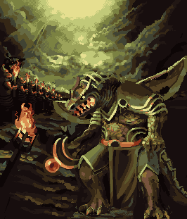
|
Posted By: Geoglatico
Date Posted: 01 June 2012 at 5:59pm
| Muito Boom,voce ta evoluindo muito ele, mas eu acho que a antiga 'boca' do monstro estava melhor do que as ultimas atualizacoes... |
Posted By: AngelOTG
Date Posted: 01 June 2012 at 8:14pm
|
I think you are adding too much and it is reducing the readability of your image. There is just so much going on and a lot of it isn't connecting.
I think you need to move the dragon back (maybe shrink him by a few pixels or increase the canvas size slightly) and add some foreground elements. Right now, he seems very pasted on as an afterthought. Which is funny since this thread proves you built the scene around him, and now he seems disconnected lol. |
Posted By: Mille
Date Posted: 02 June 2012 at 5:43am
 just to see what it would look like. I think it makes more sense. ------------- Une signature? Comme Zorro ou Batman? |
Posted By: a3um
Date Posted: 02 June 2012 at 5:37pm
I've pushed Mille's edit a little bit further

|
Posted By: philippejugnet
Date Posted: 02 June 2012 at 8:05pm
| a3um. Thank you so much. I cant depict whats going on my head. You can do it so better then me. Thanks. |
Posted By: Mille
Date Posted: 03 June 2012 at 1:56pm
 gave a try at that galvanising leader pose ------------- Une signature? Comme Zorro ou Batman? |
Posted By: philippejugnet
Date Posted: 03 June 2012 at 4:03pm
Thank you Mille, I am happy with a3um's edit! I am just having problems with the armt BTW.. THANKS!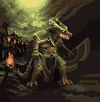 |
Posted By: Trick17
Date Posted: 03 June 2012 at 6:44pm
| Now the dragonman reminds me of Renekton from League of Legends :O |
Posted By: philippejugnet
Date Posted: 03 June 2012 at 6:57pm
|
Exactly! going to send it to the showcase XD. There is also the concept that those warrior at the left are minions :3 |
Posted By: ||||
Date Posted: 03 June 2012 at 11:12pm
|
Oh so this is what I was missing! I was away for 3 weeks then moved
(glad that's over). I really like this WIP so far; especially the row of
warriors in perspective. EDIT- I was confused and thought the last image was the last step. I almost critiqued something that had already been fixed. Why not keep the last step at the end as well? It's also nice to be able to see the last step as you reply. |
Posted By: Trick17
Date Posted: 04 June 2012 at 3:20pm
|
Originally posted by philippejugnet Exactly! going to send it to the showcase XD. There is also the concept that those warrior at the left are minions :3 Ah, ok, that's a concept, why not? But then I would love to the see a cool LoL scene, so please add minions and stuff  |
Posted By: philippejugnet
Date Posted: 06 June 2012 at 11:50am
Here! updated!

|
Posted By: Friend
Date Posted: 06 June 2012 at 1:15pm
|
First off, this is starting to look spectacular. The composition is definitely improving big time! Second, maybe it's just me, but I find the color choices a bit odd. I'm not so sure about the green-grey with the primary oranges. It comes across as a bit gaudy, and their isn't really unification of color. Perhaps if the entire piece, notably the greenish sections had some more copper or ochre tones, (Morrowind's case comes to mind) it might look better. Totally subjective input here, so take it subjectively. Lastly, the dithering in the sky just looks weak to me. It looks pretty nice in the rocks in the lower right, but it is an eyesore and looks out of place in the sky in my opinion, and creates unwanted texture as is typical for bad dithering. |
Posted By: philippejugnet
Date Posted: 06 June 2012 at 1:53pm
|
Hey frost thanks. We had some problems when I joined Joint I was in a bad mood because my life makes me frustrated but I am learning to deal with it.
Here updated. 
|
Posted By: Gamamoto
Date Posted: 07 June 2012 at 5:31am
| Looks awesome ! Hope you'll finish it soon so that we can fave it :D |
Posted By: philippejugnet
Date Posted: 07 June 2012 at 2:00pm
Like most of my pixel arts, when I flip it horizontally it looks strange.. I think I have some sort of distorsion in my eyes...

|
Posted By: Christoballs
Date Posted: 07 June 2012 at 3:36pm
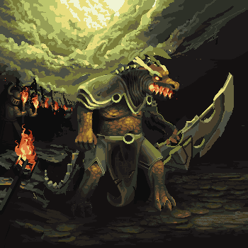
| The dragon's head looks pretty narrow and flat, and the darkness it faces gives no impression of the depth suggested by the row of warriors on the left. |
Posted By: philippejugnet
Date Posted: 08 June 2012 at 11:21am
Is this what you mean?

yeah, I am going to add more rocks to the right. |
Posted By: Christoballs
Date Posted: 08 June 2012 at 2:37pm
 This is what I mean. |
Posted By: Night
Date Posted: 09 June 2012 at 2:50am
I think that first of all you should make him bigger and make him look more muscular. Perhaps add more armour to his legs, and make instead the ones on the thigh a more robe like material.

Somewhat like this. |
Posted By: philippejugnet
Date Posted: 09 June 2012 at 8:03am
|
your edit reminded me about this =)
http://www.youtube.com/watch?v=pkWWWKKA8jY 0:40 Thanks night and christoballs! Next edit will be the update. |
Posted By: Elk
Date Posted: 09 June 2012 at 8:53am
| Why not add some pattern to the shoulderplate, why is it so polished and flat and reflecting :P |
Posted By: philippejugnet
Date Posted: 09 June 2012 at 8:59am
Like this guys? thanks all. @elk Hey alex, I don't know how to texture it =/
|
Posted By: Elk
Date Posted: 09 June 2012 at 10:23pm
| ill show you tomorrow, im so drunk right now i just got home im almost dead lol night |
Posted By: philippejugnet
Date Posted: 10 June 2012 at 8:00am
|
Hope you don't get a headache!
Thanks for the help! I will be waiting! Its almolst done. 
|
Posted By: philippejugnet
Date Posted: 11 June 2012 at 5:58pm
One of the last updates. I believe I can finish it today!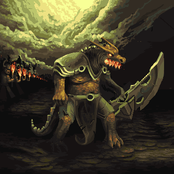 |
Posted By: Damian
Date Posted: 13 June 2012 at 11:53am
|
Hi, you've put a lot of hard work into this and previous work and the major improvements are showing.
I said a few days ago that I'd create an edit, so I sat down and did it. I didn't try to change to much I just want to try an point out a few things. 
The main point of the edit was to point out that the dragon looks like he has no waist and hips. Hips will suggest a range of movement, making him look like he's more mobile. I also think you can use the secondary lights better. You sometimes forget that about the lights from the clouds that would probable hit the dragons back. Also don't be afraid of contrast! Use the darker colours wisely to make the dragons scales detailed. I really don't think you need this advise as you're more brave than I am to attempt large pieces like this. haha. Keep it up buddy. |
Posted By: philippejugnet
Date Posted: 13 June 2012 at 1:30pm
|
damn I posted it already, going to try to fix it. I know nothing about the pixel vocabulary  I just learned things by trying it out. Didn't read any tutorials. I just learned things by trying it out. Didn't read any tutorials. |
Posted By: philippejugnet
Date Posted: 13 June 2012 at 2:39pm
|
better???????? |
Posted By: a3um
Date Posted: 14 June 2012 at 1:10am

Didn't show it earlier so you could focus on your own ideas but now when your piece is finished I decided to put it here. I made this edit (which is actually gone too far haha) to illustrate how would I placed the hero, battle line and other stuff. |
Posted By: Elk
Date Posted: 14 June 2012 at 2:01am
| looks awesome a3um |
Posted By: philippejugnet
Date Posted: 14 June 2012 at 5:34am
| OMG, I feel sad right now '=' |
Posted By: Trick17
Date Posted: 14 June 2012 at 7:09am
|
Philippe, you are pretty good at sketching, pixeling and coloring now, you should focus on composition, dynamic and so on, like a3um showed you. But please consider you dragon as finished now and focus on a new piece ;) As I said, you need to practicve general art technique. |
Posted By: philippejugnet
Date Posted: 14 June 2012 at 8:23am
| Don't worry! |