[WIP] RPG HUD/GUI mock-up
Printed From: Pixel Joint
Category: Pixel Art
Forum Name: WIP (Work In Progress)
Forum Discription: Get crits and comments on your pixel WIPs and other art too!
URL: https://pixeljoint.com/forum/forum_posts.asp?TID=14621
Printed Date: 08 June 2026 at 8:23pm
Topic: [WIP] RPG HUD/GUI mock-up
Posted By: RileyFiery
Subject: [WIP] RPG HUD/GUI mock-up
Date Posted: 28 June 2012 at 2:59pm
|
CnC is kindly welcomed. Please don't hold back. Well here's my latest WIP. I'm working on the HUD/GUI for a project of mine. I could use some good suggestions to help me improve the icons, layout, and overall look. Top-Left is the HUD that displays your HP, MP, and XP along with your equipped weapon, and secondary item. On the bottom is the menu icons and skill-hotkey bar. The Big Squares [Menu Buttons] are (left to right) Character, Social, Journal, Skills, Inventory, and Options. In the middle at the bottom is the skill-hotkey. The arrow above it pointing down allows you to collapse the bar into 5 hotkeys rather than 10. When it's smaller, there's an arrow pointing up that you can click to expand it to 10 again. The magic icons on the skill-hotkey bar are (left to right) Fire Ball, Magic Missile, and Poison Shot. 
|
Replies:
Posted By: LachieD
Date Posted: 28 June 2012 at 4:00pm
|
I really like what you are showing here. The icons seems perfect to me. Great work on. Sorry, no CC.
Do you have more tiles/sprites to show? Would love to see them. |
Posted By: ollantaytambo
Date Posted: 28 June 2012 at 4:14pm
| the character's eyes look weird, is he supposed to look worried? |
Posted By: RileyFiery
Date Posted: 28 June 2012 at 4:35pm
|
I'm not sure about the icons. I like them, but I feel like something
could be added, or changed to make them even better. Sadly, I don't know
what. Yeah, I see that now ollantaytambo. I rushed the helmet before I made this thread just so he wouldn't be a plain. You can see him without the helmet, and armor in my gallery: http://www.pixeljoint.com/pixelart/71146.htm - http://www.pixeljoint.com/pixelart/71146.htm Here are some of the inside tiles I threw together:  I need to go back over these later and fix them up some. Right now my main focus is the HUD and GUIs. |
Posted By: LachieD
Date Posted: 28 June 2012 at 4:57pm
|
Wow! This looks neat. But there is a cool tutorial about tiles, that might be interesting to you, in the sense of adding depth to the floor: http://kiwinuptuo.deviantart.com/gallery/27054576#/d3d4ufx - http://kiwinuptuo.deviantart.com/gallery/27054576#/d3d4ufx
Also, if someone would put a gun on my head and told me to edit one of your icons, I would deliver this: 
Really, I think you are fine. One could nitpick forever. |
Posted By: RileyFiery
Date Posted: 28 June 2012 at 5:10pm
|
I like your edit of the Journal icon. The shadow is a good idea, as well as the black line in the middle of the white on the cover. Also that's a good guide. I was thinking about adding some breaks and bends to the floor later on. I almost threw my computer to the ground while working on some of the outside tiles. Sort-of taking a break from them to finish up this HUD/GUI combo. Edit: Here's a shot at cleaning up the journal icon:  Left Old Right New Trying to keep the gold trim on it. Edit2: Also, I fixed the sad look on the character's eyes.  Edit3: Messed around with the character's base some to fix the sad eye thing that I only just noticed thanks to ollantaytambo. Also defined the shoulders, and legs a lil' better. |
Posted By: RileyFiery
Date Posted: 30 June 2012 at 5:50pm
Well I edited the Options icon thanks to some feedback from a friend. Here's the screenshot with the updated male character and icons:  I still have a few more icons to fix up, and I still need to decide on what to put for the character menu. I was planning to add races to the game, e.g, orcs and elves. Right now in the screenshot I have the Aryan race completed. I figured while I'm at it, I can make each race have a salute of sorts. The Aryan race will tap their feet together and throw their right arm in the air as if asking a question, but at an angle. /joking of course. Edit: Just so everyone knows, constructive criticism is welcomed. Seriously, don't hold back. The sole purpose of me posting a WIP is to get some feedback. Fixed up the backpack icon some.  |
Posted By: RileyFiery
Date Posted: 18 July 2012 at 3:54am
Last progression I did on the main HUD/GUI combo: Cleaned up the Inventory icon. Was sketching the Character menu icon, and was messing with a different idea for the Social icon. Anyhow, the real update is that I'm currently working on a sign for NPC/Character dialogue, signs, notifications, etcetera:  The text is a placeholder text for now. I'll probably make my own text later. I was also thinking of adding in a portrait box to show what it is talking. Picture of a sign for a sign, picture of the NPC you're talking to, etcetera. I was going for a stained old paper sort of look. |
Posted By: Yuran
Date Posted: 18 July 2012 at 4:27am
|
Not enough of the general style, frames around the icons completely faceless. You did not tell your idea. The icons look bad on a gray background, they merge with the background, Mark or background or icons. Or should we think about their design. The main thing is not to use a lot of small details.
You took a lot of work to do at once. I suggest to systematize process of work. Make a plan. For example: 1. Analysis of ideas, creating the overall design of the interface 2. Creating icons 3. Creating a character 4. Font Design Ornamental and some elements of the interface. Не хватает общего стиля, рамочки вокруг иконок абсолютно безлики. Ты не рассказал свою идею. Иконки плохо смотрятся на сером фоне, они сливаются с фоном, выдели или фон или иконки. Или надо подумать над их дизайном. Главное не использовать много маленьких детальей. Ты взялся делать много работы сразу. Предлагаю систематизировать процесс работы. Сделай план работ (список). Например: 1. Разбор идеи, создание общего дизайна оформления Интерфейса 2. Создание иконок 3. Создание персонажей 4. Дизайн шрифта и некоторых декоротивных элементов интерфейса. |
Posted By: RileyFiery
Date Posted: 18 July 2012 at 4:37am
|
Thanks for the feedback. I didn't explain the idea of the social because I was only stating why it was different than before. The outside frames are meant to be plain because that's the style that will transfer to every other HUD/GUI element as you can tell from looking at the HP/MP bar, menu icons, and hotkey icons. I don't understand the rest of your post. If you'd like to show me an example of some changes you would personally make then by all means do so because it would help me to understand where you're coming from. I appreciate all comments and criticism. |
Posted By: Yuran
Date Posted: 18 July 2012 at 5:32am
|
OK, I'll say specifically - I criticize the course of your work.
As I understood from what has turned out to translate by Google you will have to do what - could not understand. Write a list of what to do (the name - looks like) ... And you should definitely show how they will look like while playing? I want to help you, but do not know exactly what you need. Making the pieces, some fixes various icons - not a good. This will lead to a large number of rework and bug fixes. ОК, скажу конкретнее - я критикую ход твоей работы. Как я понял из того что получилось перевести гуглом тебе надо сделать иконки какие именно - не смог понять. Напиши список того что надо сделать (наименование - как выглядит)... А тебе обязательно надо показывать как они будут выглядить во время игры? Мне хочется тебе помочь, но пока не понимаю что тебе конкретно надо. Делать по кусочкам, отдельные исправления разных иконок - не есть правельно. Это приведёт к большому числу переделываний и исправлений.. |
Posted By: RileyFiery
Date Posted: 18 July 2012 at 5:59am
|
My goal for this thread was mainly for the HUD/GUI. I wanted feedback on how to fix the icons which is why you see icon edits throughout the thread. I eventually had to get some feedback from someone not on PJ for a couple of them. I've been asking for C&C on the icons, layout, and overall look of the HUD/GUI. Originally posted by RileyFiery This is in my first post.Well here's my latest WIP. I'm working on the HUD/GUI for a project of mine. I could use some good suggestions to help me improve the icons, layout, and overall look. If it helps you then ignore the tiles. I posted those on request. Pay attention solely to the HUD/GUI mock-up(s) you see based off of the first post. Ignore the character, background tile, and ignore the dialogue. Originally posted by Yuran ^This is what I asked for. The bold is what I didn't understand.Not enough of the general style, frames around the icons completely faceless. You did not tell your idea. The icons look bad on a gray background, they merge with the background, Mark or background or icons. Or should we think about their design. The main thing is not to use a lot of small details. |
Posted By: Yuran
Date Posted: 18 July 2012 at 12:37pm
|
Oh my God! As I want to write in my native language, I want all to understand and make myself understood, too .... My bad English .... I guess my posts to you like Chinese writing translated by Google. But I'm lazy to spend 15 minutes at each office. Ok'll help you, and then feeling quite boring :).
О боже! Как я хочу писать на родном языке, хочу всех понимать и чтоб меня понимали тоже.... Мой плохой английский.... Наверное для тебя мои посты как китайские письмена переведённые гуглом. Но я ленюсь тратить по 15 минут на каждый свой пост. Ок займусь помочь тебе, а то чуствую себя нудным.. |
Posted By: Yuran
Date Posted: 18 July 2012 at 12:50pm

What the meaning of these icons? |
Posted By: Yuran
Date Posted: 18 July 2012 at 2:26pm
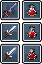 knives and hp bottles :) knives and hp bottles :)
   
 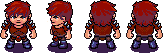   characters. characters.
 shields. shields.
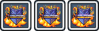
  gear/options gear/options
|