New Game Character
Printed From: Pixel Joint
Category: Pixel Art
Forum Name: WIP (Work In Progress)
Forum Discription: Get crits and comments on your pixel WIPs and other art too!
URL: https://pixeljoint.com/forum/forum_posts.asp?TID=15024
Printed Date: 13 June 2026 at 6:21am
Topic: New Game Character
Posted By: Vell123
Subject: New Game Character
Date Posted: 02 September 2012 at 5:35pm
|
Hi, I've been working hard on this character for quite some time now. He has definitely transformed a lot. I would like to know if anyone see any problems with this picture or have any suggestions as to how i can improve this character if any. Thank you
The first image is where I started 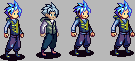
The second from the left is the first character I made. Then i ended up with the one furthest to the right. Next is what I've narrowed it down to as far as how I would like for him to look inside games and what not. 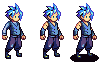
and the final revision is the following image. This is the one I want the most critic on however feel free to suggest anything toward the others as well. Thanks 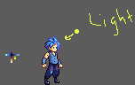
p.s. please dont steal |
Replies:
Posted By: lordjosephdeburg
Date Posted: 03 September 2012 at 12:32pm
|
*steals while vell isnt looking*
I love the contrast increase as this sprite evolved. I think a bit more expression (if possible) would go a long way with this character. Also I think the lower button might be moved forward.. it seems his jacket is leaning forward. |
Posted By: Vell123
Date Posted: 03 September 2012 at 12:50pm
| Thank you. I took a lot of tutorial reading and examination of other peoples work for me to realize to work on it...If you was having him stand you'd make his legs aligned with his torso? |
Posted By: lordjosephdeburg
Date Posted: 03 September 2012 at 1:13pm
|
well I havent created any serious sprite work in afew months, but I think it is more important to align his torso with the leg that is carrying the weight. From this sprite it looks like the left leg, although that might be an illusion.
Im sure others will be able to advice better on the characters weight distribution. To be honest though if this is one of your first sprites I am really impressed. Im a developer so I rarely have such time to invest into my sprite work. |
Posted By: Vell123
Date Posted: 03 September 2012 at 1:23pm
| Thanks I'll definitely put that into consideration. The illusion of the left leg does look a bit strange now that its brought to my attention. and I'm a developer as well. Im making this guy for a game. I normally do most of the programming but now im doing the sprites, tilesets, etc. Also Thanks for the compliment. He has come a long way. Someone revised him from what I started with but I revised that and this is what I ended up with near the end. I play to make a game similar to this.....http://ps3media.ign.com/ps3/image/article/111/1117984/castle-crashers-20100902050138751-001.jpg so I though the left leg being in the back ground was suitable. |
Posted By: lordjosephdeburg
Date Posted: 03 September 2012 at 1:32pm
|
cool! I guess I shouldnt be surprised to meet other devs here. Yeah its pretty tough to manage both sprite work and code.. but I think a nice spritesheet is definitely worth the time.
Castle Crashers is a good game, and definitely possible for a small team to make. Do you have any action shots or weapons created yet? |
Posted By: Vell123
Date Posted: 03 September 2012 at 1:51pm
|
Yeah I can say the same, it is nice to know im not the only developer here. Actually thats a negative on the weapons, simply because the writer hasnt really given me anything to work with as far as a story because I was hoping to make a kind of mix between beat em up and rpg game. I had like this epiphany today while getting ready for work about how I think the game play should be...however I do have like a tileset i made from a previous tutorial from devianart.com
Here is a simple update, the one on furthest to the right. The female character I was basing him off of. And basically I wanted him to be like a teenager. The middle image makes him look like a boy to me and the furthest left he looks like a man with a full chin. 
Here is a tileset and the original drawing of the character I was going to make. He was a very low resolution character 


|
Posted By: lordjosephdeburg
Date Posted: 04 September 2012 at 6:02pm
|
The original drawing would be great for the title screen.
The middle one does look like a boy face, but with a mans body. maybe try shrink him down a bit? |
Posted By: Vell123
Date Posted: 05 September 2012 at 2:23pm
|
Ok Ill definitely do that. Since I feel like I'm getting more comfortable drawing on the pc
Most recent update as of 9/6/12 
|
Posted By: Kopaka
Date Posted: 08 September 2012 at 12:46am
| I really like that new update, did you use a different base or take inspiration from a slightly different style? It definitely suits the original pose you had before and he looks young like you were aiming for in the first place. |
Posted By: Vell123
Date Posted: 08 September 2012 at 9:55am
| Yea i'm definitely satisfied |
Posted By: Vell123
Date Posted: 15 September 2012 at 6:20pm
|
Thanks all for the help. I dont think I want this is a finished product but I'm highly considering it especially since I'm so tired right now but here is what I have since that last time we communicated.
Any comments, suggestions, or anything I'm all ears |