First Pixel art: Street Fighter-inspired character
Printed From: Pixel Joint
Category: Pixel Art
Forum Name: WIP (Work In Progress)
Forum Discription: Get crits and comments on your pixel WIPs and other art too!
URL: https://pixeljoint.com/forum/forum_posts.asp?TID=15144
Printed Date: 11 June 2026 at 10:12pm
Topic: First Pixel art: Street Fighter-inspired character
Posted By: 1337B337
Subject: First Pixel art: Street Fighter-inspired character
Date Posted: 21 September 2012 at 6:12pm
Hey guys, here's my first bit of pixel art since I dabbled in it when I was a kid: I was trying to aim for a "Third Strike," look, but it came out kinda "Alpha-y." I plan on working on it in my spare time, maybe even start animating it into a set of sprites. Edit: Sorry, forgot to add, I'm looking for critiques and tips on how to make this any better, Thanks! |
Replies:
Posted By: -
Date Posted: 21 September 2012 at 9:54pm
|
The legs look a bit weird. change the pose for the legs.
Although it may be difficult for the player to see the shades, try putting some shades on the shirt as well. |
Posted By: 1337B337
Date Posted: 21 September 2012 at 9:57pm
|
Originally posted by Artwark The legs look a bit weird. change the pose for the legs. Although it may be difficult for the player to see the shades, try putting some shades on the shirt as well. I did, but I guess they're not contrasting enough, I'll darken the darks and lighten the lights then get back to you :) Edit: Here:  I think the reason the stance looked off was because the right foot (foreground,) made the leg look broken at the shin. Here's the reference picture I used for the stance:  I literally traced the stance, moved the arms and torso a bit, and started with the framework. So, technically, the anatomy is correct. Maybe the legs are too long, would it help if I stunted them a bit? Edit 2:  Lowered the crotch, pants look more natural now, and contrasted the colors a bit more. |
Posted By: -
Date Posted: 21 September 2012 at 11:54pm
|
Its much better now.
|
Posted By: Zeratanus
Date Posted: 22 September 2012 at 6:08am
|
Legs seem slightly too long. The back leg is still a bit shapeless. I think if you used shading to indicate where the knee is it would give it some more form (for example, shade in the whole area left of that fold and end it at the knee might work) The front arm also looks a bit off. The forearm is shorter than the upper arm as it is now. Put your sprite on a dark background and you'll notice you've still got some color problems. The back shoulder has light pixels on it that dont mesh at all on dark, and the hair looks very flat. Working on a grey background rather than pure white might help you avoid that kind of thing since you wont have the contrast of pure white surrounding it. |
Posted By: 1337B337
Date Posted: 22 September 2012 at 4:16pm
|
Originally posted by Zeratanus Legs seem slightly too long. The back leg is still a bit shapeless. I think if you used shading to indicate where the knee is it would give it some more form (for example, shade in the whole area left of that fold and end it at the knee might work) The front arm also looks a bit off. The forearm is shorter than the upper arm as it is now. Put your sprite on a dark background and you'll notice you've still got some color problems. The back shoulder has light pixels on it that dont mesh at all on dark, and the hair looks very flat. Working on a grey background rather than pure white might help you avoid that kind of thing since you wont have the contrast of pure white surrounding it. Awesome! Thanks for the critique guys, I'll work on it tonight and show my progress later! Edit: Made more edit's since yesterday:  How's it look now? |
Posted By: 1337B337
Date Posted: 23 September 2012 at 7:47pm
| Just bumping cause it's been over a day, does anyone see anything else wrong with my sprite? |
Posted By: Zeratanus
Date Posted: 24 September 2012 at 1:57pm
|
I did some playing around with it.
Changed a lot of the lighting to make it all coming strongly from the right moved the leg on the right a few pixels towards the body messed with the pant shape a bit, to better define the legs while still looking baggy messed with the hands (I just enjoy the challenge of spriting hands, so I couldnt resist) The head looked like it needed a few more pixels for the back of it (heads extend a fair ways past the back of the neck), which also helps define the ear messed with the face a bit to make it clearer All the edits are a bit sloppy, but its some ideas for you to go on. Hope it helps :) 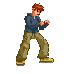
|
Posted By: 1337B337
Date Posted: 24 September 2012 at 6:55pm
|
It helps TREMENDOUSLY! I don't know why I always overlook lighting, it's one of the most basic principles of art. Would it be rude of me to place your edit with my original side by side and tweak them out a bit? |
Posted By: Zeratanus
Date Posted: 25 September 2012 at 5:48am
Feel free  Just remember that it was edited kinda quickly, so my changes could definitely be cleaned up and improved. Just remember that it was edited kinda quickly, so my changes could definitely be cleaned up and improved.As for lighting, it took me many years before I broke down and decided to actually learn anatomy, which finally started to teach me forms and how light should fall, so I'm still fairly new at it myself lol. Damned stubborn brain of mine. |
Posted By: 1337B337
Date Posted: 25 September 2012 at 2:02pm
|
I've actually found a genius artist in deviantArt who wrote out a series of tutorials that helped me understand anatomy better. If I would have put a lot more effort into my sprite, it would have been right the first time. Anyway, thanks a million! |