Walking Chef
Printed From: Pixel Joint
Category: Pixel Art
Forum Name: WIP (Work In Progress)
Forum Discription: Get crits and comments on your pixel WIPs and other art too!
URL: https://pixeljoint.com/forum/forum_posts.asp?TID=16277
Printed Date: 22 June 2026 at 8:36pm
Topic: Walking Chef
Posted By: Pixel-Samurai
Subject: Walking Chef
Date Posted: 06 May 2013 at 9:12am
|
Hey, I'm trying to get a walk cycle down pat for a small game. This is my first time working on something like this and I know the Pixel joint forum is full of pros that'll have some advice for me.
So here goes, what can I do to improve this walk cycle? I'm going to animate the arms and add some bounce later, right now I'm just trying to get the legs moving smooth. http://s1159.photobucket.com/user/amirbadri/media/pixeljoint/walkHELP_zpsaca456b4.png.html"> 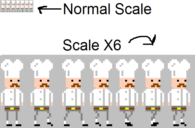 [/IMG] [/IMG]
|
Replies:
Posted By: Zeratanus
Date Posted: 06 May 2013 at 2:01pm
|
Any way you could show it in motion? It's way easier to spot issues in animation when it's moving :)
|
Posted By: Pixel-Samurai
Date Posted: 06 May 2013 at 6:46pm
Sure, I changed the food so that it dosent have that one pixel bend. Again I also havent added any bounce or anything like that because I wouldnt know what frames to add them to and I want to get the walk down pat before I start that.

|
Posted By: r1k
Date Posted: 06 May 2013 at 10:31pm
|
I personally find it easier to judge if the legs are right if the bounce is there. And really, the bounce is part of the leg movement so you should put it in now. The bounce is caused because when the legs are streched out furthest the hips are lower, and when the legs are straight the hips are higher, so thats where you put it. I think the high point, and low point should be equidistant from each other (in number of frames). I notice your belt buckle needs to shift 2 pixels or so to the right to conform with the angle we are seeing him from. I would try putting the foor bend back, but drawing it like the red tetris block in this picture: http://www.gamingmomentum.com/wp-content/uploads/Tetris-Pieces.jpg - http://www.gamingmomentum.com/wp-content/uploads/Tetris-Pieces.jpg |
Posted By: Pixel-Samurai
Date Posted: 07 May 2013 at 12:02am
|
R1k, I would like to start by saying AWESOME Tim Curry Icon.
As for you're notes, thanks for the feedback. I tried to implement what you told me. When his legs are spread widest I moved his whole body down one pixel and that is when his hat, arms and stash also scrunch down one pixel. What do you think? I think its good progress but I could do more. Any recommendations? 
|
Posted By: r1k
Date Posted: 07 May 2013 at 12:32am
| ya that helps. You gotta pick his feet off the ground though. His toe should angle down as he lifts his foot up, but angle up as hes putting it down. |
Posted By: AtskaHeart
Date Posted: 07 May 2013 at 12:38am
|
I feel that the bounce is a bit sharp, not very sure why it feels like that. Maybe the first things that have to go down (bounce first) are the most heavy things in the character, then the light things (such as the moustache and the hat) follows the bounce, then the heavy things go up (the body), then the lighter parts follows the bounce up. This type of bounce requires more frames than a simple bounce, but you are already using enough frames I believe, so you could try and evaluate the results :). Probably the problem may be related to the chef hat, not sure. |
Posted By: Pixel-Samurai
Date Posted: 07 May 2013 at 10:34am
I took into account the arms bouncing first since they are heavier than the hat and the stash. I also lifted the food one pixel up from the sock. I think it looks a lot smoother. Feedback?

|
Posted By: jalonso
Date Posted: 07 May 2013 at 10:39am
|
Nice job. Its too easy to nitpick at this size will you post a 1X? ------------- |
Posted By: Pixel-Samurai
Date Posted: 07 May 2013 at 10:56am
Sure thing, this is the same animation as the one above just at normal size lol.

|
Posted By: jalonso
Date Posted: 07 May 2013 at 11:09am
|
Its cute and moves oddly but kinda funny...I like it but will nitpick it. The white socks are kinda meaningless. I'd make that grey like the pants. The yellow buckle color is wasted. Try a deeper yellow or even an almost orange color so the eye reads a buckle without thinking. The black is not working for me. I would soften that a lot, Maybe eeven a blue so it helps the eyes too. Still reading as a dark shade but as light as you can get away with so the feet don't seem like deer hooves. The BG grey makes it hard to really see. ------------- |
Posted By: r1k
Date Posted: 07 May 2013 at 12:39pm
|
thats better. Is he supposed to be tip toeing though? Since you have his foot angled down before it hits the ground it seems like he is placing his toe before his heel and walking on tip toes. It makes his walk seem a little more careful. |
Posted By: Pixel-Samurai
Date Posted: 07 May 2013 at 4:16pm
Yes! The feet look better angled up, and the new colors help. Kinda miss the socks though lol.

|
Posted By: ChrisButton
Date Posted: 11 May 2013 at 6:43pm
|
The biggest mistake with animating cycles traditionally (hand drawing), specifically by pixel artists, is that they just leave the character on one spot and animate it. My first suggestion would be have every individual drawing on a different frame and have it move across the screen like it would in a game. *Make sure if the feet are on the ground, they don't move from their spot until they're lifted off. Only the rest of the body should be moving. I've noticed that there was some discussion about whether feet should be angled upwards or downwards. The answer is both. If you study your own walk cycle, you'll notice as your leading foot (the one taking the step) leaves the ground, it is angled downwards, and as it travels through the air it's relatively flat (if anything aiming downwards), and as it lands it angles upwards to land on the heel. If you have it angled upwards the whole time, it will look like he's walking on his heels. :O Anyways, just some ramblings from animator. Good luck dude. * = added in edit due to being vague |