Gameboy RPG mockup
Printed From: Pixel Joint
Category: Pixel Art
Forum Name: WIP (Work In Progress)
Forum Discription: Get crits and comments on your pixel WIPs and other art too!
URL: https://pixeljoint.com/forum/forum_posts.asp?TID=16301
Printed Date: 09 June 2026 at 3:10am
Topic: Gameboy RPG mockup
Posted By: ultimaodin
Subject: Gameboy RPG mockup
Date Posted: 10 May 2013 at 8:41pm
|
So far just done a tonne of tiles, the HUD and character still needs to be pixelled. This is just a test of the tiles I've made so far (since it's all on one screen it probably looks a bit busy) I kind of cheated with the water, tree, rock, flower - as I haven't made them to fit with each ground tile yet so it's just pasted over the top for now using transparency (you horrible person I know) I tried to fit as much "detail" into the four colour pallet as I could with it still being "readable". All feedback welcome. So yeah: 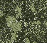 Also a 2x zoom for those having issues with the forum zoom (I also prefer the 2x zoom due to my monitor resolution making the 2x closer to actual gameboy screen size): 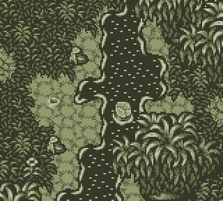 PS: If you cannot notice, I draw a lot of inspiration from Seiken Densetsu 3. (One of my favourite games of all time) ------------- The world is but a shadow of emotion, cast in shades of grey. |
Replies:
Posted By: programgamer
Date Posted: 11 May 2013 at 3:53am
|
But... But... But... I mean... WOW!
Just compare this to my entry! This is gorgeous! How am I suposed to compete against THAT?! I mean, just... This is making me go berserk. You have great chances of wining this contest good sir. Keep it up. In the mean time I will try to step up my game by a factor of 2000 to try to match at least half of your skill level. |
Posted By: ||||
Date Posted: 11 May 2013 at 3:26pm
| I don't have any crits.. I think that is some fine looking Gameboy. |
Posted By: crozier
Date Posted: 11 May 2013 at 4:18pm
|
Oooh, I like it!
Not a big fan of the river specks, though. I would advise having more variety in them. Perhaps have a random portion of them be the 2nd darkest shade, or something like that. You could also add a little depth to the shoreline, as it is kind of flat (if that makes sense). Everything else is great! |
Posted By: ultimaodin
Date Posted: 11 May 2013 at 9:25pm
|
@programgamer - Thanks, yours is looking very tasty as well. @|||| - Thank you. @crozier - You're now the second person to pint out the water's edge. I really need to stop being lazy and make some proper water tiles that mesh with the land tiles. I might try messing with specks. Since I'm thinking I should actually turn this into a game, I was thinking of adding a couple varying water tiles as well (all will be animated of course) so I'll mess around with the using the darker shade as well. Now with HUD and character. I'm thinking of changing the character sprite to a 16x32 so I can give it more depth. As is I feel it blends in too much. Thoughts?  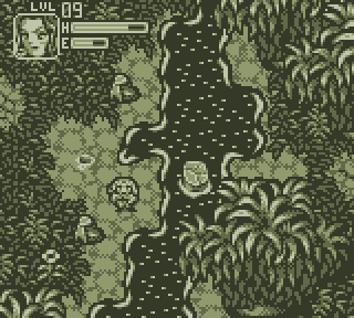 ------------- The world is but a shadow of emotion, cast in shades of grey. |
Posted By: skittle
Date Posted: 12 May 2013 at 3:20pm
| Oh wow, this is gorgous! |
Posted By: TTTBBBUUUXXX
Date Posted: 13 May 2013 at 7:07am
|
amazing job! my only nitpick would be the "water lines" so to speak. they look too thick and worm-like and not organic/"flow"-y enough. if the water is flowing "up screen" (as it looks like based on the water line "bubbling up" below the tree trunk in the water) then the other water lines should reflect this also.. there is no reason they should all be the same size and weight, and should have gaps between them. on the longer portions of shore they should just have one long wiggly line right? rather than 2 short ones
|
Posted By: king_bobston
Date Posted: 13 May 2013 at 8:15am
I died a little inside  very awesome (except the water, but water is a bitch anyway!) to see a detailed approach. It's interesting how different people tackle the limited palette in different ways. When I did mine I was aiming at low contrast walkable and high contrast sprites and objects. x2 looks way better on my monitor as well. |
Posted By: ultimaodin
Date Posted: 13 May 2013 at 7:25pm
|
@ADrawingMan - Thanks ^_^ @TTTBBBUUUXXX - It's not actually meant to be flowing, it's more like a creek than a river. The water lines are their to help distinguish the black mass from other things. I did try a thinner water line though. Also, more than two pixels long for the shines look silly and just one felt like noise. =( @king_bobston - No bad, no dying! Nobody liked my water T_T I do use only the lightest colour on objects that either block your path or are above the player height. (excluding the little hole thing I made because I couldn't help myself. New version with new character sprite and altered water tiles. Feedback is all welcome: 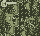  PS - is anybody else having it where the forum is just shades of grey? I miss the nice green. =( ------------- The world is but a shadow of emotion, cast in shades of grey. |
Posted By: crozier
Date Posted: 13 May 2013 at 8:10pm
|
Ooh, the land in between the creek and ground is looking a bit better. Keep up the good work! But, if I was you, I would change even more of those lighter pixels in the water to the darker shade.
And I think it just depends on the theme you have on if you are logged in/have cookies. I think the green was from the april fools thing the pixeljoint mods did last April. Just go to the Change Theme section on your pj account. You should be able to change it back. |
Posted By: king_bobston
Date Posted: 14 May 2013 at 5:07am
I tried a little something And with broken line (didn't pay attention to tilebillity)  If the land has a little slope it might be more readable if you put a bit perspective in it. I made this little edit to better illustrate what I mean, because I don't know how to exactly put it into words. If this is what you try to convience with the water then you should also edit the curves to better convey it. I like the 16x32 more, but the 16x16 may be more useful on the small screen depending on how much other stuff (blocking the path, enemies, etc.) and what gameplay (zelda like with enemies on screen or pokemon like with enemy encounter?) the game has. |
Posted By: ultimaodin
Date Posted: 15 May 2013 at 8:32pm
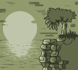
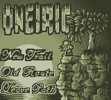
Okay, I'm going to call this screen done by now. I'll still be taking critiques but I want to focus on the titlescreen: 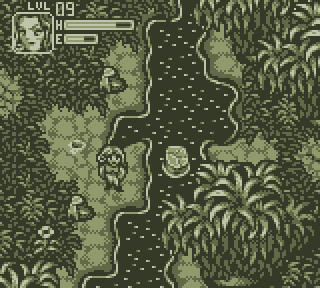 To the title-screen, not much to show yet, have started detailing the leaves. I plan on having a girl leaning, hand against, the tree gazing out at a sunset. Unfortunately I am struggling to make the anatomy of the girl for just having her lean the way I want. I tried finding a reference but couldn't find anything, so trying to visualise it from my mind. (yeah - and I suck at anatomy besides hands). As far as the name of the game - I was thinking Oneiric (of, or pertaining, to dreams). Also, what do you think of the font for the selection menu? I'll probably round off some of those flat edges. (mainly on the capital letters):  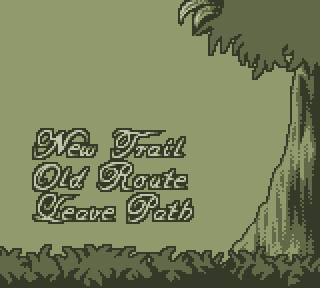 ps as you can probably tell, I decided to go for larger leaves. ------------- The world is but a shadow of emotion, cast in shades of grey. |
Posted By: CraftyPixel
Date Posted: 15 May 2013 at 9:30pm
 - Made a few edits. 4 colors is a little x.x... - |
Posted By: ultimaodin
Date Posted: 15 May 2013 at 11:20pm
|
@crafty - what you did with the bank is kind of confusing me, but I get the feeling you think I should remove all the light sparkles from the water. For the character, the double thick outline on her head is to give extra distinction between her and the background as a 1px border for the corners just didn't work efficiently enough. The other bit of banding is her mouth and chin - I need these two separate as I want to do multiple expressions for her. As for the boots, they are meant to be solid black and one is intentionally larger to make it look like it's 'closer' than the other aka so it's on the leg that's forward. Your version of the title is definitely looking better but I was going to have it as a cliff overlooking the water. So instead, I decided to change it completely: 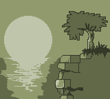 I'm going to make her sitting on the cliff edge instead - since that's a hell of a lot easier. Obviously the rocks won't look that square and sh*tty, that's just how have done for the time being to convey the basic construct of them. I'm a bit sad you didn't like the text - oh well, back to the drawing board. ------------- The world is but a shadow of emotion, cast in shades of grey. |
Posted By: ||||
Date Posted: 15 May 2013 at 11:29pm
|
Yes, please keep the menu font as it is. |
Posted By: ultimaodin
Date Posted: 17 May 2013 at 10:50pm
|
Sorry, had a day off from doing all things pixel/work/uni so didn't get anything done. So far we have 1 for the font and 1 against. I'm thinking I might go that fancy kind of font for the actual title and have the select options simple since they will also now be resting above gleaming water and a simpler font has lest chance of being lost. Anyway, update just so yah's can see kind of where I'm gong with this; done half the water, half the rocks, a small amount of leaves and calling the trunk done for the time being. Still need to put the girl sitting in there though:  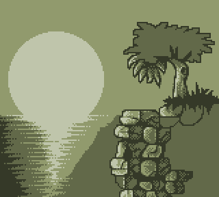 ------------- The world is but a shadow of emotion, cast in shades of grey. |
Posted By: CraftyPixel
Date Posted: 18 May 2013 at 4:43pm
|
- I think there are a few issues with this. It's more like a brick wall than rocks. and it's very stiff, excluding the tree. But I'd add few trees ( just black ) to the left of the mountain? |
Posted By: programgamer
Date Posted: 18 May 2013 at 6:49pm
Hey, just to show you another way you can do the ocean part (plus some clouds) I made a quick edit of your last WIP (I hope you don't mind...). so yeah, just a proposition. if you are having difficulties with the rock part, just look at reference pictures, it helps a lot!
|
Posted By: ultimaodin
Date Posted: 18 May 2013 at 11:27pm
|
The Cliff is a magic made cliff so it's meant to be partially unnatural - but certainly not to the degree that it looks like bricks. I'll have to play around with it a bit to get that nice line between natural and unnatural that appeals to both aspects. @Crafty - I would add a tree there, but as you can see that's where my girl is sitting and the tree beside is meant to be a smaller tree. @programgamer - Awww man that water is sweet. Makes my unfinished one look like garbage. I do plan on doing clouds but I'm undecided on the exact style as so far the attempts haven't been as visually appealing as I like. So, this is an update I've done before reading either of these comments. (Australian time zone means I'm usually asleep when everyone else posts feedback) I'd say the cliffs are done but after feedback I'm obviously going to have to alter them. Tree is half done and I'm happy with the girl (waiting for anatomy issues to be nitpicked): 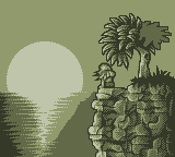  ------------- The world is but a shadow of emotion, cast in shades of grey. |
Posted By: jalonso
Date Posted: 19 May 2013 at 5:52am
This is all looking better all the time 
------------- |
Posted By: AtskaHeart
Date Posted: 19 May 2013 at 6:57am
| I love this! Cant wait to see moar! |
Posted By: ultimaodin
Date Posted: 20 May 2013 at 5:58am
Not much of an update here, just finished the tree and the water. Focusing on uni work at the moment. Need to do sky and the title plus selection options.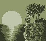  ------------- The world is but a shadow of emotion, cast in shades of grey. |
Posted By: jalonso
Date Posted: 20 May 2013 at 7:04am
|
Even without the title and GUI items it seems to me that this last scene is too busy and fails to read as a 'calm' image which it seems to be. I think perhaps the water reflection is overworked or far to big and showy. It also has a 'split in half' layout that is just not attractive. If the rock/tree/character is left as it is and all else is softened considerably it will give far more depth and help offset the GUI assets and whatever else is going over the scene. ------------- |
Posted By: TTTBBBUUUXXX
Date Posted: 20 May 2013 at 8:22am
| love your solution for he "water lines" ! looks awesome |
Posted By: ultimaodin
Date Posted: 20 May 2013 at 9:25am
|
@Jalsonso - I have gone for a very 'quartered' approach haven't I. You'd think somebody whose had the rule of thirds drilled into them wouldn't be so silly. -_- I might simplify the water as most of it gets covered anyway. Also for the calm feel, I was origionally going to make a tower juttering up from the horizon to form the first 'I' in Oneiric. I initially thought this was a cool idea because the tower is like the final place in the game - but I decided it was a stupid idea. Anyway went of on a tangent there but after forgoing foreboding tower I guess I didn't really consider the mood of the title which was a noobish mistake on my behalf. Also, I am working on a new more simple font for the menu selections but just for the sakes of it I decided to test with the old font just to get a basic feel of what the water would look like with font over it: 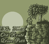 I tested the highlighted font on the New Trail option since that would be the hardest to see with the sunset. PS I'm only working on pixelart at the moment (12:30am) because my housemates are arguing and writing a happy mother daughter scene with people arguing is pretty much impossible. Still, at least I'm being somewhat productive. ------------- The world is but a shadow of emotion, cast in shades of grey. |
Posted By: programgamer
Date Posted: 20 May 2013 at 11:39am
| I think you should lower the sea level and put the menu stuff in the sky. Uniform background plus less sea ripples to do. |
Posted By: Mishok
Date Posted: 21 May 2013 at 1:50am
|
ultimaodin, Great job!!!
programgamer, Cool variation of the ocean sunset! |
Posted By: jalonso
Date Posted: 21 May 2013 at 5:55am
|
The water looks ok with the text over it ------------- |
Posted By: ultimaodin
Date Posted: 21 May 2013 at 8:17am
Okay, just playing around here. Tried programgamer's idea (since I'd also thought of moving the horizon as well. I also thought, 'hey - maybe rather than making the title font all flowy and change the selection font to something simple, I could try doing the exact opposite'. Yeah... This is the result of me being sleep deprived. I can't work out if it's actually any decent for the fact I am sleep deprived: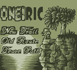  Oh and I changed the selected option to have a double black outline and the other options to have a white outline around the black outline since I also tried putting the text over the moon (although that may get moved back down again depending on popular consensus.) Now for sleep! Oh, for comparison sake, with font lower: 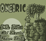 ------------- The world is but a shadow of emotion, cast in shades of grey. |
Posted By: ultimaodin
Date Posted: 21 May 2013 at 10:40pm
|
Double Posting like a boss!!!! New select font that is simpler: 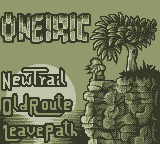  Also, just for testing sake - here's a look at it with a gradient in the BG (my eyes hurt from staring at this, I should have just gone with an ordered dither):  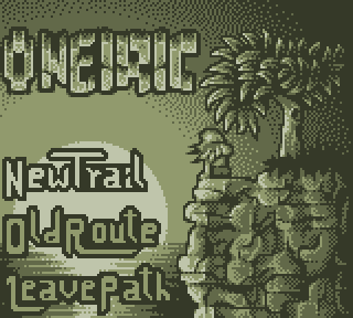 Haha, just previewing and I see a couple more pixels that feel like strays. Damn it! ------------- The world is but a shadow of emotion, cast in shades of grey. |
Posted By: jalonso
Date Posted: 22 May 2013 at 6:14am
|
I kinda like the sky pattern as it softens the title and sets in the tree...I hate the new font/type. It just does not match at all! The script is nicer looking if maybe too big and over AAd. There is on semplice.com some 8px script pixel fonts if you care to check them out. That link and others in the link section. ------------- |
Posted By: ultimaodin
Date Posted: 22 May 2013 at 6:27am
|
So older font is preferable then? So go for flow-y. I kind of want to make the fonts myself as it's good practice for type making purposes. I might try the old one with less AA so it looks 'simpler'. I will check out that site anyway as it might give me some ideas. I do need to get out of the habit of over AAing everything. Anyway, this is what the dithered BG (with a few pixels moved here and there) looks like with the old selection font: 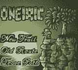 Does it look better with a flow-y styled font? ------------- The world is but a shadow of emotion, cast in shades of grey. |
Posted By: jalonso
Date Posted: 22 May 2013 at 6:45am
|
I did not say the script font is good for this I only mentioned that the new more modern one is terrible for this. That said, it does balance out the title font so that's cool.
The title is bothering me and should bother you too. You are really stuck in sections and quarters and design grids...make that title over lap the tree a tiny bit by making it bigger/airier/move over and away from the edge...break the grid fool :p ------------- |
Posted By: ultimaodin
Date Posted: 22 May 2013 at 7:20am
|
BUT GRIDZ!!!!! T_T I must admit, I've actually been avoiding overlapping stuff. -_- I too was feeling concerned it was too pressed towards the side. I don't know why I avoid overlap so much =( ------------- The world is but a shadow of emotion, cast in shades of grey. |
Posted By: r1k
Date Posted: 22 May 2013 at 7:52am
|
I think you should try centering the title, have it overlap the tree. I think it should feel like you made a background with the intent of having words on it, not like you made a background and then tried to cramm the words into the empty spaces. Centering the title might look wierd though, if the options arent. The options seem kind of big though, like almost as large as the title. |
Posted By: ultimaodin
Date Posted: 22 May 2013 at 9:12am
 How's this for size? ------------- The world is but a shadow of emotion, cast in shades of grey. |
Posted By: jalonso
Date Posted: 22 May 2013 at 9:27am
|
You are seriously not seeing straight.
Post all the elements on a single sheet for layout edit. ------------- |
Posted By: ultimaodin
Date Posted: 22 May 2013 at 9:53am
No, no I'm not. I blame it on the 4 hours sleep a night: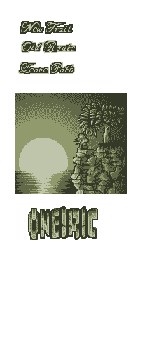 ------------- The world is but a shadow of emotion, cast in shades of grey. |
Posted By: jalonso
Date Posted: 23 May 2013 at 7:20am
|
I've just worked on layout options, k. I butchered and shopped up and moved all kinds of things. The secondary font is way too big, imo.  ------------- |
Posted By: ultimaodin
Date Posted: 23 May 2013 at 8:33am
|
Having the tree overlap is brilliant! The hell didn't I think of that!? Also by secondary font, the selection font right... I'm assuming selection font as I was thinking the same for that. (since it's literally the font from the old version) ------------- The world is but a shadow of emotion, cast in shades of grey. |
Posted By: jalonso
Date Posted: 23 May 2013 at 8:36am
|
yeah, the selection font.
Also, in my edits I aired out the title by 1px between each letter to widen it out some so it balances better. I just c/p some of your leaves so the tree is kinda ugly now. Just use as idea and rework the tree into the title. ------------- |
Posted By: Peeter
Date Posted: 24 May 2013 at 2:37am
|
Originally posted by jalonso
I've just worked on layout options, k. I butchered and shopped up and moved all kinds of things. The secondary font is way too big, imo. The text alignment in the third one hurts my eyes. Fixed it:  ------------- |
Posted By: ultimaodin
Date Posted: 25 May 2013 at 8:51am
|
Alright, updating with special thanks to Jal being freaking awesome and stuff. I'll probably add a few more leaves to the right side of the tree so it doesn't feel so lopsided. Also, new selection font with and without double thick outlines to see what you peeps think is best (yes, I just used the word peeps, I am drinking scotch right now). I personally prefer the double thick outline. Another idea is that I go the double thick outline for the selected option online to give it even more... contrast to the other selection options.:   double thick:  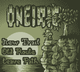 ------------- The world is but a shadow of emotion, cast in shades of grey. |
Posted By: jalonso
Date Posted: 26 May 2013 at 4:22am
|
Double lines for sure. The 'L' is hard to read.
------------- |
Posted By: ultimaodin
Date Posted: 26 May 2013 at 6:16am
|
@Jal - Cool. I'll add an extra pixel to the bottom part, should give it a bit of additional readability
------------- The world is but a shadow of emotion, cast in shades of grey. |