Need to pixel something - just house ...
Printed From: Pixel Joint
Category: Pixel Art
Forum Name: WIP (Work In Progress)
Forum Discription: Get crits and comments on your pixel WIPs and other art too!
URL: https://pixeljoint.com/forum/forum_posts.asp?TID=16604
Printed Date: 22 April 2026 at 3:51pm
Topic: Need to pixel something - just house ...
Posted By: zi-double
Subject: Need to pixel something - just house ...
Date Posted: 26 June 2013 at 4:19am
Current status: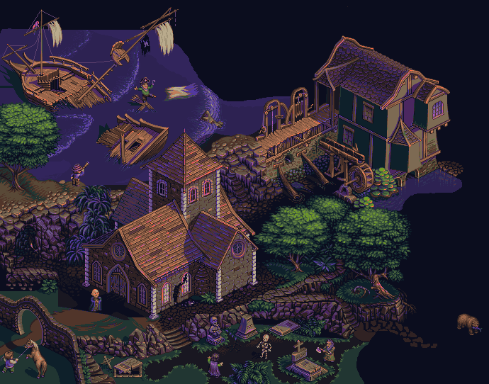 Hi to all. I just feel that need to pixel something. Where I'll go with this idea - I don't know, but I'm a bit hungry for pixels :) Just want to keep colours up to 32. Maybe texture of the roofs is too flat and some other textures should be repaired. All big beams are a bit as plasticine. Need work on many places, but if you have some suggestions will be great :)  |
Replies:
Posted By: dpixel
Date Posted: 26 June 2013 at 5:44am
|
A stone foundation would look great.
------------- |
Posted By: skaytr
Date Posted: 26 June 2013 at 7:58am
|
There are 8 stones in the front-most corner, and 10 on the left-most corner. It seems kind of slanted and its quite distracting IMHO.
Also, The purple highlights in the shadow are a bit confusing. I understand there may be multiple light sources, but it doesn't read quite right. There are also very little highlights on the other sections, no purple highlights on the bricks at all. Perhaps try decreasing the amount of purple highlights/ adjusting the angle/ adjust the hue etc. I would also suggest either bringing down the orange highlight, or "Orange-ing up" the highlighted brickface a bit more. Considering how vibrant the highlights are, the rock would be a similar color. I agree that at a stone foundation would suite it very well. Atm it kind of looks like its just sitting ontop of something the ground - it doesn't look like a proper construction. Its a pretty good start though man, keep up the good work 
|
Posted By: Yuran
Date Posted: 26 June 2013 at 12:23pm
|
It looks very picturesque, you can add a couple of brush strokes and insert a picture in a frame and hang it on the wall in the house :)The only thing that's too bright bricks (glowing neon) which are composed of the corners of the house.
Выглядит очень живописно, можно добавить пару мазков кистью и вставить картину в рамочку и повесить дома на стенку :) Единственное это слишком яркие кирпичи (светящиеся неоном) из которых сложены углы домика. |
Posted By: jalonso
Date Posted: 26 June 2013 at 12:30pm
|
hello zi. Your English is so much better now :D
It may be correct and true but something is not visually looking right.The small turret in the center doesnt look like its in the right angle. Maybe its the two windows on the left being too far in or the vertical line from the roof of the left wing. Or maybe even the right wing has a roof with too small an overhang so that turret doesn't visually fit inside the space. The right and left wing roofs have a weird looking intersection too so maybe those two roofs could have a balcony or terrace to cover that whole mess. ------------- |
Posted By: zi-double
Date Posted: 27 June 2013 at 10:19am
|
http://www.pixeljoint.com/forum/member_profile.asp?PF=20181&FID=8 - dpixel I'm not shure that stone foundation which I make look at great, because I think violates bit old style of the building, but I'll keep her for now. http://www.pixeljoint.com/forum/member_profile.asp?PF=42626&FID=8 - skaytr repair a bit all stones and columns. derease a bit purple in some colours, but will look at them again when have more elements in the work. For now I have more accurate picture of what I need. http://www.pixeljoint.com/forum/member_profile.asp?PF=38405&FID=8 - Yuran the work is far away from a good picture. Hope to be very picturesque in the end :) http://www.pixeljoint.com/forum/member_profile.asp?PF=3132&FID=8 - jal maybe my English is better than reading a chat and news in PJ :) Why you are always right ! I try to clear all problems in that area and to repair whole mess. I think now have better view, but if you think that isn't enough, I will think again. Repairs to roofs in sunny areas /but they need more depth I think/, beams, columns, ets. 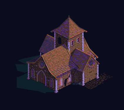 http://www.pixeljoint.com/forum/member_profile.asp?PF=42626&FID=8 - - - |
Posted By: Hapiel
Date Posted: 27 June 2013 at 11:49am
|
Haha, knowing you this won't be 'just' a house Zi! I wish you good luck and will be following this with interest! ------------- |
Posted By: jalonso
Date Posted: 28 June 2013 at 1:02pm
|
So much better. I forgot to mention before that these colors are very nice and give a lovely and mysterious look to it all.
@Hapiel, I too can already see all the tiny awesome details zi will come up with...lets hope we get animation too. ------------- |
Posted By: zi-double
Date Posted: 01 July 2013 at 3:43am
|
hahaha http://www.pixeljoint.com/forum/member_profile.asp?PF=8980&FID=8 - Hapiel maybe you are right. Just need to clear some ideas in my head :) http://www.pixeljoint.com/forum/member_profile.asp?PF=3132&FID=8 - jalonso hope to clear a bit my works with shadows and dark places. Every time when I finish them see too many mistakes, but it's hard to repair and prefer to put them as complete. One of the mistakes that were throw in animation at the beginning :) 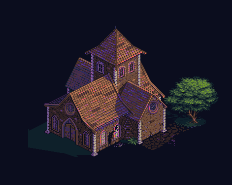 |
Posted By: zi-double
Date Posted: 02 July 2013 at 3:06am
|
Maybe someone would know where I'm going :) Last time I make a mistake to wonder how to bring the water, so now on the way back. Hope to look old enough. Apologize for the dark background ... 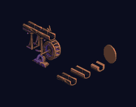 PS Why the works /first look in the post/ when I put here look like crushed. Is this from my browser firefox or ... ? From another browsers look at well ! |
Posted By: Theoden
Date Posted: 02 July 2013 at 3:56am
| This looks great, I love the colors and the awesome details. |
Posted By: jalonso
Date Posted: 02 July 2013 at 7:26am
|
Images (just checked) look fine in FF, Safari and Chrome.
--- The water wheel looks good and has the right scale but there is a visual problem that I see now but may be ok when water is added so its not really a crit. Just something to keep in mind when you add water. The thickness of the wood in the channel that carries the water on the top is so thick that it makes the wheel seem too small in comparison. The wheel should read sturdier than the channel as that carries all the weight. ------------- |
Posted By: zi-double
Date Posted: 03 July 2013 at 12:49pm
|
Thankyou Jal. Remove 1px from the thickness of the wood in the channel and 2px from width of the channel. Now is much better, because the wheel and the channel are equally "weighted". Also changed the shade of the stones. Now I'm worried about the size of the mill according to the other building. 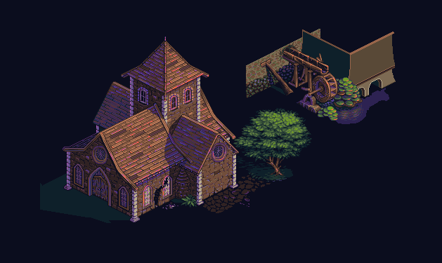 My firefox in the work have some problems :( |
Posted By: zi-double
Date Posted: 05 July 2013 at 2:33am
I hope it's understandable enough :) Dislikes right upper side of the tree, perhaps because the leaves are too "arranged" !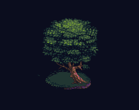 |
Posted By: jalonso
Date Posted: 05 July 2013 at 5:47am
|
Yes, the leaves are too arranged in that area.
If you intended the tree to have a face then the mouth looks weak and could be better if its only dark (a hole)? If you did not intend to make a face...I see a face. ------------- |
Posted By: zi-double
Date Posted: 08 July 2013 at 4:03am
Yes Jal, the correct answer was a hole in the tree  I have 1 main question about characters. They are a bit out of scale, but this way I can show more details will hands and feet ets. Is it acceptable this level of inconsistency ? Maybe left building need 4-5 px height, under the windows. Thus easily and the height of the door will increase. This is what I could think of to close the holes in the wall. Actually this sistem might not work, but ... 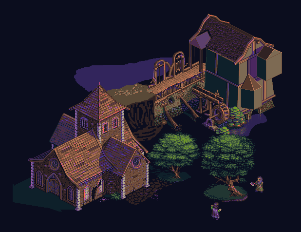 |
Posted By: jalonso
Date Posted: 09 July 2013 at 6:58am
|
* The characters are a little big but it reads fine to me.
* The canopy of the tree with the face does not have enough personality or movement. If this tree is scaring the characters and leaning forward then I would expect some leaves or branches to indicate that movement more than it has now. * The angle of the water flowing under the green plants looks wrong. * The water wheel looks very small within the scene. Are these wheels not usually very big? * The circular windows don't look quite right...maybe. It might be an idea to have one or both of these windows be stained glass should you need a splash of color? * The tower of the church is now looking very low, no? ------------- |
Posted By: Kurieta
Date Posted: 09 July 2013 at 8:35am
| This looks amazing... My jealousy level is over 9,000. |
Posted By: Yuran
Date Posted: 09 July 2013 at 8:01pm
|
I agree with Jalonso, great tips. I can not advise on pixels useful for this level of skill. But the first thing you need is now necessary to to think about the overall composition, what and where will be located, what size, then once it becomes evident what is missing and what can be modified. Just such a pace you can build a city :) Draw a few sketches of how the work will look like.
Согласен с джалонсо, отличные советы. Я ничего не могу посоветовать полезного по пикселям для такого уровня мастерства. Но первое что необходимо это сейчас надо подумать над общёй композицией, что и где будет расположено, каких размеров, тогда сразу станет видно чего не хватает, а что можно доработать. Просто такими темпами можешь построить целый город :) Нарисуй несколько набросков как эта работа будет выглядеть. |
Posted By: zi-double
Date Posted: 12 July 2013 at 5:44am
|
http://www.pixeljoint.com/forum/member_profile.asp?PF=3132&FID=8 - jalonso * for characters is great, because began to multiply. * Yep the tree look at very static now. If not animating it will try to impart orientation of leaves. * Repair a bit the water, but will need more work on it. The problem is that now I do not know where to direct it. * I looked at many references for water wheels and there are many from very small to very large. I fear that if released water will need to be animated. If it is animated with so much detail, and the greater is the water wheel the more difficult it will be to me. * need to think for that windows ... * level up the tower with 5-6 px and level down the floors of the mill with total of 5-6 px. Now it's better but I'm not sure if it's enough! thank you http://www.pixeljoint.com/forum/member_profile.asp?PF=42501&FID=8 - Kurieta :) http://www.pixeljoint.com/forum/member_profile.asp?PF=38405&FID=8 - Yuran I'm trying to draw a scheme in my head because if I'm planning a big project is almost certain that I'll not finish it. I've seen this many times also happened to me :) This way I can decide at any time to stop. If I'm did not do it for pleasure would I need scetch for all buildings and locations. Otherwise surely you are right. Small update. I feel that I will need more colors for characters or for water, although now 27 are sufficient, but have 5 until to keep them up to 32 :) Because of the decision to make differences of 2-3px in the walls will eventually straighten gaps. I hope it looks interesting that building with gently sloping walls. Just I can not figure out if it is noticed ? 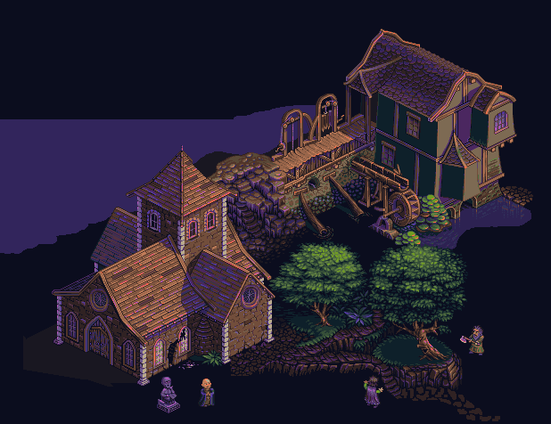 |
Posted By: Hapiel
Date Posted: 13 July 2013 at 4:25am
|
Hi Zi! I know what you mean with the planning and motivation... Exactly the same problem here ;) I thought your colors could use a bit of a push. More contrast, more saturation (especially on the green), less scary purple and more happy blue... But those are just the things I like ;) Original: Color edit 1  Color edit 2 (more extreme)  Of course you can see the difference best if you put them over each other and switch from one to the other.... I also think that the new rocks underneath the right bottom tree look a bit plastic. Perhaps define them a bit less? Good luck with the project! ------------- |
Posted By: KingGorillaKong
Date Posted: 13 July 2013 at 9:35am
| This keeps continuing to amaze me as you keep showing your progress. |
Posted By: zi-double
Date Posted: 15 July 2013 at 4:24am
|
Yes http://www.pixeljoint.com/forum/member_profile.asp?PF=8980&FID=8 - Hapiel
fully agreed with you about colours. Make just fast idea what I think for colours, but I work in Photoshop and have many layers, that is why when merge tthem, then fix the colors. Possibly then think about animation. In last big job, I made a mistake to make animations before finish it and fix the final colors. I had a big problems and why it is judged complete :) Repair the rock area, but again make mistake to use too many colours there. Next rock area will be better :) http://www.pixeljoint.com/forum/member_profile.asp?PF=42943&FID=8 - KingGorillaKong comments did keep my interest and many times help :) ... and small update ... do you think the bear is too comely ? Of course hardly will actually catch salmon in this stream, but ... Main problem about the ship, I think his scale isn't enough, but if it is actually going to take a lot of space. If not accepted will increase. I remember when http://www.pixeljoint.com/forum/member_profile.asp?PF=3132&FID=8 - jalonso do ship, buildings were smaller at the expense of the ship. This is the opposite. I think to economize his problems with sails :) 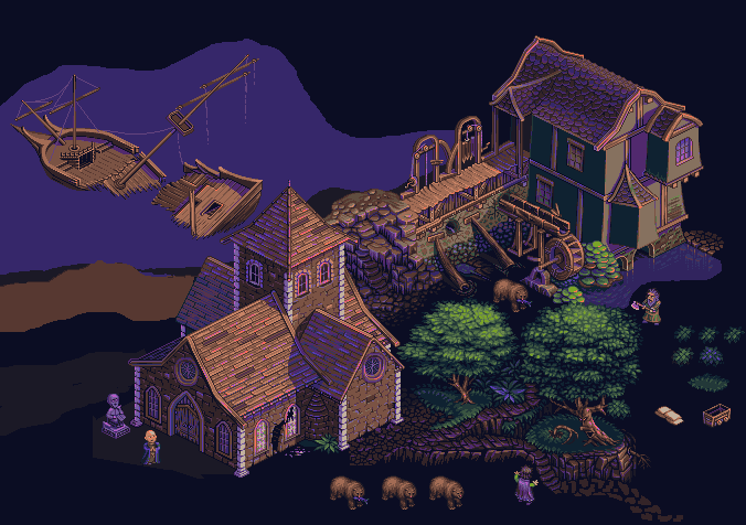 |
Posted By: jalonso
Date Posted: 15 July 2013 at 5:50am
|
I think the ship scale is acceptable and if you wish to visually increase its size but not the scale you can separate the two halves a little and scatter the halves. Front of ship to the right and back of ship down and to the left so the angle of the ship and the tower are not lined up so evenly.
The bear is too small and now makes the characters really look out of scale even tho the bear is in a better scale to the scene. ------------- |
Posted By: zi-double
Date Posted: 17 July 2013 at 4:24am
|
Yes Jal, now ship look at big and better as location. Increased the width of 4 px left and 4px in right. Increased the top mast and a few other things. If you think that need more scale, would think again. On the bear. Bear is well in size compared to the buildings and maybe 2-3 px less than peoples /I looked at some pictures of peoples with bears and peoples like the size are a little smaller than a walking bear/. I think the main problem comes from the head of the bear. Heads of the bears are more than two times greater than the human. Here would not be possible, because people's heads are big. Might help to increase the head with 2-3-4px. I'll try. 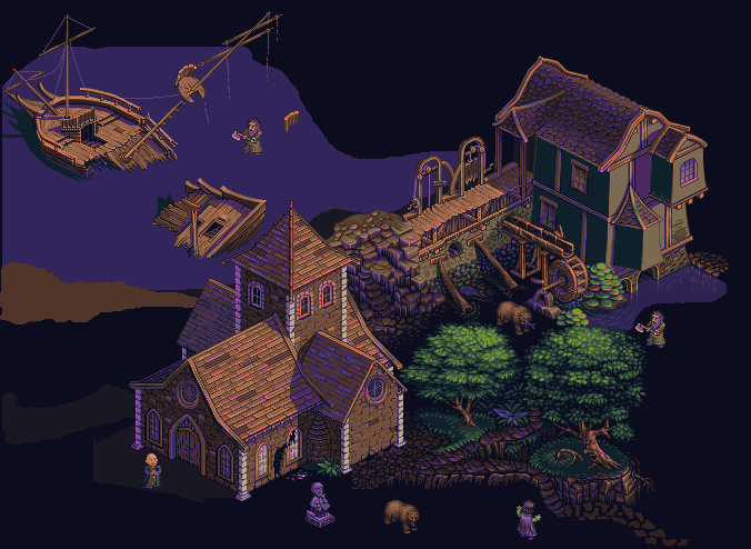 |
Posted By: paler123
Date Posted: 17 July 2013 at 3:15pm
|
Hi, Nice work my friend. Some very tidy pixelling. If i could suggest some things that may or may not have been addressed or discussed in other parts of the thread. I know you are trying to keep to a limited pallete but be careful how much brown you are using. As in the big building at the bottom is brown with brown roof. The pathways are brown and theres quite a lot of brown wooden features in the scene. So maybe try to seperate some of these elements a bit for clarity. I would suggest making the pathways a sandier colour with greyish stones. I like to make it easy for the viewer to find their way around a scene. And the roof tiles, a shade of red\orange but not too strong. Really like the tidy texturing of the leaves of the trees and the character in the trunk but theres a weird kinda thing going on where the trunk looks in front/too far forward compared to the leaves. Its fine on the tree on the left. Also as there is some quite strong purple shading in the scene i would expect to see some on the leaves in shadow\shaded, could be tricky to get right. One other thing to possibly consider with large scenes is to not overly detail and describe everything. It tends to get too much and look a bit noisey if ye know what I mean. All about balance. my 2 cents. phil |
Posted By: zi-double
Date Posted: 19 July 2013 at 1:50am
|
Hi http://www.pixeljoint.com/forum/member_profile.asp?PF=40941&FID=8 - paler12 , About brown, you're totally right. That is why I stop to make walls of the right building. I have to think of something different in a different color. I'll try to compensate somewhat brown with green. Brown on the trunks - now I fixed them to show what I think about them. Roads - have to show where are lit and really sandier colour will be good. Also do not like the roof of the building /mill/ and maybe something orange would be good. I need red/orange and for the peoples. Yes need purple/blue in the leaves /like in the trunks/, but because it is a very tricky job to clean it up in stride :) Now need something green in left over the rocks. Blue in right, maybe a waterfall. I do not know what is in the upper central empty part, but there is still a need for green. I just want to jot down major items. I hope to keep consistency throughout the work, but I'll see what happen in the end :) Thank you for ideas paler123 ! I'm a little insecure about waves. because they are unrelated with the wall at the mill and if make animations they will be static. I think they gives a fantastic look. 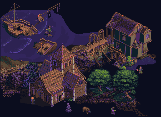 |
Posted By: zi-double
Date Posted: 23 July 2013 at 11:03am
I cleaned a little brown from the walls and from the pathways suggested fro http://www.pixeljoint.com/forum/member_profile.asp?PF=40941&FID=8 - paler123 . Tree in left is just to fix green area, needs to be repaired. Idea how to end the bottom left part of the job. I'm not sure whether they are good rags for sails. Perhaps must be larger and in different directions.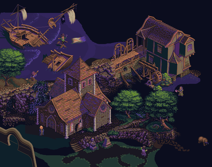 |
Posted By: Hapiel
Date Posted: 24 July 2013 at 3:37am
|
I think the top patch of the middle tree works so nice because the tree seems kinda build out of flat layers. The tree on the left is way taller and is more build out of balls it seems to me. There for the flat layers on top which you copied from the middle tree don't work perfectly for the tree on the left..
Perhaps copying from the right tree and then redoing some of the highlights would work better? ------------- |
Posted By: jalonso
Date Posted: 24 July 2013 at 7:16am
I'm a little distracted by the alignment of these 2 areas and to add visual/mental depth (even if iso) maybe the left tree can overlap the ship a little bit?
 ------------- |
Posted By: zi-double
Date Posted: 02 August 2013 at 3:45pm
|
Little slow progress ... perhaps belabor details ... http://www.pixeljoint.com/forum/member_profile.asp?PF=8980&FID=8 - Hapiel repair a bit the tree, of course in the end all trees need a bit purple in the leafs and then again will fix them. http://www.pixeljoint.com/forum/member_profile.asp?PF=3132&FID=8 - jalonso raised the tree now is better. For left 2 trees make mistake. I saw the direction of the trunks and leaves no. Now try to gloss over the situation. Not good, but it was the easiest way to break this line. Ship actually sits as planted on the house, but I do not know what to do. Maybe must move him to the left. I do not want to move up, because it will again increase the picture size. Again try to squeeze in a horse :) Deliberately head is in the other direction to make it look bigger and proportionate to the people. I do not know if it is successful. |
Posted By: Xhukari
Date Posted: 02 August 2013 at 3:51pm
| Your work is so impressive, I don't even know how you do it, I just don't! XD |
Posted By: jalonso
Date Posted: 02 August 2013 at 3:54pm
|
The ship and roof is easy to break the lines by adding a crack on the ship or another piece of wood or even some fabric from the sails. Just enough to break the two parallel lines. ------------- |
Posted By: zi-double
Date Posted: 02 August 2013 at 4:11pm
Thank you jal. Yes yes you give me a simple solution. I like to destroy  Thank you http://www.pixeljoint.com/forum/member_profile.asp?PF=42857&FID=8 - Xhukari , step by step with many repairs. Big works are never perfect. The problem is that when I look for so long a job I can not tell if something is good and hard to find an easy answers. So I am very grateful to the help here :) |
Posted By: cure
Date Posted: 02 August 2013 at 10:50pm
| This is looking fantastic so far, keep it up. Only crit at this point is the priest should be obscured in shadow, but perhaps this is something you planned to do anyway. This might become my favorite work of yours. |
Posted By: skittle
Date Posted: 02 April 2014 at 8:03am
| This is a pretty old thread but I just want to state the obvious, this looks incredibly incredible! |