Tiles Needed: Brians Iceworld
Printed From: Pixel Joint
Category: The Lounge
Forum Name: Sprites/Tiles
Forum Discription: Show off them fancy art skills.
URL: https://pixeljoint.com/forum/forum_posts.asp?TID=1705
Printed Date: 22 July 2026 at 4:13pm
Topic: Tiles Needed: Brians Iceworld
Posted By: randomblink
Subject: Tiles Needed: Brians Iceworld
Date Posted: 22 February 2006 at 12:47pm
|
ALRIGHT! And so it begins... Let's see some tiles for Brian's Iceworld... I wanna see:
Whatever you think would go good in Brian's Iceworld. Remember, Brian_the_Great commands the 'Great Penguin Army', so if you think it would fit in his world? Let's see it... ------------- www.randomblink.com I am me... no! Really! |
Replies:
Posted By: JJ_Maxx
Date Posted: 22 February 2006 at 5:02pm
I'm working on some platform tiles. Lookin' for a yea or nay. If it works I'll keep going.

And the single tile for examination: 
~ JJ |
Posted By: kwigbo
Date Posted: 22 February 2006 at 6:54pm
Those look great JJ. I love your style of pixel art. It tiles very well and I can't even think of anything to change. I wanna see more. I vote yea. 
------------- http://www.kwigbo.com"> 
|
Posted By: Psychotic_Carp
Date Posted: 22 February 2006 at 7:16pm
|
They look pretty good so far but the edges need to have a drop off instead of stopping abruptly -------------  got game? got game?
|
Posted By: JJ_Maxx
Date Posted: 22 February 2006 at 9:04pm
|
Originally posted by Psychotic_Carp
They look pretty good so far but the edges need to have a drop off instead of stopping abruptly Oh definately, those are next, as well as a bunch of misc. tiles and finishing off these ones. I'll be making a whole set of probably around 7-10 tiles. ~ JJ EDIT: Altered the tiles a bit and added the endcaps. 
~ JJ |
Posted By: Sibix
Date Posted: 22 February 2006 at 11:55pm
|
weeeeeeeeeeeeeee there are very nice :D maybe pj should wear a big coat ? the edges are schweeettt |
Posted By: jalonso
Date Posted: 23 February 2006 at 12:07am
|
I like these tiles, but think that the colors are too deep and not "icy" enough. JJMaxx does great work so it will end up great.
------------- |
Posted By: JJ_Maxx
Date Posted: 23 February 2006 at 5:31am
|
Originally posted by jalonso
I like these tiles, but think that the colors are too deep and not "icy" enough. JJMaxx does great work so it will end up great. Never good enough for you, is it Jalonso?  
Okay, well what do you think of this: 
~ JJ |
Posted By: leel
Date Posted: 23 February 2006 at 5:45am
|
well it certainly is icier.. but i dont like that too much i dunno.. i like the first version better EDIT: and by first i mean the updated one. |
Posted By: Brian the Great
Date Posted: 23 February 2006 at 5:52am
|
I like the icier one best. I say yay to that. Yeah. On a slightly different note: will the player be constantly sliding in this level? I'd love to see PJ runs his legs off trying to escape a giant penguin but not going anywhere. |
Posted By: JJ_Maxx
Date Posted: 23 February 2006 at 6:32am
|
Well, if we go with this type of 'sheeted' tile, I'm gonna have to make an extra tile to add underneth these tiles when they are in the air.
Like this: 
Not sure how kwigbo could work it, but the top tile would be solid, and the bottom tile would be non-solid, foreground tiles, so when PJ jumps up into them, he'll go behind them and bump his head on the first tile. ~ JJ |
Posted By: randomblink
Date Posted: 23 February 2006 at 6:44am
|
Originally posted by JJ_Maxx
I think that these look amazing! This is awesome work man... wow ------------- www.randomblink.com I am me... no! Really! |
Posted By: JJ_Maxx
Date Posted: 23 February 2006 at 8:15am
Thanks blink. I didn't like how textured the top layer of snow was on those tiles so I smoothed it out and I think it looks better.

A pixel artist is a constant tinkerer. ~ JJ |
Posted By: randomblink
Date Posted: 23 February 2006 at 8:29am
|
Yes they are... But I blame the medium. JJ... I am profoundly amazed are your Ice tiles. I have to ask what brought you to that design? I sat and thought about Ice Tile designs, but I couldn't even figure out where to start. Did you use a reference? Had you seen something like this before...? I gotta know... ------------- www.randomblink.com I am me... no! Really! |
Posted By: JJ_Maxx
Date Posted: 23 February 2006 at 8:40am
|
I really just used the pictures in my head to design them. Started with the frozen ground, then added the snow and icicles. (And you can see the trial and error in this thread.)
But I've always been partial to snow and ice. I made alot of ice peices for my Maxx Bloxx project. 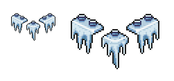
I dunno, sometimes you sit down and things click, and sometimes you close without saving and walk away. ~ JJ |
Posted By: Souly
Date Posted: 23 February 2006 at 8:44am
|
Originally posted by JJ_Maxx Thanks blink. I didn't like how textured the top layer of snow was on those tiles so I smoothed it out and I think it looks better. A pixel artist is a constant tinkerer. ~ JJ I'm loving this look, it almost looks like it's already a game. ------------- 
I am the jesus of PJ. |
Posted By: Sibix
Date Posted: 23 February 2006 at 9:06am
|
i think snow caps and a sunset should be in the background :D i think your size of game is better than the big one used for the flash so far .. |
Posted By: JJ_Maxx
Date Posted: 23 February 2006 at 11:03am
|
Originally posted by Sibix
i think your size of game is better than the big one used for the flash so far .. Naw, I think it needs to be bigger than 256x256. Kwigbo's got it set. Besides, 256x256 is a little too cramped. |
Posted By: Shark
Date Posted: 23 February 2006 at 11:14am
|
i loved your tiles, however i changed the pallette a bit, what does
every1 else think??  ------------- Snark, we love yuu. |
Posted By: Blueberry_pie
Date Posted: 23 February 2006 at 12:02pm
|
Quite awesome. This palette is a lot better, in my opinion.
------------- |
Posted By: JJ_Maxx
Date Posted: 23 February 2006 at 1:14pm
|
Sweet, I was hoping someone would work with me on these.
Less saturation definately looks better! Nice job Shark. ~ JJ |
Posted By: Sibix
Date Posted: 23 February 2006 at 1:20pm
| whats the shiny reflecty thing |
Posted By: JJ_Maxx
Date Posted: 23 February 2006 at 1:27pm
| It's PJ's twin, trapped in ice! *le gasp* |
Posted By: Psychotic_Carp
Date Posted: 23 February 2006 at 1:52pm
|
I think the dep blue platforms would look better with the lighter background ------------- got game?
|
Posted By: randomblink
Date Posted: 23 February 2006 at 2:01pm
|
Originally posted by JJ_Maxx It's PJ's twin, trapped in ice! *le gasp* No... no it's not. It cave-PJ ------------- www.randomblink.com I am me... no! Really! |
Posted By: kwigbo
Date Posted: 23 February 2006 at 3:22pm
|
I have to say I like the brighter blue better. Maybe find a happy medium between the two. The other blue just feels colder to me.
------------- http://www.kwigbo.com">
|
Posted By: JJ_Maxx
Date Posted: 23 February 2006 at 4:19pm
Hmmm...

Which one? ~ JJ |
Posted By: kwigbo
Date Posted: 23 February 2006 at 4:23pm
|
I still like the first the best it just feels colder.
------------- http://www.kwigbo.com">
|
Posted By: Monkey 'o Doom
Date Posted: 23 February 2006 at 4:54pm
|
Definitely the second. It has more realistic colors. ------------- http://pixelmonkey.ensellitis.com"> 
RPG is numberwang. |
Posted By: Psychotic_Carp
Date Posted: 23 February 2006 at 6:18pm
I think you need to have more contrast between the foreground and background

more contrast more contrast more cowbell...... ------------- got game?
|
Posted By: Saboteur
Date Posted: 23 February 2006 at 6:46pm
|
That burns my eyes, Psychotic. My vote goes for the first as well. It looks the most icy. ------------- "I was minding my own business and walking across a pebbled path, and a Duck started giving me the business." |
Posted By: Psychotic_Carp
Date Posted: 23 February 2006 at 8:32pm
|
I didnt say it looked good I just said it needs contrast ------------- got game?
|
Posted By: Sibix
Date Posted: 23 February 2006 at 11:57pm
|
Originally posted by JJ_Maxx
Hmmm... Which one? ~ JJ
my favourite is the middle one :S
that contrast one above is crazy lol |
Posted By: jalonso
Date Posted: 24 February 2006 at 12:15am
|
JJ-Maxx... "Never good enough for you, is it Jalonso? Your stuff is always awesome! On topic, if you tried somewhere between the second and third I would think it a better direction because, the first two and the previous versions lean too heavily to the blue. I do think it should be a blue pallete, but an icy/minty blue. Keep in mind that there is Shark's world were blue will surely dominate (two blue worlds  . . ------------- |
Posted By: iSTVAN
Date Posted: 24 February 2006 at 1:33am
|
Good point about the blue, Jalonso. I would like somewhere between 2 and 3 aswell. Also keep in mind how the mountainous background will affect the world's look. ------------- Listen to what the flower people say... 
|
Posted By: Shark
Date Posted: 24 February 2006 at 8:50am
|
2/3 combination. i also think a red orange sunset bg that was
mentioned will look uber cool :D Sharks Ocean world will be highly blue, however i was thinking the tiles will be sand coloured and only bg will be blue. they will look totally different if these tiles tend towards number 2&3 with the greys and desaturated blues. ------------- Snark, we love yuu. |
Posted By: jalonso
Date Posted: 24 February 2006 at 1:54pm
|
I don't konw about adding adding orange or any other "warm" color to this world (except for highlights).
------------- |
Posted By: Sibix
Date Posted: 24 February 2006 at 2:41pm
|
idisagree. adding a sunlight background over the ice caps.. clear sky with no clouds.. andit reflecting of the cie is a good way toshow. 1. how slippery the cie is and 2. how cold it is. *clear skies* i think pjs should breath steam :D |
Posted By: Larwick
Date Posted: 24 February 2006 at 3:52pm
|
I'm picking the middle one, it's the most atmospheric and will add to the tention when the player finds out he's fighting killer penguins in friggin' tanks. And seeing as Shark's level has him swimming with snorkles, i think having PJ with a coat and icy breath would be awesome. He could maybe have a blue hue to him, and icicles on his teeth. Oh wait, i'm getting carried away. -------------  http://larw-ck.deviantart.com"> http://larw-ck.deviantart.com">
|
Posted By: JJ_Maxx
Date Posted: 24 February 2006 at 4:00pm
|
By the way, these tiles I made belong to the project, so the regular rules and guidelines don't apply. Feel free to take them and edit them, fix them, re-color them but FOR THE PJ GAME ONLY.
I would also like to see some other people start slapping some stuff up here as well. C'mon, they're only tiles. 90% of the members on here are better than me! ~ JJ |
Posted By: jalonso
Date Posted: 26 February 2006 at 11:02pm
I found this on another post, the pallete is perfect ------------- |
Posted By: randomblink
Date Posted: 27 February 2006 at 6:52am
|
Ya know... The style of the penguins in that room would be good for a Mushroomish-Mario-Styled killer penguin...? Anyone wanna take a go at it...??? ------------- www.randomblink.com I am me... no! Really! |
Posted By: Saiklor
Date Posted: 04 March 2006 at 12:30pm
|
are those ice-balls? could we get some transparency going on so the balls behind are visible thru the balls in front? might look more icy.... ------------- www.semesteratsea.com |
Posted By: Larwick
Date Posted: 04 March 2006 at 12:42pm
|
Sharks world is alot more colourful and non-blue than originally thought, so i think this world should be scarily blue and white. For example, have the sun a huge pale disk, because i think, although orange would look nice, it would ruin the cold theme. If it was done well enough (which im sure it will) it could look fantastic. And randomblink, dya mean like goombas? Would they pop!? Aaah, i must hold myself back from making little cute popping penguins... ------------- http://larw-ck.deviantart.com">
|
Posted By: randomblink
Date Posted: 06 March 2006 at 8:22am
|
I don't have a preference Larwick... Make em die in a fun and carefree way... chuckle ------------- www.randomblink.com I am me... no! Really! |
Posted By: Ork
Date Posted: 30 March 2006 at 12:00pm
|
For the ice level, some serious sliding would be fun? .. That requires couple of special tiles. And here's the template for it. It contains about 10 different tiles, but don't think about the tiles, just draw on the template however you like.. 
|
Posted By: Ensellitis
Date Posted: 12 May 2006 at 12:13am
 What about some snow flakes and yellow snow? ------------- There's a pubic hair on my keyboard. What the f**k?? I "mow the lawn" so it's not mine. Gross. |
Posted By: Skull
Date Posted: 12 May 2006 at 7:23am
|
Originally posted by Ensellitis What about some snow flakes and yellow snow?  Great idea - Great idea -Piles of snowballs? ------------- |
Posted By: pixelblink
Date Posted: 31 May 2006 at 5:25pm
|
cmon guys... let's see some more tiles for this level. Also can we get the previous tiles broken down as separate pieces so we can edit them as needed? I wanna see snow forts built! ------------- |
Posted By: Brian the Great
Date Posted: 31 May 2006 at 5:38pm
|
ICE BUNKERS ------------- http://www.twoschizos.com"> 
|
Posted By: Shark
Date Posted: 01 June 2006 at 4:39am
 ------------- Snark, we love yuu. |
Posted By: Monkey 'o Doom
Date Posted: 01 June 2006 at 5:54am
|
I fixed a small tiling quirk, hope you don't mind.
------------- http://pixelmonkey.ensellitis.com">
RPG is numberwang. |

Posted By: Shark
Date Posted: 01 June 2006 at 6:40am
|
out of curiosity where was that? ------------- Snark, we love yuu. |
Posted By: Monkey 'o Doom
Date Posted: 01 June 2006 at 6:44am
|
The little collection of parallel white highlights shown here; PIC! ------------- http://pixelmonkey.ensellitis.com">
RPG is numberwang. |

Posted By: Shark
Date Posted: 01 June 2006 at 7:06am
|
Well there are bits that would stick out like rocks do but for the sake
of tiling ------------- Snark, we love yuu. |
Posted By: pixelblink
Date Posted: 27 August 2006 at 8:30pm
here's some proper 32x32 tiles I'm pretty happy with them considering I've never made tiles before this Edit: a quick and simple mockup...  ------------- |
Posted By: pixelblink
Date Posted: 28 August 2006 at 9:22pm
|
seriously, I will make ALL the tiles if I have to... some water this time.. and a heart... you gotta have heart to be into this:  and a mockup again:  going to attempt some floating icebergs next methinks ------------- |
Posted By: Ensellitis
Date Posted: 28 August 2006 at 9:42pm
|
omg, that looks great!!! if i could do tiles, i would help you out on em. :( i'll give it a shot, though, when i have a day off... but yeah, those look a lot better than the ones that were going to be used. kudos ------------- There's a pubic hair on my keyboard. What the f**k?? I "mow the lawn" so it's not mine. Gross. |
Posted By: Larwick
Date Posted: 29 August 2006 at 5:57am
|
I think they suit the style better and are easier on the eye than sharks. A bit of cleaning up and it should look great. I'm sure if jalonso had some spare time he could do wonders with that background... ------------- http://larw-ck.deviantart.com">
|
Posted By: pixelblink
Date Posted: 29 August 2006 at 10:20am
some icier tiles now  I will definitely be making some extra tiles to help out variate the obvious patterns happening. Thanks for both your comments and encouragement guys. I'm pretty stoked they turned out so well.. especially never having done tiles before this ------------- |
Posted By: randomblink
Date Posted: 29 August 2006 at 12:26pm
|
Excellent work pixelblink. Question: When did we get the ability to setup Sub-Forums? These are awesome! ------------- www.randomblink.com I am me... no! Really! |
Posted By: pixelblink
Date Posted: 29 August 2006 at 1:37pm
|
thanx RB! Answer: since I asked Sedge to do it up. more tiles:  another mockup:  Feel free to try your own alterations on these tiles for the game ------------- |
Posted By: Larwick
Date Posted: 29 August 2006 at 3:13pm
|
WOah woah woah. I think the overdetailing in the not-so-important areas of the tiles distracts from the image as a whole. I much prefered the earlier ones because they seemed calm and not overdone. Obviously they could do with some more detail, and perhaps some hints of rock shapes in the side. But i think what you've done lately to it is a tad too much. Loving the hearts though. ------------- http://larw-ck.deviantart.com">
|
Posted By: pixelblink
Date Posted: 29 August 2006 at 8:14pm
|
you're probably right Larwick. What does everyone else think about that?
------------- |
Posted By: Ensellitis
Date Posted: 29 August 2006 at 8:43pm
|
myself, i dont find it too busy, however i can see how it might be that way for someone else... but i love how you did these, maybe they can be saved? maybe if you take away some of the contrast? i also just noticed you have a vertical line going on, if you look at the right end pieces, you can see when put together, they create a noticable line. ------------- There's a pubic hair on my keyboard. What the f**k?? I "mow the lawn" so it's not mine. Gross. |
Posted By: kwigbo
Date Posted: 30 August 2006 at 9:45am
|
I agree with larwick I think you need to find a happy medium between the first set and this one. I also see the line that Ensellitis is talkin about. ------------- http://www.kwigbo.com">
|
Posted By: pixelblink
Date Posted: 30 August 2006 at 11:22am
|
yeah, see it too now that you mention it. As for the overdetailing, do you think it might be because the rocks are too concentrated together? What if they were larger and not so jumbled? I'll try and get some happy medium tiles going on sometime today. ------------- |
Posted By: Doppleganger
Date Posted: 08 November 2006 at 7:52pm
 Here's some tiles if you'd like. Not sure what the status on tile neccessity is but I gave it a shot anyways. |
Posted By: Blueberry_pie
Date Posted: 09 November 2006 at 12:08am
|
Sweeet. I love that snowman.
------------- |
Posted By: kwigbo
Date Posted: 09 November 2006 at 6:36am
|
Originally posted by Doppleganger
Here's some tiles if you'd like. Not sure what the status on tile neccessity is but I gave it a shot anyways.
Where are they I can't see them? ------------- http://www.kwigbo.com">
|
Posted By: Doppleganger
Date Posted: 09 November 2006 at 7:32am
| They're there. Not sure why you can't see them. I suppose you can just follow the url to my photobucket account. Odinno. But the pic is in your quote even so.... |
Posted By: ceddo
Date Posted: 10 November 2006 at 1:57pm
|
I agree with Larwick as well. As i first saw that screenshot sample, my eyes went to the awesomely done ice tiles :P
Which is good in a way, and bad in another. Dopplegangers' tiles are something simple you can rest your eyes on. edit: the icicles over the blue rocks stick out too much.. I say take off the black outline under them, and maybe the drop shadow too. |
Posted By: Yoggii
Date Posted: 29 November 2006 at 12:30pm
|
Here is just another..... I've added a ice-cream as a type of power up.
by the way im only 15 and all i use is paint :P.... is that good o.0.
 |
Posted By: Toonses
Date Posted: 29 November 2006 at 3:26pm
|
A lot of people here are 15 and use paint :P
Oh, and try not to use the .jpg extention for pixel art, .gif or .png work a lot better. Jpeg ruines the pics :P ------------- "I'm not that kind of orc!" -- random disgruntled peon |
Posted By: Larwick
Date Posted: 29 November 2006 at 3:30pm
|
Mhm, no jpegs. Also, this is in the wrong section, seeing as what you've added is a sprite, it should be in the sprite thread. Nice lineart, but it could use some form (shading etc) because right now it looks quite flat. Perhaps in-keeping with the style would need you to make all the outlines black aswel (with some light selout/aa here and there, i guess). And yeah dude, there are plently of younger pixellers here, and i only use MSPaint, and i find it fine. Of course, it's not the best, but it's still useable. ------------- http://larw-ck.deviantart.com">
|
Posted By: PixelSnader
Date Posted: 29 November 2006 at 3:40pm
|
lol jpegd.
paint rules. and i'm still young at heart. ------------- ▄▄█ ▄▄█ ▄█▄ ▄█▄ |
Posted By: Kfuchoin
Date Posted: 11 March 2007 at 10:20am
|
o.o what about some candycones that says : "santa's work shop" lol?
i'll make the sketch later,
and some icey mountains that he should jump over them so he wont get hurt o.o.... (sketch later)
by the way great job wqith the tiles :) amm some icey (very icey like ice cubes) would be fun.. if he slides on em.. so it would be harder to go over them
|