Robotz-like shooter mockup, but with NES colors
Printed From: Pixel Joint
Category: Pixel Art
Forum Name: WIP (Work In Progress)
Forum Discription: Get crits and comments on your pixel WIPs and other art too!
URL: https://pixeljoint.com/forum/forum_posts.asp?TID=17144
Printed Date: 09 June 2026 at 12:28am
Topic: Robotz-like shooter mockup, but with NES colors
Posted By: winged doom
Subject: Robotz-like shooter mockup, but with NES colors
Date Posted: 18 September 2013 at 1:25pm
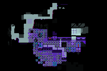
( http://25.media.tumblr.com/1ee701d6bf5b4e5985b6f861aa0188c8/tumblr_mt64iy8mNS1qjja0co1_400.gif - previous version ) Bored from 5734L3R's/J2H development, so I'm drawing something completely different from time to time, to relax and distract. I used a horrible and inconvenient palette from http://fc06.deviantart.net/fs71/f/2012/222/3/f/nes_stealer_by_winged_doom-d5ajonq.png - 5734L3R's NES mockup (for some unexplainable reasons I really like this palette and not going to change it) and plan to follow NES canons - 8x8 tiles\metasprites\3colors+ black: 
Inspired by "Robotz" from Atari ST and http://dl.dropbox.com/u/4426238/mockups.png - this great work by http://www.pixeljoint.com/p/22430.htm - Heavy Stylus . |
Replies:
Posted By: jalonso
Date Posted: 18 September 2013 at 3:06pm
|
The sprites are a little hard to see is my only crit. ------------- |
Posted By: winged doom
Date Posted: 20 September 2013 at 12:18am
|
Originally posted by jalonso
The sprites are a little hard to see is my only crit. Yes it is! I have two unused colors from nes palette and going to use them to make dudes more contrast + I use metasprites - it gives me another possibility to maneuver with character readability. |
Posted By: winged doom
Date Posted: 21 September 2013 at 8:38am
Update:

Added a pink color in palette. First enemy, spider, is perceived a lot better with this pink. I take all colors from "NTSC Palette with both Blue and Green Emphasized" which doesn't contain white. But I still have two not yet chosen colors in reserve, which will used to improve the readability of the main character. |
Posted By: jalonso
Date Posted: 21 September 2013 at 9:36am
|
I wonder if you should use the graphic secondary elements to better establish the 3/4 perspective view which is somewhat undefined. The graphic elements have a top down/head on look. ------------- |