WIP: Gantz room for The Joint
Printed From: Pixel Joint
Category: Pixel Art
Forum Name: The Joint
Forum Discription: Post your WIPs, ideas and anything else to do with the massive isometric apartment project.
URL: https://pixeljoint.com/forum/forum_posts.asp?TID=1740
Printed Date: 07 June 2026 at 1:23pm
Topic: WIP: Gantz room for The Joint
Posted By: TheRat
Subject: WIP: Gantz room for The Joint
Date Posted: 28 February 2006 at 5:26pm
|
I'm pretty new to the whole style, but I'm starting to get the hang of it. I was going to contribute with an apartment to The Joint, but first I need some advice... My theme is the almost empty apartment of the anime/manga GANTZ. I'm done with line art and some basic colors. I'm missing shades, illumination, highlights, selout and the windows...  I'm missing a lot... I'm missing a lot...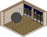 If you need references, please ask so. |
Replies:
Posted By: pixelblink
Date Posted: 28 February 2006 at 7:14pm
|
what the hell is GANTZ? A link would help so we can know what you are attempting to emulate. This is also in the wrong section. The proper section would most likely be under http://www.pixeljoint.com/forum/forum_topics.asp?FID=9 - The Joint ... hmm. Moved it for you ------------- |
Posted By: TheRat
Date Posted: 28 February 2006 at 7:46pm
|
Sure: http://en.wikipedia.org/wiki/GANTZ%21 for general info. And here is a part from the scan:  You can see some of the main stuff from the room. The main feature of the landscape outside it's that you can always see the Tokyo Tower. I tried to do something like it, but i don't know... |
Posted By: jalonso
Date Posted: 28 February 2006 at 9:45pm
Find a ref pic of the tokyo tower. I see one glaring problem with the
floor, the ref pic shows a step up on the floor but your room does not
show an elevation which makes the line going across the floor look odd.
Raise it by another px or two and shade the edges to indicate height.
The windows are broken into 3 vert planes in the ref pic but you only
did two in your room. The balcony goes too far to the left also,
perhaps it should end where the window is. The rail top is hidden
behing the window pane which gives the balcomy a goofy appearance,
lower or raise it to show it as a seperate object and further define
depth. I do think your room looks good 
------------- |
Posted By: TheRat
Date Posted: 01 March 2006 at 4:18pm
|
Thanks for your feedback. I did tried to make the step, but w/o proper shading in the separation, its only a line... I'm working on that. Good idea about the balcony, but I don't know about more vert planes in the windows. Maybe it will get too crowded and compact... Tokyo tower as seen from the room:  You will notice it isn't that big... Maybe I exaggerated a little. Since its a b/w comic you can't see the colors, but it is as an eiffel tower, but red and white. Tokyo Tower references: http://en.wikipedia.org/wiki/Tokyo_Tower  |
Posted By: TheRat
Date Posted: 01 March 2006 at 7:11pm
|
To Do: - SelOut - Lighting in wall/floor - Windows 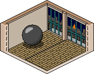 |
Posted By: jalonso
Date Posted: 01 March 2006 at 8:37pm
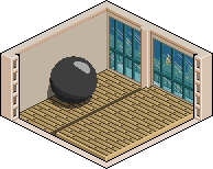
I took the liberty to edit the step.  ------------- |
Posted By: TheRat
Date Posted: 02 March 2006 at 5:52am
|
oh, so that was it... Thanks for that, now I will replicate it in the original PSD, if you don't mind EDIT: I can't help to notice you putted the light source top-right. It looks good, but it kinda conflicts with the ball. Should I change it or what? |
Posted By: jalonso
Date Posted: 02 March 2006 at 9:53am
|
Rat, I only did that to show rather than describe. The light source in
the joint is top right to bottom left. i am quite used to it so I
didn't notice your light source. the ball shadow should go up the wall.
Notice I also lit the blue window frame and added a few pixels on the
tower. Also note that the top brown should be light colored.
------------- |
Posted By: TheRat
Date Posted: 02 March 2006 at 12:41pm
|
Well, isn't that something they don't say at the template page. I guess
I will go with the flow, changing the ball to fit the standard lighting. Anyways, I wasn't started yet with lighting. I just did the ball since it was freaking me out. It was a circle... Yeah, I noticed the pixels in the tower, it looks even better. I have doubts with the horizontal bar in the right window panes, it seems too low. Will work on it as soon I hit home |
Posted By: TheRat
Date Posted: 02 March 2006 at 6:56pm
 Missing minor details (wall cracks and stuff) and the wood floor distinctive look. I think it looks OK... I can't believe I actually did that |
Posted By: Monkey 'o Doom
Date Posted: 02 March 2006 at 7:10pm
|
That's pretty good, maybe have something else going on in there. ------------- http://pixelmonkey.ensellitis.com"> 
RPG is numberwang. |
Posted By: jalonso
Date Posted: 02 March 2006 at 9:03pm
looks fantastic  . .Recolor the black lines where the corners meet with the darkest wall shade of brown. Maybe the orb needs a little more work. ------------- |
Posted By: Dra_chan
Date Posted: 03 March 2006 at 12:57am
|
You should add the doggy in there
|
Posted By: TheRat
Date Posted: 03 March 2006 at 4:54am
|
I was thinking of animating it, starting with teleporting, then opening up. I know the orb seems as "missing something", but that's space for the text. By the way, thanks a lot jalonso, your suggestions really helped me a lot EDIT: Drachan, you know the anime/manga, does it look like the real one? |
Posted By: Dra_chan
Date Posted: 03 March 2006 at 11:49am
I don't know the manga. I saw the doggy in the picture you submited , and yes, it looks like the real one for what can I see.
|
Posted By: TheRat
Date Posted: 04 March 2006 at 9:10am
| right, it's just that the doggy is a popular character among the fans... Been busy and stuff, so expect an animated final version in a few days |
Posted By: Larwick
Date Posted: 04 March 2006 at 9:15am
|
It looks great now, i'm loving the view from the window, easily the best part yet. If i was you i would definitely lighten the dark grey on the floorboards to the darker wood colour to the left of the risen area. Also, the ball seems a little nobbly to me, and the highlight isnt great, but im sure you can fix all that. I'm looking forward to the final result. -------------  http://larw-ck.deviantart.com"> http://larw-ck.deviantart.com">
|
Posted By: TheRat
Date Posted: 04 March 2006 at 2:07pm
I was going to animate, and then I realized that the back space wasn't enough... and the idea of using it in the RPG board I'm playing at, got scrapped (too much work they said) so, I present you this version, with some color fixes and singing ball.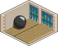 suggestions and/or comments? |
Posted By: jalonso
Date Posted: 04 March 2006 at 11:02pm
|
lovely, the floorboards are great now. The orb is a bit jaggy still (do
you you how to selout?). I did'nt notice before but the window panes
are different sizes, are they supposed to be? One last thing remember
how we raised the floor to give it height, well the balcony needs to be
raised to be level with the lower floor, it looks like quite the drop
now. The window colors are beautiful and the progress here is
outstanding, hope you end up next to one of my rooms :D
------------- |
Posted By: Larwick
Date Posted: 05 March 2006 at 3:10am
|
Looks amazing, but i still dont think the highlight looks quite right. How about a gently fading circle rather than the stark ovalyness? ------------- http://larw-ck.deviantart.com">
|
Posted By: TheRat
Date Posted: 05 March 2006 at 9:47am
|
@jalonso: please, show me what you mean with correcting jagginess, because I think I already did the selout-ing... @Larwick: Will try it... |
Posted By: jalonso
Date Posted: 05 March 2006 at 1:59pm
|
Originally posted by TheRat ...please, show me what you mean with correcting jagginess, because I think I already did the selout-ing... Since you remake things I left a few pixels out of place for you to find and fix. The orb to the right of the outlines show the pixels I touched (Notice I went outside the orb instead of inside) on the orb and shadows for you to inspect. I also messed with the walls a bit.  ------------- |
Posted By: TheRat
Date Posted: 06 March 2006 at 11:53am
| Ah, you meant AA and dithering! Liked the color changes, but I'm not that convinced on thw white spot. Maybe a little bigger... |
Posted By: jalonso
Date Posted: 06 March 2006 at 12:04pm
|
I don't mean to take over your room, its just simpler to show you a
point or detail rather than describe. You seem to learn from c+c, so I
have not minded taking time with your room. Its your piece so anything
I draw in your piece is only a visual suggestion which I expect you
will redraw.
------------- |
Posted By: TheRat
Date Posted: 06 March 2006 at 12:11pm
|
please, don't think so. I appreciate your comments, and it has really helped me learning. It's hard to believe I was a complete newbie a week ago... I didn't meant it as a scolding for the lighting, it was just an annotation. |
Posted By: jalonso
Date Posted: 06 March 2006 at 12:21pm
|
I know dude, I was just clariying. Often when n00bs ask for help/c+c they don't seem to pick up or learn much, YOU however are a rare exception. I was complimenting not bothered  ------------- |
Posted By: TheRat
Date Posted: 06 March 2006 at 4:17pm
Ok, so nobody is bothered  My first try at dithering, so it was pretty much trial and error. Added more animation, but I'm sticking to my choice of no teleporting/opening up. For those who wonder, after the song the ball shows some text that says "Your lives have ended. how you use your new lives is entirely up to me. that's the theory, anyways" And yes, anyone who is familiar will point me out that the song/briefing is after the teleporting. Let's say is my artists license  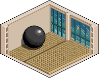 |
Posted By: TheRat
Date Posted: 08 March 2006 at 1:12pm
|
oh kay... I guess we are done with c+c. That means I will finally submit it today. Thank you all |
Posted By: Larwick
Date Posted: 08 March 2006 at 1:15pm
|
Looks great, one of the best rooms in the joint. ------------- http://larw-ck.deviantart.com">
|