[WIP] Lithone 2005
Printed From: Pixel Joint
Category: Pixel Art
Forum Name: WIP (Work In Progress)
Forum Discription: Get crits and comments on your pixel WIPs and other art too!
URL: https://pixeljoint.com/forum/forum_posts.asp?TID=17985
Printed Date: 21 July 2026 at 11:14am
Topic: [WIP] Lithone 2005
Posted By: CELS
Subject: [WIP] Lithone 2005
Date Posted: 12 January 2014 at 1:02am
|
Hey fellow joint enthusiasts!
I'm hoping some of you can help me with my great nemesis in [pixel] art: composition. How does this look to you? There are no details here yet, so it looks like a street vendor is trying to sell the lady a delicious glass of http://www.youtube.com/watch?v=UayQTu2kH-U - Grape Drink . But I'm going to add some details, some more items to give some context. They're basically having a bit of a scientific dispute. With that in mind... how does it look? 
|
Replies:
Posted By: BottleGnomes
Date Posted: 12 January 2014 at 7:13am
|
At the moment, the poses look very unnatural - I don't think crossing your legs while standing is a common stance. Also, the blue robot looks rather on the edge of action (leaned forward, arms raised, that foot put down behind). I think you just need to work on their poses, the background seems great to me, everything lined up. And at the moment I can't really tell that he's a vendor, but I'm sure that will come later. |
Posted By: CELS
Date Posted: 12 January 2014 at 8:06am
|
Much appreciated, Bottle. Standing cross legged is something I see girls doing quite often. You can google it for pictures and information about how to interpret it as body language. Girls have a bunch of weird poses, like when they twist their ankles sideways, so both ankles are nearly touching the ground. You could say it looks unnatural and I'd be inclined to agree, but... they do it anyway.
The blue robot's pose is very much exaggerated, I agree. It was a conscious choice. I wanted him to look overtly animated. He's not a vendor, by the way. I guess you misread the OP :) |
Posted By: BottleGnomes
Date Posted: 12 January 2014 at 8:47am
The difference between the standing cross legged poses I'm finding on google images and what you've drawn here is that normally they're stood with both feet planted on the ground so that their center of gravity is between their legs - in your image she seems to be balancing on one leg. It's a pose that implies assisted standing, like she's leaning on a wall or something.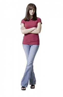 And my apologies! I did indeed misread the OP. |
Posted By: CELS
Date Posted: 12 January 2014 at 9:10am
|
Maybe it's a result of Google Images showing us different results. I didn't really google this before I drew it, I just wanted to draw a lady robot standing cross legged. But now that I do google it, I see 9-10 different pictures on the very first page, showing someone standing crosslegged without support, and they don't have both feet planted on the ground. (I would provide evidence, but let's not get crazy with the investigation)
At this point, I feel like it's not completely crazy for her to stand like that. I'm sure I've made a number of mistakes, and maybe you're picking up on something else I've done wrong, but I don't think it's a big deal that she's standing cross legged without planting both feet on the ground. |
Posted By: CELS
Date Posted: 16 January 2014 at 3:09am

Struggling a bit with the shiny metal surfaces. Haven't found any good tutorials to do this style, so I'm just trying to copy old 1980's cartoons. |
Posted By: Shadow64
Date Posted: 16 January 2014 at 5:18am
| Always impressed by your talent, man. That floor looks amazing. Why don't you try just embellishing the lines, but keep those softer colors and replicate what you did above. Right now I totally buy that that's a reflection, just based on your exception palette choice. Wow. |
Posted By: skittle
Date Posted: 16 January 2014 at 6:07am
| I dunno, I see people doing that all the time, and not necessarily like that google image. This looks pretty awesome even at this stage, I can't wait for the end result! |
Posted By: CELS
Date Posted: 17 January 2014 at 1:17am
|
Thanks for your words of encouragement, chaps :)
I will definitely keep embelleshing the lines. I think the only part I'm somewhat happy with at the moment is the bottom of the column on the left. Everything else is constantly under revision, in no particular order. 
|
Posted By: H|F
Date Posted: 17 January 2014 at 1:26am
|
This is pretty awesome and a big jump forward with the update :)
I can't really think of any critique currently however. I'm not the best at this stuff! This doesn't really look like it at all but this reminded me of a 60's Tom and Jerry cartoon when they were both in space lol Ok I edited to tell you it was from '67 and the name of it was O-Solar Meow if you are curious. I'm so off topic. |
Posted By: Shadow64
Date Posted: 17 January 2014 at 7:46pm
|
No problem, it's great work!
I really like the addition of the clouds and the rest of the galaxy work you're doing. The change in shading of the chamber in the middle is nice, but I'm not clear about the colors or what they're reflecting and directly underneath it I think should probably change as well. There are a lot of colors in a line there but I can't tell what they're being used for yet. At the base of that chamber on the left side, the reflection seems to bulge a bit. Since everything else you have is pretty vertically symmetrical in its reflection, this stands out. Finally, the orb sticking out of the wall on the bottom left could match the orb above it a little better, but I'm sure you know that. Of course, I say all of this conceding that you're still working on it and this is so beyond my abilities. Well done! |
Posted By: CELS
Date Posted: 18 January 2014 at 6:11am
Well, I think I should just come out and say, right off the bat, that I don't know what the hell I'm doing here. But I'm having a lot of fun. Hopefully at some point, someone who understands the technical side of lighting and reflection will send me crashing back to reality. But untill then..... weeeee!

Thanks for the comments, guys. @H|F: I checked out O-Solar Meow, and I remember seeing that as a kid! Not quite what I'm going for, although I can always insert a small mouse hole on one of the walls, if you want :) @Shadow64: Thanks, I will definitely keep working on the reflections on the floor from the chamber. In regards to the orb on the floor, it's definitely one of the worst things in this piece so far, so I need to go over it as well. |
Posted By: Shadow64
Date Posted: 18 January 2014 at 10:35am
|
Nice! I like the bit so that we can tell there's a window on the side and the new paneling on that wall. Very cool!
I'm not going to be the one to knock this piece down, it keeps getting better. :) |
Posted By: CELS
Date Posted: 18 January 2014 at 9:44pm
|
Thanks, Shadow64!
To be honest, I'm not sure how to do the window, really. I mean, the standard is to have two diagonal bands of light across windows. But I don't really understand the logic behind this way of drawing windows, so it feels a bit like drawings a nose as an 'L' because "That's how you draw a nose". I wish I understood reflections better. 
|
Posted By: neofotistou
Date Posted: 19 January 2014 at 6:29pm
|
Composition looks absolutely fine to me. I wonder, when you're engaged in scientific debate, do you often stand with your legs crossed? ^-^ I'm not saying nobody ever does it, I just think it's hurting your case, they're both strong-minded scientists, they should both stand equally well on their feet, whatever the rest of their body is doing. Unless she's a useless scientist, with no conviction in what she's saying and an airhead. Then the pose is right. A quick google of "scientists arguing" brought up this http://i.imgur.com/hP0zN.jpg |
Posted By: CELS
Date Posted: 20 January 2014 at 3:26am
Here's the latest version. It was suggested that I remove the star, because it looked too busy before. I've also messed around with contrast.

I still don't have a good understanding of reflections, but I've picked up a thing or two now. In regards to the controversial pose and the airhead-scientist, the idea was to portray the male and female scientists as incarnations of Yin and Yang. The male scientist as excessively animated, creative, forward, energetic (yang), the female as calm, passive, tolerant, patient (yin). From Wikipedia: "Yin is characterized as slow, soft, yielding, diffuse, cold, wet, and passive; and is associated with water, earth, the moon, femininity and nighttime. Yang, by contrast, is fast, hard, solid, focused, hot, dry, and aggressive; and is associated with fire, sky, the sun, masculinity and daytime." They're both scientists, they're both on equal standing, they both have confidence and conviction. But they represent polar opposites in their approach. He is daring, she is cautious. He is perhaps too eager, she is perhaps too skeptical. But as two halves of a whole, they complete each other, as indeed scientists often take turns playing the roles as torch bearers and nay-sayers in order to put forward new theories and then put new theories to the test. I suppose a better indication of yin and yang would have been to give her the container with fluid and give him something with an open flame of sorts. At any rate, with the new background a new foreground is needed. I haven't yet decided how to draw the characters in this version. |
Posted By: H|F
Date Posted: 20 January 2014 at 10:30am
|
I don't mind the pose so much. It seems like she was supposed to look relaxed and at ease and he looking aggressive and confident, while she may be skeptical as you have stated.
I do read that from the closed off tone of her pose. I think it's pretty close to what you want them to represent. |