ISO house-Please help me with a shadow;_;
Printed From: Pixel Joint
Category: Pixel Art
Forum Name: WIP (Work In Progress)
Forum Discription: Get crits and comments on your pixel WIPs and other art too!
URL: https://pixeljoint.com/forum/forum_posts.asp?TID=1829
Printed Date: 09 June 2026 at 1:25am
Topic: ISO house-Please help me with a shadow;_;
Posted By: Dra_chan
Subject: ISO house-Please help me with a shadow;_;
Date Posted: 15 March 2006 at 12:20pm
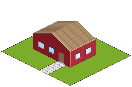 Hiya! This is my first attempt at making an isometric house. This is what I got so far. Before going any further I would like to know if the shading and choice of colors are good or not, and I would apreciate any other feedback in it. Basic things I want to add: A fence Two or three trees Grass A black labrador retriever Anything cool you suggest Thanks in advance Edit: didn't add the dog but a cat |
Replies:
Posted By: jalonso
Date Posted: 15 March 2006 at 4:54pm
It just may be the way I work, but don't sweat the colors yet. You
don't yet know what you need. Say later on in the process the house
ends up being made out of bricks, then this color works. However if you
end going with painted siding or stucco then this red color is
horrible. I would put the effeot into laying out the scene first, the
details and coloring come later in spurts. As it looks now the roof
does not everhang the walls which give it an amateurish look look. The
door seems too thin for the wall space so perhaps a portico or small
step up area to beef up the entrance which is the main focal point of a
house would help tremendously, particularly with such a wide path. The
roof could use a chimmney/skylight/santasleigh, anything to break up
the tile monotony. Also consider breaking up the box a bit. the roof
overhang will do so but also a potrusion of some sort like say a bay
window. You say you would like a tree, consider the right side of the
house to visually stop the sometimes inevitable "leaning down" look
that iso creates. This will give you a division of 3 on that side which
looks good (2 windows and a tree), smaller trees could be placed in the
front of the house or by the front door (colummn substitutes) this
would also help to break the box. The grass, dog, people leave for
later. architectural features first. The house will then tell you what
it wants.......more later, get to work
------------- |
Posted By: Dra_chan
Date Posted: 15 March 2006 at 5:20pm
| Wow, that was some feedback. Thank you very much. *goes to work* |
Posted By: Dra_chan
Date Posted: 17 March 2006 at 12:41pm
|
Update Made the roof overhang, added the bricks, steps, made the way to the house more narrow and made a chimney 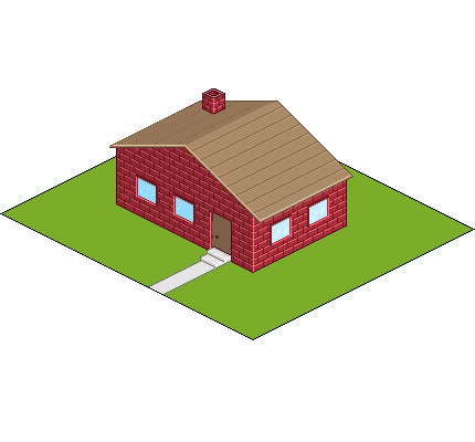 I will definetly change the color of the roof |
Posted By: jalonso
Date Posted: 17 March 2006 at 1:36pm
|
Very nice Chan, I'll be brief this time. The angle of the chimmney
should match the slope of the roof (staight across). the door handle
needs to be 2px higher. Bricks are shot really shiny (remobe highlight
in the edges, have the two shades meet and only highlight the very top
corner in a new light shade of that pink color.
------------- |
Posted By: Dra_chan
Date Posted: 18 March 2006 at 12:54am
 I did what you told me (I think this was what you meant with the bricks), and changed the roof color. Thanks sensei jalonso  Weekend tomorrow yay! I will have more time to pixel, can't wait to add the trees and details |
Posted By: jalonso
Date Posted: 18 March 2006 at 8:15am
|
That's exactly what I meant with the bricks. Something else that makes
bricks look good rather than just a texture it to erase a pixel in the
mortar along the edges of the house. I you need a visual of this check
out "polly's grocery" in my gallery. Now that you've settled on bricks,
next time you're fooling with the palette add a little yellow to the
reds, just a touch.
------------- |
Posted By: Aleiav
Date Posted: 18 March 2006 at 1:58pm
|
I like this brick style. :D But if you want more realistic and less cartoony
st0ven has a brick tut on http://zoggles.co.uk - Zoggles that you might want to use. :) ------------- |
Posted By: Shark
Date Posted: 18 March 2006 at 2:25pm
|
this is good so far, but because its such a large scale it looks a bit
boring. it needs to show more detail to add more interest. windowsills, plants hanging of the outside, birds on the roof, skylights, curtains, glass panel within door + wood effect, garden path made from concrete pieces rather than a cement line, another layer of windows, flower boxes, drains, fence, mailbox, i guess ur still working on the garden, but i suggest adding plants and maybe a water feture wood be cool. ------------- Snark, we love yuu. |
Posted By: Dra_chan
Date Posted: 18 March 2006 at 7:45pm
|
Originally posted by Aleiav I like this brick style. :D But if you want more realistic and less cartoony st0ven has a brick tut on http://zoggles.co.uk - Zoggles that you might want to use. :) That's a very nice tutorial, and the site has other tuts as well, thanks! This will be a great help in my learning. Originally posted by Shark this is good so far, but because its such a large scale it looks a bit boring. it needs to show more detail to add more interest. windowsills, plants hanging of the outside, birds on the roof, skylights, curtains, glass panel within door + wood effect, garden path made from concrete pieces rather than a cement line, another layer of windows, flower boxes, drains, fence, mailbox, i guess ur still working on the garden, but i suggest adding plants and maybe a water feture wood be cool. I'm now in phase two of the work, the details! But...I'm stuck with the trees, they look...stupid. I would like them to have a realistic look. After I figure it out I will try your cool suggestions. |
Posted By: Monkey 'o Doom
Date Posted: 18 March 2006 at 7:47pm
|
What type of trees do you want (coniferous, twisted, stereotypical, etc)? ------------- http://pixelmonkey.ensellitis.com"> 
RPG is numberwang. |
Posted By: Dra_chan
Date Posted: 18 March 2006 at 7:52pm
|
Originally posted by Monkey 'o Doom What type of trees do you want (coniferous, twisted, stereotypical, etc)? I want realistic kind of trees, the ones where you see the branches and the leaves on them in a sort of transparent way. They would take away monotony to the scene more than the round and coniferous ones I think. I haven't seen the twisted though. Edit: I officialy suck at trees  |
Posted By: jalonso
Date Posted: 18 March 2006 at 9:36pm
|
I too suck at trees but, it may help you to do what I do. I make 2/3
diff branches with leaves on it which is much easier to keep in iso
proportions. Then I arrange then into the tree form (like flower
arranging). Once content I add the trunk then smooth it all out with
single leaves 2/3 diff of those too. The traditional format of using
shapes to create organic items always end up looking unnatural. With
the build-up method you end up with a more natural looking tree.
------------- |
Posted By: Dra_chan
Date Posted: 18 March 2006 at 11:14pm
I did the trick in the edges of the bricks.  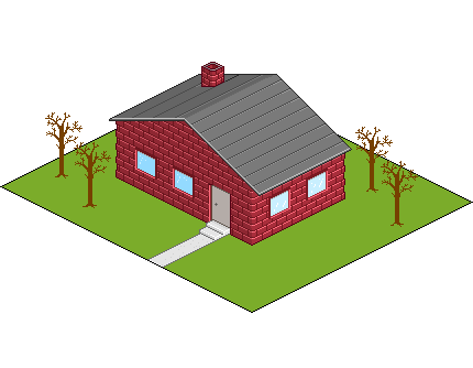 |
Posted By: alkaline
Date Posted: 18 March 2006 at 11:45pm
| The way the highlights are on the bricks make it look kinda plasticky, eh? It could just be that I have a funny way of viewing things though. |
Posted By: Dra_chan
Date Posted: 19 March 2006 at 12:45am
|
Originally posted by alkaline The way the highlights are on the bricks make it look kinda plasticky, eh? It could just be that I have a funny way of viewing things though. Aaaaaah, mmm maybe. But I will leave them as they are for the time being, I'm fighting with the trees right now   Speaking of trees 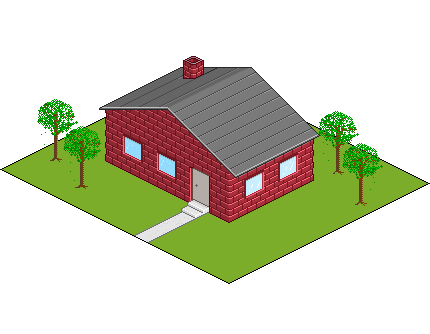 |
Posted By: Souly
Date Posted: 19 March 2006 at 12:47am
|
The cement needs more indepth texture. ------------- 
I am the jesus of PJ. |
Posted By: alkaline
Date Posted: 19 March 2006 at 8:14am
| The trees are getting somewhere, I just don't like the harsh line of dither on the side of the bark |
Posted By: jalonso
Date Posted: 19 March 2006 at 10:04am
|
you forgot to do the "trick" on the chimmney
------------- |
Posted By: Dra_chan
Date Posted: 19 March 2006 at 2:15pm
|
Originally posted by jalonso you forgot to do the "trick" on the chimmney
omgwtflololo true. Thanks. @setzer: I thought it would give a trunky look. But looking at it, I could soften it. When I finish this piece, I will give credit to everyone who have helped me, seriously  |
Posted By: alkaline
Date Posted: 19 March 2006 at 3:12pm
| the tree leaves have kinda a spraypainted sort of look, eh? unless you really do want it all wispy and thin, perhaps try it differently |
Posted By: Shark
Date Posted: 19 March 2006 at 3:19pm
|
when are trees smaller than bungalos? ------------- Snark, we love yuu. |
Posted By: Dra_chan
Date Posted: 19 March 2006 at 5:32pm
|
Originally posted by Shark when are trees smaller than bungalos? Only in Dra_chan's head @_@ |
Posted By: leel
Date Posted: 19 March 2006 at 7:41pm
|
hm this is just an idea, but aren't there white lines in-between each brick for the uhh.. sticky stuff that holds the wall together? cause right now it looks like a toy house with bricks simply stacked onto one another. and as someone mentioned the plastic-y highlights just add to the toy look. I know you're focusing on the trees right now, but I just thought I'd give you some c/c for later, since I can't really help you with the trees at all. Yupp.. that's all, keep at it, there's been great improvement since the first try 
|
Posted By: Dra_chan
Date Posted: 19 March 2006 at 8:24pm
|
Originally posted by leel hm this is just an idea, but aren't there white lines in-between each brick for the uhh.. sticky stuff that holds the wall together? cause right now it looks like a toy house with bricks simply stacked onto one another. and as someone mentioned the plastic-y highlights just add to the toy look. I know you're focusing on the trees right now, but I just thought I'd give you some c/c for later, since I can't really help you with the trees at all. Yupp.. that's all, keep at it, there's been great improvement since the first try Thank you for the c/c, and even if I'm working in something else, I take every advise in consideration. And I agree, it's a great improvement from the first image I posted, this work is a huge challenge to my patience, since I used to finish all my works in the very same day. |
Posted By: Dra_chan
Date Posted: 19 March 2006 at 11:17pm
Update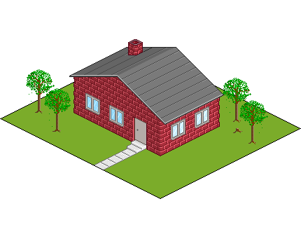 -No more plastic-y look! Or so I hope. The good thing is that now I know how to make toy houses.  -Fixed the dithering in the trunks, and added a chopped down "tree" -Added window sills -Gave texture to the path to the house Didn't do much, damn family taking over the computer >_> I will add details like boxes and things you all recommended. @jalonso: the brick trick didn't look good on the chimney |
Posted By: jalonso
Date Posted: 19 March 2006 at 11:26pm
|
May I edit your image on a section of bricks to show you what I really meant?
------------- |
Posted By: Dra_chan
Date Posted: 20 March 2006 at 1:00am
|
Originally posted by jalonso May I edit your image on a section of bricks to show you what I really meant? Yeah, please do |
Posted By: inkspot
Date Posted: 20 March 2006 at 2:39am
|
WTF THE TREES LOOK LIKE POLES? Bah, I just shut up, these thing fit into that pic anyway... But still, roof is wrong, who would place the roof like so, the lines should be vertical! |
Posted By: Souly
Date Posted: 20 March 2006 at 10:15am
|
Why do the steps not have any texture? -------------
I am the jesus of PJ. |
Posted By: jalonso
Date Posted: 20 March 2006 at 12:47pm
 Dra, This is a quick example. Things to notice here are the brick edges *trick* on both the chimmney and side. Also the coloring of the bricks between the "me", as I mentioned before a bit of yellow to the red is more realistic. Notice the grout lines have been deepened and desaturated and color variations of individual bricks to eliminate the plasticky look, colors are not perfect so please do not use these. I also added a scale ruler for you to use as you make items for this piece, based on your door, which is 7' (real life standard). The fellow is 6', therefore if you want a 12' tree, that's the height of it. This tree is also an exaple of the flower arraigement method I mentioned before. Hope this helps out some :) EDIT: please don't use this tree in any way, it belongs to a client, but was the closest one to me at the time. ------------- |
Posted By: alkaline
Date Posted: 20 March 2006 at 12:50pm
| Yes, that's what I was looking for in the bricks, it needed texture, variation....etc |
Posted By: Dra_chan
Date Posted: 20 March 2006 at 1:48pm
|
Originally posted by jalonso Dra, This is a quick example. Things to notice here are the brick edges *trick* on both the chimmney and side. Also the coloring of the bricks between the "me", as I mentioned before a bit of yellow to the red is more realistic. Notice the grout lines have been deepened and desaturated and color variations of individual bricks to eliminate the plasticky look, colors are not perfect so please do not use these. I also added a scale ruler for you to use as you make items for this piece, based on your door, which is 7' (real life standard). The fellow is 6', therefore if you want a 12' tree, that's the height of it. This tree is also an exaple of the flower arraigement method I mentioned before. Hope this helps out some :) EDIT: please don't use this tree in any way, it belongs to a client, but was the closest one to me at the time. Oooooh. Thank you for the example, it is of great help indeed. I didn't understand your method of the three before, and your way to do bricks looks way better than what I did. Tonight I will give this piece some life |
Posted By: Shark
Date Posted: 20 March 2006 at 1:58pm
|
the only way to make isometric pixel art interesting is to either -
A have hell of a lotta skill and break away from the generic cube houses/buildings ( like that pixeldam piece that just came up and got like 50 million favs) B include loads of details the viewer will have to spend ages looking at, the more small details the better. C have a really great concept that is orignal. so my advice for you if option B, just go overboard with details there can never be enough. When i see the final version of this i want to be able to spot something different everytime. ------------- Snark, we love yuu. |
Posted By: Dra_chan
Date Posted: 21 March 2006 at 9:44pm
|
Originally posted by Shark the only way to make isometric pixel art interesting is to either - A have hell of a lotta skill and break away from the generic cube houses/buildings ( like that pixeldam piece that just came up and got like 50 million favs) B include loads of details the viewer will have to spend ages looking at, the more small details the better. C have a really great concept that is orignal. so my advice for you if option B, just go overboard with details there can never be enough. When i see the final version of this i want to be able to spot something different everytime. Ok, I will try my best |
Posted By: Dra_chan
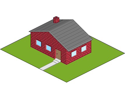
Date Posted: 22 March 2006 at 11:48am
Update Fixed the bricks following jalonso's example Added two plants pots thingies near the door Started some details To do: Details, details, DETAIIILSS!!! Change the trees Of course the grass |
Posted By: alkaline
Date Posted: 22 March 2006 at 12:23pm
| ok, there's sort of a problem with your bricks because his brick highlights are greyish and the other one isn't too much brighter, but the grey I think would only work if your colors were the same as his. and there still isn't much variation in the brick color |
Posted By: Dra_chan
Date Posted: 22 March 2006 at 7:54pm
|
Originally posted by alkaline ok, there's sort of a problem with your bricks because his brick highlights are greyish and the other one isn't too much brighter, but the grey I think would only work if your colors were the same as his. and there still isn't much variation in the brick color Lol, I feel like smashing a brick on my head. Anyways, I will try to finish this already and then make the necesary changes to the bricks. |
Posted By: alkaline
Date Posted: 22 March 2006 at 8:03pm
|
alright, sure I'll be looking forward to your trees then! |
Posted By: Dra_chan
Date Posted: 23 March 2006 at 1:32am
|
Originally posted by alkaline alright, sure I'll be looking forward to your trees then! Here is my tree  Big and leafy  |
Posted By: Aleiav
Date Posted: 23 March 2006 at 11:00am
|
The leaves look nice but the trunk needs a bit of work. Look at jalonso's wood texture. ------------- |
Posted By: Dra_chan
Date Posted: 23 March 2006 at 11:38am
|
Originally posted by Aleiav The leaves look nice but the trunk needs a bit of work. Look at jalonso's wood texture. The leaves look nice? Yay! That's a great advance  |
Posted By: alkaline
Date Posted: 23 March 2006 at 12:20pm
|
the way you highlighted and shaded the trunk makes it look shiny. Also the leaves should be in a more bunched, 3d way. |
Posted By: Dra_chan
Date Posted: 23 March 2006 at 1:22pm
|
Originally posted by alkaline Also the leaves should be in a more bunched, 3d way. And there I was getting excited....  |
Posted By: Dra_chan
Date Posted: 24 March 2006 at 2:21am
Update: Some more details, and a wannabe fountain (must look for a water tutorial) |
Posted By: ..::Naso::..
Date Posted: 24 March 2006 at 12:46pm
|
i think you should add more contrast to the leafs of the tree, and the dither on the tree gives it more like a smooth feeling try looking around for other peaices that have trees in them and try to make the texture like that, but so far it looks preety good, nice job considering i hate Iso :O
|
Posted By: Monkey 'o Doom
Date Posted: 24 March 2006 at 2:13pm
|
That slide looks painful. I love the bush/plants, but the tree is too shiny. ------------- http://pixelmonkey.ensellitis.com">
RPG is numberwang. |
Posted By: Dra_chan
Date Posted: 24 March 2006 at 9:19pm
| Woops, didn't post the version with the AA already in the slide, it looks like a torture device of some sort O_o. Thanks for your advice, guys, I will improve the tree and add the final details. |
Posted By: Dra_chan
Date Posted: 26 March 2006 at 1:38pm
Update: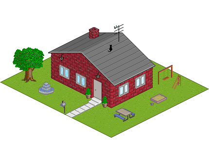 |
Posted By: Monkey 'o Doom
Date Posted: 26 March 2006 at 4:37pm
|
My meaning was to add an actual slide part so they don't fall off the ladder. XD I like the table, and the tree is better, but maybe darken the highlight, or use less and dither for texture. ------------- http://pixelmonkey.ensellitis.com">
RPG is numberwang. |
Posted By: Dra_chan
Date Posted: 26 March 2006 at 5:51pm
|
Originally posted by Monkey 'o Doom My meaning was to add an actual slide part so they don't fall off the ladder. XD I like the table, and the tree is better, but maybe darken the highlight, or use less and dither for texture. Ah lol. Well, I have seen many slides that are only two pipes, I used to play in them. What I forgot was to add the thing in the top where you put your hands for not to fall  |
Posted By: Dra_chan
Date Posted: 28 March 2006 at 10:56pm
|
Ok, this is the final version. I think I took long enough with it. It's not pro, but I have learned tons of stuff First version Final version 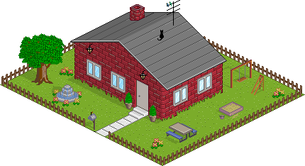 I might have forgotten a couple of things (as always), but anyways, time to move to something else. If you still have critique I can give it a last minute fix. WEEEEEEEE |
Posted By: Souly
Date Posted: 29 March 2006 at 11:05am
|
I like how you've added so much more. :] There are only two problems I have with it... The thng above the door, what is it? D: Also, I hate how all the grass goes on the house. I mean, I can understand random patches of grass, but all the way around? -------------
I am the jesus of PJ. |
Posted By: Souly
Date Posted: 29 March 2006 at 11:07am
|
Oh also, how can the tree have so much light on it? It's almost like you have like 4 light sources... -------------
I am the jesus of PJ. |
Posted By: miau
Date Posted: 29 March 2006 at 11:19am
|
Your light source seems very inconsistent (looking at the shadows). And talking about shadows... kitty deserves one as well =( All in all it's a lovely scene ------------- ... |
Posted By: Dra_chan
Date Posted: 29 March 2006 at 12:11pm
|
Originally posted by Souly I like how you've added so much more. :] There are only two problems I have with it... The thng above the door, what is it? D: Also, I hate how all the grass goes on the house. I mean, I can understand random patches of grass, but all the way around? Hahaha, the thing above the door is a "lamp" I thought the grass around the house looked good. At least it's easy to remove it weee. And the lightsource, mmm, AAAAh! I still need a lot of practice with it. |
Posted By: Dra_chan
Date Posted: 29 March 2006 at 11:49pm
S.O.S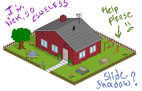 |
Posted By: Souly
Date Posted: 29 March 2006 at 11:58pm
|
Oh, and why are the shrubs so bright?
-------------
I am the jesus of PJ. |
Posted By: Dra_chan
Date Posted: 30 March 2006 at 1:28am
|
Originally posted by Souly Oh, and why are the shrubs so bright? I'm in the process of fixing the whole thing and Ill lower the brightness in the plants. You see, today I saw my work in a different computer and it looked so different than in mine. My screen has a weird resolution and it shows everything in different tones, in this case very dark ones (even at max settings), no wonder everybody told me about the too light lighting . Help me with the shadow? :3 |