CHALLENGE 3/17/2014: The Clover Monster
Printed From: Pixel Joint
Category: Pixel Art
Forum Name: Collaborations/Challenges
Forum Discription: Submit pixel art project ideas/templates or contribute to an existing pixel art collaboration.
URL: https://pixeljoint.com/forum/forum_posts.asp?TID=18417
Printed Date: 20 July 2026 at 5:20pm
Topic: CHALLENGE 3/17/2014: The Clover Monster
Posted By: administrator
Subject: CHALLENGE 3/17/2014: The Clover Monster
Date Posted: 17 March 2014 at 12:00am
Replies:
Posted By: Eggy
Date Posted: 17 March 2014 at 4:05am
|
I'm so in :3
Draft done at school:  I plan on animating this, and I'm gonna have Zee Tee (Eversion) sit at the driver seat... or maybe a leprechaun who looks like Chris McLean if Zee Tee isn't fitting enough.
EDIT: 
I decided to just show what I made so far, without the draft located below. Also, the reason the top looks cut off is because it's unfinished; there's supposed to be a shamrock-shaped propeller thing at the top, and I haven't even gotten to that part yet. |
Posted By: Jinn
Date Posted: 17 March 2014 at 6:24pm
|
Optional Bonus Challenge: Don't use any green
 |
Posted By: Gecimen
Date Posted: 18 March 2014 at 9:52am
|
Originally posted by Jinn
Optional Bonus Challenge: Don't use any green
This. |
Posted By: ||||
Date Posted: 18 March 2014 at 5:19pm
|
I want to enter this challenge.. but only if I can enter a certain heraldic crest I have created. I'd like to make a pure pixel art version of it, but It's an inanimate object that seems to be alive and it is monstrous in a way. I'll just put the quote of the description down here as well for your consideration: "Do not approach our black towers; they have eyes.. If you approach them arrows will rain down upon you and your forces." I also have a patch of it sewn onto my favorite coat:  If not that is completely fine; just let me know mods! If not that is completely fine; just let me know mods! |
Posted By: Noburo
Date Posted: 18 March 2014 at 5:40pm

Blocking out the animation for my entry. Its a.. Shamwalk.... *ba dum tss* |
Posted By: Eggy
Date Posted: 19 March 2014 at 1:13pm
While the optional bonus challenge is neat, I myself am not into it :P

Just now I noticed there's a stray pixel... to be honest, there was a line, and it seems I somehow missed a pixel when removing it. |
Posted By: Jman17774
Date Posted: 20 March 2014 at 3:26pm
|
Here is my Submission! Sorry that it sucks...  I know I won't win or anything but I just started doing pixel art a little over a week ago so I think I did pretty good considering! I know I won't win or anything but I just started doing pixel art a little over a week ago so I think I did pretty good considering! 
>_< Sorry if I am wasting my or anyone else's time. http://imgur.com/ELuNrUF 
|
Posted By: Temessis
Date Posted: 20 March 2014 at 3:53pm
|
@Jman17774
No one is wasting time of anybody, we've got forum for showing what you can do, nobody is artist from birth, just practise :P You should see my first pixel arts ^.^ Your art is very cool and good, add some shading, play with colors and have fun :p |
Posted By: jalonso
Date Posted: 20 March 2014 at 6:15pm
|
Originally posted by Jman17774 Here is my Submission! Sorry that it sucks... I know I won't win or anything but I just started doing pixel art a little over a week ago so I think I did pretty good considering!
>_< Sorry if I am wasting my or anyone else's time. http://imgur.com/ELuNrUF Please don't ever be sorry here you waste no time if you enjoy the artform and get into pixelling. We love new pixel artists especially when they show the desire to learn and are patient as they come along. I will probably add this because even with one week of experience you seem to get the most basic point of pixelart which is controlling your pixels. However, the lineart is very messy and you'll soon come to cringe at that. The shine on the leaves are really ugly in that they almost look blurry. The wolf's head casts a shadow on the clover but the body and even the clover does not cast a shadow on the ground. You know little things like that. C+C yourself a little, we all do it and its the best you'll ever get. Because you have till the end of the week and because other Mods can and will override me your piece might get sent back. Showing a little more effort to be clean and thoughtful will weaken their defenses  Make sure you read and review both cure's pixelart and the noobtorial threads in the resource section, k. ------------- |
Posted By: jalonso
Date Posted: 20 March 2014 at 6:34pm
|
Originally posted by |||| I want to enter this challenge.. but only if I can enter a certain heraldic crest I have created. I'd like to make a pure pixel art version of it, but It's an inanimate object that seems to be alive and it is monstrous in a way. I'll just put the quote of the description down here as well for your consideration: "Do not approach our black towers; they have eyes.. If you approach them arrows will rain down upon you and your forces." I also have a patch of it sewn onto my favorite coat: If not that is completely fine; just let me know mods!Can you "create a creature, character, or vehicle based on the shamrock/clover leaf." out of your idea so it fits the rules? If not just make a PA of your crest sometime. ------------- |
Posted By: jalonso
Date Posted: 20 March 2014 at 6:40pm
|
Originally posted by Noburo
Blocking out the animation for my entry. Its a.. Shamwalk.... *ba dum tss* An awesome job already  ------------- |
Posted By: Jman17774
Date Posted: 20 March 2014 at 8:31pm
|
@jalonso & @Temessis Thanks for the vote of confidence!
I really do appreciate the constructive criticism Jalonso! I will definitely check out those tutorials, which I have been slowing getting through over the past week. I WILL try harder! Rome wasn't built in a day I guess. 
With the shadows on the ground thing, the reason there are none is I thought because the ground is on a flat plane so with the light shining from the front there would be a shadow behind the wolf... Like directly behind it, out of sight. Guess I was sorely mistaken! lol |
Posted By: Eggy
Date Posted: 21 March 2014 at 11:07am

I'm fully aware it needs cleaning, working on etc. and I know the propeller animation probably looks a bit weird and that it doesn't look very attached to the top of the vehicle. I just wanted to drop it here as more progress, while I work on it more. |
Posted By: jalonso
Date Posted: 21 March 2014 at 11:44am
|
Its looking good eggy. Concentrate of pixel placement and being clean with every single pixel. You still tend to be sloppy in the areas of color. Maybe try looking at every area/cluster as a single piece and clean as you go watching that you don't band and that you are slightly more careful with AAing. ------------- |
Posted By: Myleo
Date Posted: 21 March 2014 at 12:05pm
http://s741.photobucket.com/user/riddla77/media/ALien_zps252695b7.png.html">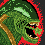
|
Posted By: Eggy
Date Posted: 21 March 2014 at 12:24pm
@jal Thanks :3

Decided to add a color, attempt to remove AA stuff on the propeller and whatnot. I dunno how am I gonna spot banding though. I'll continue working on it tomorrow (because I have other stuff and it's night), hopefully it gets finished by the time the deadline steps up. |
Posted By: ||||
Date Posted: 21 March 2014 at 12:26pm
|
Originally posted by jalonso If not just make a PA of your crest sometime. Yeah I'll probably just do that.  |
Posted By: Temessis
Date Posted: 21 March 2014 at 3:50pm
|
Hah, some WIP - what do you think about it? :D
Of course I will destroy black outline, it is just WIP, but say me what do you think about this idea - "scary" monster ^.^ 
http://i.imgur.com/Mp7to2R.png // Edit Maybe something with leafs dithering 

http://i.imgur.com/ppBPyID.png // Edit 2 / Almost done 
I think I will need other palette, especially for wood  , maybe someone has got one? , maybe someone has got one? 

http://i.imgur.com/7akIZTE.png |
Posted By: Finlal
Date Posted: 22 March 2014 at 6:07am
|
So, here's my WIP. He's something like shamrock vampire.
How do you think, is he "shamrock-y" enough? 
UPD1. Just noticed canvas limitation. Damn. Luckily, I just started, so there was no much to re-do. 
UPD2. Good thing is - I have 2 more colors. Bad thing is - he looks more like flying leprechaun, then like a vampire. 
|
Posted By: SpeedyCube
Date Posted: 22 March 2014 at 7:20am
WIP:

Excuse the oddly colored highlight on the cheek, accidentally did that. @Finlal, looks pretty sweet. @Temessis, the dithering is just too much and makes it look less realistic in my eyes, not much realistic shadowing going on, just shaded upwards. For the palette, you might want to look at some color tutorials. EDIT: 
Just about done with the character, then to add a background and post. Anything need to be changed? |
Posted By: Temessis
Date Posted: 22 March 2014 at 8:15am
|
@SpeedyCube
Yea, I know about this dithering, I'm just learning and I'm not especially good in shading, but I will try to fix it :/ And about palette, I read some tuts and I think I will use this palette created by me: 
|
Posted By: Eggy
Date Posted: 22 March 2014 at 9:49am
|
@Temessis You should change that palette, buddy :)
When it comes to color palettes, you should hue shift the colors; for example, the lighter parts become not just lighter in color, but yellow as well, and the darker parts become bluish because the color is shifting in the opposite direction. Just adjusting the luminosity of the color isn't enough; it would make the piece look unnatural, so avoid only adjusting the luminosity. I did a palette edit on your piece to show you what am I talking about, with the unedited piece beside for comparison: 
The edit doesn't look too different (in fact, a palette edit of the brown might not even be noticeable at first), but when compared to the unedited version, you'll see that, with hue shifted palette, it looks more natural. I hope this helps, and please correct me if I'm wrong. As for myself, I have made more progress: 
I'm definitely putting a driver in there. In my opinion, it's not complete without a driver... and maybe some texture to prettify the ride up. |
Posted By: SpeedyCube
Date Posted: 22 March 2014 at 10:33am
| @Eggy, you should add some more frames to the animation to make the end more natural, if you weren't planning on doing so. |
Posted By: CELS
Date Posted: 22 March 2014 at 10:35am
| I really love that truck, Eggy, but when the clover-rotor spins fast, it looks way too flat, like it suddenly transforms into a disc, instead of a fluffy clover. |
Posted By: Eggy
Date Posted: 22 March 2014 at 10:57am
|
Thanks for the feedback, guys :3 I'll look into the propeller animation and extra frames suggestions.
Also, it's more of a jeep than a truck :P |
Posted By: SpeedyCube
Date Posted: 22 March 2014 at 11:24am
Any thoughts before I submit? I've added a background and a couple of shades.

|
Posted By: Temessis
Date Posted: 22 March 2014 at 11:28am
|
@Eggy
Yea, thanks a lot, now I understand how to create palettes :3 Leafs looks awesome for me with these new colors, but I still can't accept colors of tree, with new and old, especially on his face... I will try to fix this, maybe with success :S |
Posted By: Eggy
Date Posted: 22 March 2014 at 12:01pm
|
Ok... I forgot to tell that the flat disk thing was actually intentional. No excuse intended, this is true.
Progress (with obvious cleanup needed): 
I tried to do something with the flat disk thing to fix it but I ultimately failed to :$ So I though that the only way would be to change the shape of the propeller and modify the flat disk a bit. Also did a little something with the animation. It might suck though, but that's just my idea and I don't know if I'll have enough time for smoother frames. ...Oh yeah. Now I noticed the flat disk isn't in place. <_< |
Posted By: SpeedyCube
Date Posted: 22 March 2014 at 12:05pm
| @Eggy, I think it looks a lot better. It still seems a bit too fast, though. |
Posted By: Eggy
Date Posted: 22 March 2014 at 12:23pm

Made a little change; I slowed the animation down a bit (apparently, 0.05 was too fast and 0.1 made it look choppy, so I used 0.07 this time) and cleaned it up a bit. I just need to know if the propeller shape, shading etc. is okay, since I've got only 1 more day to finish this and submit my entry to the challenge. EDIT: Darn. I wrote "sped up" instead of "slowed down". |
Posted By: Finlal
Date Posted: 22 March 2014 at 12:45pm
|
Without his wings he looks like irish version of Superman.
Cloverman or something. Also, I don't really ike position of his feet. 
|
Posted By: Finlal
Date Posted: 22 March 2014 at 3:07pm
|
I spent two damn hours on this damn leg, and it's not done yet! Damn it!
But I did some work on colors and added cool pot. 
|
Posted By: Temessis
Date Posted: 22 March 2014 at 5:24pm
|
Yea, I think it is done, I don't have too much time, so I won't especially change this right now, I will try with this dithering and shading later.
@Eggy Thanks for help with these colors, I think it looks now a bit better than first color palette, and I know now how to improve my color palettes "a little bit" in the future ;) But I still can't become accustomed to these tree colors :D 
http://i.imgur.com/PfBX9F0.gif (I will remove color palette on the right and I think I will send it) |
Posted By: jalonso
Date Posted: 22 March 2014 at 6:01pm
|
@Temessis, play with this http://www.pixelfor.me/crc/ - http://www.pixelfor.me/crc/
------------- |
Posted By: Eggy
Date Posted: 23 March 2014 at 1:47am

Almost done, it just needs a few more touch-ups (I think) and a driver. And after that I'm submitting this, and I'll hope for the best. I did work hard on this :P EDIT: 
Change of plans; instead of a reality warping orange asterisk or a sadistic leprechaun, I decided to put Groteska in as a driver. Yeah that's her name. I think I'm done. I'm submitting this now. *crosses fingers* |
Posted By: ranska
Date Posted: 23 March 2014 at 10:56am
|
Hello pixeljoint members.
This is my first post I just subscribe this morning. (but played with "Amiga personal paint" when i was a teenager) And practice with grafx2 the whole afternoon. Here is my first picture. Please i will realy apreciate any kind of comment on it, specialy if there is thing that i can learn, or fix. Thank's for made this community I love pixel so much :)  
|
Posted By: jalonso
Date Posted: 23 March 2014 at 11:20am
|
Originally posted by ranska Hello pixeljoint members. This is my first post I just subscribe this morning. (but played with "Amiga personal paint" when i was a teenager) And practice with grafx2 the whole afternoon. Here is my first picture. Please i will realy apreciate any kind of comment on it, specialy if there is thing that i can learn, or fix. Thank's for made this community I love pixel so much :) Not bad at all for day one. Looks like for now you just need to focus on being as clean as possible and define as much as you can. The leaves, besides the unfinished one, are little messy and those loose extra light colored pixels on the leaf by the hand are real ugly, ditch those. E: Read and review cure's pixelart thread and the noobtorial thread in the resource section of the forum. ------------- |
Posted By: ranska
Date Posted: 23 March 2014 at 2:34pm
|
thank's for your comments
I have update the leaves and ... Hum good to know ; i should not post version control url.. the picture change. And yeah i always dream about test this feature for me (first i'm a coder ) https://github.com/ranska/pixeljoin/commit/93f9e24950b537399d37009380855e42b92137ab?diff-0=2-100 did someone use this kind of tool to see changes ? we can see the changes between those 2 commit specialy with onion skin tool. I have improve the pot and reduce left legs length. for the leaves I don't really know at witch level of Dithering should I stop ? About the background there is nothing special on it, but this deep green go well. What it's best should I remove it to submit on weekly challenge ? Dithering balance look so magic to me 
|
Posted By: Temessis
Date Posted: 23 March 2014 at 2:43pm
|
@ranska "Dithering balance look so magic to me"
Hah, so be happy, you could always do what I did - overdo it with dithering ^.^ |