LARWICKINATOR 2006
Printed From: Pixel Joint
Category: Pixel Art
Forum Name: WIP (Work In Progress)
Forum Discription: Get crits and comments on your pixel WIPs and other art too!
URL: https://pixeljoint.com/forum/forum_posts.asp?TID=1938
Printed Date: 27 December 2025 at 10:29am
Topic: LARWICKINATOR 2006
Posted By: Larwick
Subject: LARWICKINATOR 2006
Date Posted: 04 April 2006 at 5:41pm
|
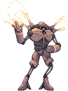
I was bored and so decided to start on another, seeing as i had so much fun before. Yep, it's a robot. Very sketchy stages at the moment. I'm planning on having his lower arms like large cylinders, with large hands at the end. I'm not sure about the face yet, but it should be quite interesting.
Which pose do you prefer? If the second one, what should its other arm be doing? Also, crit about any other niggles you see. -------------  http://larw-ck.deviantart.com"> http://larw-ck.deviantart.com">
|

Replies:
Posted By: CDI
Date Posted: 04 April 2006 at 5:43pm
|
first one... totally ------------- http://omnimaga.dyndns.org - Coders of tomorrow |
Posted By: Larwick
Date Posted: 04 April 2006 at 5:54pm
|
Alright, sweet. it does sort of look cooler. I've added some better hands and they look much better on the first (at least i think).
(And yeah i'm sort of rushing through this a bit... but hey) ------------- http://larw-ck.deviantart.com">
|

Posted By: Souly
Date Posted: 04 April 2006 at 6:14pm
|
Pose 1 looks a hell of alot more badass. Hmmm, with the left upper hand, you should have a blue electric shock going from finger thingy to finger thingy. ------------- 
I am the jesus of PJ. |
Posted By: Larwick
Date Posted: 04 April 2006 at 6:17pm
|
Awesome idea Souly, i'll try that.
What does everyone think of the head? Where should the eyes go? At the moment i'm thinking on the crease... Ok, although i do want this to have mainly my input... I am stumped at what colourscheme i should do it in.. ------------- http://larw-ck.deviantart.com">
|

Posted By: MurrMan
Date Posted: 04 April 2006 at 7:14pm
|
the spikes on the shoulders are out of place... in fact there dont seem
to be any shoulder joints...How can he fight if he cant move his
shoulders? i would maybe broaden the shoulders and build a joint
between the torso and shoulder and some wires for the neck. also, it looks like the head is behind its right shoulder, but that is behind the left arm, so the poe looks ackward. as for a color scheme.. maybe a redish brown for the wires and joints and the rest would be like a a white with orange detail... |
Posted By: Souly
Date Posted: 04 April 2006 at 8:31pm
|
Maybe a red or green for wires and joints. I agree with Murr on the White with orange detail. The shock is looking pretty good. -------------
I am the jesus of PJ. |
Posted By: hawken
Date Posted: 04 April 2006 at 8:54pm
damn I thought this thread would about ZOMBIES 
------------- http://hawken.dadako.com/skillset.pixel.php?page=main - my pixel page! |
Posted By: Larwick
Date Posted: 05 April 2006 at 1:51pm
|
Thanks all. And yes, i was going to fix the problem of the shoulders, but hey. I decided to make a few more concepts, and this is what i came up with. His waist is a bit buggered up but i'll fix that another time. And if there's weird curves in the joints, just imagine it's bendy material, not metal.
It's friggin huge now, im not sure whether i should add a head, or just go back to the old one. ------------- http://larw-ck.deviantart.com">
|

Posted By: Brian the Great
Date Posted: 05 April 2006 at 2:07pm
| I'd go with an upside-down bucket or something semi-silly like that. |
Posted By: Monkey 'o Doom
Date Posted: 05 April 2006 at 2:15pm
|
A toaster! ------------- http://pixelmonkey.ensellitis.com"> 
RPG is numberwang. |
Posted By: Souly
Date Posted: 05 April 2006 at 3:46pm
|
I say the bucket.
-------------
I am the jesus of PJ. |
Posted By: Blick
Date Posted: 05 April 2006 at 3:50pm
|
I think it looks kind of cool right now, without a head. Like his chest and head are one piece.
------------- http://punaji.com/"> 
|
Posted By: Larwick
Date Posted: 06 April 2006 at 3:45am
|
Yeah Blick, it's a good idea. I think i might go with that. ^_^ ------------- Here we go, i went along the lines, and gave it a semi-head thing.
Gee, i feel so sad editing my post with all these updates. I just dont like bumping, i guess. ------------- http://larw-ck.deviantart.com">
|
 "CRUSH, KILL, WEDGIE RYU..."
 Yeah, those are sherbert sticks on his shoulders. LIGHTNING SHERBERT STICKS.
 Shall i add another hue to it... or is this enough?
 How about jade? It might sorta take away the menacingness though...
 What do its wrist/lower arms remind you of? Oh and yes i tried snot green. Horrific.
Posted By: jalonso
Date Posted: 06 April 2006 at 7:52am
|
Larwick those colors are great, the chest and head are amazing. I
would try changing the light blue to a radiant violet to pick up the orange hues of the body, then add some secondary violet over the shoulders. I have one problem with this guy and maybe its just me. From the waist down he's very feminine, the stance lof the legs seem "alluring" in a bad way for this piece and is not helped by the "high heels" he appears to be wearing, it could just be the curvyness of the thighs. I can't pinpoint it but I suggest you give it an objective view. ------------- |
Posted By: Larwick
Date Posted: 06 April 2006 at 7:57am
|
Haha, good point jalonso. I was thinking earlier the legs didnt suit the body, but hey, i do quite like it. I might edit the feet later on to see if i can fix the high heel problem. And hey, it's an it, not a he. I'll also take your advice on the lighting. ------------- http://larw-ck.deviantart.com">
|
Posted By: Monkey 'o Doom
Date Posted: 06 April 2006 at 8:23am
|
I'm loving this piece, but an you aa or selout some of your dark outlines? They just ruin it for me, especially on the 'sherbert sticks'. ------------- http://pixelmonkey.ensellitis.com">
RPG is numberwang. |
Posted By: Souly
Date Posted: 06 April 2006 at 8:37am
|
I'm loving how it's going. -------------
I am the jesus of PJ. |
Posted By: Larwick
Date Posted: 06 April 2006 at 10:01am
|
And thanks guys, and i will be doing all the sellout and aaing later ^_^ Unless of course i prefer it having an outline.. ------------- http://larw-ck.deviantart.com">
|
 Just fixed the hand and stuff...
Posted By: Souly
Date Posted: 06 April 2006 at 10:23am
|
Looks cool. :] Now the electricity coming from the hand looks alot better with the hand edit. -------------
I am the jesus of PJ. |
Posted By: Blick
Date Posted: 06 April 2006 at 10:28am
|
Heh, the lower hand could make this a second installment of Hardcore Robot Facials! :D Having the black outline (or near black) in places is alright, like in the shadows, but it's a good choice to use selout on parts with a highlight on them, like the sticks and arms. So far you've used good judgement on where to place selout. ------------- http://punaji.com/">
|
Posted By: Larwick
Date Posted: 06 April 2006 at 10:38am
|
Thankyuu! ^_^ More updates:
------------- http://larw-ck.deviantart.com">
|
Posted By: Souly
Date Posted: 06 April 2006 at 10:43am
|
Are you going to have some secondary lighting from te electricity?
-------------
I am the jesus of PJ. |
Posted By: Larwick
Date Posted: 06 April 2006 at 11:00am
|
Yeah i should do later, although it might be a tad hard because for one thing it'll hit most of the same areas as the normal light. ------------- http://larw-ck.deviantart.com">
|
Posted By: Blick
Date Posted: 06 April 2006 at 11:29am
|
but through experience i've noticed people finding random dithering a bit odd It looks fine when it's subtle enough like this. ------------- http://punaji.com/">
|
Posted By: Larwick
Date Posted: 06 April 2006 at 11:42am
|
Ah, thats good.
I still might change the feet, and have to do a tad more sellout etc. Also, theres the electricity and lighting from it to overcome... Gah, i definetely need the electricity, it looks like it's waving otherwise... ------------- http://larw-ck.deviantart.com">
|


Posted By: Souly
Date Posted: 06 April 2006 at 12:05pm
|
Could you point out where your lighsource is? -------------
I am the jesus of PJ. |
Posted By: Larwick
Date Posted: 06 April 2006 at 12:22pm
|
Um, main one from top right, then probably a dim light from mid left... the feet just didn't look so good without highlights... ------------- http://larw-ck.deviantart.com">
|
Posted By: alkaline
Date Posted: 06 April 2006 at 1:42pm
|
Hey mang. That's pretty awesome. Ok. First, I don't really like those little heels on its feet. What's up with those? Unless I'm looking at it wrong. But it doesn't really look like it's right on the ground with the way you made the feet. If they were on the ground, they'd be pointing back more. And, is he supposed to be bending his knee forward? The way the feet are positioned makes him look like he's standing, but his legs are all positioned differently. Number three. The left leg seems devoid of lighting. Unless his whole body and everything is blocking the light, well, it just seems dark to me. Oh, and the tummy shading seems harsh without AA or whatever. |
Posted By: MurrMan
Date Posted: 07 April 2006 at 1:16pm
| i dont like those thys and the hip area... i look a the work of art and i say WoW. but then, it is like, a frieght train rams into me in mid sentence. I love the rest ofthe thing |
Posted By: Sibix
Date Posted: 08 April 2006 at 1:09am
|
Originally posted by Larwick
Alright, sweet. it does sort of look cooler. I've added some better hands and they look much better on the first (at least i think).
(And yeah i'm sort of rushing through this a bit... but hey)
do that one.. its better |
Posted By: Souly
Date Posted: 08 April 2006 at 1:22am
Ummm Sibix, he's passed that... -------------
I am the jesus of PJ. |
Posted By: Larwick
Date Posted: 08 April 2006 at 1:51pm
|
Lol yes, unless i find myself dying of boredom more than usual one day i dont think i'll be bothering to finish the older draft such as that one Sibix. Well, i think i've finished. At least, i won't be obsessing over it any longer, so if there's anything you think should be changed it's unlikely i'll bother, for a while at least (unless i'm missing its leg or something) to change it.
I thought i'd be amusing and rack up a quick little animation for ya'lls to see how i made it with:
Ok, so less critisism now, more comments and personal likes/dislikes, although its probably best to be doing that in the gallery, so get in there! ^_^ ------------- http://larw-ck.deviantart.com">
|


Posted By: jalonso
Date Posted: 08 April 2006 at 1:56pm
|
Larwick its the animation that rocks, submit that
------------- |
Posted By: alkaline
Date Posted: 08 April 2006 at 3:10pm
| you win at life. |
Posted By: Souly
Date Posted: 08 April 2006 at 3:46pm
He he, he pointed out that the electricity was my idea. It looks wonderful Larwick, I'm glad I could be of some assistance. -------------
I am the jesus of PJ. |
Posted By: ..::Naso::..
Date Posted: 08 April 2006 at 9:03pm
| Very nice larwick, you make it look so easy :O make me wana make one >_> |
Posted By: Shark
Date Posted: 09 April 2006 at 4:28am
|
omg i cant believed i missed this amazing wip. that animation is
hilarious, submit XD ------------- Snark, we love yuu. |