Improving my spooky ghost
Printed From: Pixel Joint
Category: Pixel Art
Forum Name: WIP (Work In Progress)
Forum Discription: Get crits and comments on your pixel WIPs and other art too!
URL: https://pixeljoint.com/forum/forum_posts.asp?TID=19617
Printed Date: 25 February 2026 at 12:51am
Topic: Improving my spooky ghost
Posted By: Lakelezz
Subject: Improving my spooky ghost
Date Posted: 22 August 2014 at 2:48pm
Dear pixeljoint-community  Right now I am working at this piece: 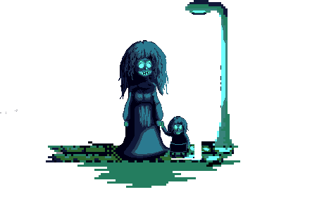 It got upscaled quite a lot, that is why most parts are having a low resolution. However that is not my current problem since I am working on the bigger woman right now. There were several attempts by me to add folds on her dress but they all failed. The source of light is the lantern behind her. Next to the woman is a little "thing" being a doll. Can also be a little girl - this is totally up to the imagination of the viewer. Neither the doll nor the background are even close to be done. I am really struggling by doing the folds of the woman's dress and would be glad to get maybe an edit. Resources on the internet could not really help me. I feel like the way the light is falling onto the dress is not right. However I would be really thankful for any help you can give me! with best regards Lakelezz |
Replies:
Posted By: MasterSky
Date Posted: 22 August 2014 at 6:20pm
|
very spooky indeed!
but the hair on the large girl looks like it's sitting on top of the head rather than attached to it |
Posted By: noaqh
Date Posted: 22 August 2014 at 9:18pm
|
agreed with @MasterSky welp~ but you could just say that is a bad wig or she is wearing a mask( if only that's a mask) the rest to do is fixing the BG with some more details... dithering in a high-contrast palete would surely fit the taste : ) |
Posted By: jtfjtfjtf
Date Posted: 22 August 2014 at 9:25pm
| If you're going for just long pleated folds just draw them on the skirt and then highlight and shade each pleat individually. |
Posted By: noriah
Date Posted: 23 August 2014 at 4:53am
|
I suppose what you're going for is a http://www.google.com/images?q=chiffon+dress - chiffon dress?
For the form, something like http://www.missbushbridalblog.co.uk/wp-content/uploads/2013/05/noir-by-lazaro-bridesmaid-chiffon-gown-empire-keyhole-draped-natural-waist-a-line-skirt-sweep-train-3185_zm.jpg - this , http://cdn3.volusion.com/cjgzw.hrfep/v/vspfiles/photos/MN1003-2.jpg - this , http://www.forherandforhim.com/image/cache/products/1714/201308024ed0313146e25b130c0f26c3c352d0d7-900x1200.jpg - or this might work. For the lighting, perhaps looking at something noir would help you work it out. http://www.google.com/images?q=noir+street+dame - images http://www.marcribot.com/projects/NoirFilmProject/NoirTouchOfEvil0005.jpg - close to your lighting http://s1.wallls.com/original/0/wallls.com_2538.jpg - this seems close too Hope that helps. |
Posted By: Lakelezz
Date Posted: 23 August 2014 at 12:59pm
|
Thank you all for the help and specially noriah, who gave me quite a lot of good references. Here is the latest version - the streetlamp's size will be increased. About the "wig-like" looking hair: Any tips to solve that? Also maybe an edit to look at? 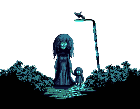 |
Posted By: jalonso
Date Posted: 23 August 2014 at 1:24pm
|
I think the hair adds a lot of personality. I would keep that shape. The whole scene is charming visually but not so much technically. Technical > all. You are pixelling very, very dirty. I'm hesitant to even call it pixelart atm. The grass bushes especially almost look like its a brush pattern :/ If you made a section and c/p then make that bit nice and clean. The mixed res on the light post is just ugly. This is very dirty too. ------------- |
Posted By: Lakelezz
Date Posted: 23 August 2014 at 1:35pm
|
I pixeled multiple tiles for the bushes and formed those two brushes out of them without using heavy highlighting to prevent a wrong focus. Maybe I am gonna remove the left brush too, since the focus point should not be in the middle, I guess. I could clean up those little noises of the brushes. The lantern is still in work, since I have to redo it. It was a little bit thinner before - that is why I tried to scale it in width (just to see how it would work out - it did not, haha). What does C/P stand for? |
Posted By: jalonso
Date Posted: 23 August 2014 at 2:08pm
|
Yeah, I suspected that's what you did. Imo, that never looks good because it ends up as a lot of noise with an overall uncontrolled look. Since actual pixelling is a small area then controlling that is important because you just never know what you are actually pixellling... For example, look at the top edge of the bushes and see the 3 repeats that look like a wolf? ...don't even try that its a scary scene and you meant to make wolves :P ------------- |
Posted By: Lakelezz
Date Posted: 23 August 2014 at 2:17pm
|
No, of course not, that was never meant to be a wolf. However I guess it could always happen, that a natural pattern is relating to something due imagination and so on. I will try to make those bushes more unique - on a controlled way. Thanks for your help! Are you fine with the cobblestone? |
Posted By: jalonso
Date Posted: 23 August 2014 at 3:12pm
|
The cobbles are maybe the best part of all, but cleaning up everywhere is needed, k.
------------- |
Posted By: jtfjtfjtf
Date Posted: 23 August 2014 at 9:45pm
| I think for the wig like hair if you want to try something different, do very normal or attractive looking silhouettes on everything and then do scraggly/horror interiors. Like an extra layer of "Surprise! this is actually scary!" |
Posted By: Lakelezz
Date Posted: 20 September 2014 at 4:03pm
I wanted to share my latest version of this piece: There will be probably an animation in the end. The flies will fly around the lantern while the whole image will flicker after some longer intervals. |
Posted By: jalonso
Date Posted: 20 September 2014 at 4:08pm
|
The scene is looking nicer tho its still so 'dirty'.
Do you understand what dirty means in pixelart? Is the glow on the lamp a gradient or semi-trans? ------------- |
Posted By: Lakelezz
Date Posted: 20 September 2014 at 4:23pm
|
This piece is using 9 indexed colours, no transparent stuff :) I am really trying to make it less dirty but that is kinda really difficult for me somehow. Therefore I am curious if you have got some tips for me! Thanks for your fast reply! |
Posted By: jalonso
Date Posted: 20 September 2014 at 4:29pm
|
I just wondered about the glow ;)
Try this. Look at each area/cluster of pixels all thru the piece as a stand alone item and make them smooth and clean. Remember you are pixelling NOT painting or coloring. ------------- |
Posted By: jalonso
Date Posted: 20 September 2014 at 6:49pm
Kinda like this: I think that dark blue could be lightened a little bit and the fake black darkened a little bit so the show up better and help you define too. Most of what I did was to make sure you don't have ugly bits and that areas do not line up in the way banding does even tho there is no banding here. Just the principle. ------------- |
Posted By: Lakelezz
Date Posted: 21 September 2014 at 12:36pm
|
Oh, thank you a lot for your help! I tried to clean my piece up:  -The dresses were much more defined, removed random feeling pixels. -Pavements highlights are now more "smooth" and less edgy -The shadows between the single stones were "fixed" -Face got changed a little bit -Tweaked colours A few things I want to change: -The pavement got reduced on the right side due ugly placement of some stones -> Repairing the right side. -Also the faces could be improved a little bit more -Maybe her left arm needs some more fixes -Still there it could be that there are some parts still being dirty |
Posted By: jalonso
Date Posted: 21 September 2014 at 4:42pm
|
That's it. Whenever you are doing anything just look at the area and clean as you go. If a shape/area/cluster looks ugly on its own, clean/fix it.
------------- |
Posted By: Limes
Date Posted: 21 September 2014 at 5:51pm
| I would crop the image first |
Posted By: Lakelezz
Date Posted: 03 October 2014 at 2:51pm
|
Okay, I did some more edits. This is my current piece: 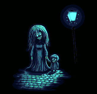 The next thing is done some days ago. It simply means that the footage of the character is older. In the upcoming two examples fog can be seen. Furthermore it will move from left to the right - that is it, no more animation of the fog itself. Inspired by Probo who shared this link containing some Castlevania IV fog-style: http://youtu.be/t0myhqezd-s?t=1m10s - http://youtu.be/t0myhqezd-s?t=1m10s However I am aware that this is alpha-based. 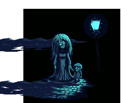 This one got changed colours, does not work though: 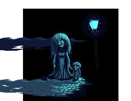 The fog is not cleaned up. I kinda disliked the fog and so I continued working on the characters and pavement. |
Posted By: jalonso
Date Posted: 03 October 2014 at 6:11pm
|
So much better and cleaner. Keep going :) ------------- |
Posted By: Lakelezz
Date Posted: 03 October 2014 at 7:29pm
|
Thank you, Jalonso :) Anything bothering you - something critical? Do you have any suggestions about the fog? |
Posted By: Ozcr
Date Posted: 03 October 2014 at 8:35pm
| Removed |
Posted By: SuperTurnip
Date Posted: 03 October 2014 at 9:38pm
|
With very dimmed lighting, fog might be hard to add--it helps to have a background and/or foreground to express things like this in my opinion. Search "fog at night" or "foggy lamp post at night" for impressions on what atmospheric fog looks like. That creeping cinema-smoke type of fog is translucent. You could curl it around the figures to show this, letting features show through the mist.
The hair could use a little cleaning, my tip is to light it like big, wide silk ribbons and then add smaller ribbons+stray hairs. That way it's not so overwhelming! Other than that, this looks good. Keep up the good work. |
Posted By: Lakelezz
Date Posted: 04 October 2014 at 9:31am
|
Ozcr, do you have any examples to visualize your idea? I am curious! SuperTurnip, what do you mean? As far as I can think of the behavior of silk ribbons is strongly changing in terms of highlights due strong reflections at upper parts. However should this look at her hair? Could you maybe show me an example? Additionally yes, when I said alpha based I of course meant translucent. I will probably not add fog though. It is simply not working out and does not look good. It creates a mess while floating from the left to the right. |
Posted By: showtime
Date Posted: 04 October 2014 at 1:33pm
|
You might want to look at Superturnip's hair edit in http://www.pixeljoint.com/forum/forum_posts.asp?TID=19203 - this thread . Hope that helps... I think they mostly just mean that you should draw bigger pieces of hair. |
Posted By: Ozcr
Date Posted: 04 October 2014 at 5:31pm
| Removed |
Posted By: Lakelezz
Date Posted: 11 October 2014 at 9:41am
|
Thanks for sharing the link, showtime! Ozcr, now I understand (visually) what you mean! Thanks for your idea and example. Back then I worked on bushes (you can see the two-colour-version when scrolling up). There was one more version, which I have never posted here. However this version is more fitting to the scenery but was extremely dirty, too. Now I wanted to try it again! I really like the atmosphere being created supported by the bushes. Additionally another idea (which came up in my mind had in the last days) was to add a border to the left (a tree). 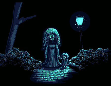 On the one hand the tree is just sketched but on the other I tried to add some texture to it. The lines on it (the brightest colour) should be more curved maybe due the tree being roundish :P Nonetheless the tree is targeted to be not that fancy to reduce attraction. That is why I do not want to use highlights on it. However I really want to tackle them again! This is my first rough attempt to bring some real volume into these bushes: 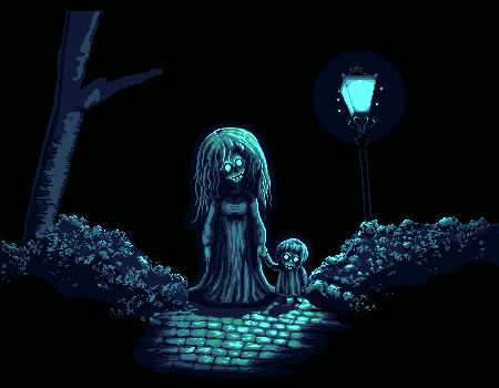 This was another attempt make more out of the texture while respecting the volume idea: 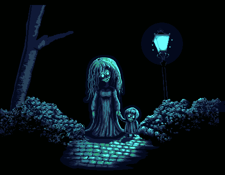 I really want to go for those bushes. If somebody could give me some help and share his or her mind about those posted images that would be great! If there would be someone who could do an edit onto certain area of the bushes to show me how to clean them that would be even greater :D Overall I am thankful for every idea and help concerning this piece! :) |
Posted By: H|F
Date Posted: 11 October 2014 at 4:10pm
|
Lakelezz,
I just wanted to jump in and let you know how much this topic has improved and how great this is looking! Great concept and I like the color choices. Looking forward to the finished piece! |
Posted By: Lakelezz
Date Posted: 11 October 2014 at 4:21pm
|
Thank you a lot, H|F! Your critique means a lot to me and pushes me even more to improve on this and in general :) Some new updates (specially on the tree):  |
Posted By: Limes
Date Posted: 11 October 2014 at 4:53pm
| For the bush think in clusters. It may be a bit noisy right now |
Posted By: StepDragon
Date Posted: 12 October 2014 at 5:50am
|
Keep your light source in mind. Currently you only have a single light source shown (and no additional light sources implied, other than the glowing eyes)
So my question is, where is the back glow coming from? On the back of the tree, or other side of the hair, you have a back glow. This isn't necessarily bad, but it doesn't read well with your light source. Your bushes do need to be refined, but don't go overboard, I really like the style you have going on. Having the bugs so close to the lamp makes them hard to read, at first I thought they were sparks or something. I think your tree should be slightly more highlighted as well. Here is a quick edit showing a few of the things I mentioned: 
I highlighted the tree, removed the backglow on the tree, Moved the bugs further from the lamp, darkened the face a bit (does a flashlight light itself?), and added trails to the bugs to help show motion (it makes them read better when placed further from the lamp) |
Posted By: Lakelezz
Date Posted: 12 October 2014 at 1:44pm
|
Limes, I am really trying to reduce that but the texture needs something noisy to be that bushy. Could you point out strongly noisy areas or maybe consider me an example on how to fix the bushes? Thanks you a lot for the comprehensive feedback, StepDragon! The light might be a problem. I guess I have to look further into this. Though the eyes are not the same as a flashlight. I agree that if the eyes would cast rays from the head's inner, it could be like a flashlight. However while casting and behaving like a sphere being rather on the border between inner and outer, the rays would actually hit the surrounding areas. This would cause some small reflection on her skin. You could imagine it as glowing eyeballs. The flies will be animated. Here is a rather old (but animated) version of this piece: 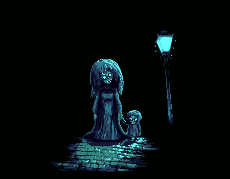 I really like your edit on the tree texture, it will be taken into account for my next edit. Hopefully I will be able to manage the bushes. They are really complex to handle and I get easily lost in their maze-like appearance while fixing them. |
Posted By: H|F
Date Posted: 12 October 2014 at 1:58pm
|
For the flashing, make it more random if you can rather than strobe-like.
Also maybe one of the "flash" frames be more dim to create a more frightening feel. This is amazing |
Posted By: Lakelezz
Date Posted: 12 October 2014 at 2:10pm
|
Haha, yes, do not worry! All of your mentioned points are already taken into account :) This is just pretty old and I wanted to show StepDragon the idea behind the flies. The animation will be reworked in the very end. Thanks for your critique! It motivates me to 'outskill' myself even more :) |
Posted By: JosChavz
Date Posted: 12 October 2014 at 3:42pm
| Wow! Awsome work, but maybe slow down the GIF? That'll look good. But I love it! |
Posted By: Lakelezz
Date Posted: 13 October 2014 at 4:39pm
Due the conflict with the light source and the back light (which comes from no light source!) I made some changes: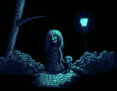 OLD: 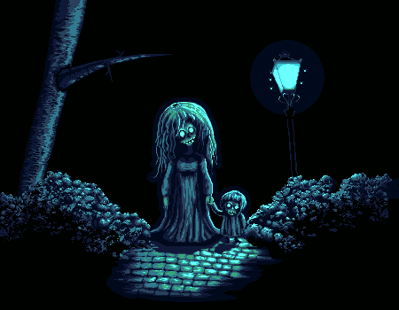 I would be interested in feedback if this was a positive change to the piece? The reason why I can not decide is simply due the destruction of "a lot of work" which comes with this change. |
Posted By: StepDragon
Date Posted: 13 October 2014 at 11:24pm
|
YES! I love where you're taking this. The attention to the light source definately improves the overall feel of the piece. Don't think of any changes as 'work lost', everything you've done up until this point has brought you to this point.
I do have a few ideas as to how you can take this another step further. First, while you were removing light from the far side of the dress, you ended up with apparent banding around the front. Let some of your colors mingle a bit and you'll notice it start to feel more fluid. second, you've darkened the dress, but the bricks on the ground on the far side of the character are still lit. The shadow should extend further. Side Note: I think the change also highlights the hand holding, which should be a focal point of the piece anyways. It makes you wonder. What? and Why? The more symbolic, the better. I would also recommend blocking in shapes using your darkest color for the backgrounds. Give it a 'bit' more context. The full back isn't bad, but it feels wasted when you have such a subtle color available to you. Perhaps, some just barely visible clouds, or other (non working) lamps in the background, more bushes, or more path. Whatever you go with, I know it'll be awesome. I'm happy you decided to try out my idea. P.S. If you do the cloud idea, you could probably sneak in the moon peeking from behind one of them, giving you a second (but not as bright) light source to work with. Multiple light sources are harder to work with, but if you're really trying to challenge yourself, it may be worth a shot. |
Posted By: PixelSnader
Date Posted: 14 October 2014 at 8:48pm
|
What makes the hair look like a wig is that it's very big in comparison to the face.
As for the light, you only need two frames for the lamppost for a flickering effect: 
You can add more intermediates if you want to have a sort of halfway buzzy kind of flicker, but you shouldn't have a nice 'pyramid' animation like 000012343210000. Instead do 0001001023232301001000010 or something. A feeling of randomness is what makes it work. A possible cool effect could be made by having the lamp be on a bit (1-2) and their eyes off, then the light going on and their eyes off(0), then the lamp flickering halfway a bit more(1-2), and then the lamp going completely off (4) and showing a bunch more slightly glowing eyes in the background for just a frame. It might be overkill/cliche, but I think if you make it a gif of several seconds long and only have a fraction of a second with a whole group, it'll still have a good effect. ------------- ▄▄█ ▄▄█ ▄█▄ ▄█▄ |
Posted By: Lakelezz
Date Posted: 15 October 2014 at 6:35am
|
Thanks for your feedback! I am currently working on an update. StepDragon, I am not sure if I really want to add much more to this. It will just take more time and someday I need to get to an end. The shadow might get removed, I am not sure about. I made an edit to show how the new shadow probably would fall. PixelSnader, thanks for your interesting ideas and precise description! Though your image is not visible. You need to share the file and use that link. Linking directly onto your PC hard drive wont work :P Here is the main edit:  This the edit with how I personally think the shadows could fall (if extended): 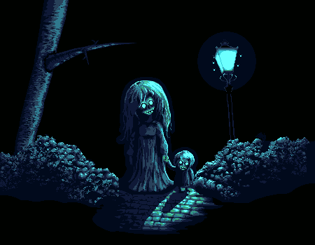 Lastly this is an idea about how the left bush could be more impressive. Still struggling with dirty pixels. It is a suffering:  I am looking forward for your feedback and replies! Thanks all :) |
Posted By: Lakelezz
Date Posted: 15 October 2014 at 11:01am
Okay, I made some critical fixes: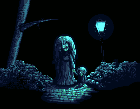 The hair of the woman and the girl has now a better lighting on it. Also the pavement and the woman's dress got cleaned up. I am still pretty undecided about their shadows. Please check out my last post to get a proper idea of what I am talking about. Lastly I am still undecided about the bush update (also on my last post - last picture). |
Posted By: SuperTurnip
Date Posted: 15 October 2014 at 5:54pm
I think something that may make your work a little easier is cutting down on your composition a little. The central elements, the lamp and ghosts, are just really well placed. They are well composed and don't need crazy editing. Consider how you can work your ideas into this central looping path of "face-face-lamp", so that the viewer has an easier time navigating your image.

It also is a big plus to make the most important parts of your image off-center. It's somehow more dynamic and exciting! If you crop your composition a little bit, you may find that things fall into place easier. I have no idea why this happens, but it does, so consider a tighter composition whilst you work! By the way, I somehow missed the flashing animation... That is simply the scariest thing ever. Good job, you get a ten out of ten for sheer creepiness! |
Posted By: PixelSnader
Date Posted: 15 October 2014 at 10:54pm
|
I was a retard and used a C:\ file location instead of an http:// one. Fixed it now. ------------- ▄▄█ ▄▄█ ▄█▄ ▄█▄ |
Posted By: skittle
Date Posted: 16 October 2014 at 3:01am
|
Wow, the improvement is great!
For crits, I think that the cobble is far too busy with all those highlights going on. Maybe if you took out the two lightest blues on the ground it would draw more attention to the ghosts? Also, the way the pavement fades into a sort of scratchy texture, looks a tad bit awkward imo. |
Posted By: Lakelezz
Date Posted: 16 October 2014 at 2:11pm
|
SuperTurnip, you are right. The picture would of course look more interesting / more dynamic when the focal points are not placed in the middle. I will take a look into this. Thanks for fixing the link, PixelSnader! This is exactly what I was going for in my animation. However I need to finish the rest before that. ADrawingMan, thanks! I am happy to hear that you like the improvement done on this piece! I am not quite sure about the pavement changes:  It feels like a downgrade to the materialistic effect. This is what I originally aimed for:  In the end I am still struggling with bushes... As I posted above.. what is better? A rather 'dirty' pattern or the more cluster-based one? The dirty one occurs to be more realistic though. |
Posted By: jalonso
Date Posted: 16 October 2014 at 2:51pm
|
Originally posted by Lakelezz
... As I posted above.. what is better? A rather 'dirty' pattern or the more cluster-based one?The dirty one occurs to be more realistic though... Its not a realistic scene so realism should not be a concern. You are going well cept, I'm still calling for you to be clean with your pixels, k. ------------- |
Posted By: Lakelezz
Date Posted: 16 October 2014 at 3:08pm
|
Yes, I am really trying to stay clean! This scene is of course not realistic but the dirty bushes are feeling more bushy. While I look at these bushes: It feels like I am building a rather rocky pattern... |
Posted By: PixelSnader
Date Posted: 16 October 2014 at 6:56pm
|
I also feel that the previous bushes looked more natural. Though you did have a lot of single speckles on it. I think just cleaning it up a bit would be fine though.
Don't forget the drop shadow of the bushes on the road. I think the tree is very... cartoony in a sense. Just a cyinder with a stick. A general rule of thumb for trees is that the thicker a branch is, the smoother it flows into the trunk or a main branch. Compare these: http://lonsdalemedia.net/wp-content/gallery/day-4-perth-city-night/071-kings-park-night.jpg http://pix.purplecow.org/wp-content/uploads/2008/10/park_at_night1_sm.jpg http://static.squarespace.com/static/515aaa6be4b063d29d1c71ea/t/527b81f1e4b05821d4d1f01a/1383825909209/Mikko-Lagerstedt-Night-at-the-Park.jpg Your branch juts out without any kind of transition. Also, I think the tree would catch significantly less light as well as have a darker bark color than the leaves are. While we're on light, I think the kind of fish eye effect you get from the tiles and the lamp would work nicely with a bit of a circular cloud clearing, nothing too bright but just to break up the flatness a bit. Perhaps clouds at the top of the image, then a bit of clearing, and then a skyline or a treeline to get back into the darkness. It could also give you a light to put main tree's leave silhouettes in front of. That way you can steer the eye a bit more. Oh and if you're going to redo the tree... I suggest curving the trunk a bit to also match the fish eye effect. ------------- ▄▄█ ▄▄█ ▄█▄ ▄█▄ |
Posted By: Friend
Date Posted: 17 October 2014 at 9:37am
|
I think the cobbles and bushes you had in the second picture in this thread (posted Aug. 23) were the best cobbles and bushes. (though the bushes especially needed tweaking, were still stylistically sound and you had the right idea, I think) But I like the progress you've made on the ghost and other additions like the lamp and child etc. Btw, I could totally do an edit to knock the sketchiness out of the picture for you if you'd like. I could actually knock out the sketchy while preserving the dirtiness. I also disagree a bit with the early crits about the dirty pixeling. Yes, some parts were dirty, but there is a slight difference between pixeling dirty and pixeling sketchy. Pixeling dirty is more about not being afraid to bypass a few "pixel rules" such as avoiding single pixels and jagged lines etc etc. Pixeling sketchy is more about having uncontrolled pixels, to where your pixel placements aren't very mindful, and thus begin to degenerate your piece into less of pixel art and more of "oakaki" or pixel scribbles |
Posted By: Lakelezz
Date Posted: 17 October 2014 at 2:52pm
|
I am of course interested to see an edit! The bushes are the most complicated pattern I ever worked on. Every edit I do on them does not feel like progress rather like running in a maze. Thanks for your feedback, friend! PixelSnader, thank you for the references! I will take a look onto these. However two of the references were rather less useful due those trees being really old and giant. Nonetheless I got your idea with rather bowed/curved form. |
Posted By: Friend
Date Posted: 17 October 2014 at 5:29pm
| cool, I'm working on my edit of your piece :]. Will post it tomorrow |
Posted By: Friend
Date Posted: 18 October 2014 at 9:46am
  while playing around with your piece, I realized how well drawn everything is. :] the most obvious things that were cleaned up were the two characters. For example, you may notice that the harmony between the dress and hair is much improved, simply by paying more attention to every single pixel and every single pixel cluster. After just a few clicks, I was amazed at the potential that was right below the surfaceAgain, your drawing was very good, but some of the greatness was hidden behind a few mindless pixels here and there. This is also noticeable in the outlines of things. For instance, the outline of the hair of the little boy. If you look closely on your version, the outline is a little sketchy. But again, a few pixels here and there and proper understanding of AA and somehow fine tuning the outline of the hair really brings out the greatness of the design of the character, because again, a few technical problems were hiding some greatness. I also played with the bushes. I copy and pasted some of your older bushes because the shape better fit your pixeling of the bushes. Lo and behold, again, with a few more mindful pixel changes here and there in the bushes, even the very dirty pixeling there can look ok. And obviously, because other things have been touched up and cleaned, it allows for the bushes to be messy. (When everything is sketchy, the bushes just reinforce it. When everything is tightened up, the bushes can be dirty, as long as you can achieve a uniform, controlled and mindful look within the dirtiness.) (little tweaks throughout the whole image as well.) I really liked the cobblestones in the second image still though :] |
Posted By: Lakelezz
Date Posted: 18 October 2014 at 4:50pm
|
Thanks for your edit! First of all, you took an old version of my piece, haha :P It was of course the last image I posted but actually I reposted this without thinking about it. I simply wanted to show the bushes again - that is why I took the next version I found. Actually this is the latest version: I does not matter that much, though. So let me comment on the edit. It feels rather like you focused on something I had no problems with: The palette. I really like my palette and there is no need for me to do such huge changes. However I like how the light source is "glowing" in your palette. On the other hand the green around it does not fit. You might have thought a lot about your changes on the bushes but sadly it still looks messy / dirty. That is actually what I want to try to solve, to create a good pixel art bush pattern. In the end, thanks for your work. I will take your edit into account of course. Whenever I work on updates I often check a lot of posts and edits to see how I am developing! |
Posted By: Friend
Date Posted: 19 October 2014 at 7:36am
| To clarify, the palette change I made was not part of my critique, but just playing around and to differentiate my edit. My critique is solely about your sketchy pixeling |
Posted By: Lakelezz
Date Posted: 20 October 2014 at 5:42pm
|
There is no reason to change the palette then since the colours on the bushes are harder to differ on your edit. However I am still struggling. I browsed through the gallery, internet and several other sources but could not find pixel bushes being similar to mine. When I try to clean those bushes up it is often minimal and rather changing the general look. I tried to part the bush in areas to not lose my overview but still. In the end it is simply that I do not know how (specially the left) bush could be cleaned up. Maybe someone could enlighten me, pointing me out what is already done well on the left bush (if even) by marking the area. Thanks everyone for helping me :) |
Posted By: Teapot[ISO]
Date Posted: 20 October 2014 at 7:24pm
|
That is one seriously creepy picture.
Looks good though! |
Posted By: Lakelezz
Date Posted: 22 October 2014 at 7:56am
| Thanks! I am still not happy with the bushes, haha. |
Posted By: Limes
Date Posted: 22 October 2014 at 9:44am
| Keep playing with it until your satisfied. |
Posted By: Lakelezz
Date Posted: 25 October 2014 at 8:33am
|
I made some changes. The shadows on the ground were removed. Ghosts do not cast shadows. Also even if I simply could not make shadows which would not cover 70% of the shadows. However if one has an idea how to do good and fitting shadows which are not 'destroying' the pavement, feel free to share your draft! The bushes are still a pretty hard thing to change. I guess I have to stick with this way. Old: This is my current version:  |
Posted By: MrHai
Date Posted: 25 October 2014 at 10:19am
Couldn't you keep the 'highlights' even in the shadows? Now, this image is only to illustrate my point, I'm not suggesting you overlay semi-transparent black over the cobbles, neither am I suggesting you add a bunch of new colours to make the shadows. However, would it be possible to bring each value in the shadow area down a step or two in the palette, maybe even going all the way to black?

I really like the image by the way, amazing development from the first post :) ------------- "Work is more fun than fun" -John Cale |
Posted By: Lakelezz
Date Posted: 25 October 2014 at 12:39pm
This is what ended up with: With highlights:  I do not like how that works out :/ Without shadows is probably better. Any ideas/tips/thoughts about the bushes? |
Posted By: PixelSnader
Date Posted: 25 October 2014 at 1:05pm
|
No. That's not how highlights and shadows work.
Highlights are specular reflections, which are dependent on a direct line between the lightsource and the object that's lit. It will still be lit diffusely, from light bouncing off of other objects, but because of the nature of diffuse (i.e. 'widely spread out') light, there won't be any highlights. It could be possible if we were to work with a translucent material for the ghost, but then you'd have to be able to somewhat accurately work in diffraction. And then you'd still only get a very minor specular effect, because of how the ghost's body diffracts and distorts the light bundle, making it more scattered and less uniform/directional. Here is a simple shape, and you can see how much caustics/refraction already affect the direction and intensity of the light. 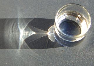
And as the shape becomes more complex, the resulting lightcast becomes even more complex. We could assume that the ghost is a sort of smoke? Smoke are small bits of a material, but not small enough to be separate molecules; they're clumps. And they are like mini-objects. They won't bend light uniform, but scatter it around, again making it diffused light. Not entirely diffuse, but enough to make highlights spread out. You can create a striking effect of translucency without a precise model of how the light moves, sure, but then you have to base it on diffuse light. And you'd have to add a lot of extra colors plus it wouldn't work well with the monochromatic aestetic. And even though it could be a decent effect for the ghost, it still won't do anything for the specular reflection of the cobblestones. In short, you can't reasonably pixel the specular reflections from a light inside the shadow of that same light. It could sort of work in a case like this: https://www.flickr.com/photos/anuwintschalek/6144824307/sizes/l"> 
But that's because the specular reflections in the shadows are from different lights than the ones casting those shadows. In this ghost image, however, there's one dominant lightsource; the streetlight. Related to this babbling about physics, I suggest you make the shadows a bit blurry, because the lamppost isn't a point light, but a fairly large box, and thus should give a noticable penumbra: 
The longer the relative distance (compared the distance to the lightsource) between a point on an object, and that same point on the object's shadow, the blurrier it becomes. In most cases this means that shadows are sharp at the feet, blurry at the head: This effect is much more pronounced with artificial lights, because the sun is 'infinitely' far away. And now I gotta run and pick someone up from the airpoirt kthxbye ------------- ▄▄█ ▄▄█ ▄█▄ ▄█▄ |
Posted By: MrHai
Date Posted: 25 October 2014 at 2:06pm
|
That's all great info, and I'm all for the idea that all artists need a firm grasp of how things look in real life and why they look that way. However, I also think that there is a time to put realism before aesthetics, and a time to put aesthetics before realism. ------------- "Work is more fun than fun" -John Cale |
Posted By: Lakelezz
Date Posted: 25 October 2014 at 4:20pm
|
Wow, thanks for your comprehensive post, PixelSnader :) It will probably help me quite a lot while I try to improve generally! However I guess that shadows will just destroy the pavement. Specially when I follow what you wrote o: I might try it again when I fixed my bushes :( Could my piece be denied on the gallery if I would stick to the current bush style? |
Posted By: PixelSnader
Date Posted: 26 October 2014 at 1:29pm

You don't need to completely ruin your road. You can simply tone it down a few shades, and remove the highlights. Like I said, the specular is impossible, but diffuse lighting can work (although less bright). 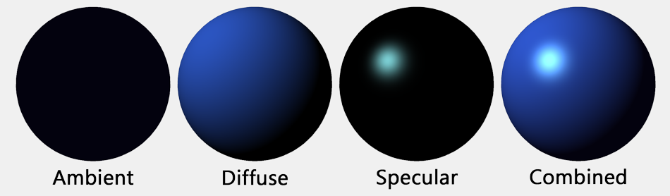
This work only has a point light; so no ambient lighting aside from the clouds and whatever bounces off of the bushes and tree. And only specular highlights in places where there's no shadow. You're probably able to rework the shadowed pathway with just two colors without losing too much. If not, try adding one color. ------------- ▄▄█ ▄▄█ ▄█▄ ▄█▄ |
Posted By: Lakelezz
Date Posted: 27 October 2014 at 6:32pm
|
Thank you very much(!), PixelSnader :) I really like the idea of your edit. When I start working on the animation I will try to do some diffused shadows. Nonetheless I want the shadows to change in their strength according to the flicker (weak, strong, no light) of the lamp. However the bushes were really freaking me out. I edited them again. Old: This is what I ended up with for now: 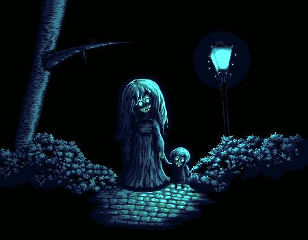 |
Posted By: Lakelezz
Date Posted: 28 October 2014 at 3:52pm
|
I started to work on the animation but did not add shadow, yet. There will be one test at least when the animation is complete. Right now the flickering and flies can be seen. Flies are much smoother in terms of movement and the blending of the flicker-effect is much nicer. As I mentioned: The animation is not finished due time lack - the flies will stop existing at some frame. I will fix the first two frames soon, where the upper left fly is "spawning" and directly disappearing (flying behind the lamp) too weirdly. 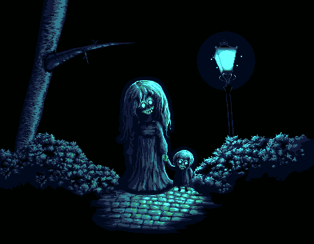 |
Posted By: DrTripwire
Date Posted: 28 October 2014 at 9:33pm
|
I don't have a big critique for you, but encouragement. I hope that's okay. c:
I just read the entirety of this thread - dude, you're amazing. Not only have you improved so much in a single thread, you responded maturely to the critique. Your textures are fantastic! What you have now is probably going to give me nightmares. (My only comment might not even be relevant.) The lantern's light extends to the background, too. I'm fond of the pitch black background, but if you ever wanted to expand and show a dim background, that would be cool. I dunno. That is all. Fantastic job, you. c: Keep it up! PS: Stop hatin' on the bushes. They're beautiful. |
Posted By: Lakelezz
Date Posted: 29 October 2014 at 8:29am
|
Thank you a lot, DrTripwire :)! By the way, welcome to pixeljoint! It is a good characteristic to read through a whole thread!! That will often lead to make your help very precise. Often people tend to repeat (by mistake) but you would of course avoid this. I am glad that you like my improvement and hope that you will of course be unable to sleep until Halloween, haha. About the background: It will stay black. Though I added a soft purple shade around the lantern. That should be enough. There is no reason to add more objects to this piece. On this way it wont overload - specially with the animation on, this can be a threat - I guess. The old bushes were dirty. They were not actually hating on them but telling me that is rather not like it should be. The bushes had not intentionally placed pixels which was leading to a too strong random, less logical, and very messy (dirty) pattern. If you meant the new bushes, gladly nobody "hated" about them, yet, haha :P I finished my animation:  Nonetheless there might be a last update (including several sub-fix-updates). Fizzick suggested that the branch should cast a shadow onto the tree. I guess that is right? Generally I want to try to cast more shadows. PixelSnader gave me so much input (which I am really thankful for) that I now want to put into this piece - at least for an attempt. |
Posted By: DrTripwire
Date Posted: 29 October 2014 at 9:06am
|
Thanks!
I do like the new purple. :) Oh! I was talking to you because you kept saying you didn't like them. I guess I don't know much about the technical side of pixeling and all the terms, haha. Is it just me, or is the flicker different? I don't see the actual "flicker" movement now; I'm only seeing off and on. A very short flicker if anything. |
Posted By: Lakelezz
Date Posted: 29 October 2014 at 9:19am
|
Oh no! The "new purple" was already added back then! I just mentioned it. The flicker is the same as before. I just added the last fly-animation-frames. |
Posted By: Limes
Date Posted: 29 October 2014 at 9:23am
| If someone doesn't mind could you post a version of the pic not through deviant art? |
Posted By: Lakelezz
Date Posted: 29 October 2014 at 9:35am
|
Oh, what is wrong with sta.sh-links? This is not uploaded on sta.sh / dA:  |
Posted By: H|F
Date Posted: 30 October 2014 at 9:45am
| Are they floating? There is so much light under them where I feel like they would cast shadows from the lamp. |
Posted By: Lakelezz
Date Posted: 30 October 2014 at 2:27pm
|
Oh! No no, they are not floating, haha. I mentioned it somewhere already, I will add the shadows in the last update :) I just had the feeling that they would take over too much place of the pavement. There are some drafts in thread to look at, just if you are curious. I made some different animation:  It is mixing the rather calm frames and then some rapid ones. I do not want to go for a strobelight festival, so I guess this rather fits? I am not quite sure. Additionally I added the darkest shade to the dark frames. |
Posted By: Finlal
Date Posted: 31 October 2014 at 3:51pm
| That is good. But in my opinion lantern blinks too much. It's quite hard to check out all details. Could you make it stand turned on for about 3 seconds? |
Posted By: Lakelezz
Date Posted: 31 October 2014 at 5:27pm
|
Haha, your suggestion is already in the final version. However not three seconds. Lately I finished my piece. I worked for such a long time on this that I feel like moving on. The gallery just accepted the piece, you can find it here: http://www.pixeljoint.com/pixelart/90021.htm - http://www.pixeljoint.com/pixelart/90021.htm -The flickering-pattern was optimized. -Some areas got slightly redefined -The tree pattern was changed a little bit The piece is done now. I probably wont change things from this point on. In the end I want to thank you all for you great support, ideas, and edits! |
Posted By: jalonso
Date Posted: 31 October 2014 at 6:15pm
|
You did awesome! More PJers should take advantage of the forum as you have. ------------- |