CHALLENGE 9/15/2014: Impact!
Printed From: Pixel Joint
Category: Pixel Art
Forum Name: Collaborations/Challenges
Forum Discription: Submit pixel art project ideas/templates or contribute to an existing pixel art collaboration.
URL: https://pixeljoint.com/forum/forum_posts.asp?TID=19766
Printed Date: 20 July 2026 at 5:20pm
Topic: CHALLENGE 9/15/2014: Impact!
Posted By: administrator
Subject: CHALLENGE 9/15/2014: Impact!
Date Posted: 15 September 2014 at 12:01am
Replies:
Posted By: Whisper Heart
Date Posted: 15 September 2014 at 11:14am
fast wip
wip2 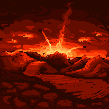
|
Posted By: Evidence
Date Posted: 15 September 2014 at 1:01pm
|
Let me see if i understand..
Can it be something that its about to impact ? or has to be something wich has already impacted ? Thanks! Rough WIP from a reference photo Someone is gonna impact on the floor http://postimage.org/"> 
Its completly killing me off. Hope i can finish it how i want too, also need to recylce colours i am already about the max. :D http://postimage.org/"> 
|
Posted By: felchqueen
Date Posted: 15 September 2014 at 9:59pm
|
@Evidence - IT says 'impact occurring' So we want to see knees and elbows on the floor! :) but what you've got so far looks really good, you could probably move the rider closer to the floor? |
Posted By: 7heSama
Date Posted: 15 September 2014 at 11:38pm
| Alternatively, if you like the current pose, just stick a rock in front of one of the board's wheels. Not only is it technically correct, it spiritually is, too! |
Posted By: Siikikala
Date Posted: 16 September 2014 at 1:52pm
|
playing around once again. 
I cropped it a bit, i thought the big sky and land were very distracting. 
|
Posted By: Xevil
Date Posted: 16 September 2014 at 4:36pm
|
Just wondering if i'm allowed to do this I took the magic card "Fastbond" Link below http://gatherer.wizards.com/Handlers/Image.ashx?multiverseid=382934&type=card And I traced it in MS paint, cut out all the colouring, resulting in..  And I was going to have him casting a massive spell into a fleet of ships, but before I do anything, I just want to know if that is ripping the art or not |
Posted By: jalonso
Date Posted: 16 September 2014 at 4:59pm
|
Originally posted by Siikikala
playing around once again. Oh! that looks very promising. ------------- |
Posted By: DawnBringer
Date Posted: 16 September 2014 at 6:10pm
| @Siikikala: Very nice colors! |
Posted By: Iscalio
Date Posted: 16 September 2014 at 7:04pm
been doing a lot of effects lately so I needed to do something else.

|
Posted By: Hamenopi
Date Posted: 17 September 2014 at 9:45am
|
WIP
I'm thinking inferred impact. I may animate it but I think it might be more powerful if the impact is just 'suggested' 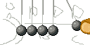
|
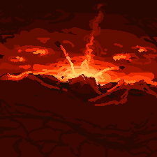
Posted By: Siikikala
Date Posted: 17 September 2014 at 11:02am

Started cleanup, i think it's good enough otherwise. I want to finish atleast one challenge since i haven't done that in the couple last ones so i'm avoiding obsessing about things. And challenges can be slightly wonky i think. |
Posted By: felchqueen
Date Posted: 17 September 2014 at 11:52am
|
@Siikikala- This is looking like a winner! :) I miss the lighter tones in your previous WIP, it gave the image a more 'painted' feel. But that's just a personal preference, so crack on and get it done! |
Posted By: Siikikala
Date Posted: 17 September 2014 at 1:48pm
| i think the grimmer background fits better what's going on, that's why i changed the colors around. |
Posted By: Lyud
Date Posted: 17 September 2014 at 2:37pm
|
Originally posted by Siikikala
Wow!! The way the magenta is mixed with blue, this is amazing! |
Posted By: jalonso
Date Posted: 17 September 2014 at 3:02pm
|
Originally posted by Siikikala
Started cleanup, i think it's good enough otherwise. I want to finish atleast one challenge since i haven't done that in the couple last ones so i'm avoiding obsessing about things. And challenges can be slightly wonky i think. Its still terrific but half the promise held in the early WIP was the balance of great, great colors and the scene design. By cutting the canvas down it has minimized the impact(no pun intended) of the scene. This is especially true of the ground part of the scene. ------------- |
Posted By: Siikikala
Date Posted: 17 September 2014 at 3:43pm
|
I'd disagree heavily about the old colors, they were just quick picks somewhere around the hue i wanted to have and i think it lacked contrast. And i felt the excess land mass was just a waste, so i made it fade in to the horizon faster rather than have the broad curve. the focus should be on the explosion, and this is why i made the background darker so the bright explosion would draw attention to itself.
I don't mean to sound ignorant and deny critique, i just wanted to say the reasoning behind the changes. Hope it doesn't have that kind of ring to it. I haven't really lookd into composition at all, so i appreciate the critique i get regarding that. |
Posted By: jalonso
Date Posted: 17 September 2014 at 4:08pm
|
Of course you are correct because you are the artist and its your creation and vision. I did start off by saying its still terrific :p
Any feedback (mine, for sure) is for your consideration and is given to be used or not. No 'ring' at all! ------------- |
Posted By: showtime
Date Posted: 17 September 2014 at 7:32pm
| @Hamenopi, it wouldn't look as dynamic, but within the context of the challenge I think it would be great to do a Newton's cradle at the moment of impact, which I believe would appear indistinguishable from it being at rest. |
Posted By: volter9
Date Posted: 18 September 2014 at 4:59pm
|
Hello guys!
My WIP: 
That's basic concept. I'm yet choosing the colors. I think, I need to stop using others palette and create my own :D |
Posted By: DawnBringer
Date Posted: 18 September 2014 at 10:10pm
| @Siikikala: You killed the magic :( |
Posted By: Gecimen
Date Posted: 19 September 2014 at 1:22am
|
Originally posted by DawnBringer @Siikikala: You killed the magic :( I disagree. I prefer the current realism. |
Posted By: Temessis
Date Posted: 19 September 2014 at 4:31am
May be a laser?
 
|
Posted By: jalonso
Date Posted: 19 September 2014 at 7:32am
|
Originally posted by Gecimen
Originally posted by DawnBringer I disagree. I prefer the current realism.@Siikikala: You killed the magic :( Magic > Realism  ------------- |
Posted By: Gecimen
Date Posted: 19 September 2014 at 9:34am
|
Originally posted by jalonso Originally posted by Gecimen
Originally posted by DawnBringer I disagree. I prefer the current realism.@Siikikala: You killed the magic :( Magic > Realism I agree but it's also harder to do "finish" such a piece. |
Posted By: volter9
Date Posted: 19 September 2014 at 11:14am
|
Hey, there's another my WIP. I think I made some progress here :D
Any suggestions how I can improve this picture? Or critique? 
I changed a little bit the image (but idea the same). Thanks for Noobtorials I could do some progress (Daruda's boulder tutorial, Jeremy's Scale'n'Stuff and jalonso's Colors, Layout + Composition tutorial), thank you guys!. |
Posted By: Siikikala
Date Posted: 19 September 2014 at 12:07pm
|
Originally posted by DawnBringer
@Siikikala: You killed the magic :( Was it he color change or the cropping? |
Posted By: Onipunks
Date Posted: 20 September 2014 at 3:46am
|
Hello, new guy's here ;)
It's still WIP [a bit spicy though]. 
Nice to meet you guys. Loup d'ONI |
Posted By: jtfjtfjtf
Date Posted: 20 September 2014 at 4:22pm
|
Originally posted by Siikikala Originally posted by DawnBringer
@Siikikala: You killed the magic :( Was it he color change or the cropping? I think the color change is a little too depressing. That's just my personal feeling since I don't find bright background/devastating action to be too contradictory (like in Guardians of the Galaxy, which has some action scenes in bright daylight). I also think the cropped scene is problematic because of the pixel detailing. In the bigger scene there's simple sky and simple ground and then busy action. So the eye goes to the action even though it's a big shot. I'm always drawn back into the explosion. In the cropped scene there's busy sky, busy ground, busy action, so the eye gets confused in a very tight shot. The contrast is also lessened between the sky and the smoke. In the big shot it's light blue sky, dark blue smoke. In the tight shot it's mid blue sky, dark blue smoke, making it a little muddy. |
Posted By: the pixel chicken
Date Posted: 25 September 2014 at 1:41pm
hmm I'm not too sure about this...

perhaps a bit too weird!? |
Posted By: the pixel chicken
Date Posted: 25 September 2014 at 2:04pm
made a few changes still looks really weird!! 

|
Posted By: the pixel chicken
Date Posted: 25 September 2014 at 2:17pm
here we go one last change before i give up for a while!

|
Posted By: Gecimen
Date Posted: 25 September 2014 at 2:24pm
| Nice work, but you see this is the last week's challenge. |
Posted By: the pixel chicken
Date Posted: 25 September 2014 at 2:45pm
| i know but i started it a while ago didnt finish in time but thought id stick it on here and carry on cos its not worth leaving |