Art quality...
Printed From: Pixel Joint
Category: Pixel Art
Forum Name: WIP (Work In Progress)
Forum Discription: Get crits and comments on your pixel WIPs and other art too!
URL: https://pixeljoint.com/forum/forum_posts.asp?TID=2037
Printed Date: 13 June 2026 at 10:23am
Topic: Art quality...
Posted By: Flameruler13
Subject: Art quality...
Date Posted: 22 April 2006 at 8:04pm
|
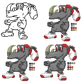
I colored this line art.. cant remember who made it but i just wanna know what you think of it:
------------- http://www.pixeljoint.com/pixels/profile.asp?pg=1&id=4085&sec=icons - Gallery |

Replies:
Posted By: Pixel_Outlaw
Date Posted: 22 April 2006 at 9:03pm
|
well i'm glad you didn't pillowshade that. Maybe try having a very light yellow colored lightsource and blending accordingly. I almost never shade to white but this is a stylistic choice. Decent job there. ------------- http://www.shmup-dev.com/forum/"> 
|
Posted By: leel
Date Posted: 22 April 2006 at 9:32pm
|
maybe add some highlights? The shading is pretty good ^_^ Also, this should probably go in WIP forum.. though if you're done..eh I dunno |
Posted By: Brian the Great
Date Posted: 23 April 2006 at 2:09am
| I'm guessing the lineart is Flaber's. |
Posted By: PixelSnader
Date Posted: 23 April 2006 at 5:07am
|
i'd lose the horn's dithering and add some highlights ------------- ▄▄█ ▄▄█ ▄█▄ ▄█▄ |
Posted By: Flameruler13
Date Posted: 23 April 2006 at 6:05am
|
ya i didnt put it in the WIP section cause its done and im not submitting it ------------- http://www.pixeljoint.com/pixels/profile.asp?pg=1&id=4085&sec=icons - Gallery |
Posted By: Brian the Great
Date Posted: 23 April 2006 at 6:25am
| Either way, pixel art topics go in WIP. |
Posted By: Flameruler13
Date Posted: 23 April 2006 at 6:32am
|
I took away the horn dithering and i tried to do highlights.... i need help, he looks likes a baloon
------------- http://www.pixeljoint.com/pixels/profile.asp?pg=1&id=4085&sec=icons - Gallery |
Posted By: AndyOaks
Date Posted: 23 August 2006 at 8:51am
The outline and final shading looks pretty good to me. I'd reduce the pupil size but that's just me I especially like the shoes. Originally posted by Flameruler13
I colored this line art.. cant remember who made it but i just wanna know what you think of it:
|
Posted By: alkaline
Date Posted: 23 August 2006 at 9:29am
|
looks like flaber's to me. either dither the body or add another tone in between your two. ------------- |
Posted By: Skull
Date Posted: 23 August 2006 at 9:53am
|
It's looking pretty good to me. Might want to AA between the skin tone and highlight / shade.. make it smoother.
------------- |
Posted By: Brian the Great
Date Posted: 23 August 2006 at 10:18am
|
Originally posted by AndyOaks Omg necropost.The outline and final shading looks pretty good to me. I'd reduce the pupil size but that's just me I especially like the shoes. Originally posted by Flameruler13 I colored this line art.. cant remember who made it but i just wanna know what you think of it:
------------- http://www.twoschizos.com"> 
|