Well apparently im horible at pixel art..
Printed From: Pixel Joint
Category: Pixel Art
Forum Name: WIP (Work In Progress)
Forum Discription: Get crits and comments on your pixel WIPs and other art too!
URL: https://pixeljoint.com/forum/forum_posts.asp?TID=2056
Printed Date: 21 July 2026 at 4:04pm
Topic: Well apparently im horible at pixel art..
Posted By: Flameruler13
Subject: Well apparently im horible at pixel art..
Date Posted: 25 April 2006 at 4:03pm
|
Im trying to make a giant pixel art of me but i dont want to make it and then have to start over because it doesnt meet you standereds so im posting it as i go. You can tell me when i do something wrong. ------------- http://www.pixeljoint.com/pixels/profile.asp?pg=1&id=4085&sec=icons - Gallery |
Replies:
Posted By: Flameruler13
Date Posted: 25 April 2006 at 4:09pm
|
Ok i made the rough draft of line art but which do you think i should use:
------------- http://www.pixeljoint.com/pixels/profile.asp?pg=1&id=4085&sec=icons - Gallery |
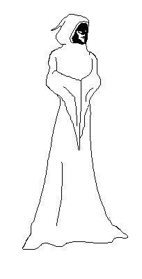 Normal(i know the feet are messed up)i think its more of what i was looking for.=-)
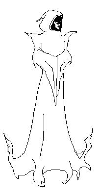 Spiky(i dunno)
Posted By: Larwick
Date Posted: 25 April 2006 at 4:12pm
|
The spikey one looks pretty sweet! With some sort of magically effects it could look very atmoshperic. The first one would obviously be the easier choice though. His arms seem a tad small at this stage. Good luck, -------------  http://larw-ck.deviantart.com"> http://larw-ck.deviantart.com">
|
Posted By: PixelSnader
Date Posted: 25 April 2006 at 4:12pm
|
i'd say the normal version, but with a bit of a harnass with small sdpikes on the shoulders and stuff. and maybe some small rips in the bottom, but think the ''spiky version'' is a bit overdone. he's a tad skinny.. on purpose? ------------- ▄▄█ ▄▄█ ▄█▄ ▄█▄ |
Posted By: Flameruler13
Date Posted: 25 April 2006 at 4:30pm
|
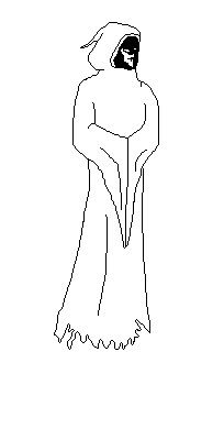
UPDATE: Ok i made him fatter and ripped his shirt at the bottom
------------- http://www.pixeljoint.com/pixels/profile.asp?pg=1&id=4085&sec=icons - Gallery |

Posted By: Bifur
Date Posted: 25 April 2006 at 4:31pm
|
I would make a torn effect along with the spikes in the bottom ,
------------- 
I know! Leafs shouldn't make shadow... |
Posted By: Flameruler13
Date Posted: 25 April 2006 at 4:33pm
|
think i should make the rips bigger? ------------- http://www.pixeljoint.com/pixels/profile.asp?pg=1&id=4085&sec=icons - Gallery |
Posted By: Larwick
Date Posted: 25 April 2006 at 4:33pm
|
Howabout thickening up his upper arms (not outwards, inwards) I also think quite a few of the lines (such as in the area were his sleeve hangs down) could be neatened up, to make colouring it alot easier. Well, thats all from me for today... lol. ------------- http://larw-ck.deviantart.com">
|
Posted By: Flameruler13
Date Posted: 25 April 2006 at 4:43pm
|
think that looks better?
------------- http://www.pixeljoint.com/pixels/profile.asp?pg=1&id=4085&sec=icons - Gallery |

Posted By: leel
Date Posted: 25 April 2006 at 5:53pm
|
hmm.. maybe try making the arms longer? He's so tall, but the arms (upper arms especially) seem too short. I tried standing like that and my hands ended up on my belly button, so try positioning them where his belly button would be. Doing good so far ;) |
Posted By: inkspot
Date Posted: 26 April 2006 at 9:58am
|
It is floating in the air or what? ------------- |
Posted By: Flameruler13
Date Posted: 26 April 2006 at 11:44am
|
ya hes floating... ill work on the arms ------------- http://www.pixeljoint.com/pixels/profile.asp?pg=1&id=4085&sec=icons - Gallery |
Posted By: Saboteur
Date Posted: 26 April 2006 at 12:55pm
|
If he's floating... would the cloth even fan back out at the bottom? Seems as if it would just hang straight down, then, more or less. ------------- "I was minding my own business and walking across a pebbled path, and a Duck started giving me the business." |
Posted By: Flameruler13
Date Posted: 26 April 2006 at 1:44pm
|
UPDATE: his robe doesnt fan out as much, i made the sleeeve sag the same amount and his arms are a little longer
------------- http://www.pixeljoint.com/pixels/profile.asp?pg=1&id=4085&sec=icons - Gallery |
Posted By: Larwick
Date Posted: 26 April 2006 at 2:30pm
|
Hmm, take a tshirt or cloth of some sort and hold it above the floor. That should grealty help you in the process of texturing the end of the cloak, because at the moment it seems very odd. ------------- http://larw-ck.deviantart.com">
|
Posted By: Dar Kuma
Date Posted: 26 April 2006 at 2:33pm
|
if he is floating,the cloak wouldve been dragging on the floor so i guess it would be ripped ------------- http://www.geocities.com/Spookyjuggalo/index.html"> 
|
Posted By: Flameruler13
Date Posted: 26 April 2006 at 2:47pm
|
Originally posted by Larwick
Hmm, take a tshirt or cloth of some sort and hold it above the floor. That should grealty help you in the process of texturing the end of the cloak, because at the moment it seems very odd. what are you talking about?!?!?! ------------- http://www.pixeljoint.com/pixels/profile.asp?pg=1&id=4085&sec=icons - Gallery |
Posted By: Larwick
Date Posted: 26 April 2006 at 2:53pm
|
Originally posted by Flameruler13
Originally posted by Larwick
Hmm, take a tshirt or cloth of some sort and hold it above the floor. That should grealty help you in the process of texturing the end of the cloak, because at the moment it seems very odd. what are you talking about?!?!?! *flinches* ------------- http://larw-ck.deviantart.com">
|
Posted By: Flameruler13
Date Posted: 26 April 2006 at 3:10pm
|
oh ill try... yea your right needs more folds ------------- http://www.pixeljoint.com/pixels/profile.asp?pg=1&id=4085&sec=icons - Gallery |
Posted By: Flameruler13
Date Posted: 26 April 2006 at 6:30pm
|
UPDATE: i tried fold but failed greatly. i think i like it not ripped though....
------------- http://www.pixeljoint.com/pixels/profile.asp?pg=1&id=4085&sec=icons - Gallery |

Posted By: glitchey
Date Posted: 26 April 2006 at 7:03pm
|
looks fine except for some paint freehand-ngitis on the bottom right of the robe
------------- "you sunk my jangerjam!" homsar |
Posted By: Aleiav
Date Posted: 27 April 2006 at 12:46am
|
I think the hood doesn't really look 3D. http://spriteart.com - st0ven makes an awesome hood look on one of his sprites. I'd suggest taking a look at that.
------------- |
Posted By: Flameruler13
Date Posted: 27 April 2006 at 12:03pm
|
Originally posted by glitchey
looks fine except for some paint freehand-ngitis on the bottom right of the robe im just trying to get a rough outline first ------------- http://www.pixeljoint.com/pixels/profile.asp?pg=1&id=4085&sec=icons - Gallery |
Posted By: Souly
Date Posted: 27 April 2006 at 12:09pm
|
Why'd you remove the rips? ------------- 
I am the jesus of PJ. |
Posted By: Flameruler13
Date Posted: 27 April 2006 at 12:38pm
|
i dunno i think it looks better ------------- http://www.pixeljoint.com/pixels/profile.asp?pg=1&id=4085&sec=icons - Gallery |
Posted By: Larwick
Date Posted: 27 April 2006 at 1:20pm
|
I honestly dont think the cloak would hang like that. Did you try the reference idea? If not, check this out: http://www.larp.com/legioxx/paen1.jpg - http://www.larp.com/legioxx/paen1.jpg The cloth hangs above the ground, so its still sort of what you're looking for, physics wise (although of course, you'd have to change the perspective). ------------- http://larw-ck.deviantart.com">
|
Posted By: 0xDB
Date Posted: 28 April 2006 at 7:43am
|
To me it looked better with the rips than without. Some sort of overlay-collar like a monk would wear it would also be nice. Here is a nice http://www.ritterladen.de/shop/images/10922b.jpg - reference picture for what i'm thinking of. ------------- http://www.dennisbusch.de/index.php - 0xDB | https://twitter.com/dennisbusch_de - twitter |
Posted By: Flameruler13
Date Posted: 28 April 2006 at 4:01pm
|
i tried to do what Larwick said but i couldnt. ------------- http://www.pixeljoint.com/pixels/profile.asp?pg=1&id=4085&sec=icons - Gallery |
Posted By: Flameruler13
Date Posted: 28 April 2006 at 6:18pm
|
UPDATE: Ok i like how it looks now so i smoothed out the line art and i think im ready to color.
------------- http://www.pixeljoint.com/pixels/profile.asp?pg=1&id=4085&sec=icons - Gallery |

Posted By: Larwick
Date Posted: 28 April 2006 at 6:29pm
|
Howabout adding a bit of gathered cloth at the top of where his hands meet? If you're def sure about everything else, i think that would finish the lineart. ------------- http://larw-ck.deviantart.com">
|
Posted By: alkaline
Date Posted: 28 April 2006 at 6:50pm
|
there's a strange tumor-like bump in the cloak hood.. I don't really like the way the sleeves come together and just...droop in one triangle. looks kinda strange. other than that, tis pretty good. |
Posted By: Flameruler13
Date Posted: 28 April 2006 at 8:30pm
|
think the back of the hood should be less round? ------------- http://www.pixeljoint.com/pixels/profile.asp?pg=1&id=4085&sec=icons - Gallery |
Posted By: Atomicrat12
Date Posted: 29 April 2006 at 3:13pm
| ya |
Posted By: Brian the Great
Date Posted: 29 April 2006 at 3:16pm
|
no spam pls
------------- http://www.twoschizos.com"> 
|
Posted By: Skull
Date Posted: 30 April 2006 at 1:01am
|
Looking good so far.. Question - Is there movement for the character, or have they just moved? If so, you might want to add a little trail of the robe behind, unless they're floating. But overall, some nice stuff. ------------- |
Posted By: Flameruler13
Date Posted: 01 May 2006 at 1:27pm
|
ya hes just randomly standing there... think its ready for color? ------------- http://www.pixeljoint.com/pixels/profile.asp?pg=1&id=4085&sec=icons - Gallery |
Posted By: Skull
Date Posted: 01 May 2006 at 1:29pm
|
Go for it - You can add details during the shadeing process.
------------- |
Posted By: Flameruler13
Date Posted: 01 May 2006 at 1:30pm
|
k ------------- http://www.pixeljoint.com/pixels/profile.asp?pg=1&id=4085&sec=icons - Gallery |
Posted By: Aleiav
Date Posted: 02 May 2006 at 1:07am
|
I still think you need to reshape the hood before you begin shading.
------------- |
Posted By: Souly
Date Posted: 02 May 2006 at 8:47am
|
Originally posted by Aleiav I still think you need to reshape the hood before you begin shading. -------------
I am the jesus of PJ. |
Posted By: Flameruler13
Date Posted: 03 May 2006 at 12:22pm
|
k i will ------------- http://www.pixeljoint.com/pixels/profile.asp?pg=1&id=4085&sec=icons - Gallery |
Posted By: Flameruler13
Date Posted: 05 May 2006 at 7:40pm
|
Update: how does it look?
------------- http://www.pixeljoint.com/pixels/profile.asp?pg=1&id=4085&sec=icons - Gallery |

Posted By: Flameruler13
Date Posted: 05 May 2006 at 8:09pm
|
i started to color it. how's it look?
------------- http://www.pixeljoint.com/pixels/profile.asp?pg=1&id=4085&sec=icons - Gallery |
 Update:
Posted By: Flameruler13
Date Posted: 05 May 2006 at 8:11pm
|
crap... i saved it as the wrong file... w8 a minute... ------------- http://www.pixeljoint.com/pixels/profile.asp?pg=1&id=4085&sec=icons - Gallery |
Posted By: Flameruler13
Date Posted: 05 May 2006 at 8:13pm
|
here it is:
------------- http://www.pixeljoint.com/pixels/profile.asp?pg=1&id=4085&sec=icons - Gallery |

Posted By: Bifur
Date Posted: 05 May 2006 at 8:33pm
|
the cloth is still strange and 5 color for the eye? i would reuse some
-------------
I know! Leafs shouldn't make shadow... |
Posted By: Big nothing
Date Posted: 05 May 2006 at 11:11pm
HAH i love dark monks and necro! But shading of dress... uee 
|
Posted By: Larwick
Date Posted: 06 May 2006 at 4:02am
|
You're currently using far too many colours to little effect. I'd start off with 1 black for the lineart, 3 greys for the cloak (highlight, normal & shadow) and 2 or 3 red/oranges for the eyes. This will make it easier to start with, and you will be able to neaten it up later. ------------- http://larw-ck.deviantart.com">
|
Posted By: Flameruler13
Date Posted: 06 May 2006 at 6:49am
|
so much less colors? ------------- http://www.pixeljoint.com/pixels/profile.asp?pg=1&id=4085&sec=icons - Gallery |
Posted By: Monkey 'o Doom
Date Posted: 06 May 2006 at 6:59am
|
yes as in 8 colors or so for a goal ------------- http://pixelmonkey.ensellitis.com"> 
RPG is numberwang. |
Posted By: Bryan24
Date Posted: 06 May 2006 at 8:22pm
|
du,du du,du,du. he looks so evil! ------------- Revive the bannana thread, and keep the pomegrantate thread! P.S.The bannana thread is supposed to not make sense. P.S.S.or dollars |
Posted By: Flameruler13
Date Posted: 08 May 2006 at 12:20pm
|
Originally posted by Bryan24
du,du du,du,du. he looks so evil! thanx!!!! ------------- http://www.pixeljoint.com/pixels/profile.asp?pg=1&id=4085&sec=icons - Gallery |
Posted By: Souly
Date Posted: 08 May 2006 at 12:23pm
|
There is 7 different blacks in that!? WTF -------------
I am the jesus of PJ. |
Posted By: Flameruler13
Date Posted: 09 May 2006 at 11:48am
|
how many blacks and how many reds? ------------- http://www.pixeljoint.com/pixels/profile.asp?pg=1&id=4085&sec=icons - Gallery |
Posted By: Larwick
Date Posted: 09 May 2006 at 11:51am
|
Originally posted by Larwick
You're currently using far too many colours to little effect. I'd start off with 1 black for the lineart, 3 greys for the cloak (highlight, normal & shadow) and 2 or 3 red/oranges for the eyes. This will make it easier to start with, and you will be able to neaten it up later. ------------- http://larw-ck.deviantart.com">
|
Posted By: Setzer
Date Posted: 09 May 2006 at 12:12pm
|
OKay, I just cranked my monitor brightness up to 100, zoomed in x8, and I *still* couldn't tell the difference between those bottom 3 blacks. :( ------------- http://sj-gfx.com"> 
|
Posted By: Bifur
Date Posted: 09 May 2006 at 12:24pm
|
They are different
-------------
I know! Leafs shouldn't make shadow... |
Posted By: Larwick
Date Posted: 09 May 2006 at 12:57pm
|
Lol, but it's hardly noticable. Seriously, it's pointless. ------------- http://larw-ck.deviantart.com">
|
Posted By: Flameruler13
Date Posted: 10 May 2006 at 3:14pm
|
ok i got the colors but i cant get the shading right. any tips?
------------- http://www.pixeljoint.com/pixels/profile.asp?pg=1&id=4085&sec=icons - Gallery |

Posted By: Flameruler13
Date Posted: 10 May 2006 at 3:15pm
|
except for the face part. thats done. ------------- http://www.pixeljoint.com/pixels/profile.asp?pg=1&id=4085&sec=icons - Gallery |
Posted By: Larwick
Date Posted: 10 May 2006 at 3:15pm
|
Select a lightsource first, and work from there. Anything that is shadowed by something, be it an arm or a fold, will have... a shadow. Use reference. ------------- http://larw-ck.deviantart.com">
|
Posted By: Flameruler13
Date Posted: 10 May 2006 at 3:16pm
|
you mean pick where the light is coming from? ------------- http://www.pixeljoint.com/pixels/profile.asp?pg=1&id=4085&sec=icons - Gallery |
Posted By: Larwick
Date Posted: 10 May 2006 at 3:28pm
|
Yes. ------------- http://larw-ck.deviantart.com">
|
Posted By: Flameruler13
Date Posted: 10 May 2006 at 3:35pm
|
mine is usully at the top left ------------- http://www.pixeljoint.com/pixels/profile.asp?pg=1&id=4085&sec=icons - Gallery |
Posted By: Flameruler13
Date Posted: 12 May 2006 at 12:40pm
|
but i tried and it came out ugly ------------- http://www.pixeljoint.com/pixels/profile.asp?pg=1&id=4085&sec=icons - Gallery |
Posted By: Pixel_Outlaw
Date Posted: 12 May 2006 at 12:54pm
|
You have double posted and are approaching your 4 page limit. ------------- http://www.shmup-dev.com/forum/"> 
|
Posted By: Brian the Great
Date Posted: 12 May 2006 at 12:56pm
|
It'd be nice if we could see your attempt so we can point out what you're doing wrong. ------------- http://www.twoschizos.com">
|
Posted By: Setzer
Date Posted: 12 May 2006 at 1:26pm
|
there's a 4-page limit? or does that mean LOCKSLOCKSLOCKS =o. ditto what BtG said.
------------- http://sj-gfx.com">
|
Posted By: Flameruler13
Date Posted: 13 May 2006 at 8:03am

------------- http://www.pixeljoint.com/pixels/profile.asp?pg=1&id=4085&sec=icons - Gallery |
Posted By: PixelSnader
Date Posted: 13 May 2006 at 9:33am
|
dude. jpeggernatorzerated ------------- ▄▄█ ▄▄█ ▄█▄ ▄█▄ |
Posted By: Bifur
Date Posted: 13 May 2006 at 5:39pm
|
even if this is jpeggernatorzerated , i can see trhat u r trying to make his clothes of metal or some kind of super hard and unflexible dragon leather i mean one fold on the sleeve like that is not all ... -------------
I know! Leafs shouldn't make shadow... |
Posted By: Flameruler13
Date Posted: 14 May 2006 at 3:59am
|
im worried about the shading not the sleeves
------------- http://www.pixeljoint.com/pixels/profile.asp?pg=1&id=4085&sec=icons - Gallery |
Posted By: Larwick
Date Posted: 14 May 2006 at 4:30am
|
Yes but Bifur is telling you that he sees a problem with the sleeves/physics aswel, surely you'd want to fix that too? ------------- http://larw-ck.deviantart.com">
|
Posted By: Flameruler13
Date Posted: 15 May 2006 at 5:43am
|
i cant do folds!!!!!!!!!!!!!!!!!!!!!!!!!!!!!!!!!!!!!!!!!!!!!!!!!!!!!!! !!!!!!!!!!!!!!!!!!!!!!!!!!!!!!!!!!!!!!!!!!!!!!!!!!!!!!!!!!!! !!!!!!!!!!!!!!!!!!!!!!!!!!!!!!!!!!!!!!!!!!!!!!!!!!!!!!!!!!!! !!!!!!!!!!!!!!!!!!!!!!!!!!!!!!!!!!!!!!!!!!!!!!!!!!!!!!!!!!!! !!!!!!!!!!!!!!!!!!!!!!!!!!!!!!!!!!!!!!!!!!!!!!!!!!!!!!!!!!!! !!!!!!!!!!!!!!!!!!!!!!!!!!!!!!!!!!!!
------------- http://www.pixeljoint.com/pixels/profile.asp?pg=1&id=4085&sec=icons - Gallery |
Posted By: Saiklor
Date Posted: 15 May 2006 at 6:13am
|
and you know how you learn? study them draw them pixel them here's a reference, come back when you've pixelled at least some of these. practise makes perfect, there really are NO SHORTCUTS in art. http://elfwood.lysator.liu.se/farp/elizafolds/elizafolds.htm l http://elfwood.lysator.liu.se/farp/theart/elizamale/index.ht ml ------------- www.semesteratsea.com |
Posted By: Bifur
Date Posted: 15 May 2006 at 4:21pm
|
Originally posted by Flameruler13 im worried about the shading not the sleeves u cant make shading without figuring out the folds , pluis get rid of the shadow on the bottom of the cloak -------------
I know! Leafs shouldn't make shadow... |
Posted By: Flameruler13
Date Posted: 16 May 2006 at 4:28pm
|
Originally posted by Bifur get rid of the shadow on the bottom of the cloak k ------------- http://www.pixeljoint.com/pixels/profile.asp?pg=1&id=4085&sec=icons - Gallery |
Posted By: Setzer
Date Posted: 16 May 2006 at 4:47pm
|
Originally posted by Flameruler13 i cant do folds!!!!!!!!!!!!!!!!!!!!!!!!!!!!!!!!!!!!!!!!!!!!!!!!!!!!!!! !!!!!!!!!!!!!!!!!!!!!!!!!!!!!!!!!!!!!!!!!!!!!!!!!!!!!!!!!!!! !!!!!!!!!!!!!!!!!!!!!!!!!!!!!!!!!!!!!!!!!!!!!!!!!!!!!!!!!!!! !!!!!!!!!!!!!!!!!!!!!!!!!!!!!!!!!!!!!!!!!!!!!!!!!!!!!!!!!!!! !!!!!!!!!!!!!!!!!!!!!!!!!!!!!!!!!!!!!!!!!!!!!!!!!!!!!!!!!!!! !!!!!!!!!!!!!!!!!!!!!!!!!!!!!!!!!!!! Art == dedication. This tells me you're whiny and not willing to learn how to be better. it also tells me you're in the age range of 8-12, and in general dosen't make people want to help you. ------------- http://sj-gfx.com">
|
Posted By: Flameruler13
Date Posted: 17 May 2006 at 11:55am
|
Originally posted by Setzer tells me you're in the age range of 8-12, your an idiot. ------------- http://www.pixeljoint.com/pixels/profile.asp?pg=1&id=4085&sec=icons - Gallery |
Posted By: Pixel_Outlaw
Date Posted: 17 May 2006 at 12:01pm
|
actually he's around 14 Actually you're more of a FlameMagnet14 but does not take critisism well ------------- http://www.shmup-dev.com/forum/">
|
Posted By: Souly
Date Posted: 17 May 2006 at 1:20pm
|
Originally posted by Flameruler13 your an idiot. And so the pot calls the kettle black. -------------
I am the jesus of PJ. |
Posted By: Pixel_Outlaw
Date Posted: 17 May 2006 at 1:44pm
|
This thread shouldn't take this long to end. Really this is just a cycle of flammy:Help me or if you prefer psudo code: while(flammy.mood != happy) { ------------- http://www.shmup-dev.com/forum/">
|
Posted By: Souly
Date Posted: 17 May 2006 at 1:48pm
|
{ -------------
I am the jesus of PJ. |
Posted By: Larwick
Date Posted: 17 May 2006 at 2:17pm
|
>__< \_/ ------------- http://larw-ck.deviantart.com">
|
Posted By: Psychotic_Carp
Date Posted: 17 May 2006 at 2:29pm
|
what is this I see? Is it flamescript? -------------  got game? got game?
|
Posted By: Bifur
Date Posted: 17 May 2006 at 5:30pm
|
if ( bifur == commented && "gotignored"){ printf (normal day) } else{ printf( run , its apocalypse ) } -------------
I know! Leafs shouldn't make shadow... |
Posted By: Monkey 'o Doom
Date Posted: 17 May 2006 at 5:42pm
|
You need an avvie to be a real person here. >.< ------------- http://pixelmonkey.ensellitis.com">
RPG is numberwang. |
Posted By: Brian the Great
Date Posted: 17 May 2006 at 5:57pm
|
SNAP SNAP ------------- http://www.twoschizos.com">
|