Feedback for Mobile Suit Design
Printed From: Pixel Joint
Category: Pixel Art
Forum Name: WIP (Work In Progress)
Forum Discription: Get crits and comments on your pixel WIPs and other art too!
URL: https://pixeljoint.com/forum/forum_posts.asp?TID=21201
Printed Date: 23 April 2026 at 11:16pm
Topic: Feedback for Mobile Suit Design
Posted By: thoughtmachine
Subject: Feedback for Mobile Suit Design
Date Posted: 31 January 2015 at 2:22pm
|
Can you guys give me some feedback on our Pterodactyl Mobile Suit Design?
I am not sure how to shade the vents on the abdomen area. 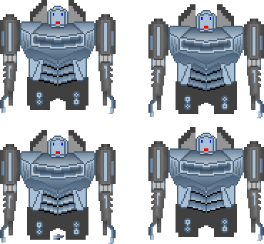
|
Replies:
Posted By: RebeaLeion
Date Posted: 31 January 2015 at 3:06pm
|
Too much color banding! - everywhere.
Check out tutorials (both), very helpful: http://www.pixeljoint.com/forum/forum_posts.asp?TID=5692 - http://www.pixeljoint.com/forum/forum_posts.asp?TID=5692 http://www.pixeljoint.com/forum/forum_posts.asp?TID=11299 - http://www.pixeljoint.com/forum/forum_posts.asp?TID=11299 |
Posted By: thoughtmachine
Date Posted: 31 January 2015 at 3:22pm
|
Originally posted by RebeaLeion
Too much color banding! - everywhere. Thanx, I am already aware of that. The gradient tool is evil! But when you are just beginning a piece, using gradients is a very helpful tool to access proper surface depths and overall design Q&A. Naturally those gradients won't be there when the sprite is finished. Originally posted by RebeaLeion
http://www.pixeljoint.com/forum/forum_posts.asp?TID=5692 - http://www.pixeljoint.com/forum/forum_posts.asp?TID=5692 http://www.pixeljoint.com/forum/forum_posts.asp?TID=11299 - http://www.pixeljoint.com/forum/forum_posts.asp?TID=11299 I have already read those :) |
Posted By: r1k
Date Posted: 31 January 2015 at 11:00pm
|
starting your shading with flat colors may be a better method than starting with gradients. For example, the bottom part of his chest could be dark, the front plane lighter, and the top plane lighter than that. Doing that would quickly establish those plane, whereas the gradients you have on the chest right now don't really do that and actually look pretty flat. I've never drawn a mech before and don't think I'm the best one to give design advice, but I have 2 main issues with the design. First, the arms don't seem like they could rotate at the shoulders. Like they could only move forwards and backwards, which seems less cool. And I think overall the design is kind of boxy. Especially how the torso is perfectly rectangular and the arms are perfectly straight. |
Posted By: thoughtmachine
Date Posted: 02 February 2015 at 7:35am
|
Originally posted by r1k
starting your shading with flat colors may be a better method than starting with gradients. It's easier for me to assess depth with a gradient than with a single flat color. Originally posted by r1k
seem like they could rotate at the shoulders. Like they could only move forwards and backwards If you look at the Transformers from G1 or the Gundam series most of the mecha have no ball joint in the shoulder and yet somehow they magically rotate on more than one axis. And I would admit, that is poor form. These arms will only move forwards and backwards. That is the intention. This is for a 2D platform game. |
Posted By: SuperTurnip
Date Posted: 02 February 2015 at 8:32pm
| It's great if you've found a way to assess depth early on that works for you, but so we don't focus on it as an issue, can you please provide the next step in the process? Try continuing your work from where you are, and show us how you'll work in hand-drawn shading. If we can't help you because you're coming from a very different approach, you can teach us by showing what's going on in your head. :) |