Eternal Night: Project Dee
Printed From: Pixel Joint
Category: Pixel Art
Forum Name: WIP (Work In Progress)
Forum Discription: Get crits and comments on your pixel WIPs and other art too!
URL: https://pixeljoint.com/forum/forum_posts.asp?TID=2197
Printed Date: 30 September 2025 at 2:03am
Topic: Eternal Night: Project Dee
Posted By: Shoba
Subject: Eternal Night: Project Dee
Date Posted: 19 May 2006 at 2:29am
I'm still working on my personal crusade .... errr .... game project called "Eteranl Night: Project Dee". I'm pretty much done with the normal character Animations (jump, run, climb etc) and Im currently working on the Attack animations. Since all animations are done with black outlines only, I also started to shade them, but for some reason the result doesnt seem quite right to me. So, if anyone got a constructive suggestions, please let me hear it. 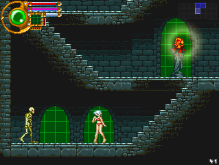 |
Replies:
Posted By: Saxamaphone
Date Posted: 19 May 2006 at 2:55am
The background is beautiful. Setting is great, maybe an easier way to see the health better. The chick in the bikini is cool aswell, but doesn't look in place amongst skeletons and dungeons, but not saying there is anything wrong with that, it's great. Maybe work on a different way to shade her. 
|
Posted By: Shoba
Date Posted: 19 May 2006 at 3:35am
| The Bikini is only temporary. I'm working on an overlay system which shows most of the equiped Items on the character. Shes supposed to wear dresses, Armours or robes in the Game. |
Posted By: alkaline
Date Posted: 19 May 2006 at 3:50am
|
Great background. I suggest making dark outlines for them. Right now it's too light.
------------- |
Posted By: Hotlead Junkie
Date Posted: 19 May 2006 at 7:16am
| First thing I thought of when I saw this was 'Castlevania'. I'd love to see the windows with some more detail, possibly a nice stained-glass pattern |
Posted By: mixxedstuff
Date Posted: 19 May 2006 at 8:25am
|
Awesome, you're still working on this! A few nitpicks about your mockup- On the background wall, the shadows from the stairs seem a bit too blocky. IF you note, they're basically giant rectangles coming down, while the stairs above them disappear in a diagonal direction. It looks a bit odd. The flame in the back also looks a bit fake in the midst of the rest of the environment. This may be due to the excessive reflection on the statue. At first, it even had me to the point of thinking that the statue was a clawed limb pointing straight up with a ball of flame floating over it, but upon zooming in, I see that's very wrong. You might just tone down the saturation of the reflection, that may work. Other than that, not much I can say. You capture the feel of the environment very well, and the detail is great. Oh, what's with the rogue red pixels in the bricks? (the bottom of the flat elevated floor, just down and left of the statue) ------------- This is a signature. What it is for, I have no idea. |
Posted By: Grindie
Date Posted: 19 May 2006 at 3:35pm
| I love those tiles and the background (Castlevania-tastic!), but I don't think the girl fots with them. Maybe some darker outlines would help. |
Posted By: Aleiav
Date Posted: 19 May 2006 at 9:45pm
|
Really awesome background going. :) I think the light effect on the latern up top looks a bit strange though. I'm not sure what's wrong with it but it looks odd. Maybe you should put the lighting effects behind the light fixture (of sorts) rather than in frount?
------------- |
Posted By: 0xDB
Date Posted: 20 May 2006 at 1:43am
|
I like the stairs and how the brick tiles below them blend slowly into full black. crits: The characters might be a tad too bright for that background so maybe your game engine will want to shade them darker or lighter automatically to fit each background. Some of the larger brick tiles (e.g.below the girl and skeleton) could use a little more texture, like dents and bumps as they currently look too washed out, imo. ------------- http://www.dennisbusch.de/index.php - 0xDB | https://twitter.com/dennisbusch_de - twitter |
Posted By: Shoba
Date Posted: 20 May 2006 at 4:53am
|
Thanks for the Comments on the Background, but those where currently not really the Topic :3. As for the Lack of Texture on the larger Bricks, I currently got only two different Paterns, each 48x48 pixel big, so its kinda hard to break up the monotony. @Dennis Busch: You might be right, she seems to be to bright, that might be the problem. But the next problem might be, unlike an typical Castlevania Game, in this game some Stages might be a lot lighter then a typical Dungeon. @Grindie: Dark outlines might solve the Problems, but actually I wanted to get rid of them. Hmm... Castlevania Games work without dark outlines pretty well, but their characters seem darker then mine, and so do all of their backgrounds. Maybe its worth a try. |
Posted By: Shoba
Date Posted: 24 July 2006 at 12:56am
Back from the dead :3. I did this enemy Design lately: Its supposed to be some Cyborg Ninja Harpy. The Face looks different then the rest of the body because it's supposed to be an Ceramic Mask. |
Posted By: Aleiav
Date Posted: 24 July 2006 at 1:45pm
|
cool enemy, but her leg seems weird. It's not moving the same way as her body.
------------- |
Posted By: Morgan
Date Posted: 24 July 2006 at 2:36pm
|
Cyborg Ninja Harpy!
That's awesome. And the flap looks nice, but I agree with Aleiav anbout the leg.
|
Posted By: Shoba
Date Posted: 25 July 2006 at 12:15am
I thought it might be nice if her leg moves up and down a little bit. But I made her animation move up and down in the same way afterwards. Maybe that was a mistake. If she "stands still" it kinda looks like this
|
Posted By: Aleiav
Date Posted: 25 July 2006 at 10:31am
|
your problem is that only her legs and her boobs are moving, not her body or her head. It's like when humans run, their torso and even their head isn't stationary. Your extremities move and affect your body as well. She should be moving WITH her wings. When the wings go up, her body should move down and when her wings flap down, her body should be going up. You've got the right idea by moving the legs and her boobs, but her whole body needs to be moving, not just those. Otherwise, it just looks odd.
------------- |
Posted By: Skull
Date Posted: 25 July 2006 at 10:57am
|
Originally posted by Aleiav your problem is that only her legs and her boobs are moving, not her body or her head. It's like when humans run, their torso and even their head isn't stationary. Your extremities move and affect your body as well. She should be moving WITH her wings. When the wings go up, her body should move down and when her wings flap down, her body should be going up. You've got the right idea by moving the legs and her boobs, but her whole body needs to be moving, not just those. Otherwise, it just looks odd. I agree.. Overall, the animation and sprite is rather impressive.. as the project. Looking quite good in my eyes.. You do now know that you're going to have to wack a zombie in their now  ------------- |
Posted By: Shoba
Date Posted: 26 July 2006 at 1:47pm
I simply removed the up/down movement of the whole body to make it easier to look at. Anyway, I changed the loop of the leg animation. Now the leg moves upwards together with the body.  And all for an enemy which is way to fast to take a clear look at :3. |
Posted By: alkaline
Date Posted: 26 July 2006 at 5:37pm
|
don't make the leg bob more than the rest of the body. the only thing you could maybe do was do something on the detail level like her feet flaw things curl inward and outward. ya know, detail.
------------- |
Posted By: Morgan
Date Posted: 26 July 2006 at 5:59pm
| This looks much better. I think the leg movement is fine as-is, honestly. |
Posted By: Aleiav
Date Posted: 27 July 2006 at 1:17pm
|
Definately looks better, but you've still got the leg and chest moving oddly, I'd stop that.
------------- |
Posted By: Monkey 'o Doom
Date Posted: 27 July 2006 at 1:31pm
|
I think your problem is having the leg/breast movements aligned wrong with the up-down motion. As the body is pulled upwards by force of the wings, the extremities will follow later and be pulled down by inertia. ------------- http://pixelmonkey.ensellitis.com"> 
RPG is numberwang. |
Posted By: Aleiav
Date Posted: 28 July 2006 at 7:32am
|
Also, looking at it now, the face should have more detail like the body.
------------- |
Posted By: Souly
Date Posted: 28 July 2006 at 12:00pm
|
As he said earlier the face is covered by a ceramic mask.
------------- 
I am the jesus of PJ. |
Posted By: Aleiav
Date Posted: 28 July 2006 at 2:41pm
|
oooh, okie doke. Maybe some slight shading would make it look more like a mask and less like an unfinished graphic.
------------- |
Posted By: Shoba
Date Posted: 25 August 2006 at 3:31am
|
One major problem is that I cant invest all the Time I want into one single sprite ... I'd really love too, but ... that way I'll never finish the game. I suppose it would be much easier if I had some team members, but its kinda hard to find people who're willing to join if you're not paid at all, since the game's supposed to be freeware. Anyway, some Mugshots:     If someone got some usefull suggestion how to shade fur ... its one of my first tries to shade fur like that and I'm not that happy with the outcome. |
Posted By: Acke
Date Posted: 25 August 2006 at 5:26am
|
Shoba: awsome tiles man, i love the colors. As for the fur, i think you'd be better off just shading it like the girl. iow not too much detail. sometimes less is more. just my 2 cents. ------------- Get this big yellow beetle scuttling towards my destiny... |
Posted By: PixelSnader
Date Posted: 25 August 2006 at 5:33am
|
yup. shade it like the girl. goes better with the style of the rest, and it gives a decent fluffy feel. maybe a bit more plucks of hair though.
and the eyes of the girl look too much to the side.
and maybe use the ears and some hair parts and stuff in the expression portraits? ------------- ▄▄█ ▄▄█ ▄█▄ ▄█▄ |
Posted By: fil_razorback
Date Posted: 25 August 2006 at 7:12am
|
Waaaw...I really like what you're doing. keep it up ! How is the game coded ? |
Posted By: Morgan
Date Posted: 25 August 2006 at 12:26pm
|
Shoba, you're doing some quality work here. I think you're doing the right thing by not obsessing over every sprite, but it's still looking good.
That said, I think your main character looks a bit more masculine in those mugshots than you may have intended, so I did a "girlified" edit. Feel free to use it if you like it, or disregard it if you don't.
 |
Posted By: Shoba
Date Posted: 01 September 2006 at 1:36am
|
You might be right Morgan, I suppose it looks more feminine this way. I suppose its allso a good Idea to shade the Cat like the girl ~ which means less work for me :3. Anyway, the mugshots are currently in development, but nothing to different to show them now, whats kinda new is this little lady:  Since many people told me the original Hazreddigger lacks a decent lightsource, I suppose I'll put his mother in charge of the first level :3.
|
Posted By: Shoba
Date Posted: 23 January 2007 at 3:25am
|
This project is not jet dead ... its not like anyone cares :3. *emo mode off* Anyway, I hope noone minds this double post, since its kinda 4 Month since my last post. The Dragon is still not done, animating this monster is like hell². Anyway, I've decided to give Dee (the female portargonist of this game), an Armour and long hair. ... for no paticular reason. Its simply more fun animating long hair, then short.  |
Posted By: fil_razorback
Date Posted: 23 January 2007 at 8:25am
| I still like it and I do care =). But you haven't answered my question ^^ |
Posted By: Shoba
Date Posted: 23 January 2007 at 3:47pm
| Woah, I totaly overseen that question. The whole Game is done in http://www.gamemaker.nl - Mark Overmars Game Maker , since I'm still to lazy to create a game framework from scratch :3. |
Posted By: Aleiav
Date Posted: 25 January 2007 at 4:49pm
|
Her leg seems weirdly place in the beginning frame... seems twisted. I'd just put it flat down. ------------- |
Posted By: Shoba
Date Posted: 02 February 2007 at 2:46am
|
Its part of a breathing, slight moving pose. If the player doesn't move for a few seconds, she'll goes into a more comforting pose (Its not like I've finished either of those animations :3). Anyway, I've finished running lately. And for some Unknown reason Image Ready messes up all Transparent animated GIF's lately.  |
Posted By: Ensellitis
Date Posted: 02 February 2007 at 5:26am
|
i know, imageready really pissed me of when i was making sprites yesterday. as for her run, kinda looks like she has something up her ass... i cant pinpoint what is wrong, but something makes it just seem awkward. otherwise that is ace ------------- There's a pubic hair on my keyboard. What the f**k?? I "mow the lawn" so it's not mine. Gross. |